Abhinand
Posts
4
Likes
4
Liked Posts
0
Given Feedback
4
Feedback
good
1 year ago by Abhinand
so good!
1 year ago by Abhinand
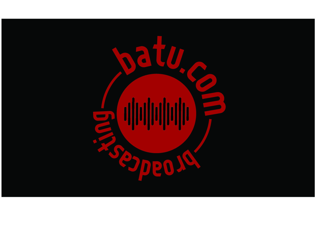
try not putting up the logo more than once.
1 year ago by Abhinand
broadcasting would look better is not inversed
1 year ago by Abhinand
Posts
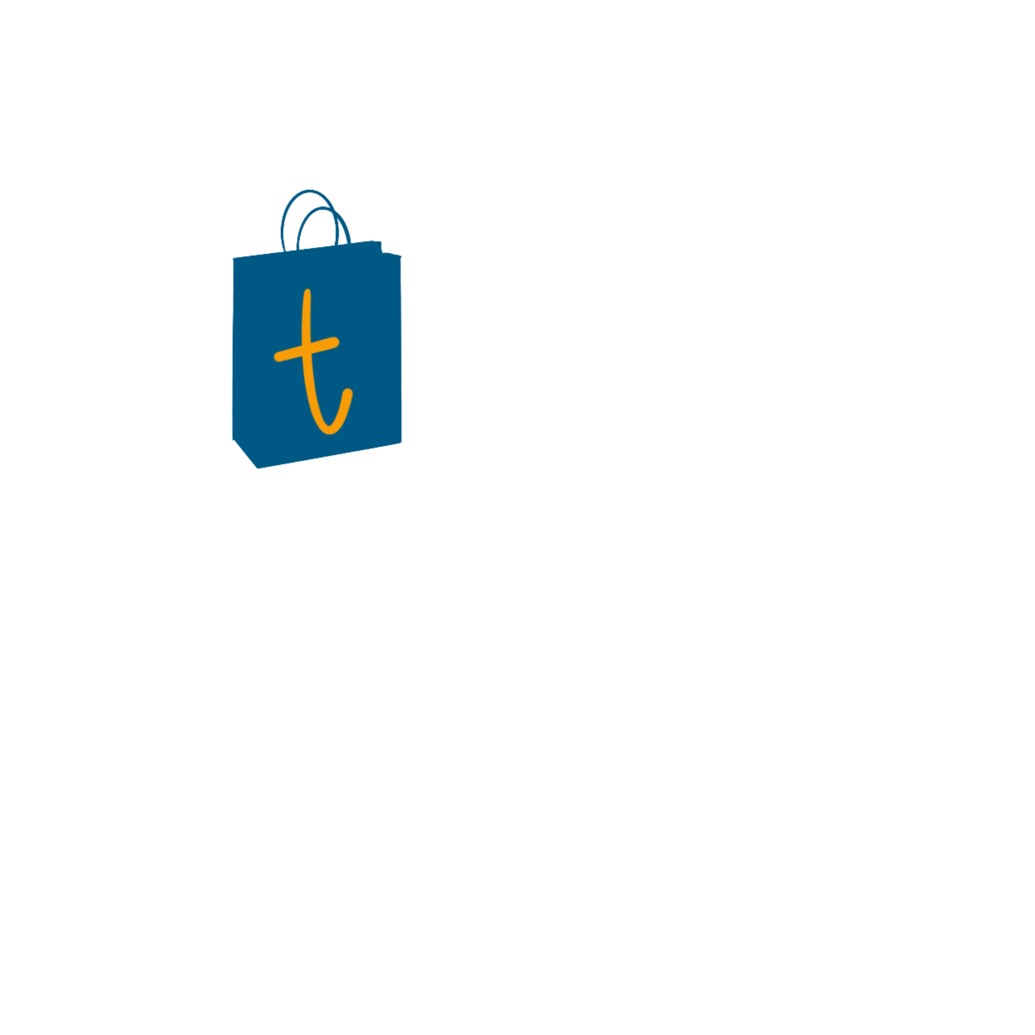
Cruise pad
- Report
1 year ago by Abhinand
pictorial mark
Hi,
I am Yan, creator of CruisePad. For a while now, we've been looking for a good logo for our business. I like pictorial marks. We would love to work with you!
I am Yan, creator of CruisePad. For a while now, we've been looking for a good logo for our business. I like pictorial marks. We would love to work with you!
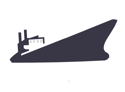
 2 Likes
 1
1
serves the purpose
1 year ago by Monojoy Dey - Reply
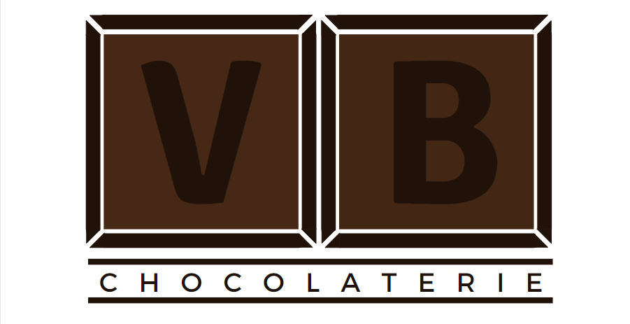
VB chocolaterie
- Report
1 year ago by Abhinand
an abstract mark.
Hey!
I am Elaina, owner of VB Chocolaterie. For a while now, we've been looking for a good logo for our Chocolaterie. I would like the logo to be an abstract mark. Can you help us out?
I am Elaina, owner of VB Chocolaterie. For a while now, we've been looking for a good logo for our Chocolaterie. I would like the logo to be an abstract mark. Can you help us out?
 1 Like
3
1 Like
3
I like the idea of using VB letters as a chocolate bar. I think it would be more visible if you'd use brighter brown. Try next time :)
11 months ago by Joanna Piechuła - Reply
I'm into the concept of the chocolate divisions, but the contrast between the black and the dark brown is too low and I think you should either make the brown lighter, or the black of the "VB" should be changed to white.
11 months ago by P - Reply
this is good design, and it work for ads as well
1 year ago by Mohamad Harisun - Reply
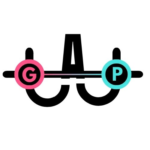
GAP
- Report
1 year ago by Abhinand
it is an abstract mark. I've tried making it creative and intrusive, the G and P are put in distance to show the "gap".
Hey!
I am Ivonne, I just founded a new business called Gap. I am looking for someone that can design a professional logo for my business. I would like the logo to be an abstract mark. Can you help me out?
I am Ivonne, I just founded a new business called Gap. I am looking for someone that can design a professional logo for my business. I would like the logo to be an abstract mark. Can you help me out?
1 Like
2
The way its made is unique , but the G and the P don't look original rest all the creativity and way you made it is amazing maybe try changing the G and P
10 months ago by WriterOftheNation - Reply
so good!
1 year ago by Abhinand - Reply
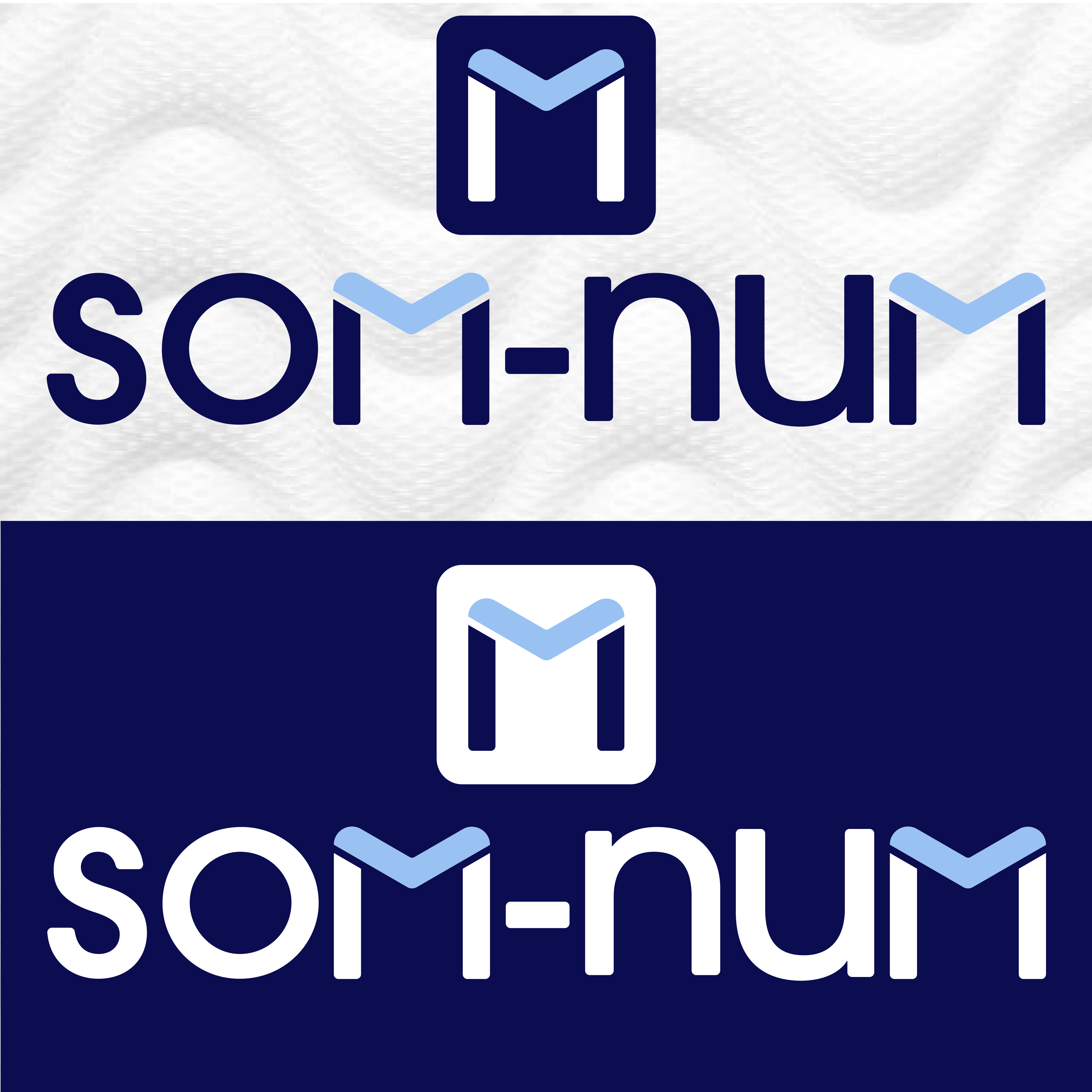
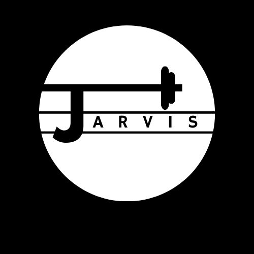
jarvis's gym
- Report
1 year ago by Abhinand
gym logo need not be attractive or color, so I went with a simple yet creative aesthetic
Hey,
I'm Jarvis, creator of Jarvis's Gym. We're looking for someone that can make a good logo for our business. I think a lettermark will fit best. Can you do that?
I'm Jarvis, creator of Jarvis's Gym. We're looking for someone that can make a good logo for our business. I think a lettermark will fit best. Can you do that?
 Like
1
Like
1
i think its interesting that youve used typography with vector this way.
1 year ago by Maham Burki - Reply