All Feedback Posts
![]()
DTP Shipping Solutions Logo
DTP Shipping Solutions Logo
- Report
Aaryan • 2 years ago
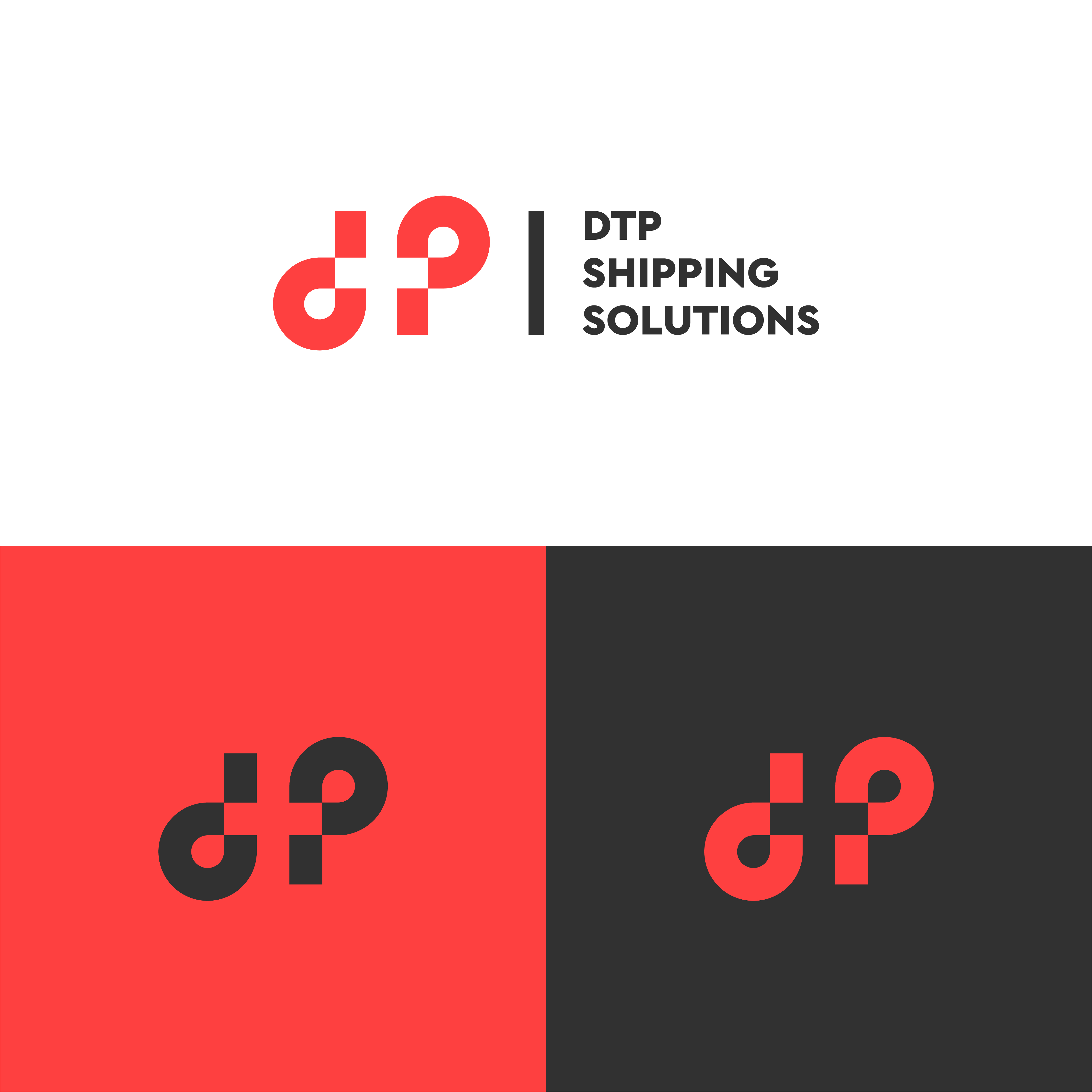
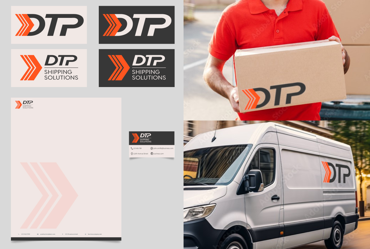
Hi guys, this is my first ever logo and I really want advice and critics!
It doesn’t matter if you have don’t have any professional experience because I would love to hear as many peoples opinions that I can to help me improve.
With this piece of work I attempted to make my logo look like it has a sense of motion when looked at it.
I made it look simple to the eye and easily recognisable.
I stuck with just the colour black because we live in a age where most things are viewed on a screen so therefore having a less complex colour scheme to a logo is usually what’s preferred (from the research I have done) :)
I’m sorry for not being able to completely complete what the fake client had in store! I’m a bit of a busy man these days!
Let me know what you think and CRITICS PLEASEEE!!!


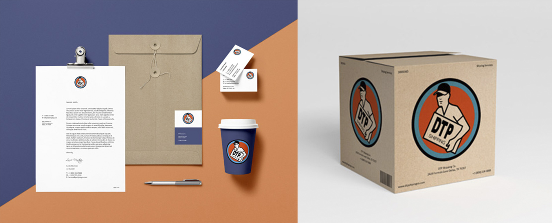
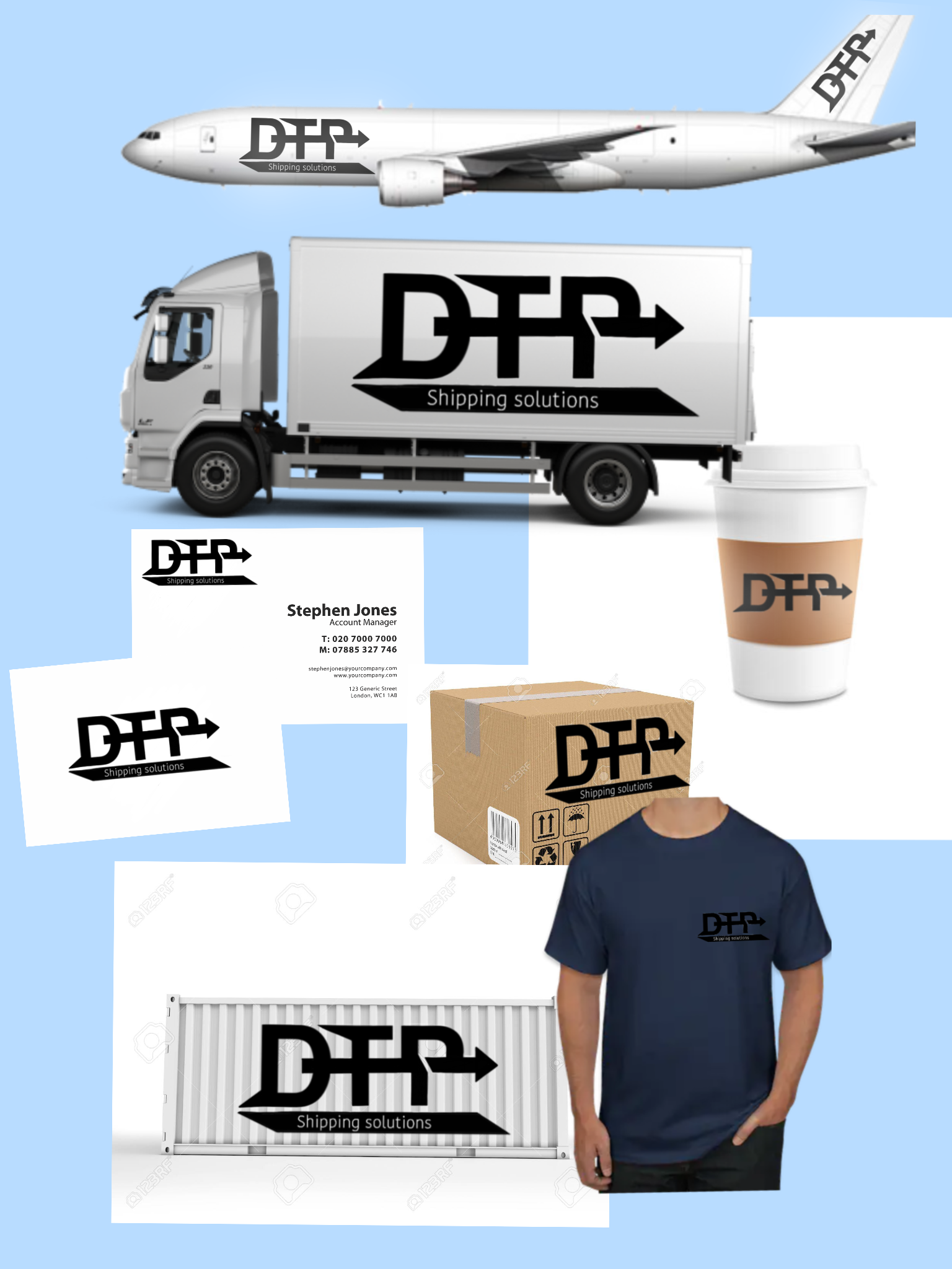
Hi there fellow designer!
Pros
-This is a nice bold logo and well done mock ups in correct order
- I like the arrow that pass through all the letters and shows the fast motion which is the A & Z in the delivery company.
Cons
-If I were you I wouldn't add so much details in the letters. Try to keep one shape in your logos or two if they have nice harmony.
-Always create two types of logo's. One for the light backgrounds and one for the dark backgrounds. For example in the T-shirt mock upo it should be a lighter version of the logo because the color of the shirt is dark and you cannot see the logo clearly.
Pros (version 2)
Overall it is a nice logo and I love the fact of the motion with the arrow and the mock up's are really really good.
My humble opinion with love!
10 months ago by Krystal Antoniou - Reply
This looks really cool
1 year ago by Sammy - Reply