


Krystal Antoniou
Posts
2
Likes
3
Liked Posts
12
Given Feedback
4
Feedback
<3
10 months ago by Krystal Antoniou
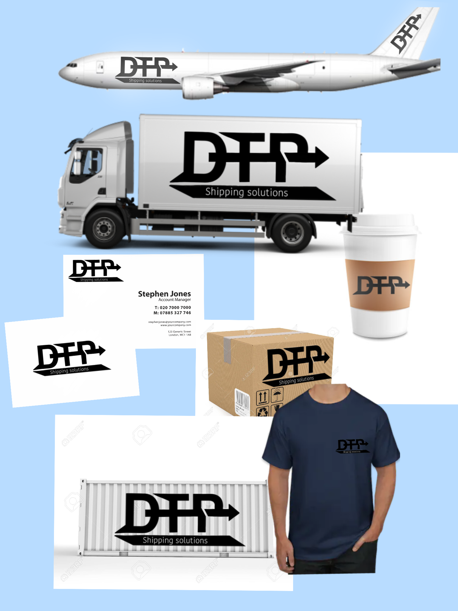
Hi there fellow designer!
Pros
-This is a nice bold logo and well done mock ups in correct order
- I like the arrow that pass through all the letters and shows the fast motion which is the A & Z in the delivery company.
Cons
-If I were you I wouldn't add so much details in the letters. Try to keep one shape in your logos or two if they have nice harmony.
-Always create two types of logo's. One for the light backgrounds and one for the dark backgrounds. For example in the T-shirt mock upo it should be a lighter version of the logo because the color of the shirt is dark and you cannot see the logo clearly.
Pros (version 2)
Overall it is a nice logo and I love the fact of the motion with the arrow and the mock up's are really really good.
My humble opinion with love!
10 months ago by Krystal Antoniou
Thank you dear I'm glad that you liked it :)
10 months ago by Krystal Antoniou
thank you very much :)
10 months ago by Krystal Antoniou
Posts
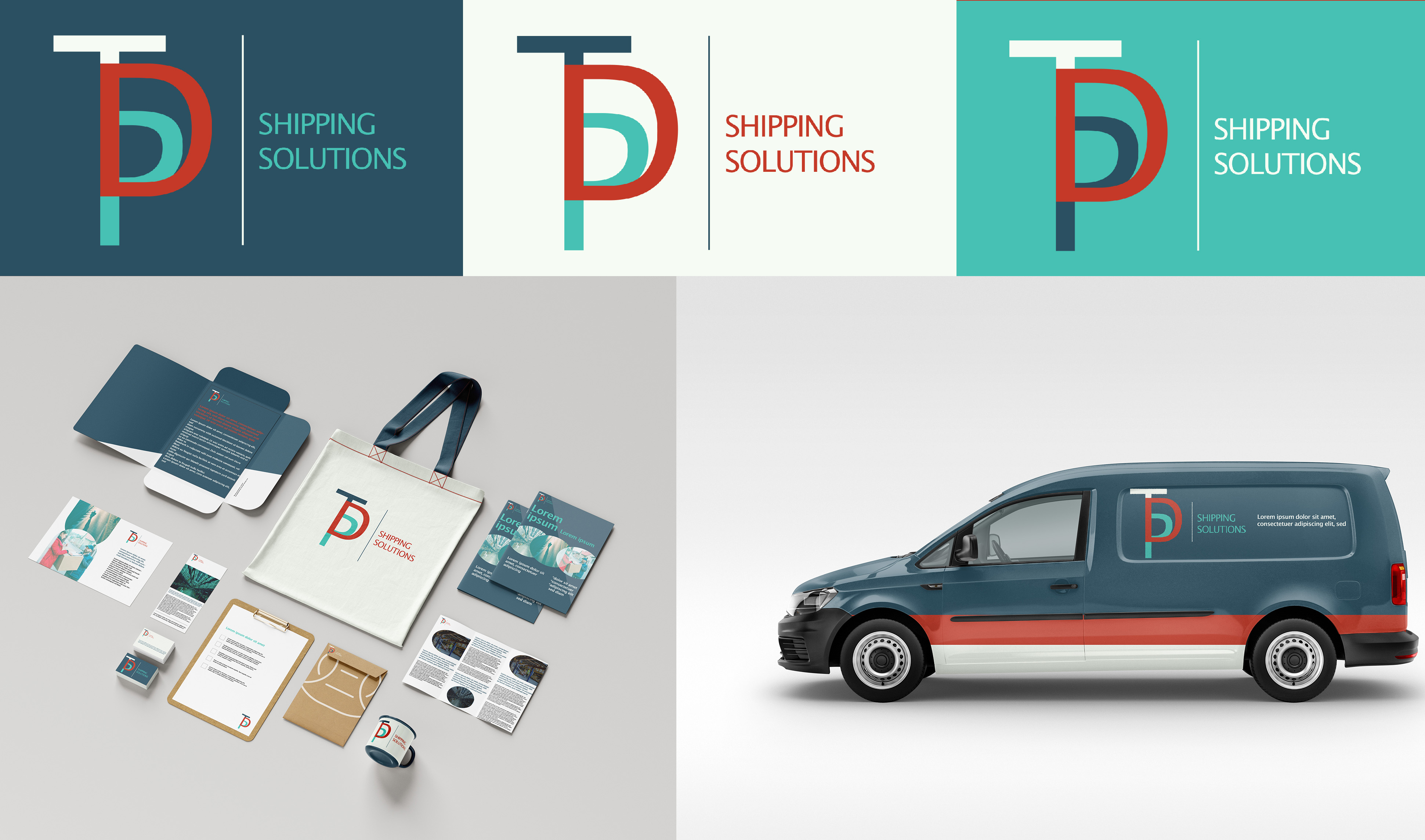
DTP Shipping Solutions brand
- Report
Krystal Antoniou • 10 months ago
Your feedback is always welcome


DTP Shipping Solutions logo design 2024
10 months ago by zahid designs - Reply
<3
10 months ago by Krystal Antoniou - Reply

love it
10 months ago by Ayush - Reply
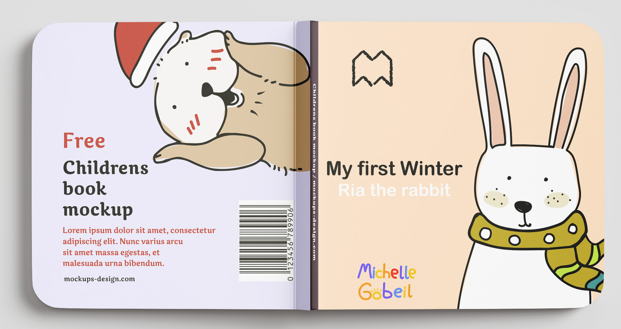
It is quite appropriate for the book and blends well the design.
10 months ago by Dan Roe Jaspe - Reply
thank you very much :)
10 months ago by Krystal Antoniou - Reply
Really nice and colourful which takes into account that she works on children's books
10 months ago by Nicole Patton - Reply
Thank you dear I'm glad that you liked it :)
10 months ago by Krystal Antoniou - Reply