Ayush
Posts
3
Likes
15
Liked Posts
30
Given Feedback
17
Feedback
love it
5 months ago by Ayush
go for it... 👍
6 months ago by Ayush
Just change green to orange... You ll love the result... the design is quite creative already.
6 months ago by Ayush
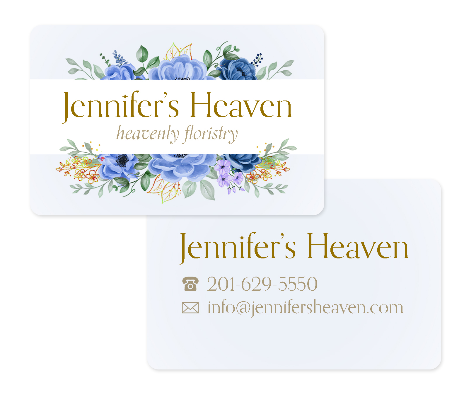
it actually does look good... front looks amazing... i m not a fan of images of biz cards but it stil looks descent here... Back side, the font in yellow box is not readable as its decorative font. I would prefer you use the same font that was used on the front side. Secondly the vector that is used before phone number, address can be white to make it stand out on the bg and increase the gap between the vector and the text a little bit, maybe by 20 px. Rest is really good.
6 months ago by Ayush
cool... where do u take your mockups from btw?
6 months ago by Ayush
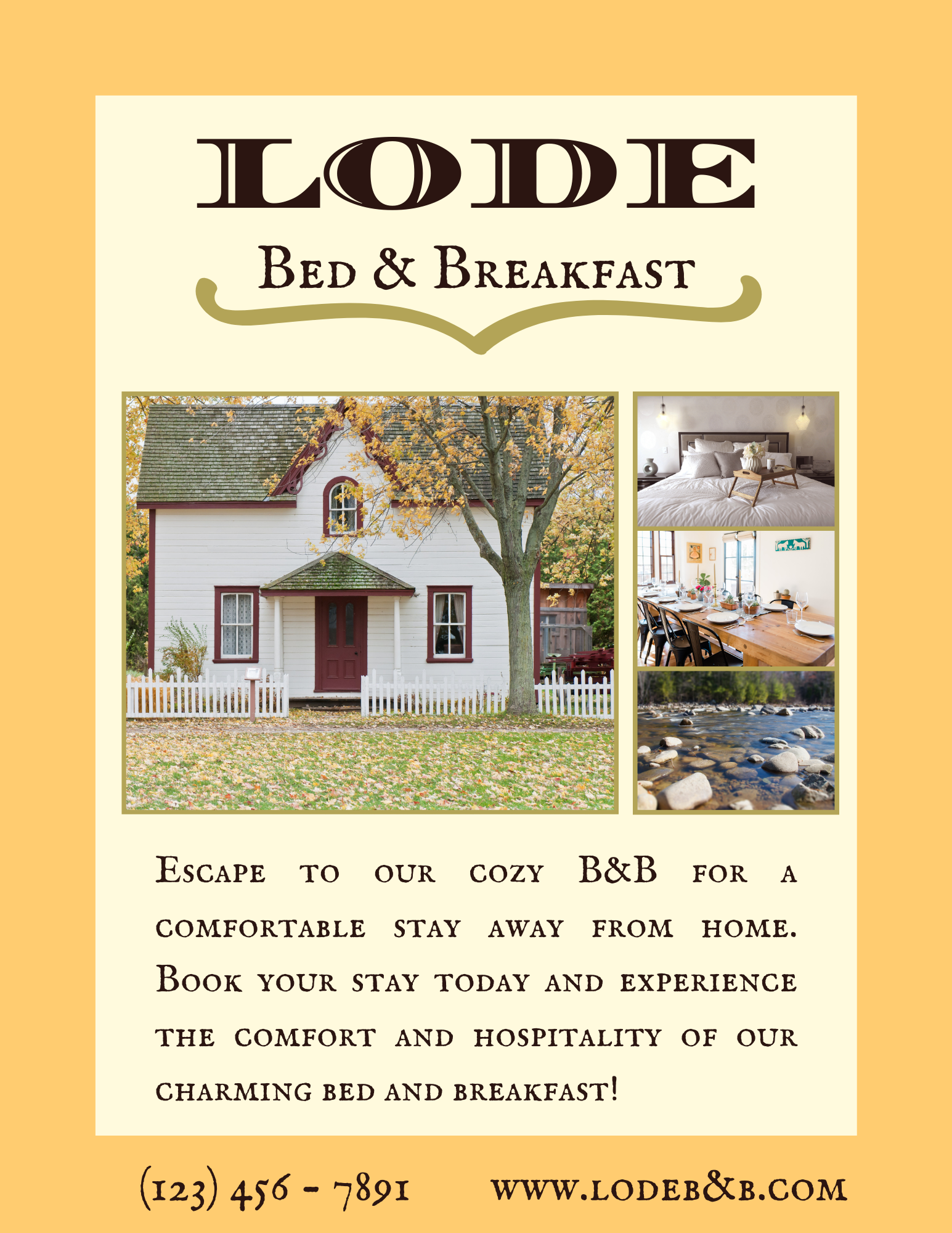
There are quite a few stuff that you ll have to work on. lets start with technical points. In a domain name ampersand (&) is not allowed. you can make it www.lodebandb.com. It is a all caps which is very hard to read. The way the pictures are presented are quite nice tho. I saw your creative and tried making a new one just for your reference. Hope that would help.
6 months ago by Ayush
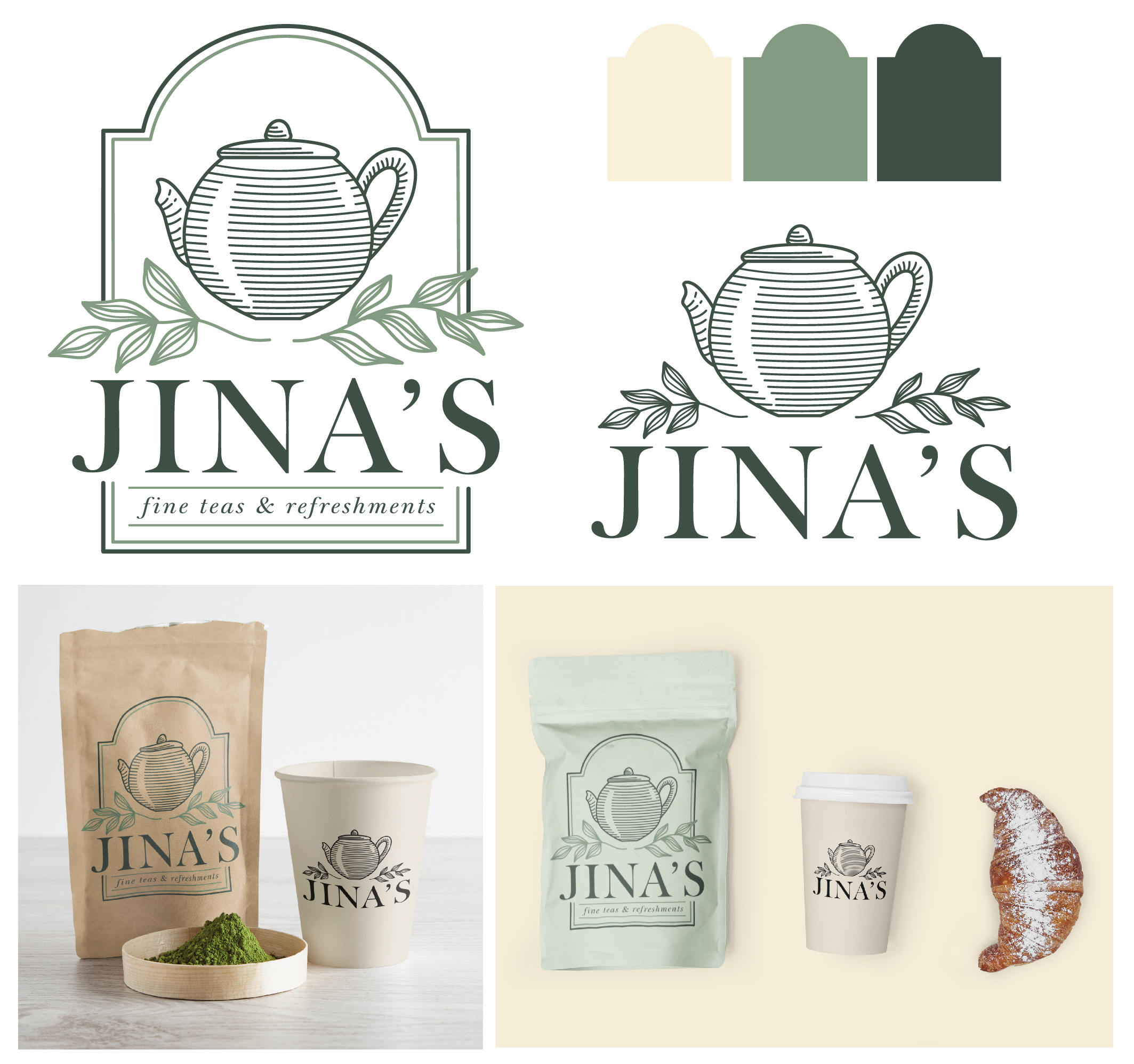
Amazing design. Can u try "fine teas and refreshments" in a sans serif. I think it would look good... font like quicksand light or something... the design is really very beautiful and your presentation acted as a cherry on top.
6 months ago by Ayush
hey Temidun. As you suggested you are aspiring to become a graphic designer. I would suggest you study about design principles. here is a link to help you https://www.adobe.com/express/learn/blog/8-basic-design-principles-to-help-you-create-better-graphics ... Also, Visit pinterest, savee.io regularly. these sites provide nice inspiration. Cheers and all the best on your journey. Do share more creatives here. I am looking forward to your designs as you have real potential :)
6 months ago by Ayush
pretty good design... combination of serif and sans looks really good and is pretty much a design standard at this point to provide contrast... u can try tht too... cheers
7 months ago by Ayush
thats quite an observation... I missed that.. thanks
7 months ago by Ayush
cool
7 months ago by Ayush
hey Aisha... Concept is really good. Couple of things to take it to the next level, the name on the card "corrie" can have more top margin, can use more earthly color for yellow like brown i guess. The contrast of a serif font with a sans serif in the next line. so founder can be written in a sans. Can u please try the combination of white and brown. I think it might look good. Just give it a try yaa... Cheers
7 months ago by Ayush
simplify*
7 months ago by Ayush
hey... thats a sweet design... just one thing.. in abstract designs we have more creative freedom so we can simply it even more... also blue is a really nice color to use as it resonates trust and stability which fits the context really well.. cheers
7 months ago by Ayush
thank you Maria ^_^
7 months ago by Ayush
Very creative...
7 months ago by Ayush
love the gradients and the illustration...
7 months ago by Ayush
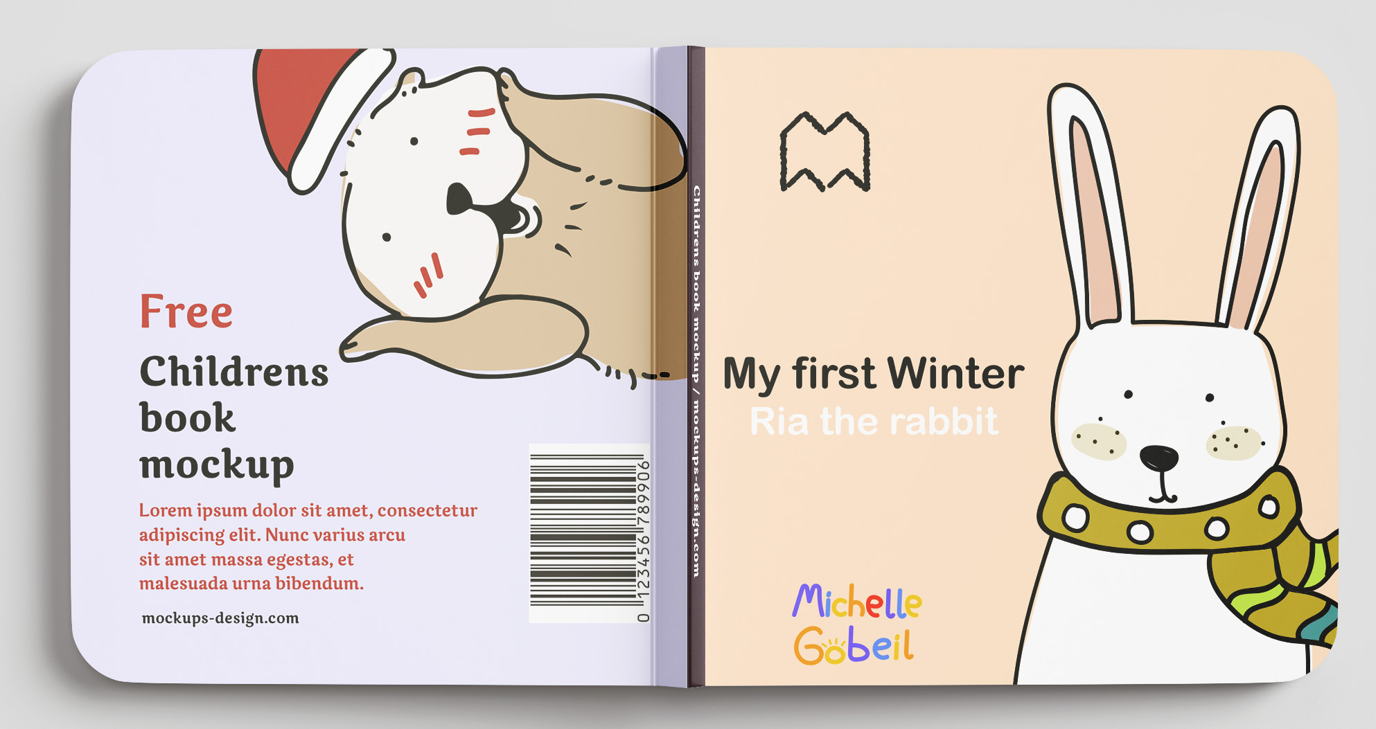
Posts
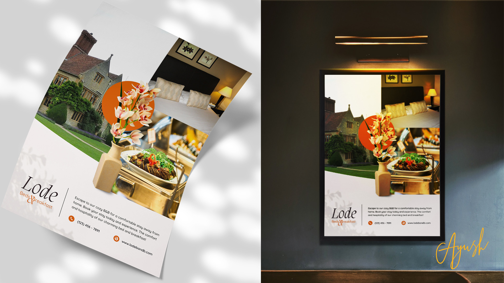
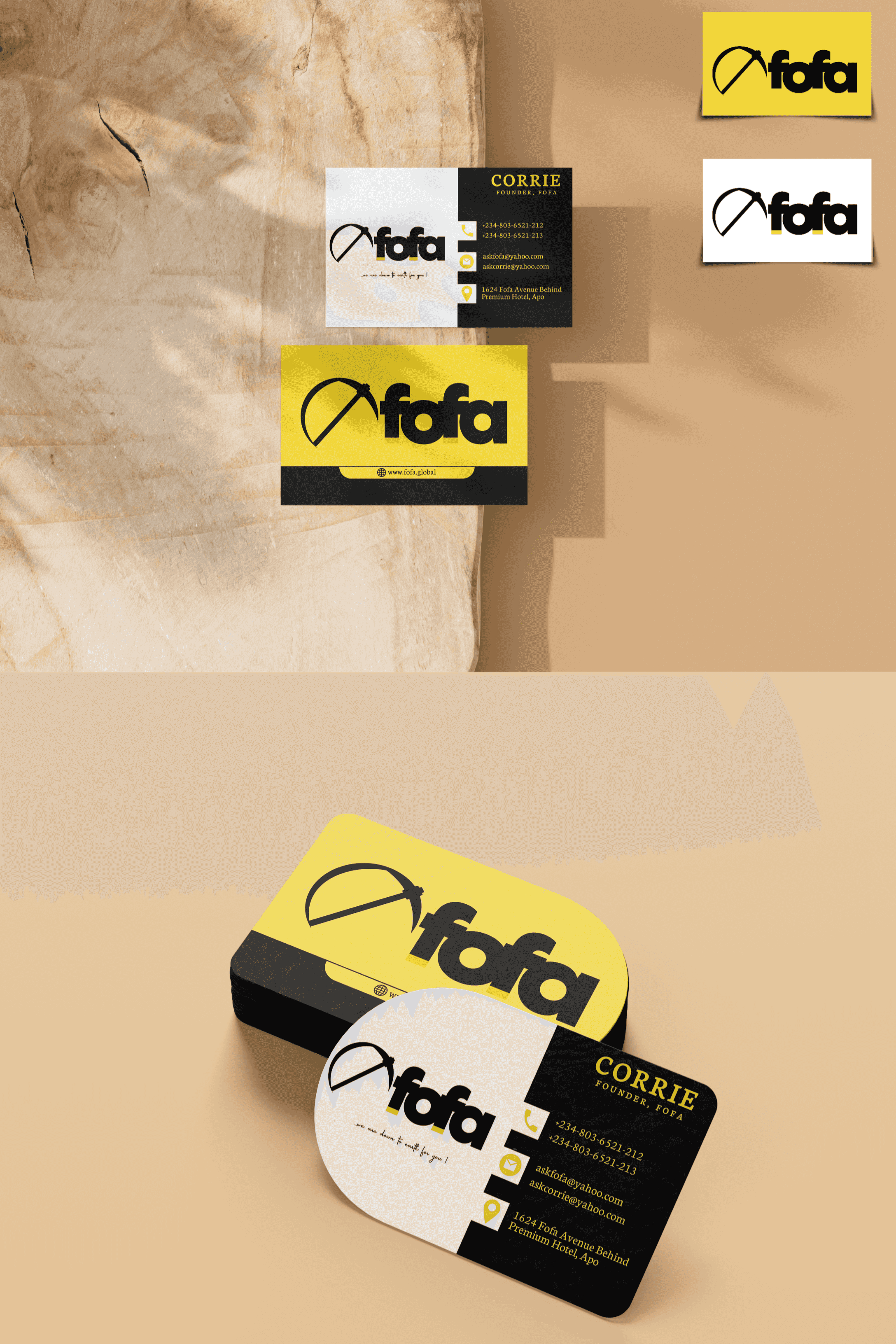
Lode Bed & Breakfast
- Report
6 months ago by Ayush
Brief
Hey, I'm Antonia, I recently started a new business called Lode. I'm looking for someone that can design something for my bed and breakfast. We will need a poster to advertise our business. Can you help me out?
Hey, I'm Antonia, I recently started a new business called Lode. I'm looking for someone that can design something for my bed and breakfast. We will need a poster to advertise our business. Can you help me out?
 2 Likes
 3
3
Sum-Num logo
- Report
7 months ago by Ayush
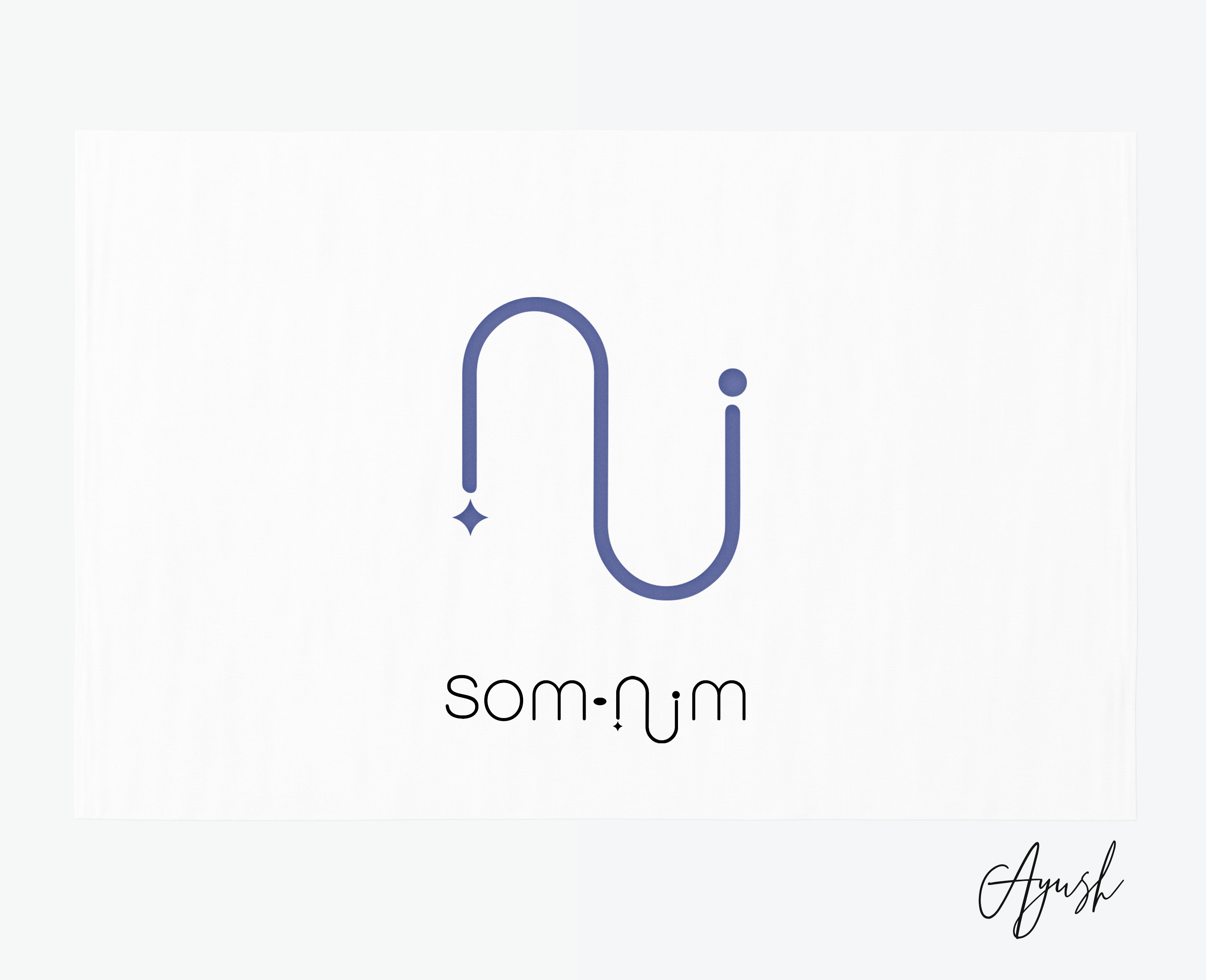
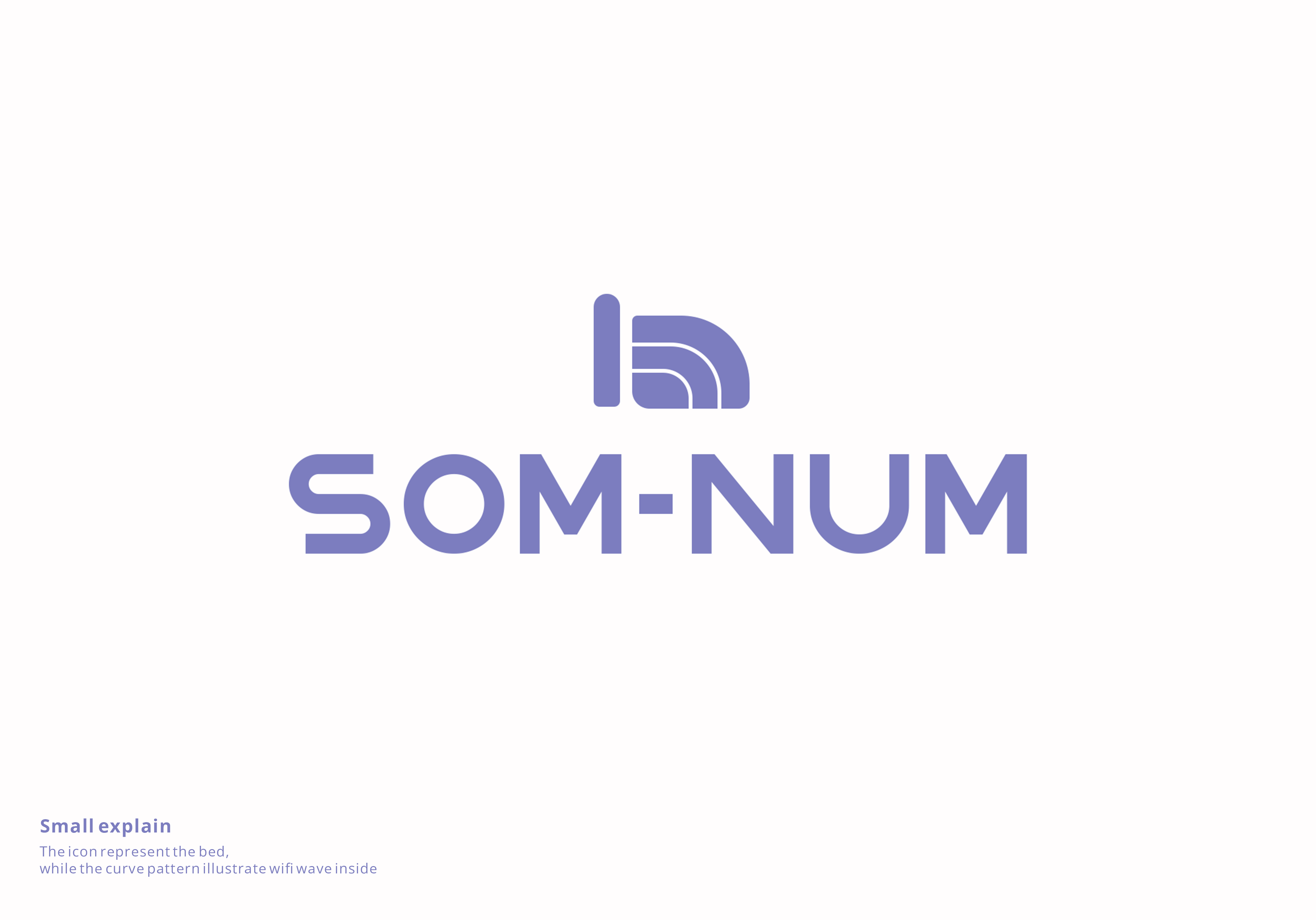
We are an up-and-coming startup based in Seattle that develops smart mattresses, called "Som-Num" (from the Latin word somnum, meaning sleep). Our business is still very young as we have just finished the Kickstarter campaign for our Bluetooth-enabled mattress that helps you track your sleep. We don't have a good logo yet and we actually need one before the end of this week because the pre-ordered mattresses are going into production next week.
Below, we have listed some of our competitors with logos that we like:
Casper
Helix Sleep
Tuft & Needle
Below, we have listed some of our competitors with logos that we like:
Casper
Helix Sleep
Tuft & Needle
Som-Numlogo
7 Likes
2
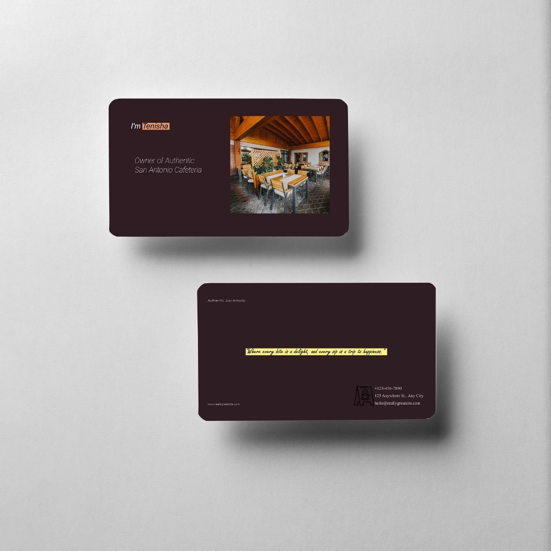
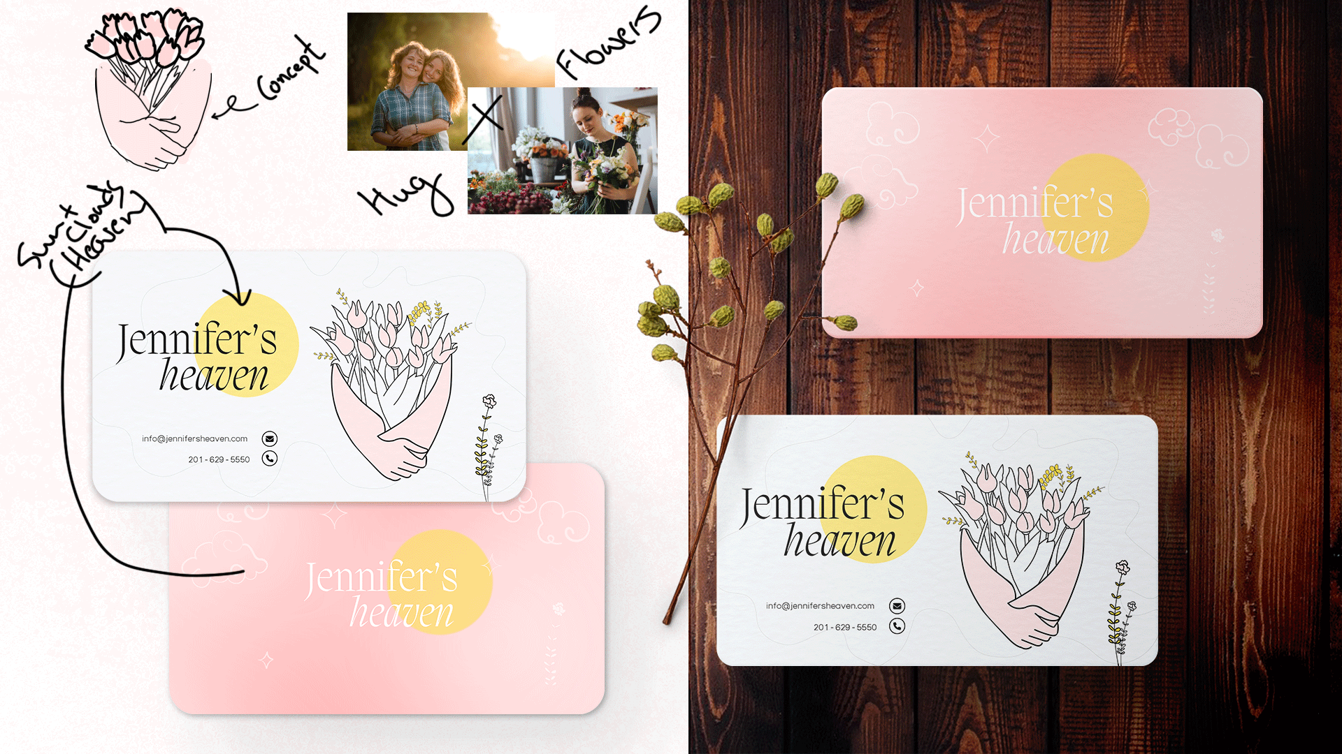
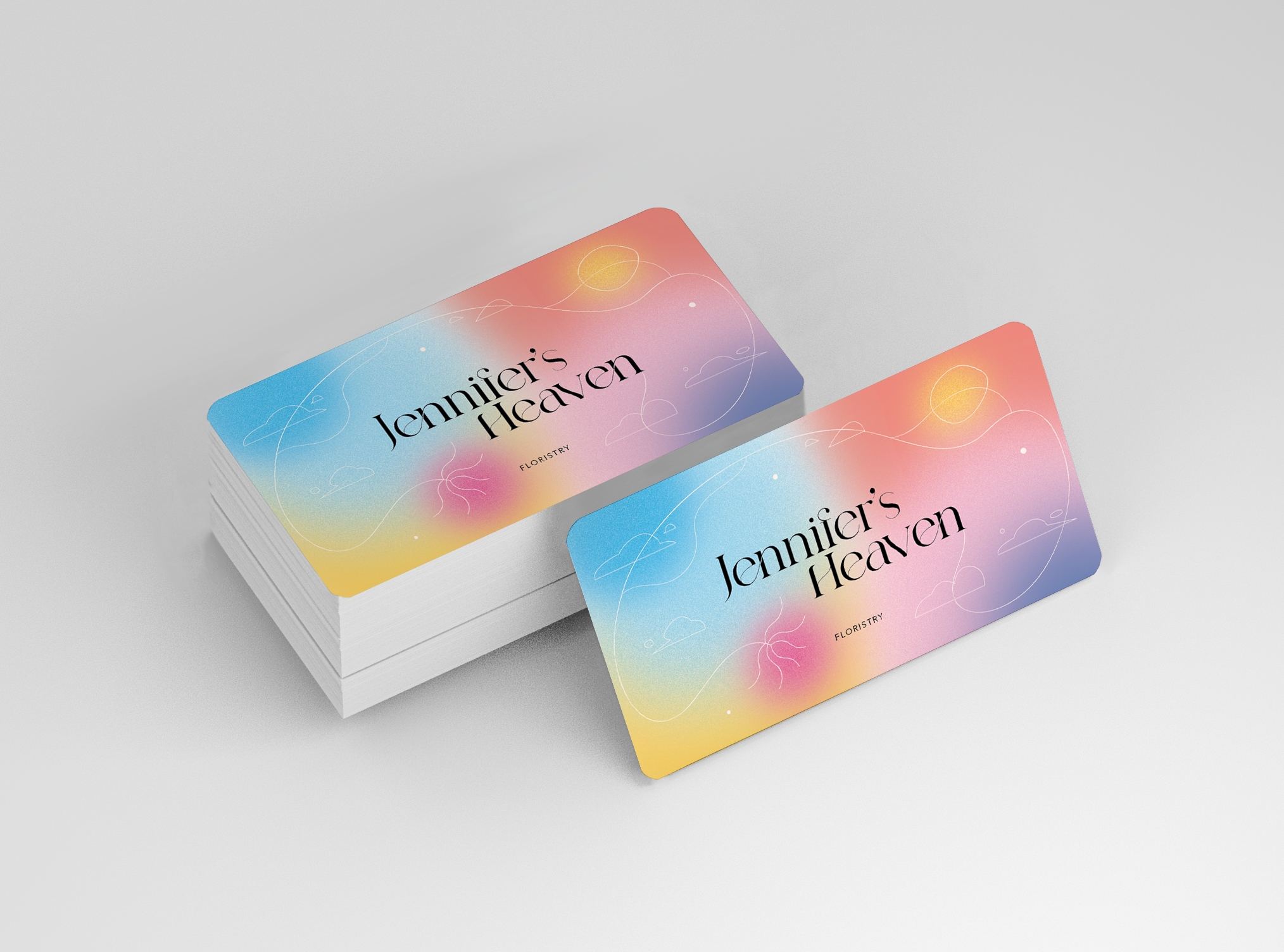
Jennifer's Heaven biz Card
- Report
7 months ago by Ayush
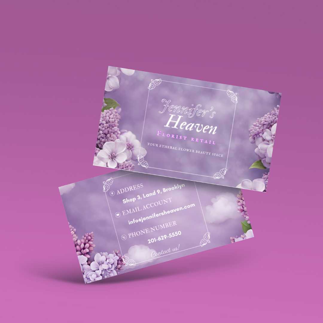
the card elicits love and caring that the florist have for their brand. It also uses feminine colors to match the theme of the name. For heavenly look, clouds, sun and stars have been used with a gradient of pink.
Jennifer's Heavengraphic
6 Likes
2
Really neat design!
I like the layout with the ilustration, great job!
7 months ago by Maria Rodriguez - Reply
thank you Maria ^_^
7 months ago by Ayush - Reply