Lise
Posts
1
Likes
3
Liked Posts
1
Given Feedback
2
Feedback
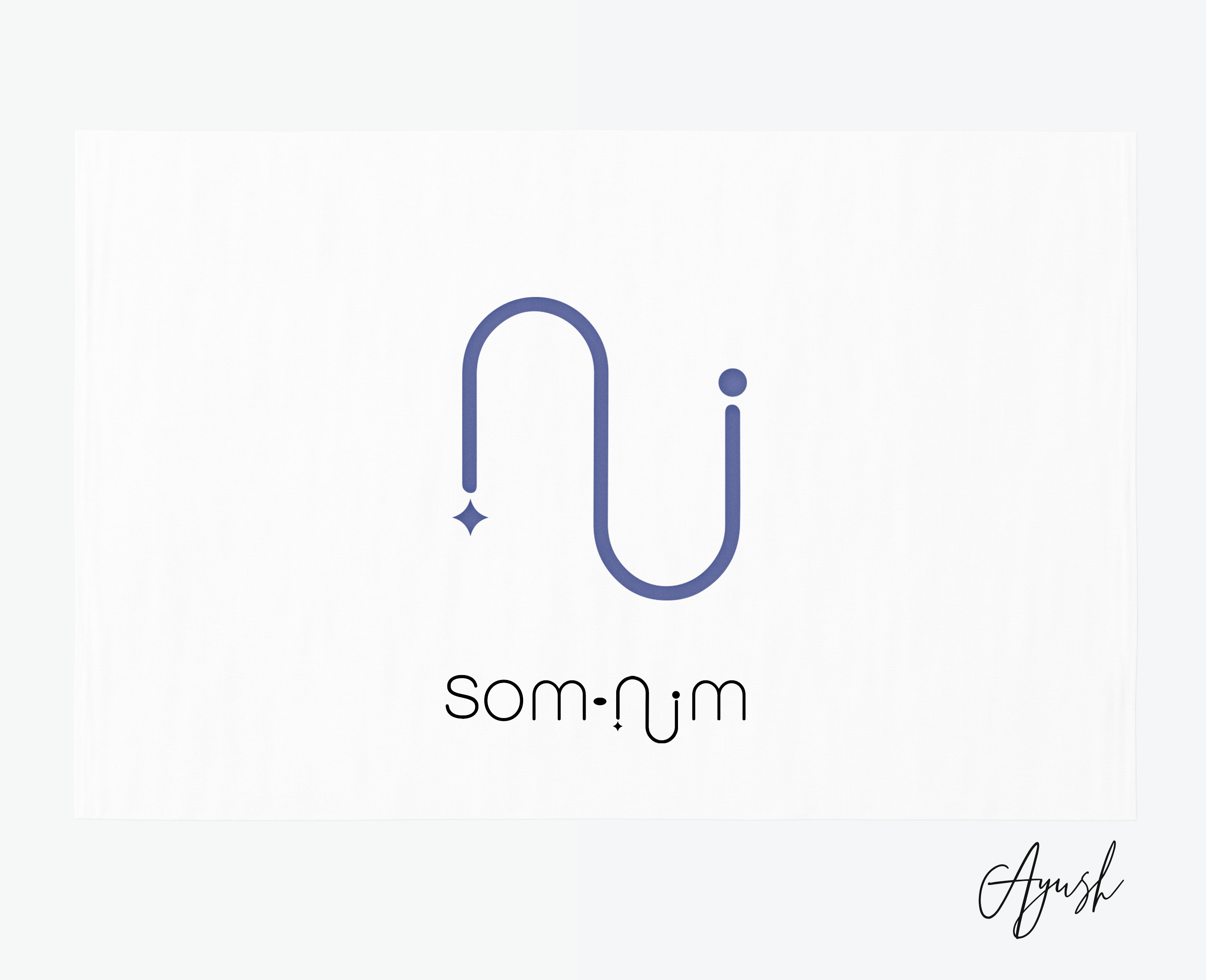
I like the concept, but it would've been better if there wasn't so much space between the letters n, u and m. The way it is now kind of reads like 'snum'.

7 months ago by Lise
Beautiful. Very fitting, relaxing colour choice. However, I wish the - in the name was a little rounder, to fit with the other dots.
7 months ago by Lise
Posts
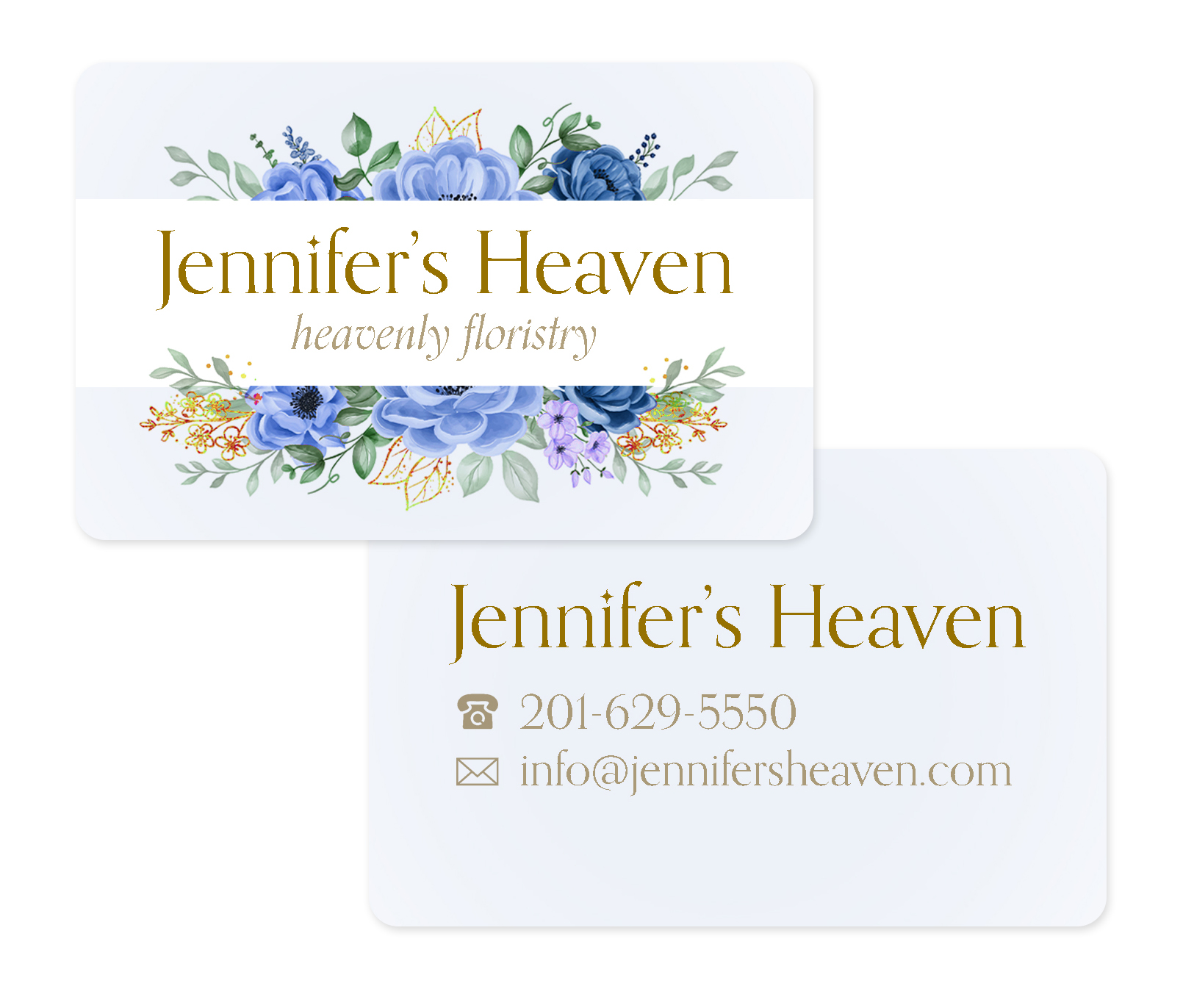
Jennifer's Heaven
- Report
7 months ago by Lise
Hi! I'm an illustrator trying to get better at graphic design, because that could be useful in my freelance illustration work! This is my first time using a brief on this website.
The flower image and phone/email icons used are designed by Freepik.
The flower image and phone/email icons used are designed by Freepik.
Jennifer's Heavengraphic
 3 Likes
 1
1
pretty good design... combination of serif and sans looks really good and is pretty much a design standard at this point to provide contrast... u can try tht too... cheers
7 months ago by Ayush - Reply