


Aaryan
Posts
2
Likes
8
Liked Posts
5
Given Feedback
2
Feedback
I just realised how bad my English was in the description of my work lmao
2 years ago by Aaryan
So beautiful and simplistic!
I’m new to graphic design and I was scrolling down fake clients for inspiration and this logo caught my eye!
Keep up the great work!
2 years ago by Aaryan
Posts
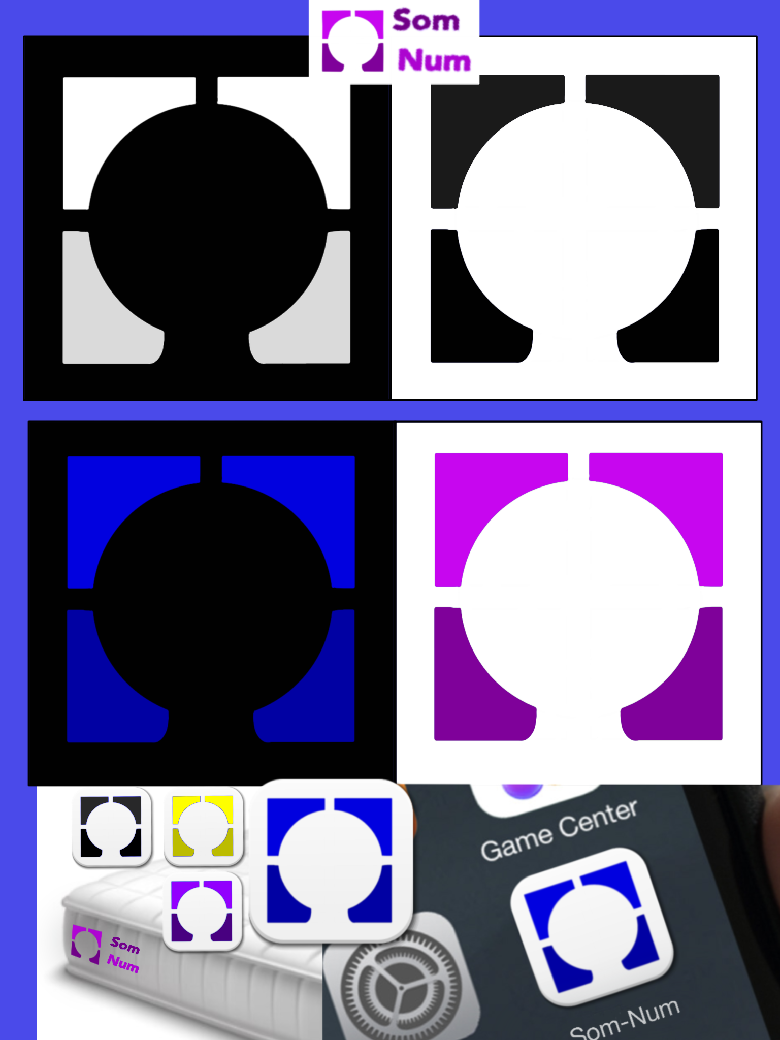
Som-Num Logo
- Report
Aaryan • 2 years ago
Som-Numlogo
Gday fellow fakeclient-ers
This is my attempt on the ‘Som-Num’ logo.
I went simplistic with my logo to keep it suitable for the client who mentioned how they wanted the logo to be used on applications.
The shapes that are mentioned in my logo represent something linked with the theme of Som-Num and I want you guys to see if you know what they represent to test if my work has actually worked!!!
I’m proud of my design but I really want to hear what you guys think about it and don’t feel afraid to critic since I REALLY want some critics to help me improve!!!
It doesn’t matter if your professionally experienced or not, gathering more people’s opinions to help me progress with my work would mean everything to me!
Thanks for your time!


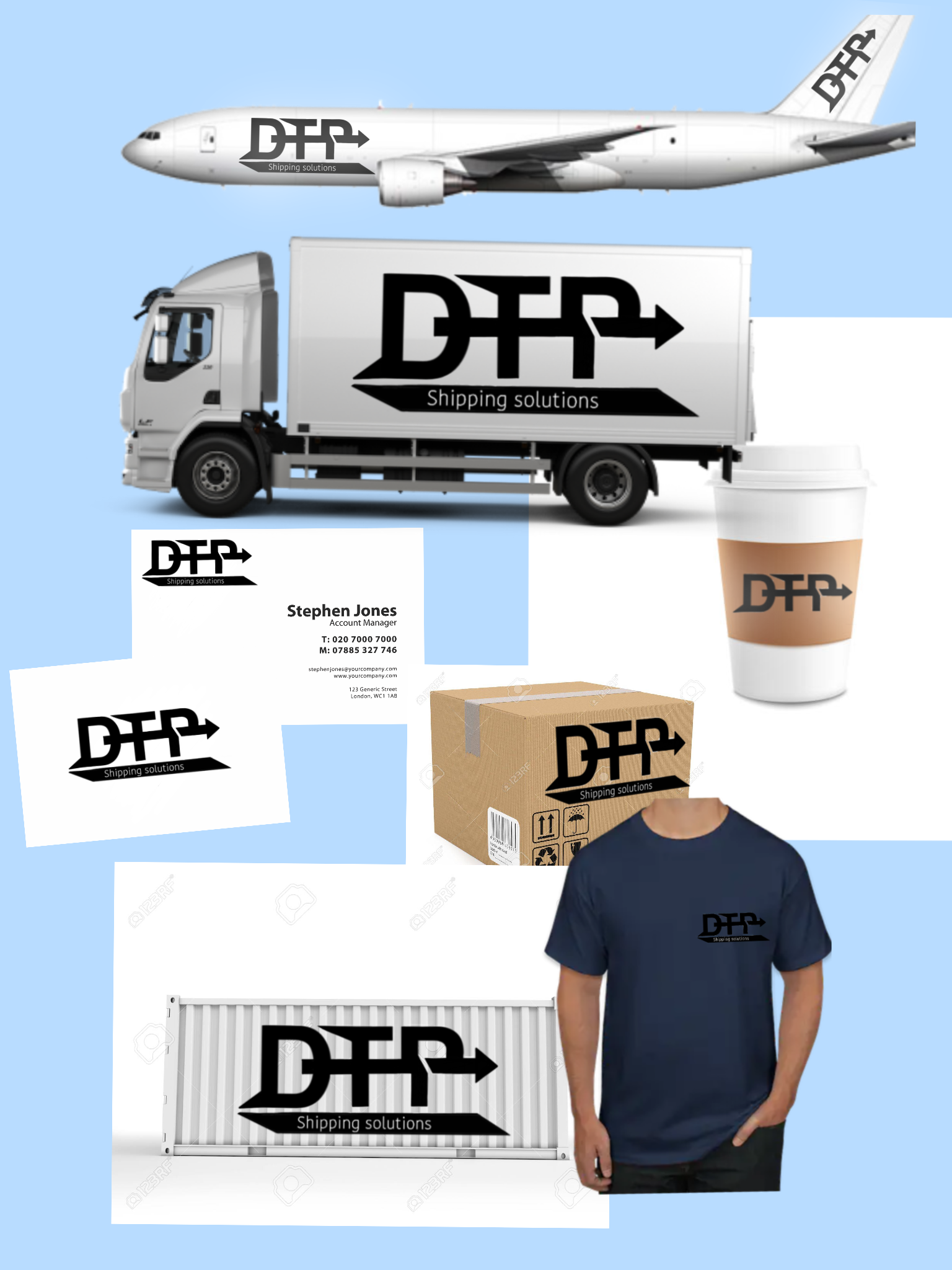
DTP Shipping Solutions Logo
- Report
Aaryan • 2 years ago
Hi guys, this is my first ever logo and I really want advice and critics!
It doesn’t matter if you have don’t have any professional experience because I would love to hear as many peoples opinions that I can to help me improve.
With this piece of work I attempted to make my logo look like it has a sense of motion when looked at it.
I made it look simple to the eye and easily recognisable.
I stuck with just the colour black because we live in a age where most things are viewed on a screen so therefore having a less complex colour scheme to a logo is usually what’s preferred (from the research I have done) :)
I’m sorry for not being able to completely complete what the fake client had in store! I’m a bit of a busy man these days!
Let me know what you think and CRITICS PLEASEEE!!!

Hi there fellow designer!
Pros
-This is a nice bold logo and well done mock ups in correct order
- I like the arrow that pass through all the letters and shows the fast motion which is the A & Z in the delivery company.
Cons
-If I were you I wouldn't add so much details in the letters. Try to keep one shape in your logos or two if they have nice harmony.
-Always create two types of logo's. One for the light backgrounds and one for the dark backgrounds. For example in the T-shirt mock upo it should be a lighter version of the logo because the color of the shirt is dark and you cannot see the logo clearly.
Pros (version 2)
Overall it is a nice logo and I love the fact of the motion with the arrow and the mock up's are really really good.
My humble opinion with love!
10 months ago by Krystal Antoniou - Reply
This looks really cool
1 year ago by Sammy - Reply