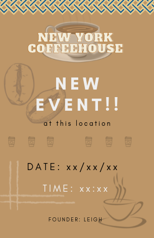
Simple New York Coffeehouse Flyer Event
- Report
2 years ago by Suzi
Hello! Feedback will be greatly appreciated.
 1 Like
 2
2
I like the overall layout maybe bring that blue from the top border into some of the other elements to break up the the beige. I think you could lose the Lowe coffee cup and move the beans in that corner smaller to make the founder name fully legible. And filling in the gap of those middle to go cups would make it more of a page break.
2 years ago by Alexis Vasquez - Reply
Thank you so much! I will take this into consideration next prompt. I appericate it.
2 years ago by Suzi - Reply


