Alexis Vasquez
Posts
9
Likes
7
Liked Posts
40
Given Feedback
9
Feedback
very nice

1 year ago by Alexis Vasquez
love the sketch style of the ice cream
1 year ago by Alexis Vasquez
It looks really nice!
1 year ago by Alexis Vasquez
Got it thank you for taking the time to explain
2 years ago by Alexis Vasquez
I personally like the bold imposing “world” and its contrast to the light scratchy “record”. But I’d agree a more colorful scheme might be better

2 years ago by Alexis Vasquez
Could you explain what that means? I genuinely don't know lol
2 years ago by Alexis Vasquez
I kind of like that the font contrasts the fun of the “o” personally. But the o is very boxy You could put a cupcake with a domed top and slightly tapered bottom it may give more of a “o” feel and that s is a little to far from the rest of the text.
2 years ago by Alexis Vasquez
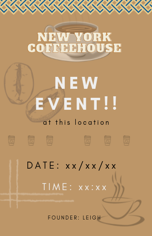
I like the overall layout maybe bring that blue from the top border into some of the other elements to break up the the beige. I think you could lose the Lowe coffee cup and move the beans in that corner smaller to make the founder name fully legible. And filling in the gap of those middle to go cups would make it more of a page break.
2 years ago by Alexis Vasquez
I like the idea there is a lot of negative space in the middle, maybe make the contact info bigger, and the hue of pink might look better if it was lighter

2 years ago by Alexis Vasquez
Posts
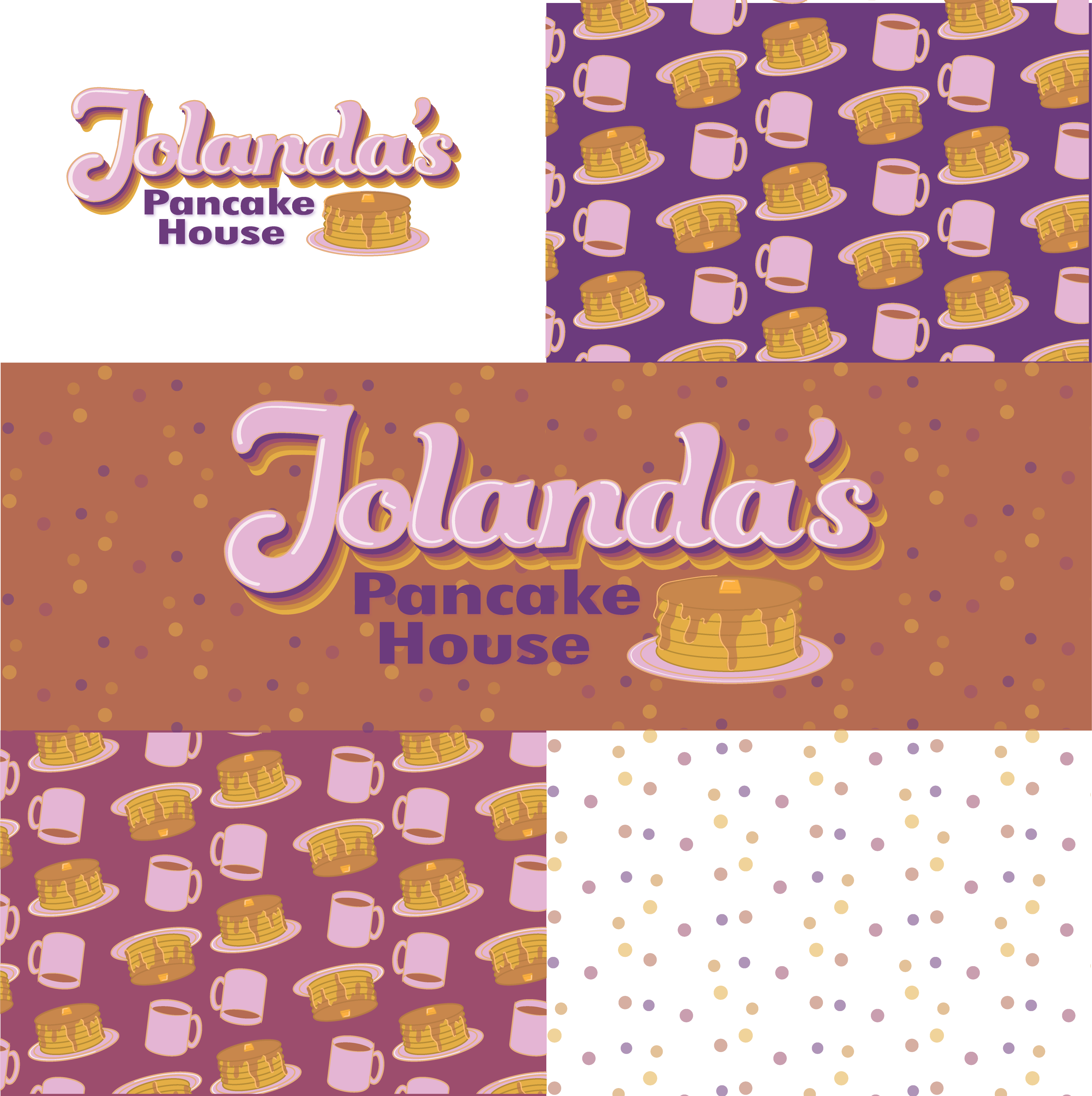
Jolanda's Pancake House
- Report
Alexis Vasquez • 1 year ago
Retro lettering and little breakfast graphics
 Like
Like


it's a good design, but I think it would be better if you change the color of background.
1 year ago by Diyana - Reply
beach square
- Report
Alexis Vasquez • 1 year ago
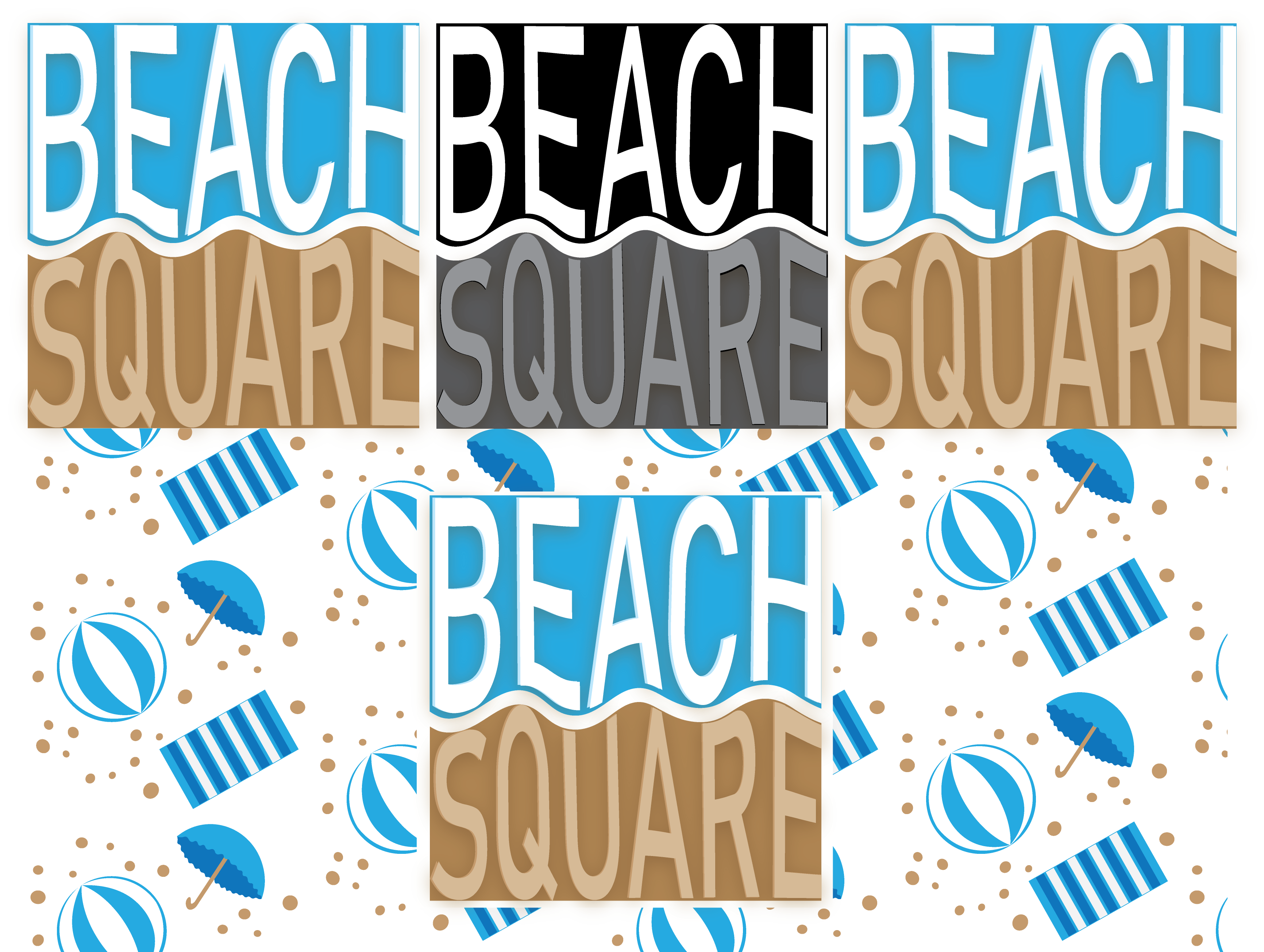

Color and lines combinations were efficiently used. Overall, it was nice.
1 year ago by jessa marie agosto sanchez - Reply
Clair de Lune
- Report
Alexis Vasquez • 1 year ago

Hy, my name is Oluwaseyi, i must say that this is a fantastic Design and i love it. ❤️

1 year ago by Oluwaseyi Ogundare - Reply


RWJ Repairs logo
- Report
Alexis Vasquez • 1 year ago
Hey,
I am Rea, I just founded a new business called RWJ Repairs. I'm looking for someone that can make a good logo for my Repairs. I think a combination mark will fit best with the business. Can you help me out?
I am Rea, I just founded a new business called RWJ Repairs. I'm looking for someone that can make a good logo for my Repairs. I think a combination mark will fit best with the business. Can you help me out?
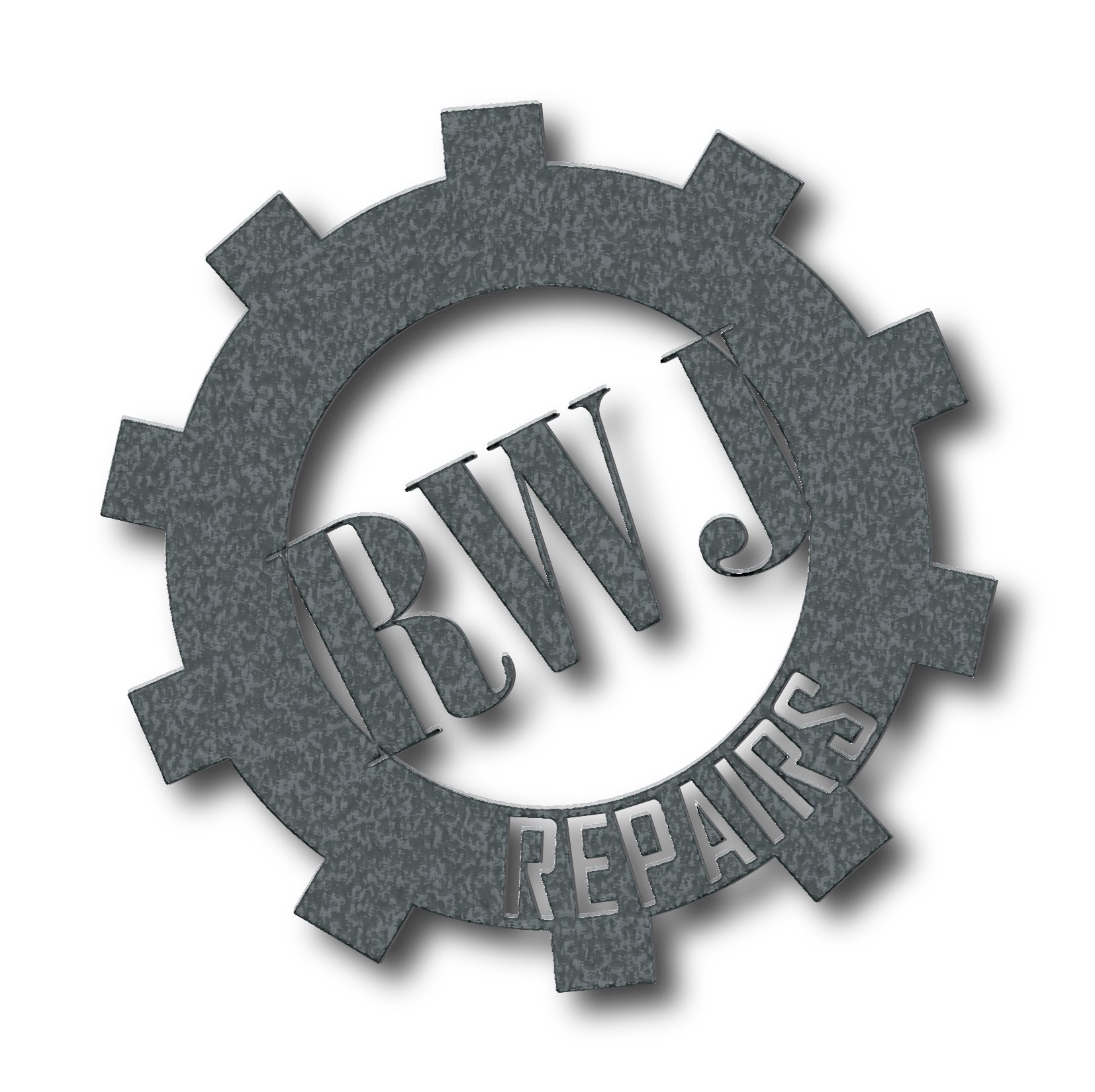

Wow, fantastic and clear. This is great 👍
1 year ago by Oluwaseyi Ogundare - Reply