Authentic PA Bakery Abstract Logo
- Report
3 years ago by Sti
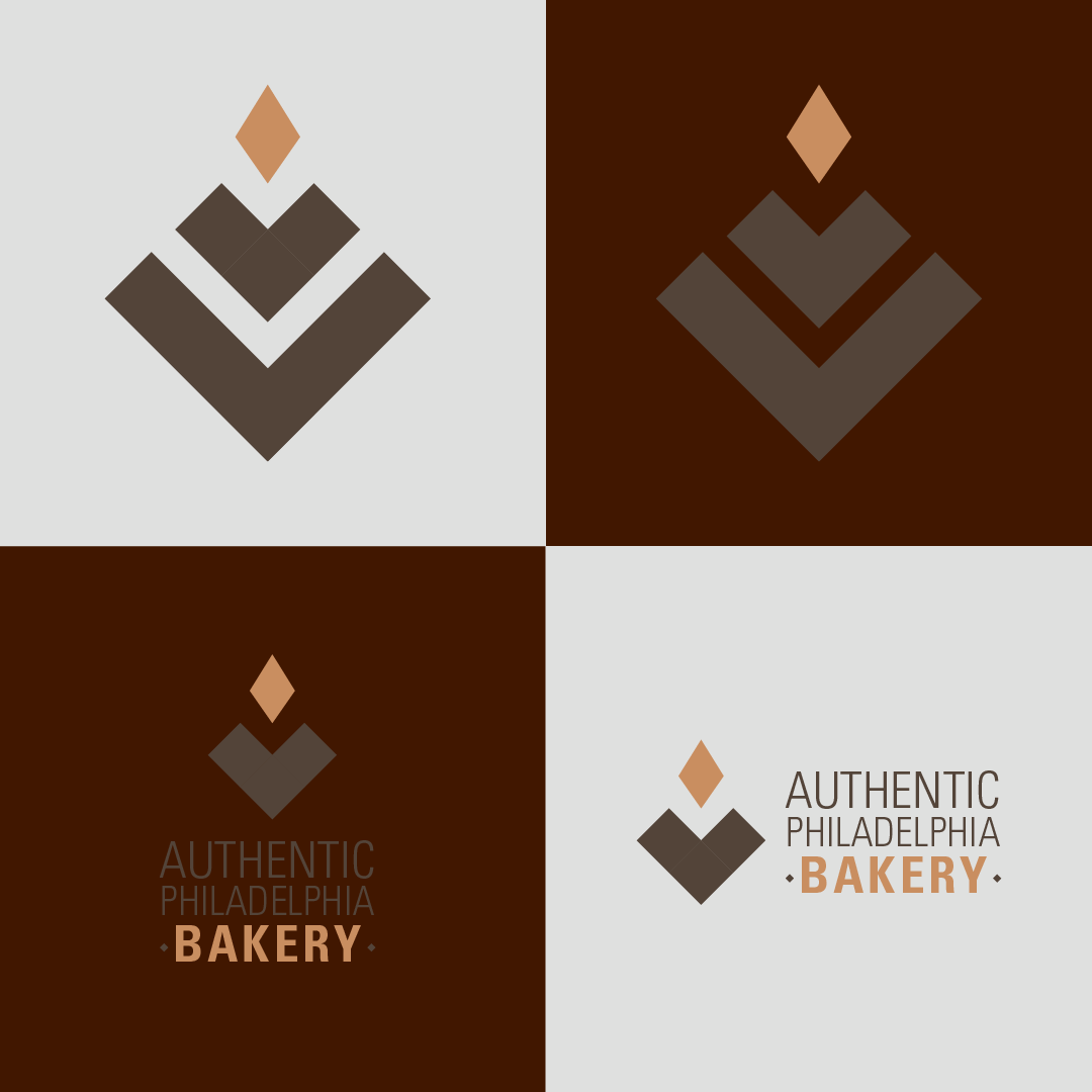
I got inspired in wheat fields to make this logo. The color palette was chosen from bread and grains, it makes you crave a good loaf of bread.
Although the logo is abstract, it has some shapes that resembles the wheat, a heart shape that goes out of it and a grain, embracing themselves, that's the way bread is made. I made a big abstract logo, but then a little one too with the name of the bakery, I don't know if the bakery is famous or not, so maybe they want to include the name.
I appreciate feedback. Please, let me know what you think about it!
Hello!
I am Chester, creator of Authentic Philadelphia Bakery. I'm looking for someone that can create a simple logo for my Bakery. I would like the logo to be an abstract mark. Can you help me out?
I am Chester, creator of Authentic Philadelphia Bakery. I'm looking for someone that can create a simple logo for my Bakery. I would like the logo to be an abstract mark. Can you help me out?
 3 Likes
 1
1
The color palette suits the brand and the creativity is top-notch.
1 month ago by Mercy Mwangi - Reply


