All Feedback Posts
![]()
SOM - NUM

SOM - NUM
- Report
Shaira Umali • 3 months ago
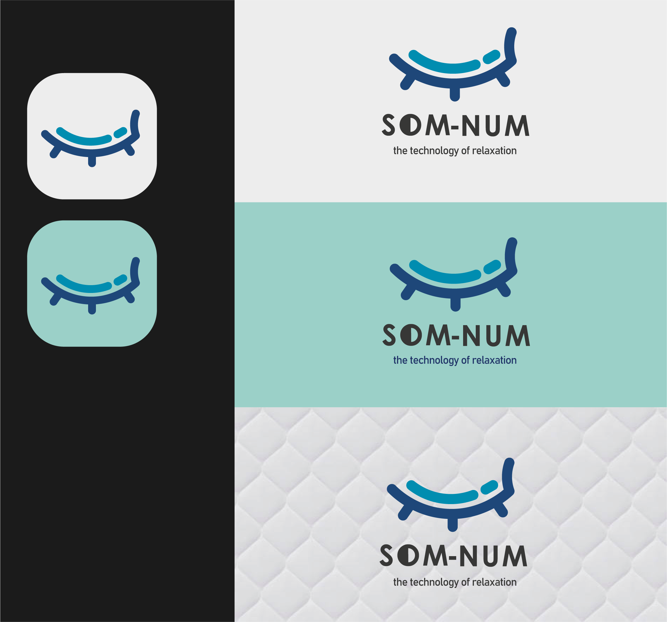
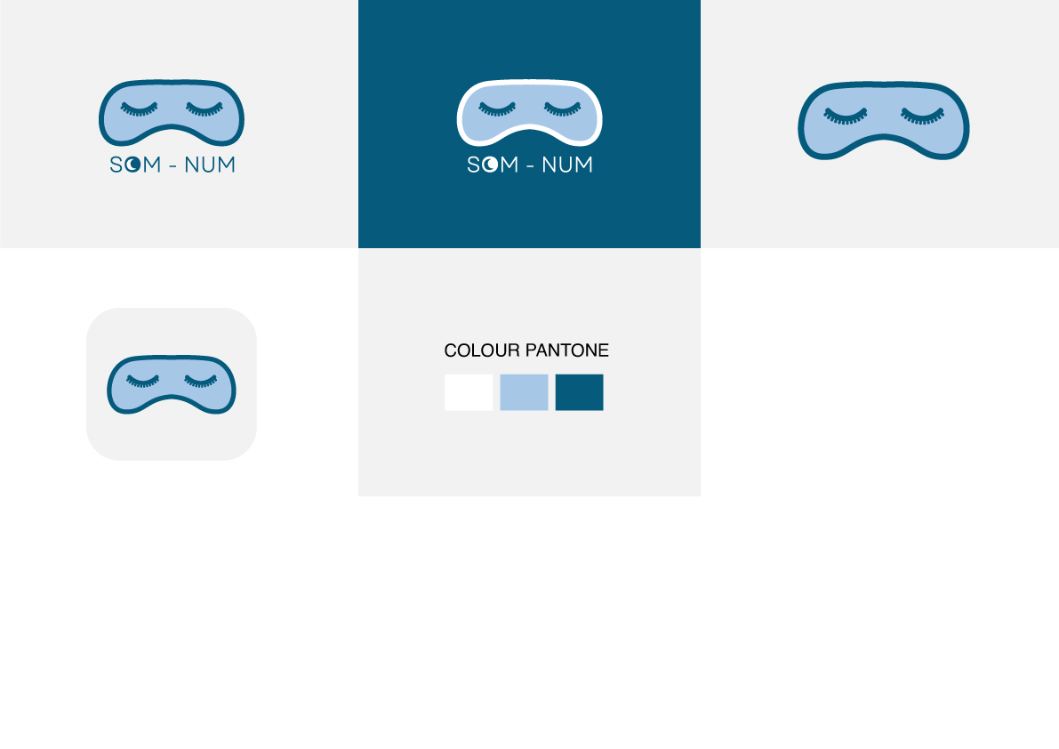
Som-Numlogo
My design is based is a mixture of elegance and simplicity.


Good design. Would be effective in other colors, too.
2 months ago by Bobbie Hall - Reply
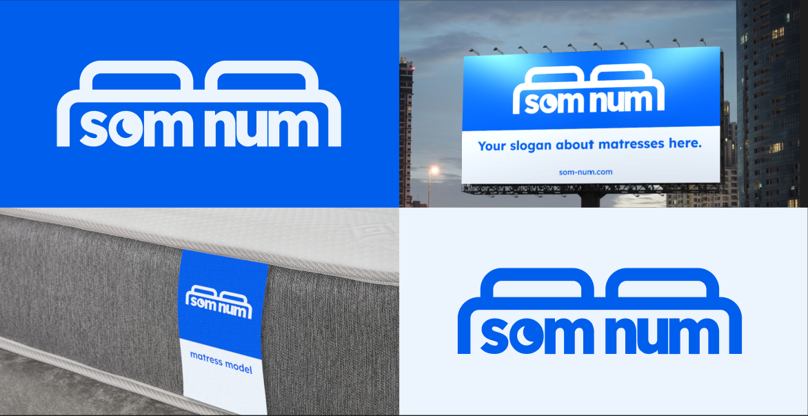
The wavy line is inconsitent in how it meets the Bedframe. choose one way how it interacts with it and keep it like that for all points. If you for example want to choose the right side of your logo and how it interacts with the line then put the middle one closer and leave the same gap and create a gap on the left aswell. I also would consider making the lower text the same length as the upper text and maybe make it smaller aswell. But except that its a really good logo
2 months ago by Mooncake - Reply
I find the logo to be quite simple and nice
3 months ago by Lehavah Nachalah - Reply