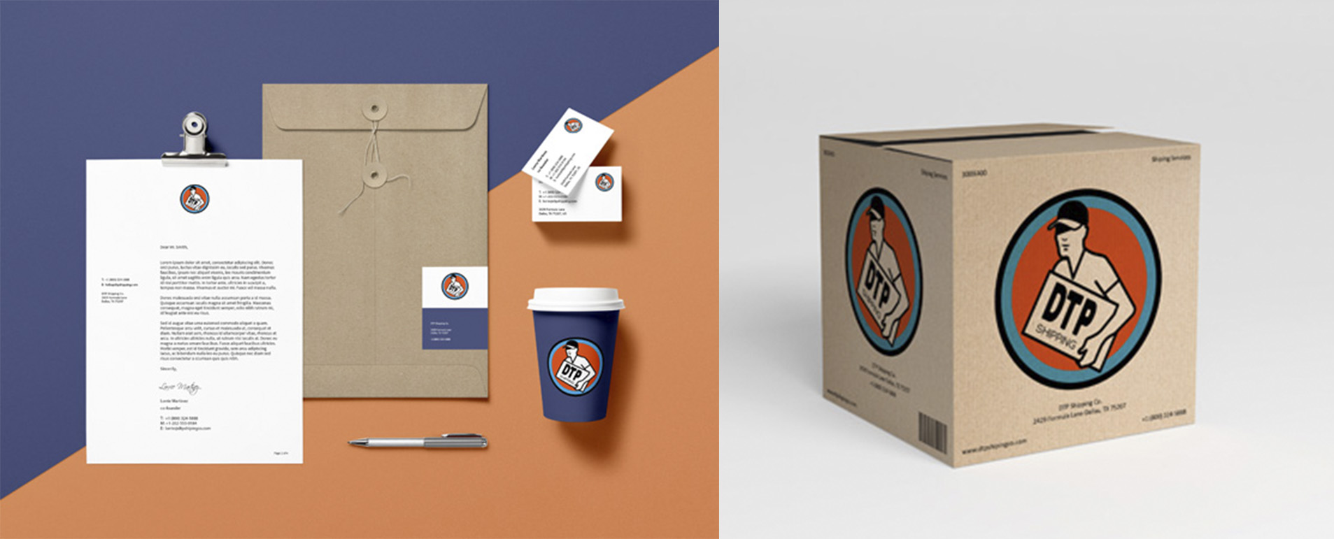
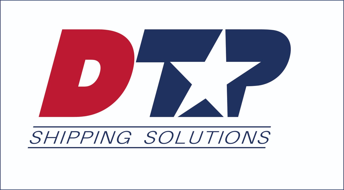
DTP logo
- Report
JbeansFakeID • 7 months ago
Two arrows represent the intent of business to business, forming the T. d and p picked for symmetry of business to business. bold and simple for scalability. 3 options for different applications.
I like the third desing the most, I Feel like the second 3D option the P should be shadowed more on the right side. Overall good job!
7 months ago by Matěj Fanta - Reply


