JbeansFakeID
Posts
2
Likes
8
Liked Posts
6
Given Feedback
2
Feedback
I like the artisanal aspect of the pizza. You might add a third shade (between black and white) to the pizza in the crust area at least so it looks more obviously like a pizza. Cheers.
6 months ago by JbeansFakeID
Hey I like the design but think you posted in the wrong brief. Cheers

6 months ago by JbeansFakeID
Posts
DTP logo
- Report
JbeansFakeID • 6 months ago
Two arrows represent the intent of business to business, forming the T. d and p picked for symmetry of business to business. bold and simple for scalability. 3 options for different applications.


I like the third desing the most, I Feel like the second 3D option the P should be shadowed more on the right side. Overall good job!
6 months ago by Matěj Fanta - Reply
Jennifer's Heaven Card
- Report
JbeansFakeID • 6 months ago
Hello Designers. I am new at this. I wanted to zero in on the "high end" requirement of the brief. Instead of the classic gold on black I went with gold on dark purple which has a more floral feel to it. Purple is also royal so that's very high end. The while lily (still working on vector drawing lol) was intended to have a vague cloud connection. I decided to have the flip side a different color for a more dramatic effect.
Jennifer's Heavengraphic
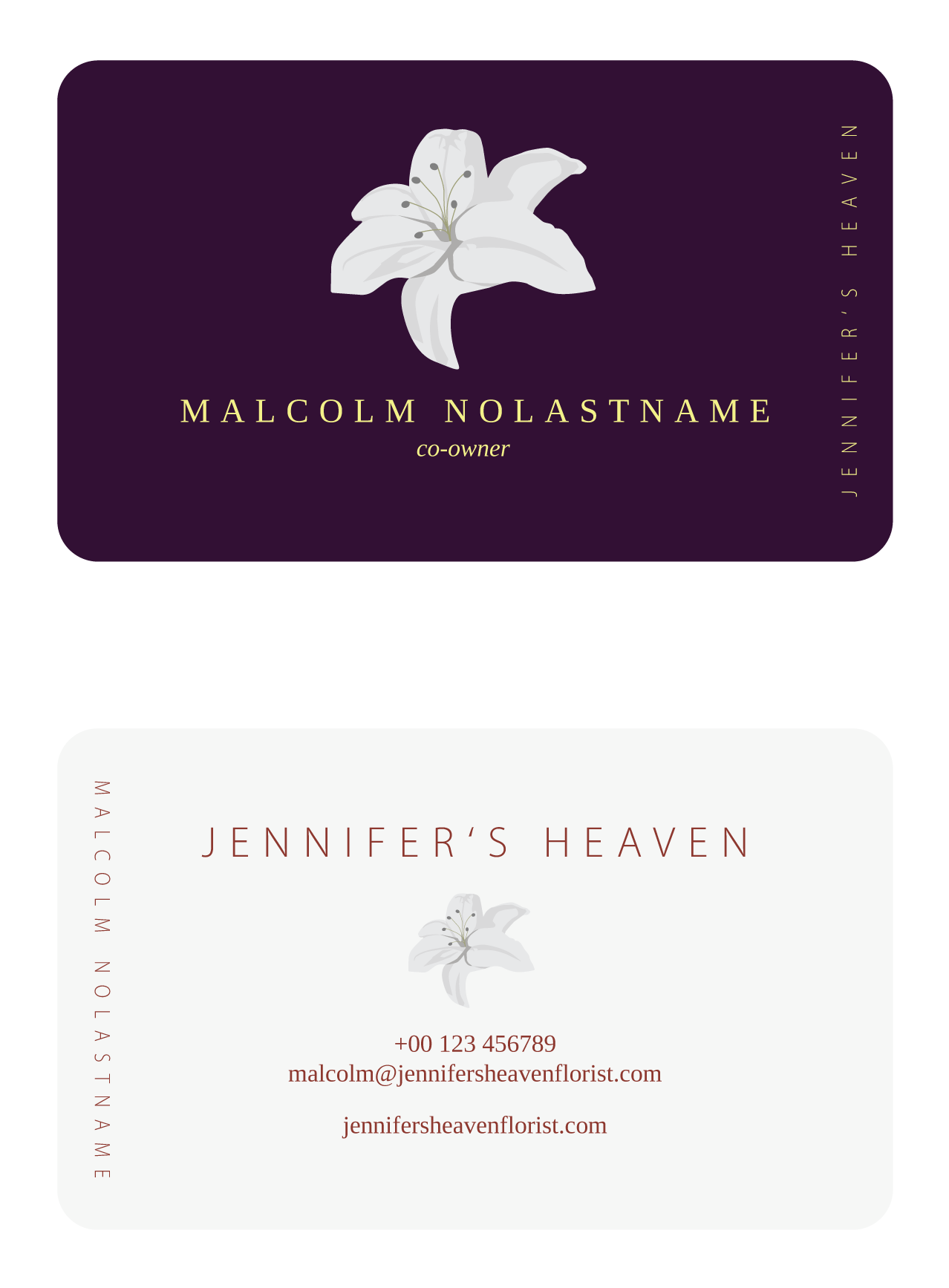

I really like the flipside contrast idea, I prefer the smaller lily.
6 months ago by Matěj Fanta - Reply
nice color of the card
6 months ago by dk - Reply