Logo Design for DTP Shipping Solutions
- Report
1 year ago by Marlies
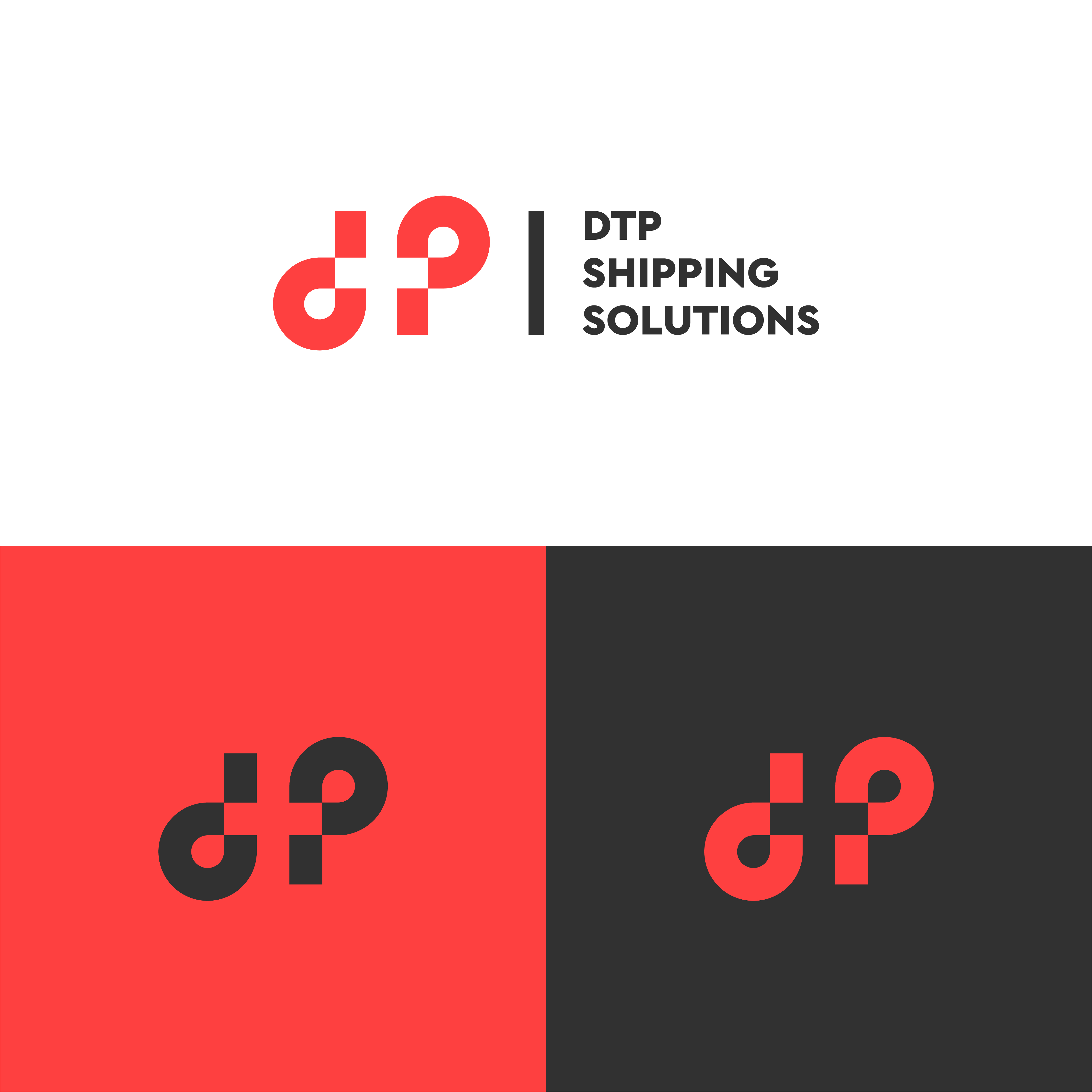
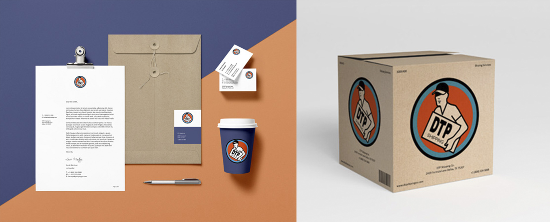
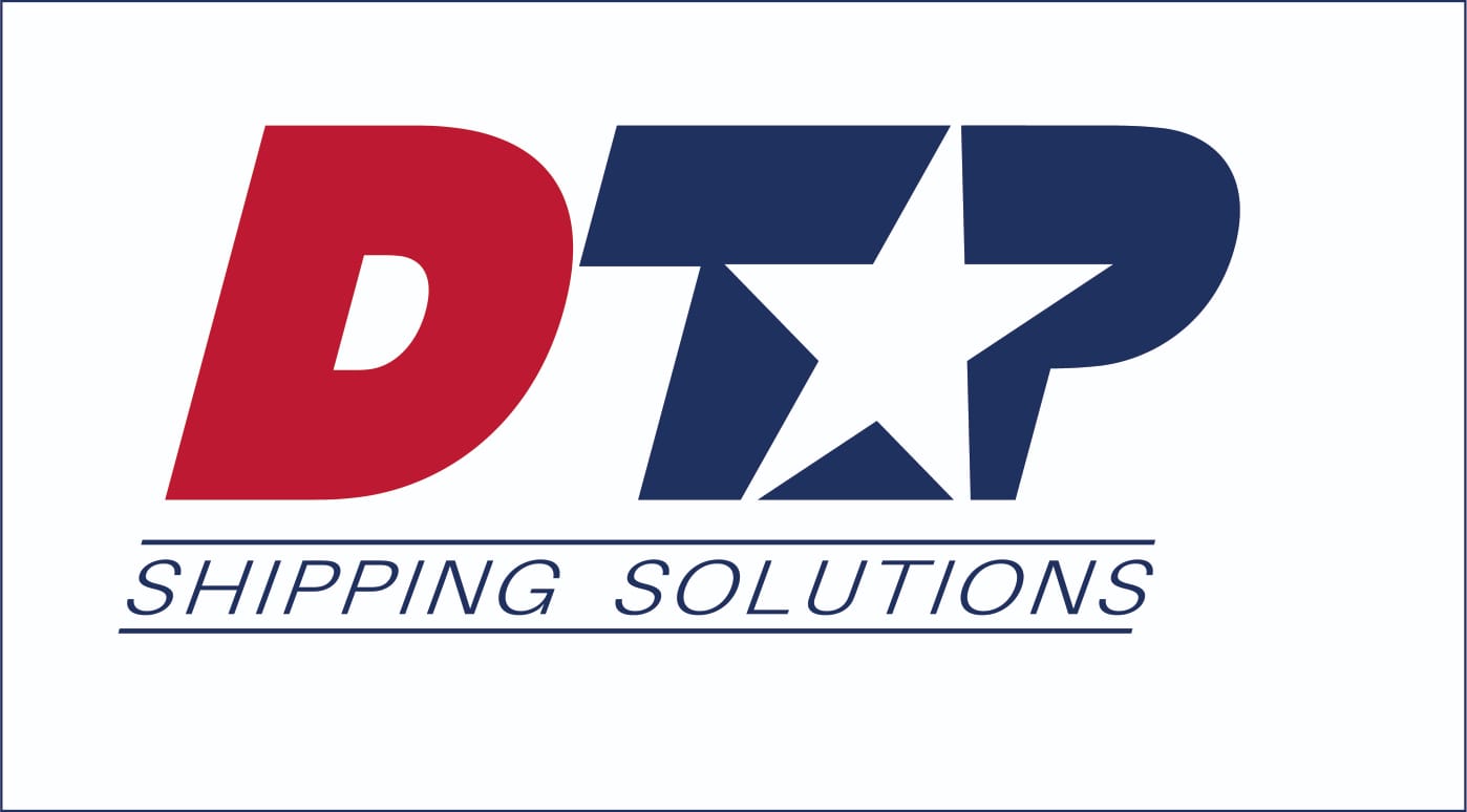
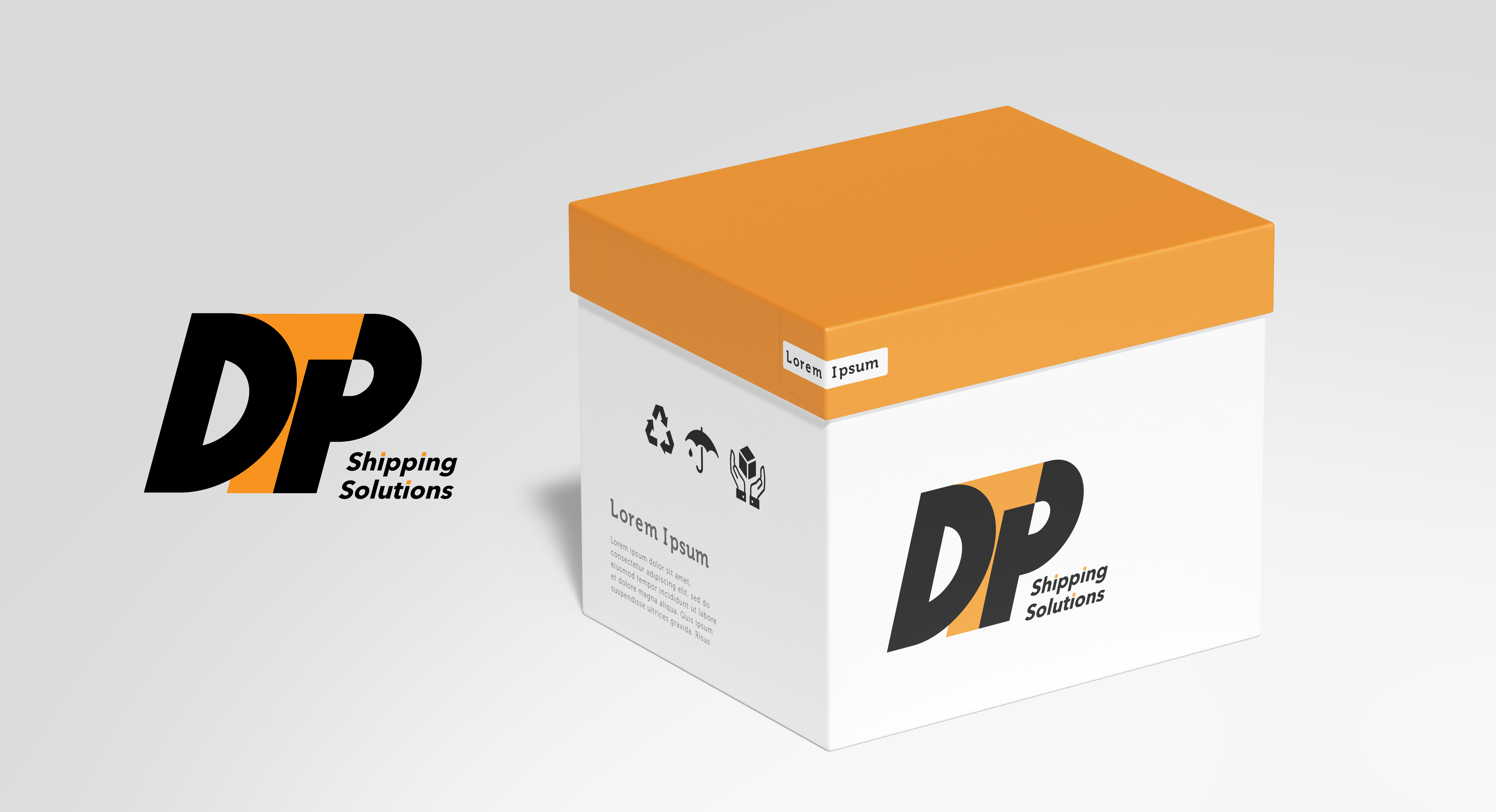
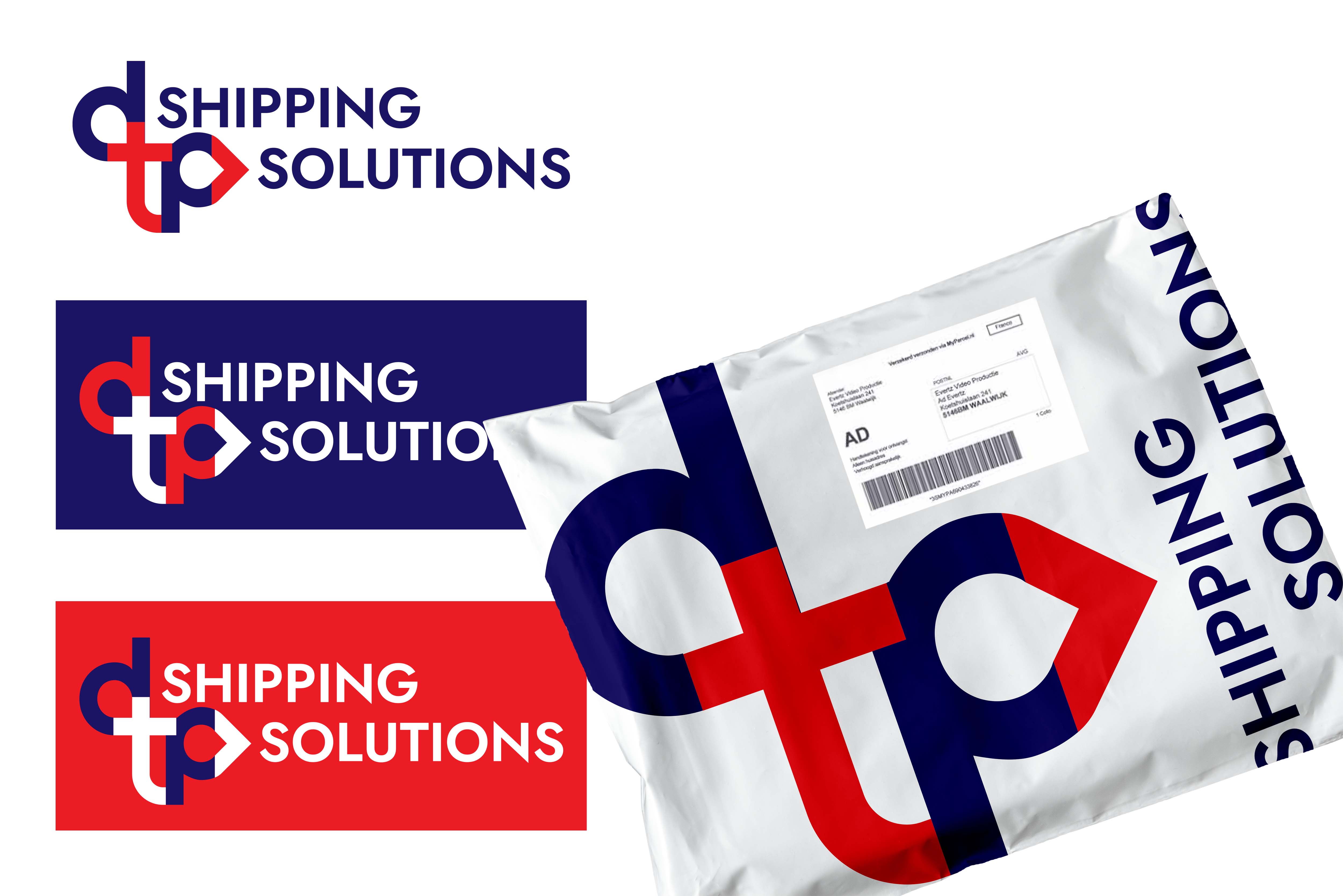
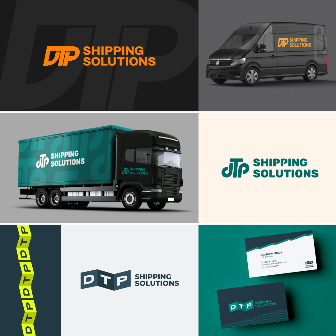
Three different versions of the logo for DTP Shipping Solutions. I tried to convey a sense of movement and rythm in all of the logos, since DTP is like an oiled machine with a smooth shipping system.
I'm not an expererienced logo designer (yet ;-)) so feedback is very welcome. Also, I would love to know: which concept is your favourite?
I'm not an expererienced logo designer (yet ;-)) so feedback is very welcome. Also, I would love to know: which concept is your favourite?
 17 Likes
 5
5
The first one is my favourite, I feel like it's the most dynamic one and a great fit for a shipping company
1 year ago by Patrycja - Reply
my favourite is the fist one!
1 year ago by Melisa Sánchez - Reply
I'm most drawn to the third design :) I love the others as well, but the third one is more modern-ish and creative. I'm loving the squares behind the letters, and defo kudos to the layout as well!
1 year ago by Madelynn - Reply
all of these look great! my favorite logo is the first, but my favorite color scheme has to be the last.
1 year ago by Amina - Reply
Thank you!
1 year ago by Marlies - Reply