All Feedback Posts
![]()
Som-Num Mattress company logo
Som-Num Mattress company logo
- Report
CJ • 2 years ago
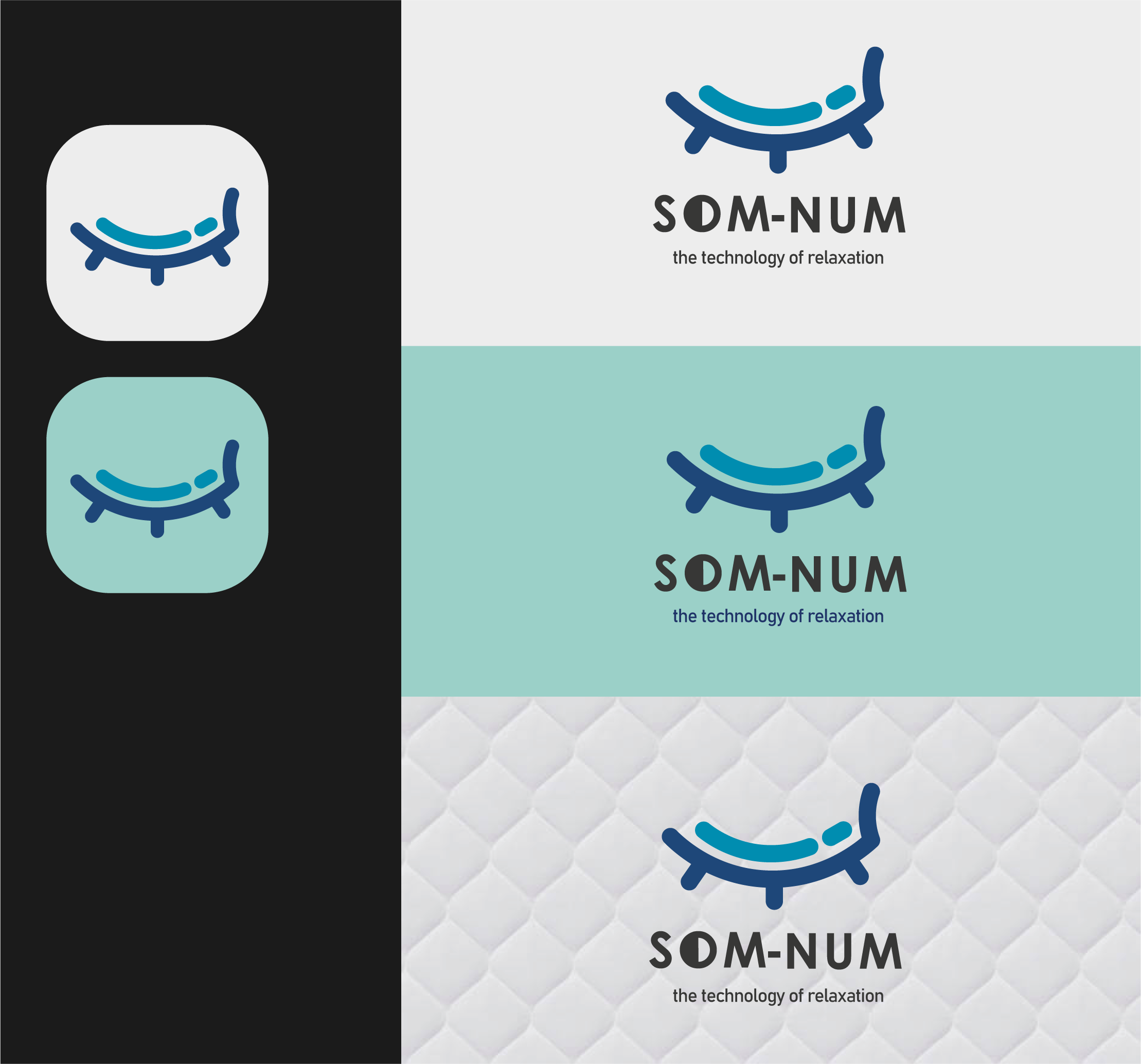
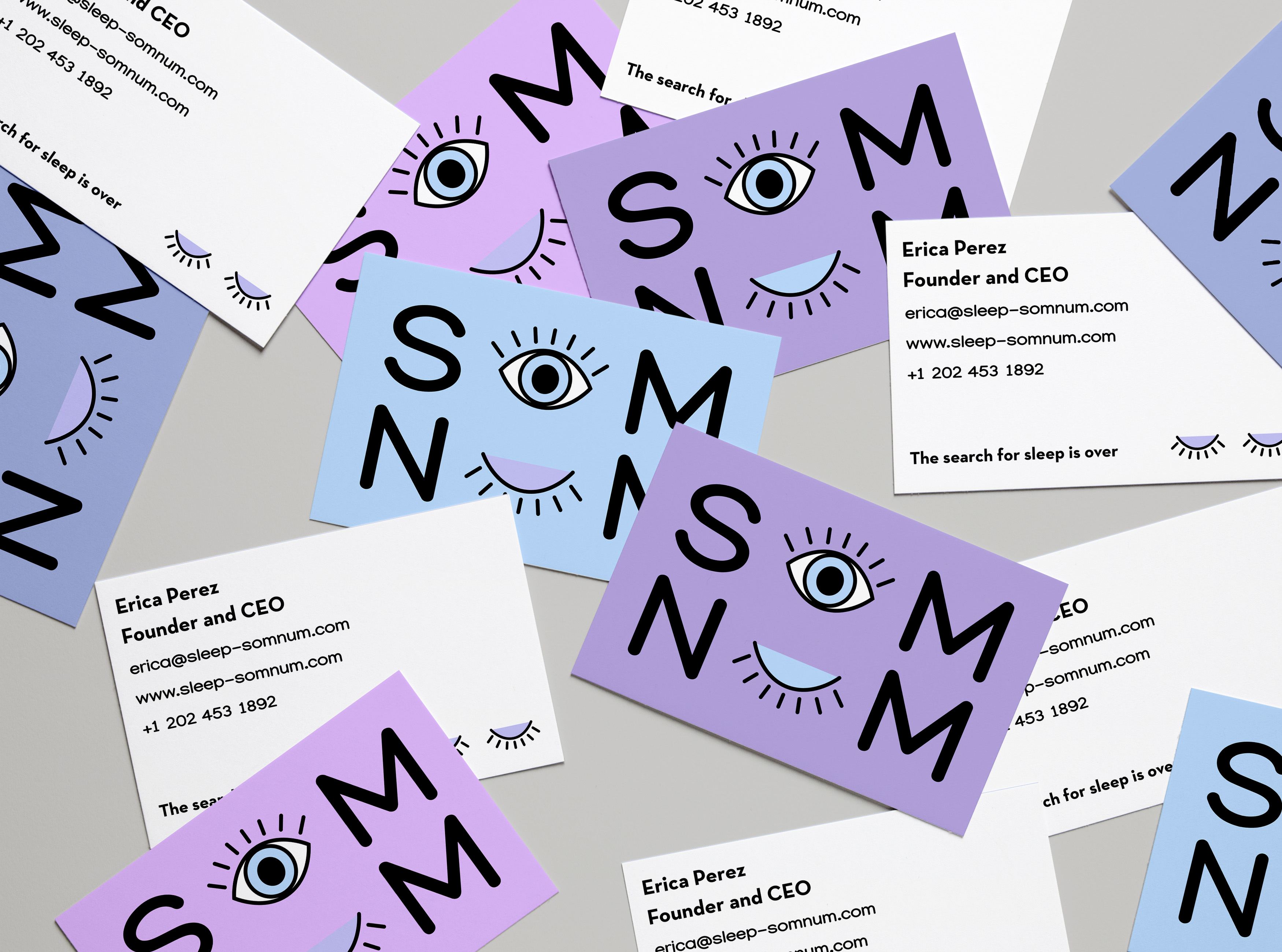
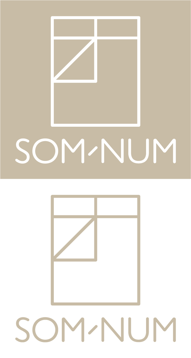
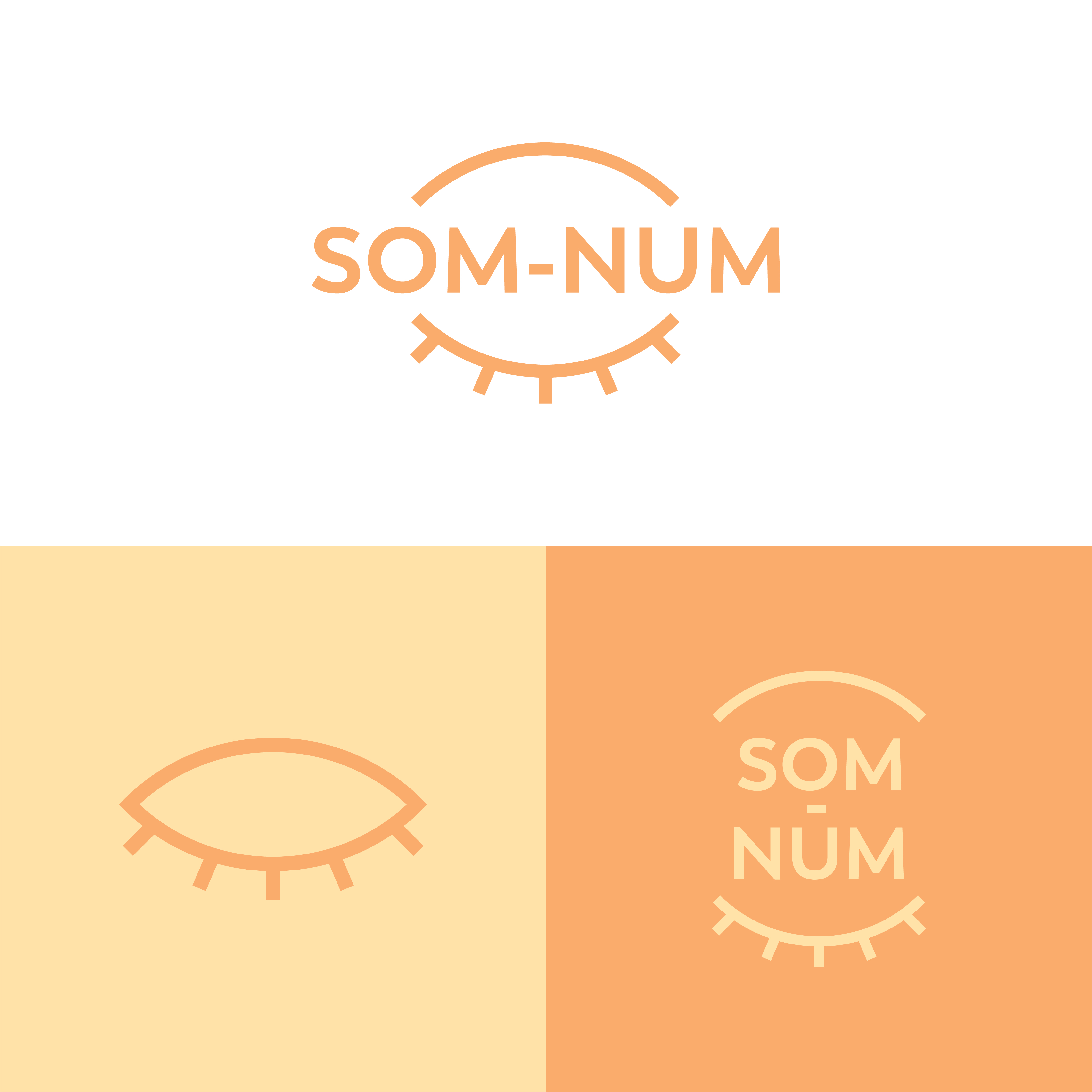
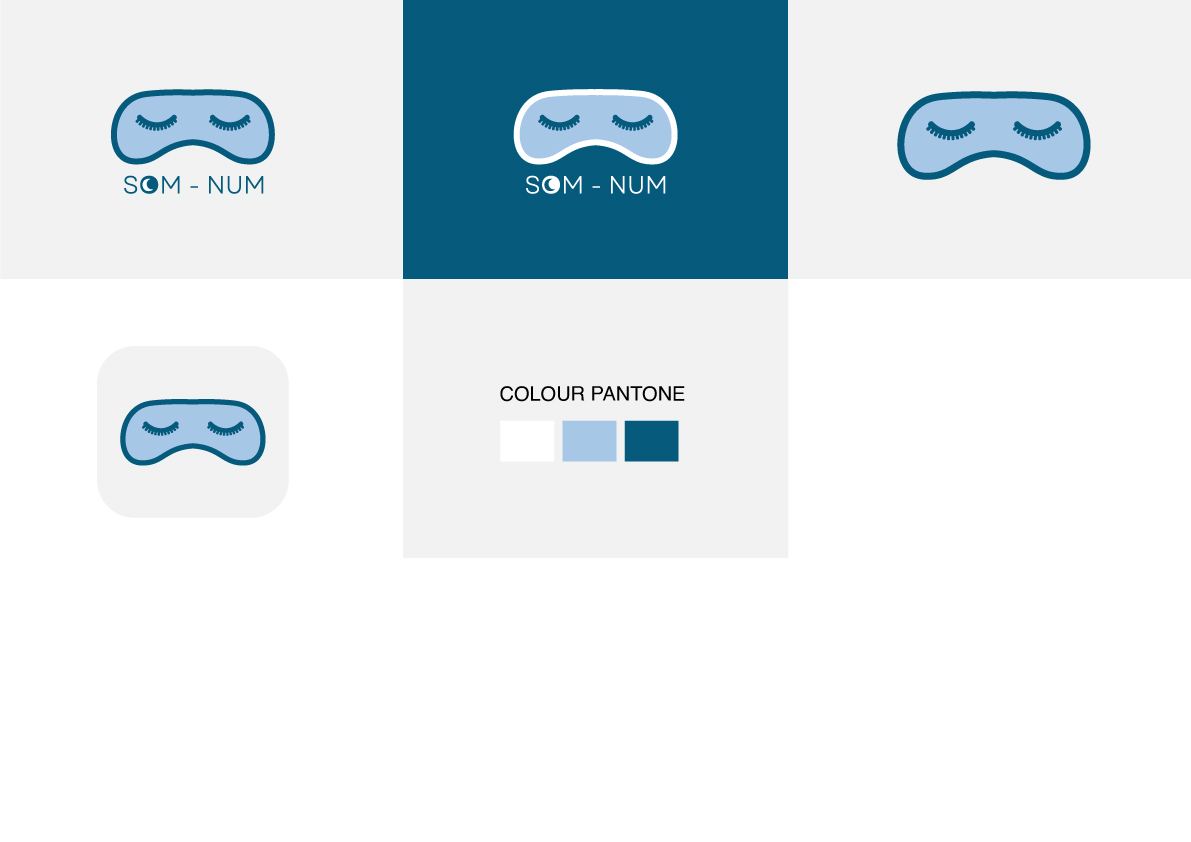
Som-Numlogo
"A simple, easily recognizable icon, that can be easily embroidered on the mattresses and icon should appear fun and not too serious"
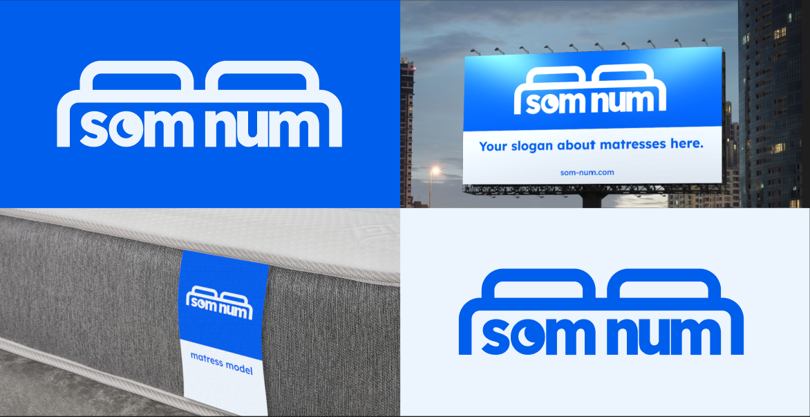
I decided the logo should look... expensive, gender neutral, popular, and mature yet colourful.
Normally expensive brands have a typographic icon, and I used bright colours to make the brand still seem fun and not too serious. Also used blue and light colours to appear dreamy and relate to sleep. I made sure the logo looked good small as-well and simple to be embroidered onto a mattress.
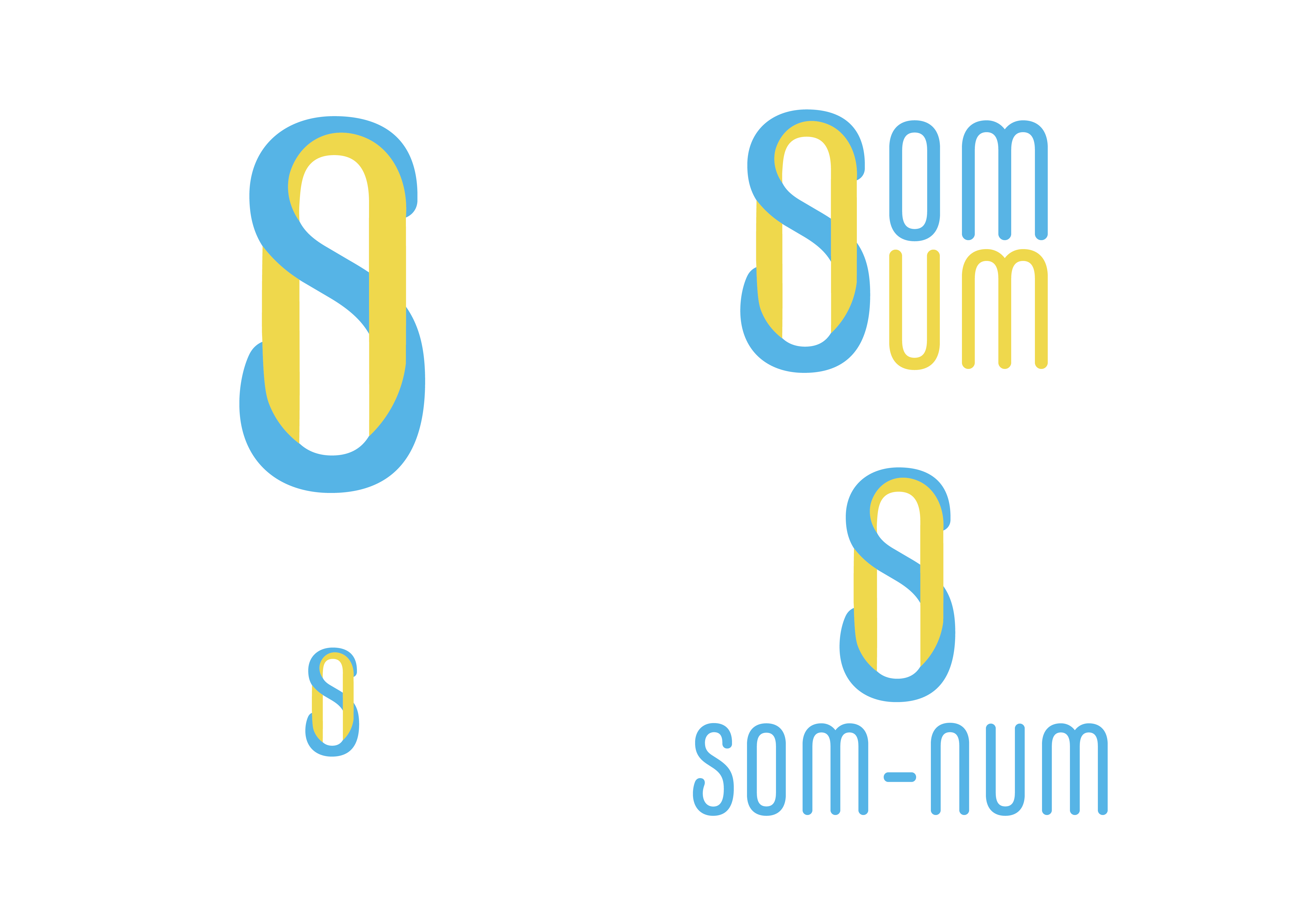


I love this design! I think you did a great job representing the brand’s modern products while also keeping it simple and fun-looking.
2 years ago by Patience Salisbury - Reply