


Maxime Than
Posts
3
Likes
7
Liked Posts
2
Given Feedback
3
Feedback
Thank you !
1 month ago by Maxime Than
Nice layout and color choices ! However, you should make the corners of your images round to match the other elements of your design (round logo, round buttons, and round search bar), this would make your design more consistent.
1 month ago by Maxime Than
Love the background, but the text is hard to read because of the color contrast and the font size.
1 month ago by Maxime Than
Posts
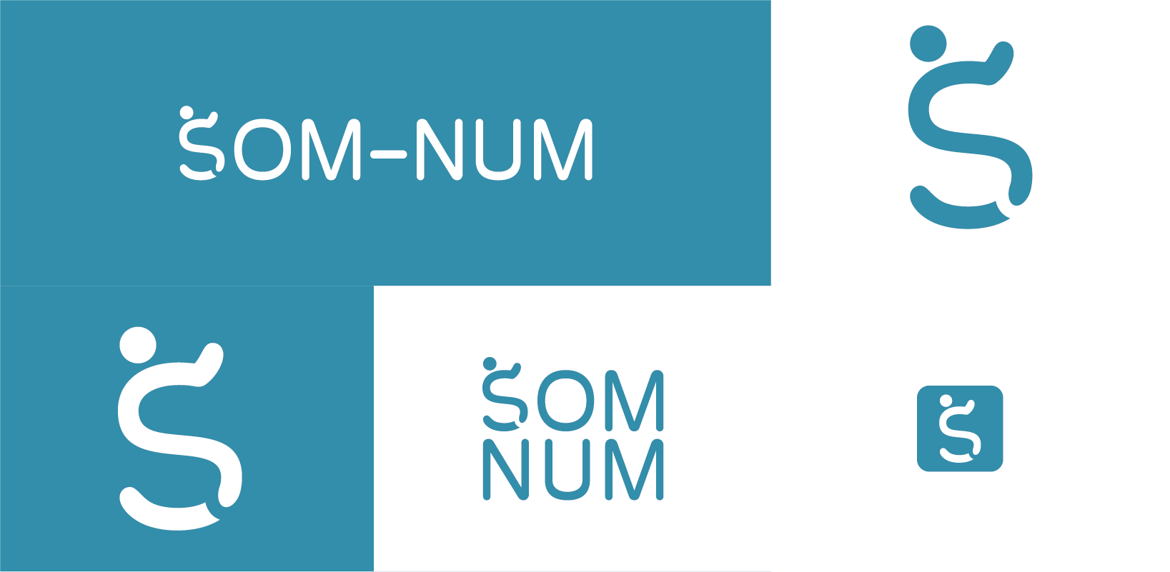
Som-num Logo
- Report
Maxime Than • 1 month ago
Som-Numlogo
For this logo, I made the S look like someone sleeping. Let me know what you think !


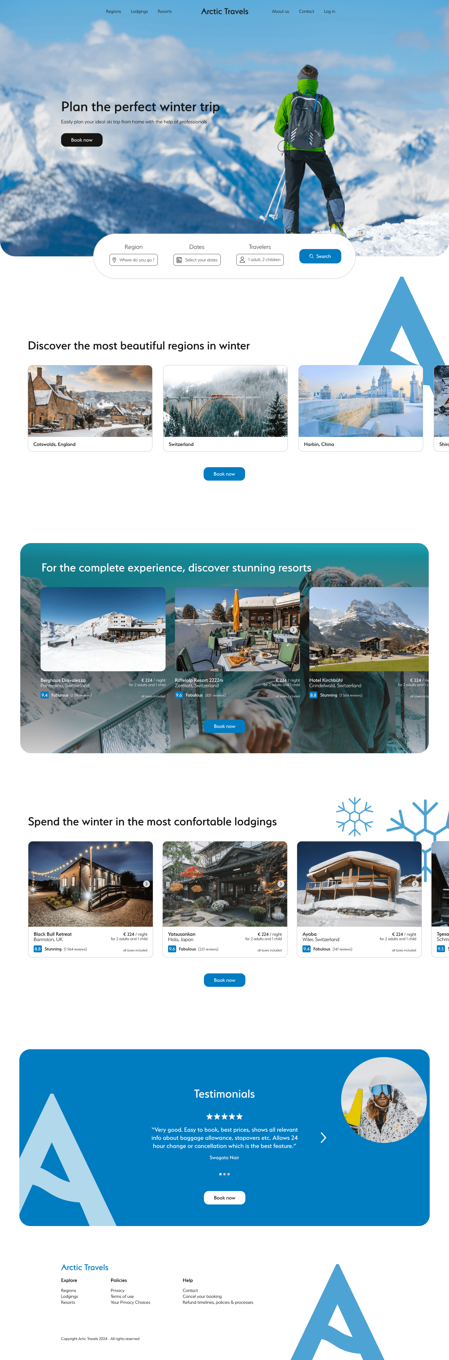
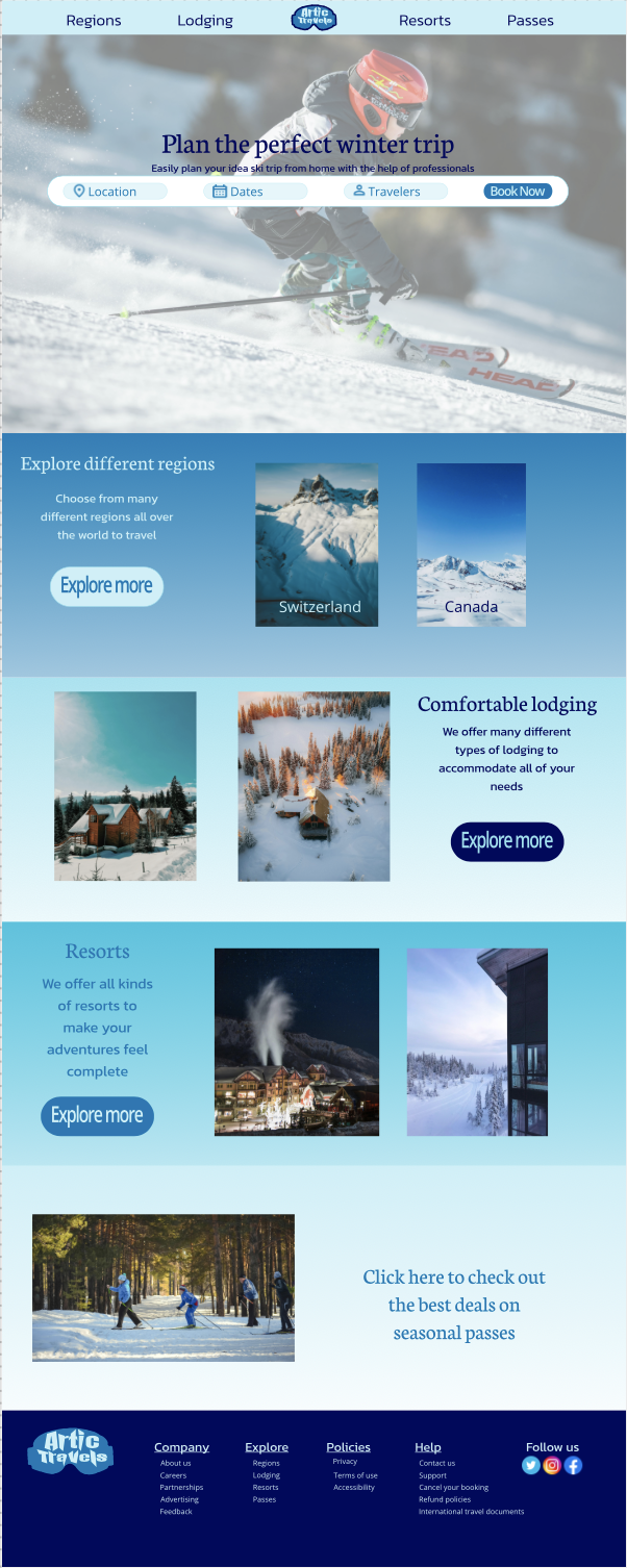
Arctic Travels Webdesign
- Report
Maxime Than • 1 month ago
I think this is my best webdesign yet. Let me know what there is to improve. Thank you !
Hero section Image : by Alessio Soggetti on Unsplash
Resorts section Image : by Daniel Frank on Unsplash
Testimonials section Image : by Karsten Winegeart on Unsplash
Hero section Image : by Alessio Soggetti on Unsplash
Resorts section Image : by Daniel Frank on Unsplash
Testimonials section Image : by Karsten Winegeart on Unsplash

very clean and structured properly
1 month ago by Jess Watson - Reply
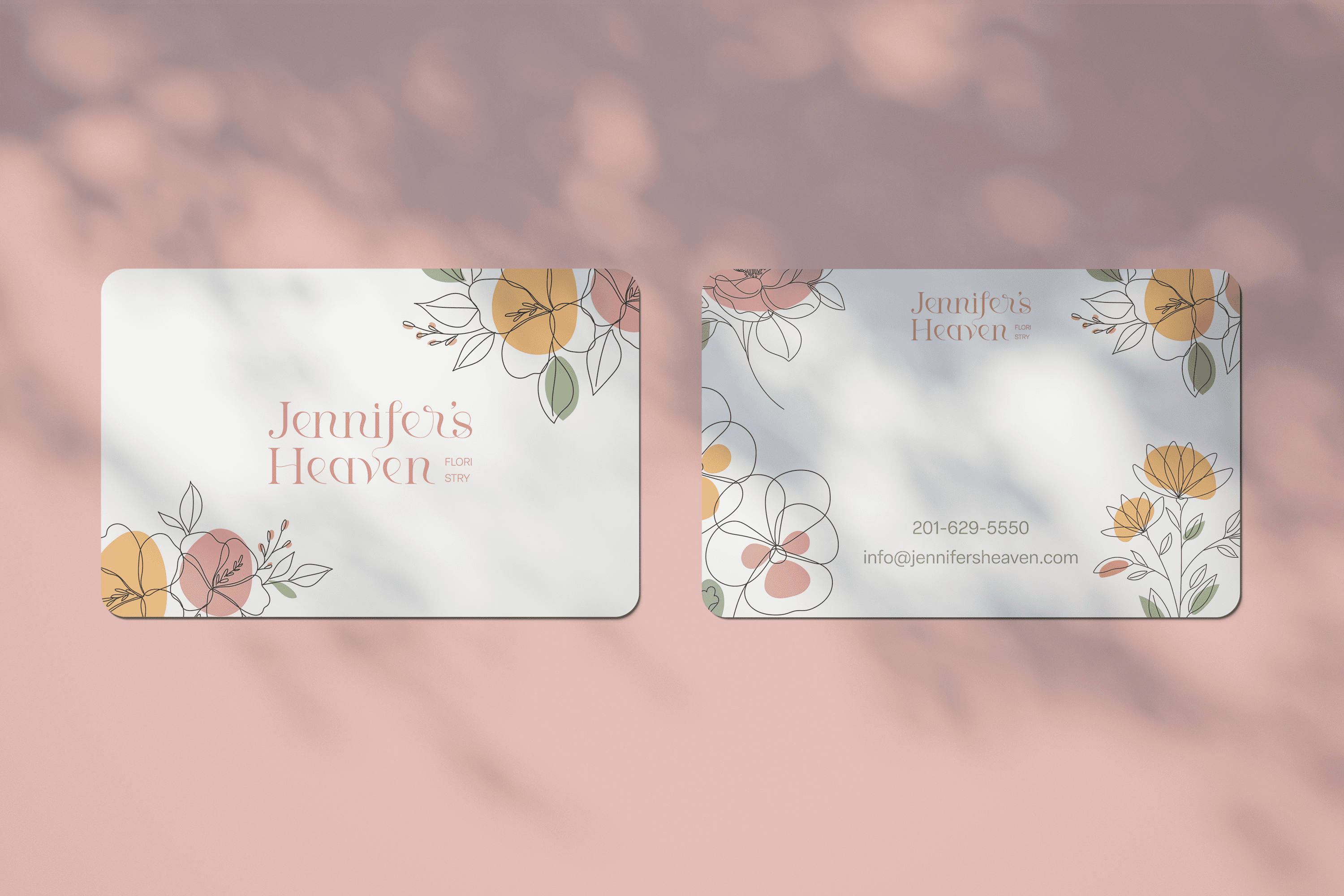
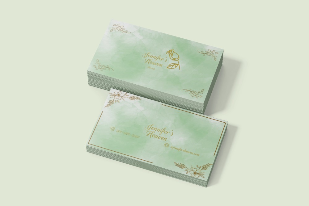
Jennifer's Heaven
- Report
Maxime Than • 1 month ago
Jennifer's Heavengraphic
This is my first fakeclients post. Any feedback is appreciated. Thank you !

it's simple but so pretty, this card give me a good feeling, i love the colors so much !
1 month ago by Diarry - Reply
Thank you !
1 month ago by Maxime Than - Reply