Artic travels landing page
- Report
Chantel • 3 months ago


Nice layout and color choices ! However, you should make the corners of your images round to match the other elements of your design (round logo, round buttons, and round search bar), this would make your design more consistent.
4 weeks ago by Maxime Than - Reply
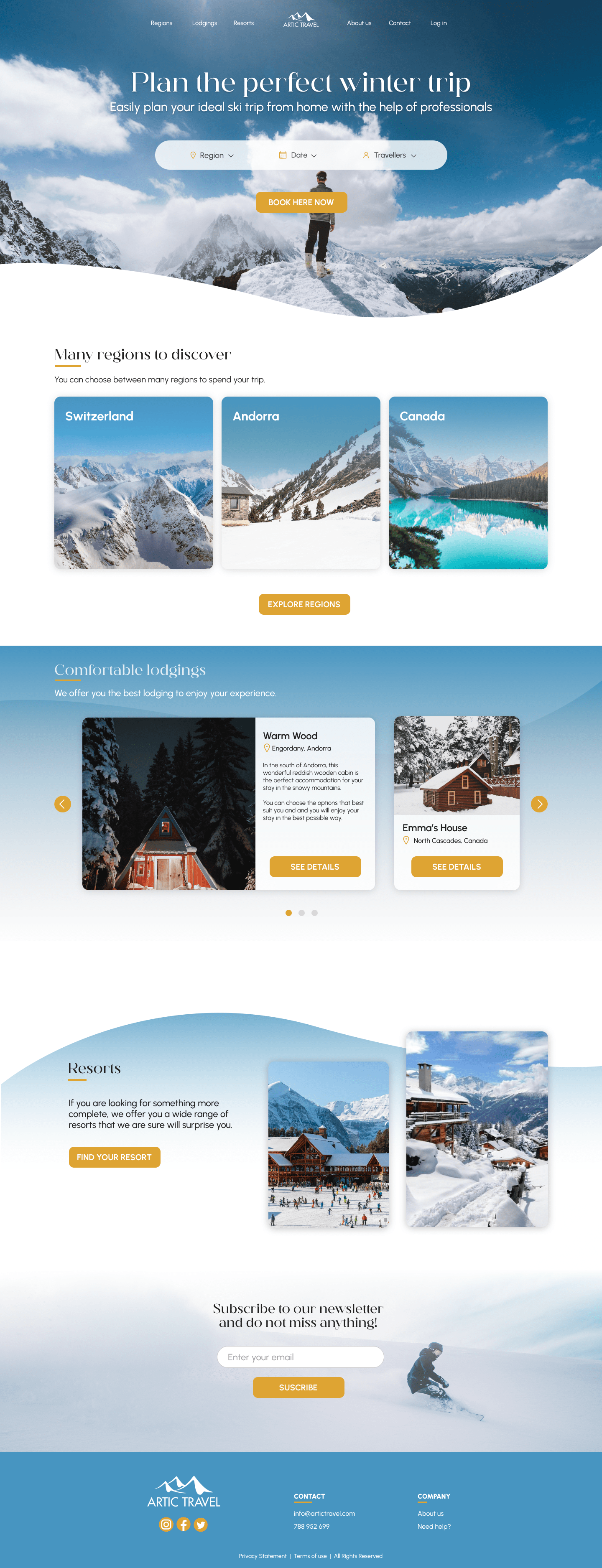
Nice layout. Excellent landing page photo. The subtle gradients of blues in the sections really say, "Winter."
3 months ago by Bobbie Hall - Reply
The color scheme is great and I love the images you chose! Is there a way to move the interactive search bar so it does not cover the image of the skiier? It's a little distracting and looks out of place on top of it. I'd also make sure there aren't too many "widows" or single words at the end of a text block standing alone. Perhaps you could re-break the block under "comfortable lodging" to be more even. Good job with this though!
3 months ago by Alexandra Ghiz - Reply