Activity Feed


Feedback Leaderboard (Past 30 days)
Remove Ads: Upgrade to Pro
Get feedback on your work
Give feedback to other users!
Give FeedbackSOM - NUM: The technology of relaxation
- Report
alejandr0000 • 3 years ago
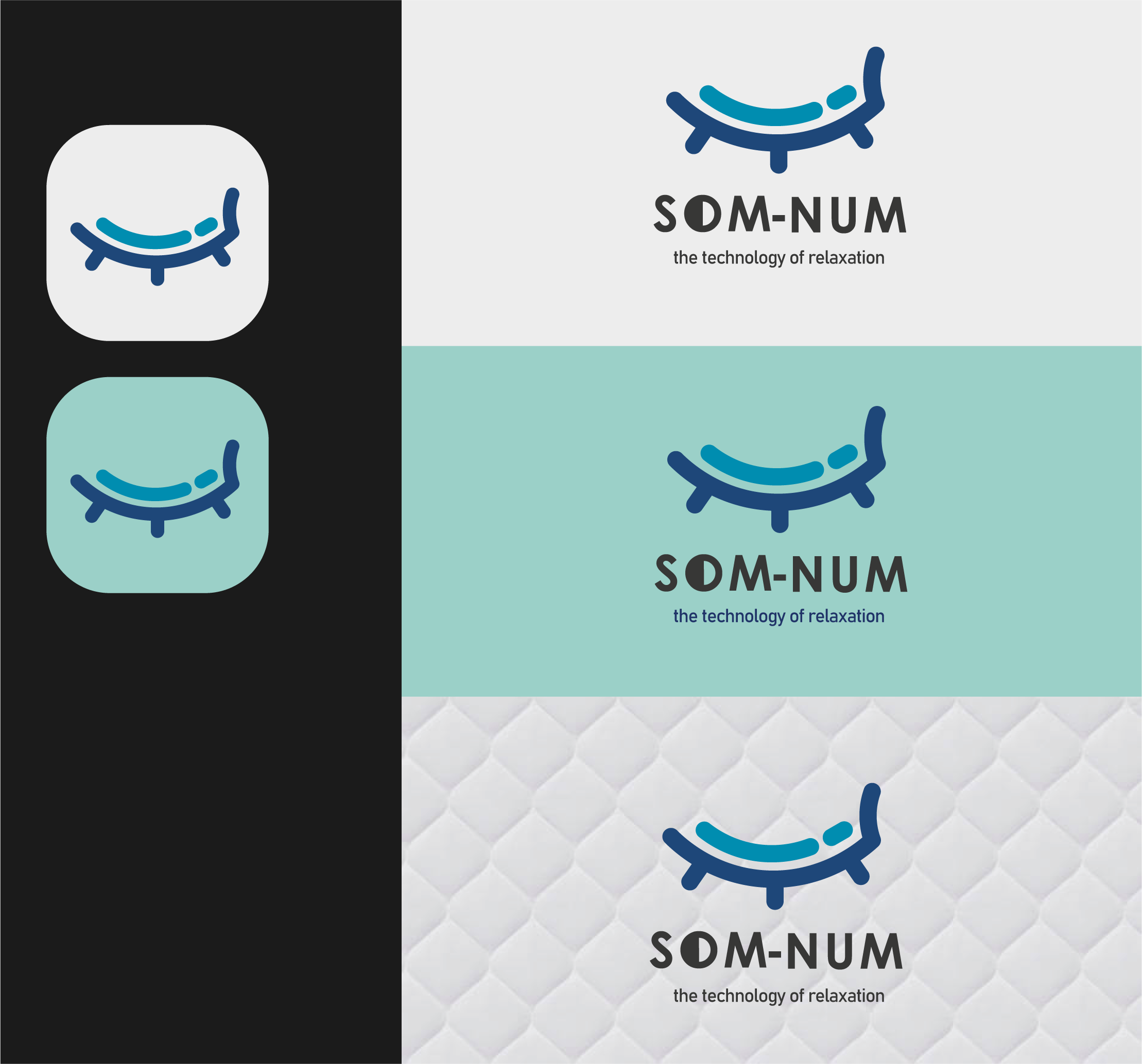
my design is based on a mix between a bed and a closed eye, both related to the concept of sleeping :) the logo in question is intended for a smart mattresses up-and-coming business. more info with the brief below:
Som-Numlogo


This is great!
2 months ago by Jordan Ragsdale - Reply
I like the shape and it's a very clean line. The thing that is missing is the reference to Bluetooth which is an important element of the project.
9 months ago by Adele Varlotta - Reply
Its different its good
10 months ago by Sahar Ali - Reply
All Comments

Som-Num Logo
- Report
Enzo • 4 years ago
Hi!
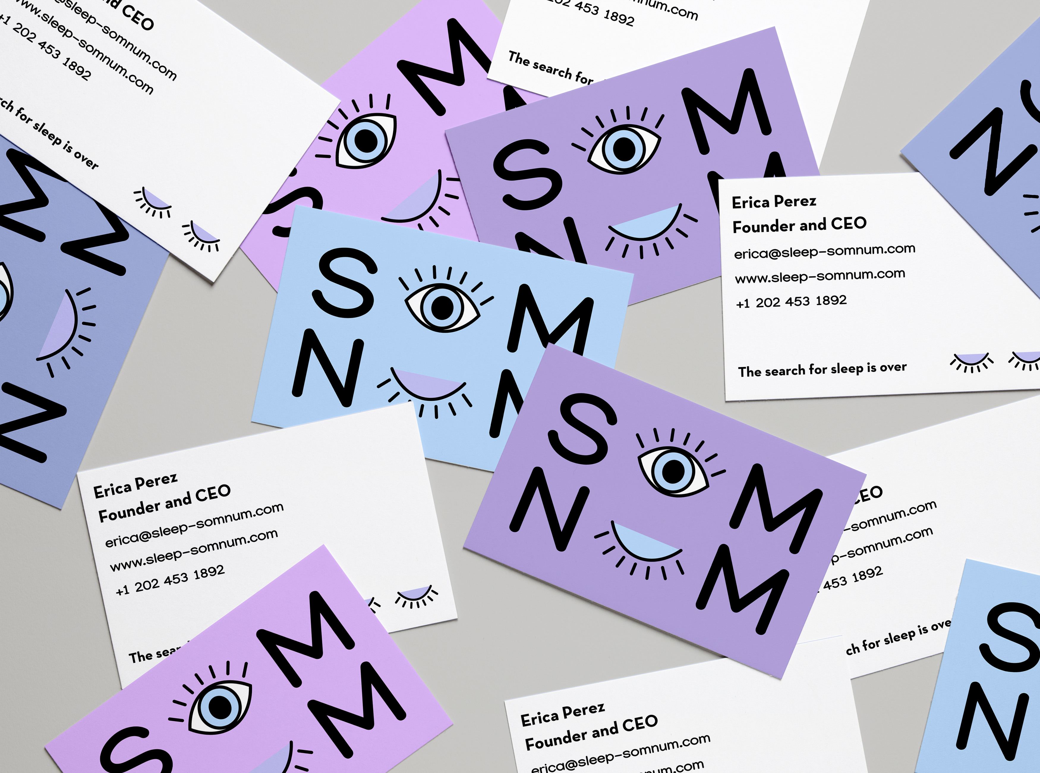
For this brief, I made sure to maintain the simplistic style that the client wanted and I also took inspiration from the sample pegs the brief provided.
The logomark is a closed eye that implies �sleeping� which is the meaning of the brand name, somnus. The colors were inspired by the night shift mode of the iPhone. It�s a mode that changes your screen to a warmer tone to help induce sleeping so I felt it was an appropriate color choice for the brand.
Overall, I think this design was able to solve the pain points of the client. Let me know what you think.
Som-Numlogo

the colors make me think of day. Second its driving crazy that the letters aren't in line
1 year ago by Garett Noll - Reply
I love the idea behind the color scheme!
1 year ago by May_J - Reply
If those are 3 different concepts, then the first is a suitable concept
4 years ago by Ghalib Putra - Reply
All Comments
Som-Num
- Report
Rob Sollom • 4 years ago
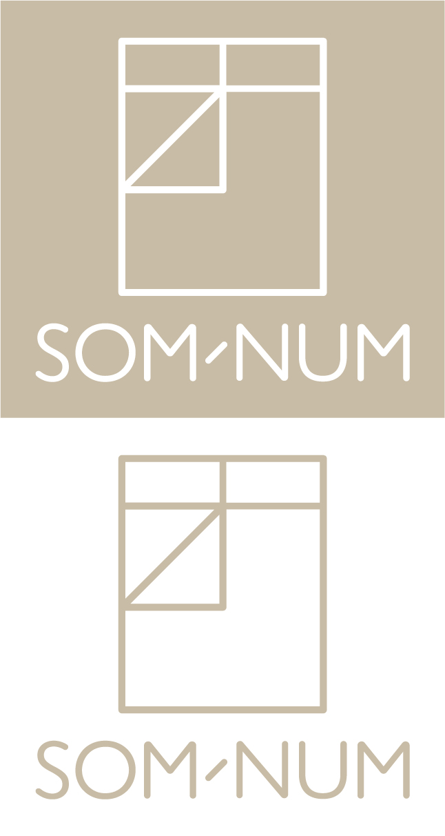
I created this logo in response to a brief to design a logo for a company that makes smart mattresses. I've used a rounded version of Gill Sans in order to give a soft feel and picked a calming beige colour.
This logo can be applied to business cards, printed stationary, the company website and embroidered onto the mattresses in either the white-out or coloured version. The hyphen echos the 45� angle of the folded back duvet.
This logo can be applied to business cards, printed stationary, the company website and embroidered onto the mattresses in either the white-out or coloured version. The hyphen echos the 45� angle of the folded back duvet.
Som-Numlogo

Son-Num Logo
- Report
Jennivah delos Santos • 2 years ago
Som-Numlogo
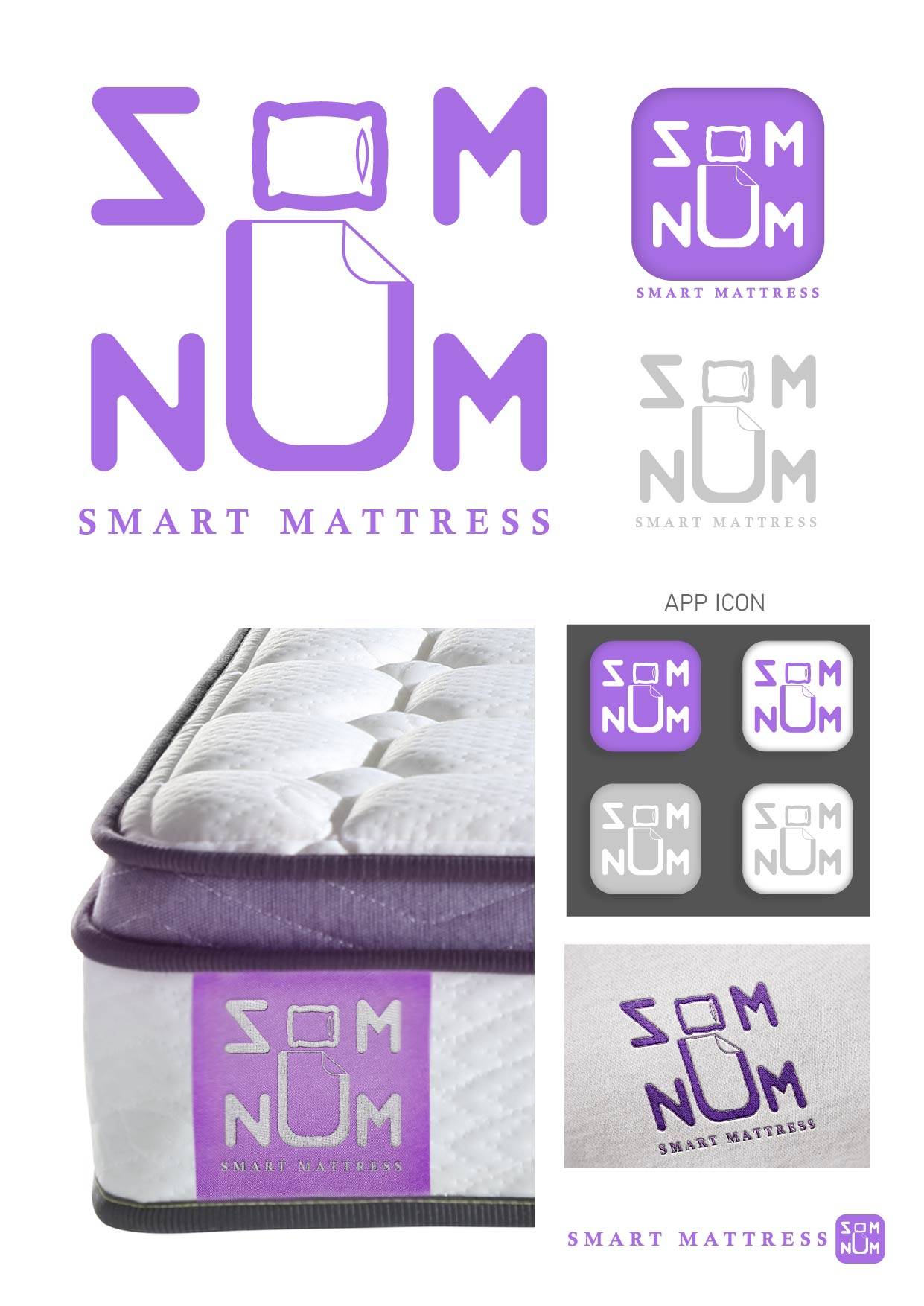

I like the proof of it actually embroidered on the mattress, however the logo and type have a lot of inconsistencies, for instance the weight of the line of the O/pillow is not the same as the text.
1 year ago by Garett Noll - Reply
The besttttt... one
2 years ago by Yash - Reply
thank you! :)
2 years ago by Jennivah delos Santos - Reply
Som-Num Logo
- Report
Digital • 3 years ago
Som-Numlogo
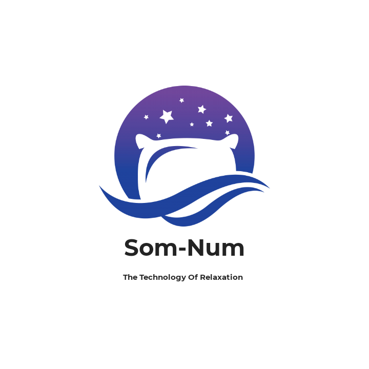

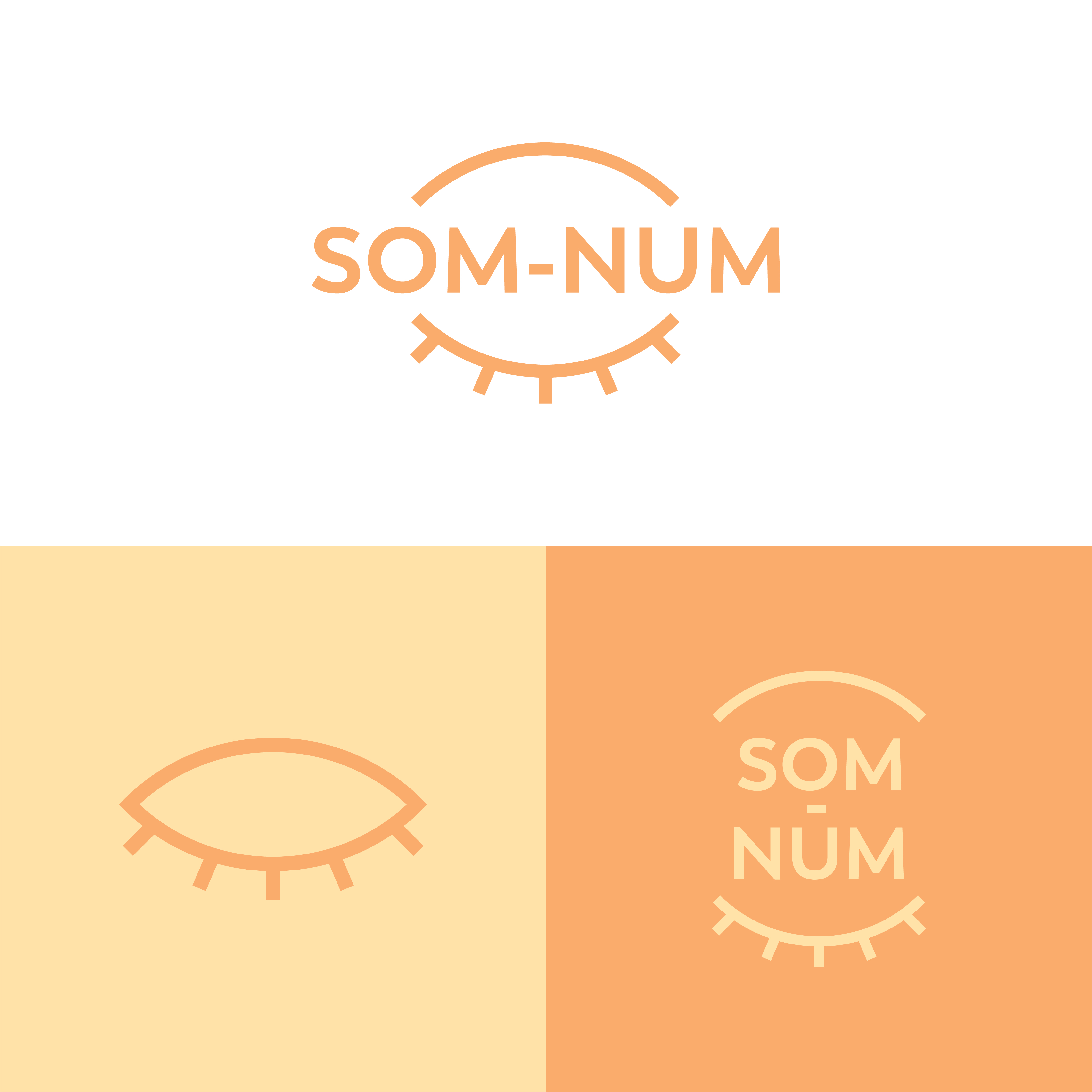
A main point of this logo was to be simple so it can be easily embroidered, I don't think this fits that. Removing the gradient and the extra lines at the bottom would be a good start towards simplifying it
1 year ago by Garett Noll - Reply
This icon is very pleasing to see
I would only recomand adjusting the size of the lower text (THE TECHNOLOGY........) because it's hard to read
Really good work
3 years ago by Boby - Reply
Gorgeous and unique design
3 years ago by ahmad - Reply
All Comments
Load more
