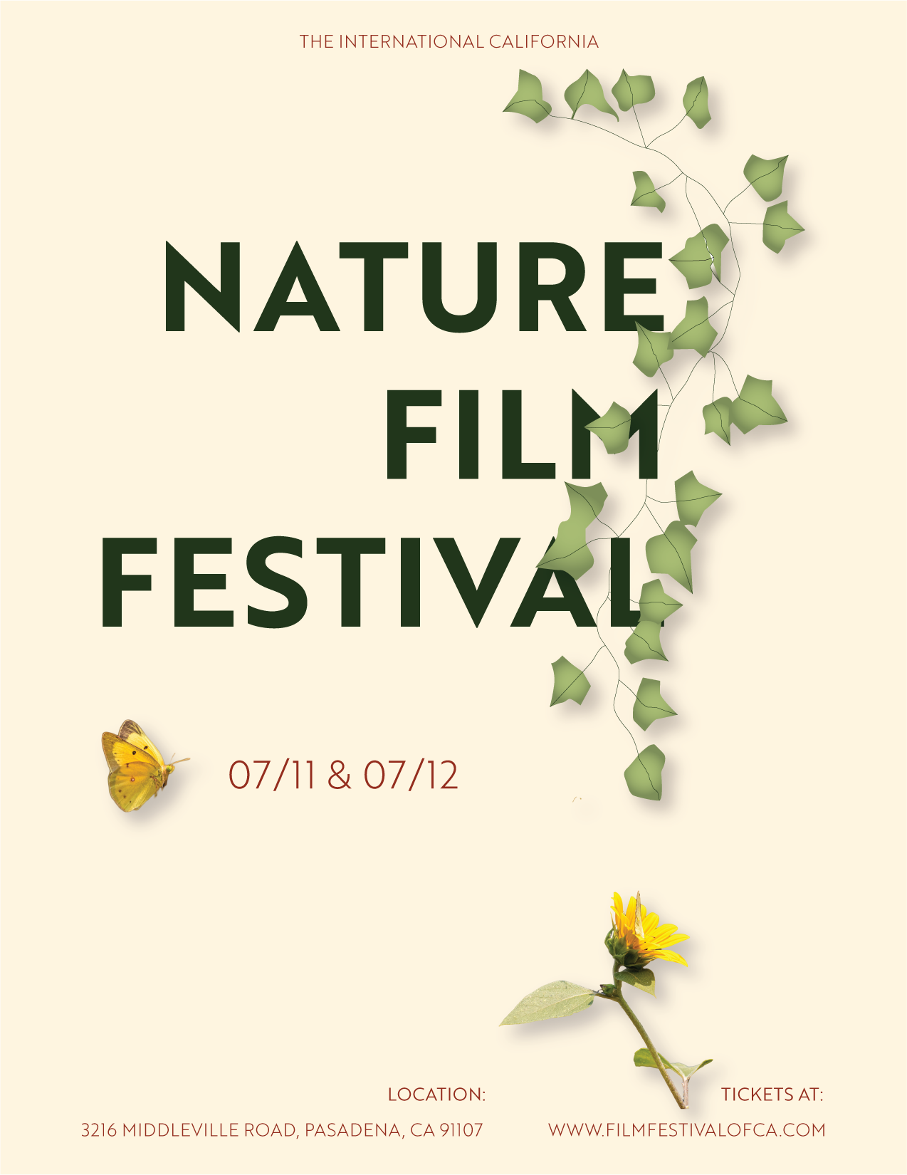
International California Nature Film Festival
- Report
1 year ago by Doreen
not bad
1 year ago by samin - Reply
nice
1 year ago by samin - Reply
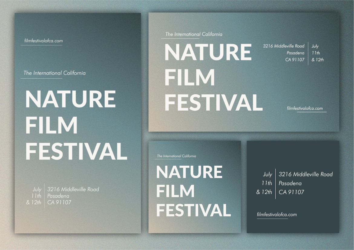
I dick the design but there are a couple issues. The lines overextend past the "alignment line" which could be purposeful, but it just seems a bit odd (in my opinion, this is subjective). What I do think should be changed is the "&" symbol as well as the "th". I think you could just get rid of it as it is pretty self explanatory without it. I don't understand the two in the bottom right too?
1 year ago by Endo - Reply
