Doreen
Posts
4
Likes
11
Liked Posts
3
Given Feedback
0
Posts
Patterson Fletcher
- Report
Doreen • 1 year ago


I love the concept of this - it certainly feels high-end. Might be worth playing around with the position of 19 and 64 - 64 is a bit lost over the background image... perhaps try and bring them closer to the central logo back onto the brown part of the background? Play around with it - it's a really great aesthetic :)
11 months ago by Shona McQuillan - Reply
like the look and feel of this design. It's giving a luxury vibe
1 year ago by Dani - Reply
GOOD
1 year ago by Fasya Emilia - Reply
Thompson Brothers' Circus
- Report
Doreen • 1 year ago
I wasn't quite sure if "vintage posters" meant the beautiful embellished and highly decorated posters, or if it was referring to the simpler, but very impressively painted posters á la Barnum & Bailey. Therefore, for the first version I took the typical circus rays and stripes as a basis and decorated the design with self-drawn circus figures.
I hope you can see where I was going with my idea. :)
I hope you can see where I was going with my idea. :)
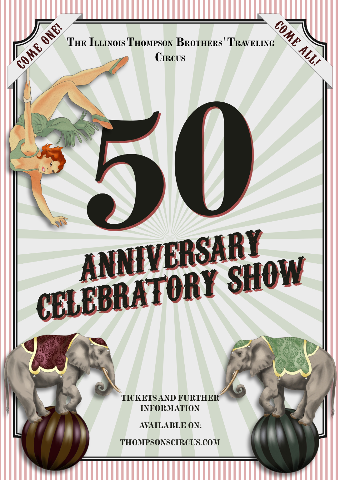

I think you hit the vintage look of the poster.
1 year ago by Marco Estanislao - Reply
International California Nature Film Festival
- Report
Doreen • 1 year ago


not bad
1 year ago by samin - Reply
nice
1 year ago by samin - Reply
I dick the design but there are a couple issues. The lines overextend past the "alignment line" which could be purposeful, but it just seems a bit odd (in my opinion, this is subjective). What I do think should be changed is the "&" symbol as well as the "th". I think you could just get rid of it as it is pretty self explanatory without it. I don't understand the two in the bottom right too?
1 year ago by Endo - Reply
Star Interior Design
- Report
Doreen • 1 year ago
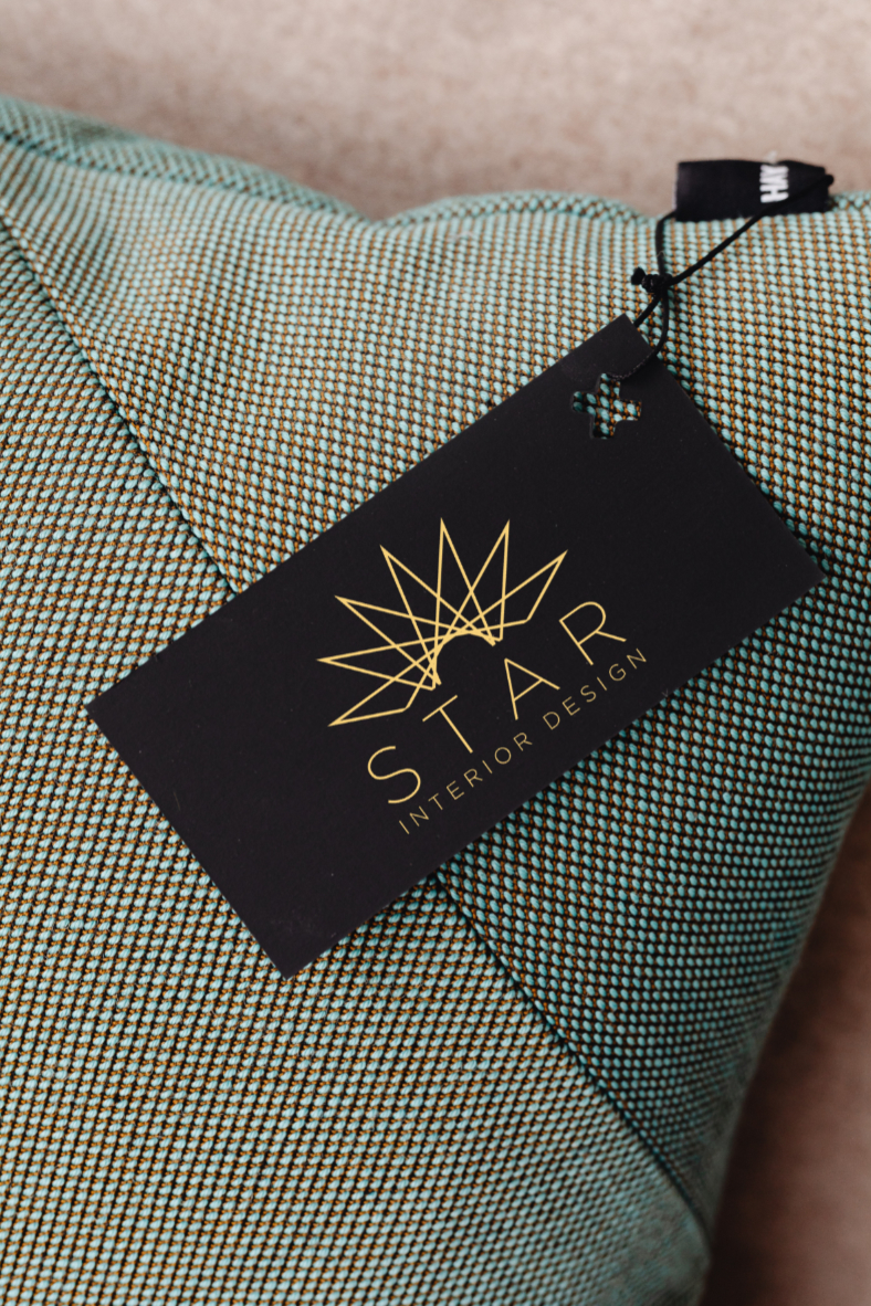

Great logo. Perhaps increase the "STAR" font's thickness? Not by much, just enough to stand out a little more :)
1 year ago by Luke - Reply
Well executed. Only thing that could be done better is the font choice for STAR. Otherwise perfect
1 year ago by glendale marie ang - Reply