Shona McQuillan
Posts
0
Likes
0
Liked Posts
18
Given Feedback
3
Feedback
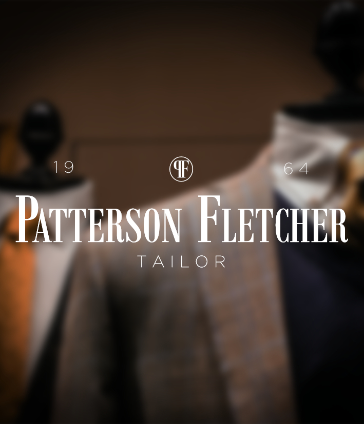
I love the concept of this - it certainly feels high-end. Might be worth playing around with the position of 19 and 64 - 64 is a bit lost over the background image... perhaps try and bring them closer to the central logo back onto the brown part of the background? Play around with it - it's a really great aesthetic :)
8 months ago by Shona McQuillan
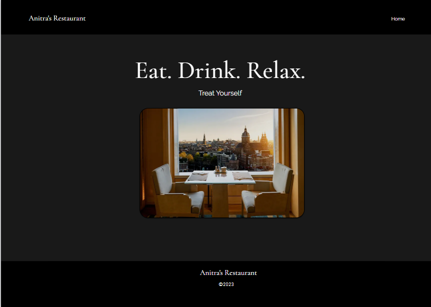
I really like this - it's very elegant and has a sophisticated feel. Make sure to centre the restaurant name and year at the bottom as they are just slightly off to the right, otherwise it looks spot on. Hope this helps :)
8 months ago by Shona McQuillan
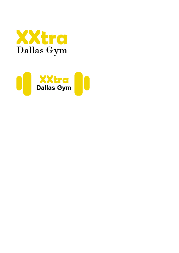
I really like the simplicity of this (sometimes less is more!) - the second one with the weights each side is great because it captures the nature of the business.
8 months ago by Shona McQuillan