Endo
Posts
1
Likes
0
Liked Posts
0
Given Feedback
15
Feedback
I dick the design but there are a couple issues. The lines overextend past the "alignment line" which could be purposeful, but it just seems a bit odd (in my opinion, this is subjective). What I do think should be changed is the "&" symbol as well as the "th". I think you could just get rid of it as it is pretty self explanatory without it. I don't understand the two in the bottom right too?
1 year ago by Endo
I like the colors, but I don't even think you need the image and name on the back as you already have the stuff on the front. That could make it seem more "clean"
1 year ago by Endo
I like the colors, but maybe the legibility is a bit low, switch the color progression maybe?
1 year ago by Endo
This is cool and colors are pretty good, but my only qualm is that the logo doesn't seem "easily recognizable from a distance" as asked by the brief as it doesn't seem too unique or special (no offense), but that is already very nit-picky. Otherwise, amazing!
1 year ago by Endo
AI generated?
1 year ago by Endo
I respect good art, but this kind of looks like AI generated stuff, is it AI generated?
1 year ago by Endo
I think this looks cool, but what does the capital A have to do with anything? I think more context would make more sense but as I can see the brief is not too good...
1 year ago by Endo
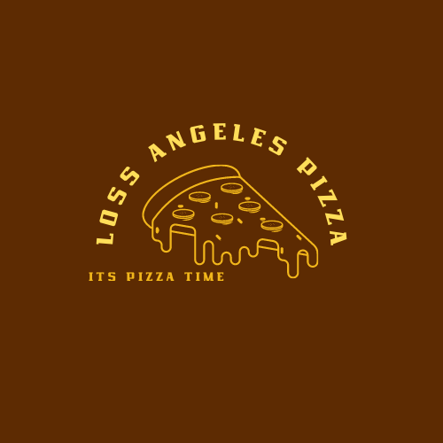
Lines are too long (they overlap), the spacing above and below the text seems of (everywhere), and why 2 stars and not 5? reading the text is a little hard as it is partially upside down, if you want to do round text I don't recommend going all the way upside down. Finally, the mascot will be hard to see in smaller versions of the logo, so I recommend making it the head of the mascot instead of the whole mascot
1 year ago by Endo
Yeah, alignment is the main issue. Two options (from what I can imagine) is aligning it to the left (where the L in "Loss angeles (misspelled btw) is), or in the center and have some of the text covered by the pizza, which might actually turn out cool
1 year ago by Endo
This looks very cool! My only comment is that if they are a more "premium" brand you might not want the shadow. If you look at a lot of modern companies the behind-text shadow is not really visible anymore. Other than that I love the placement and color choice!

1 year ago by Endo
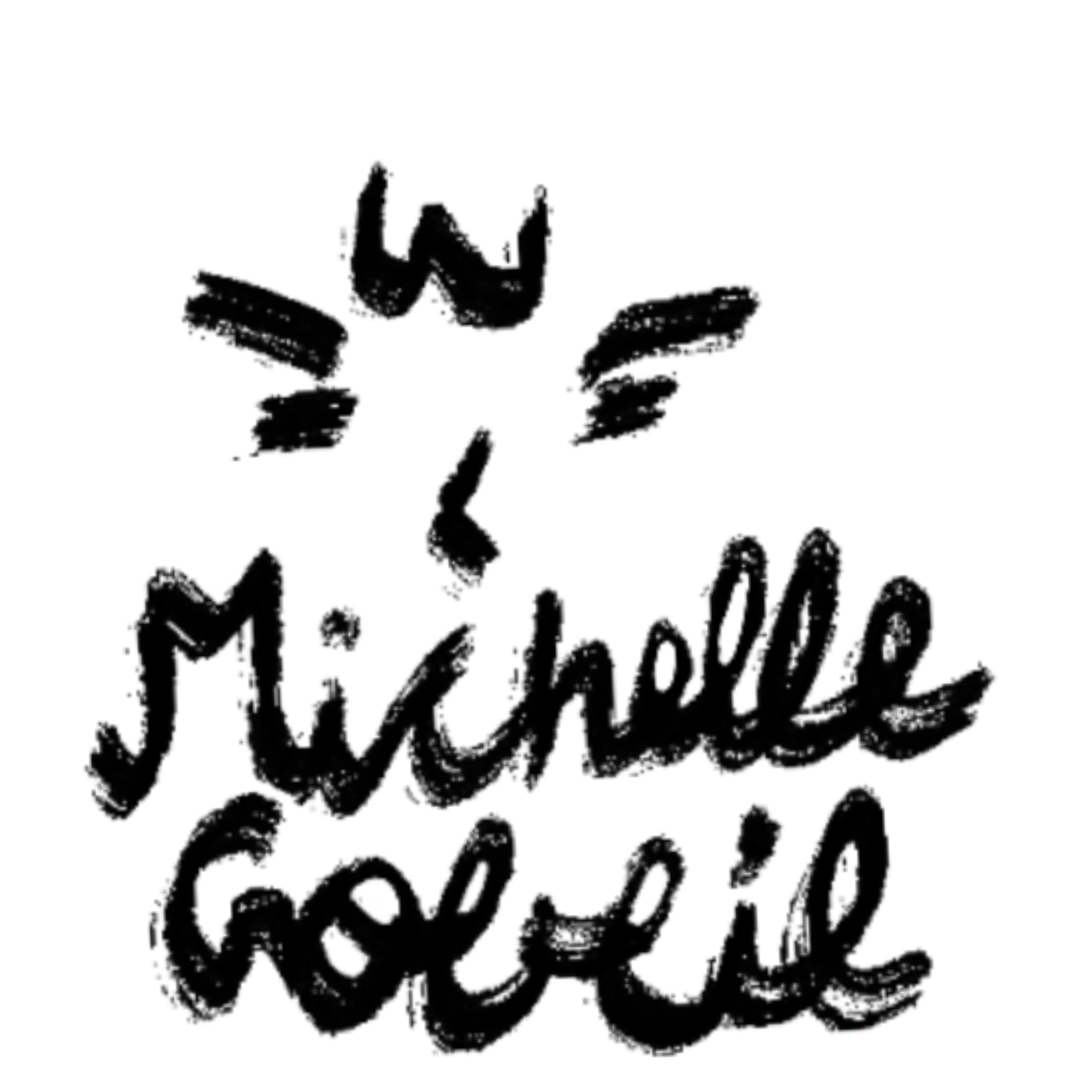
This looks VERY cool, but it is a little hard to understand, maybe make the letters a bit more obvious (to me the last name looks like "Goeeie"
Otherwise dope design!
1 year ago by Endo
As people have said, black on dark blue is bad legibility.
If this is a website, it may be good but from the picture I'm looking at the text may be a bit small, and it seems like you are accentuating the price of the food instead of the name, which ma be a good idea but honestly it looks a bit pricy and it may make more sense to accentuate the name more and make the price small.
Capitalization in the black title too. I don't think the slogan is good as it won't last for long (when the shop is no longer new).
Font choice for the white text is a bit odd but I do like the stroke text (maybe make the stroke smaller or choose a different font that uses white space).
Finally (in my opinion this may be subjective) I don't completely understand the images on the right. They're overlapping, no margins, and the woman doesn't seem to be related as she is carrying coffee but this is a bakery?
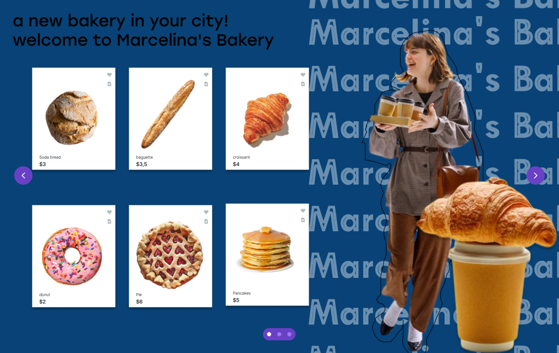
1 year ago by Endo
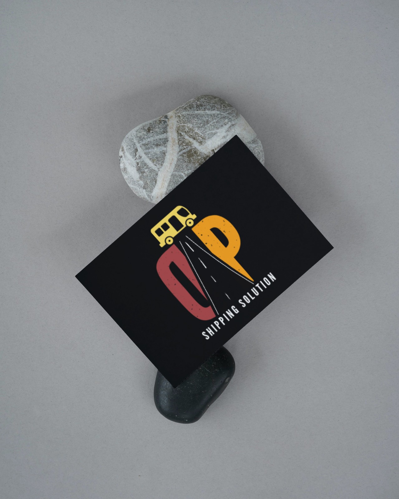
Very nice concept, but I think the T is not very obvious in this case, maybe change the line strokes to one of those thick yellow once you see on the road?
Also I don't understand why the bus is there, doesn't seem like a sterotypical shipment truck.
Solution is misspelled (solutions)
1 year ago by Endo
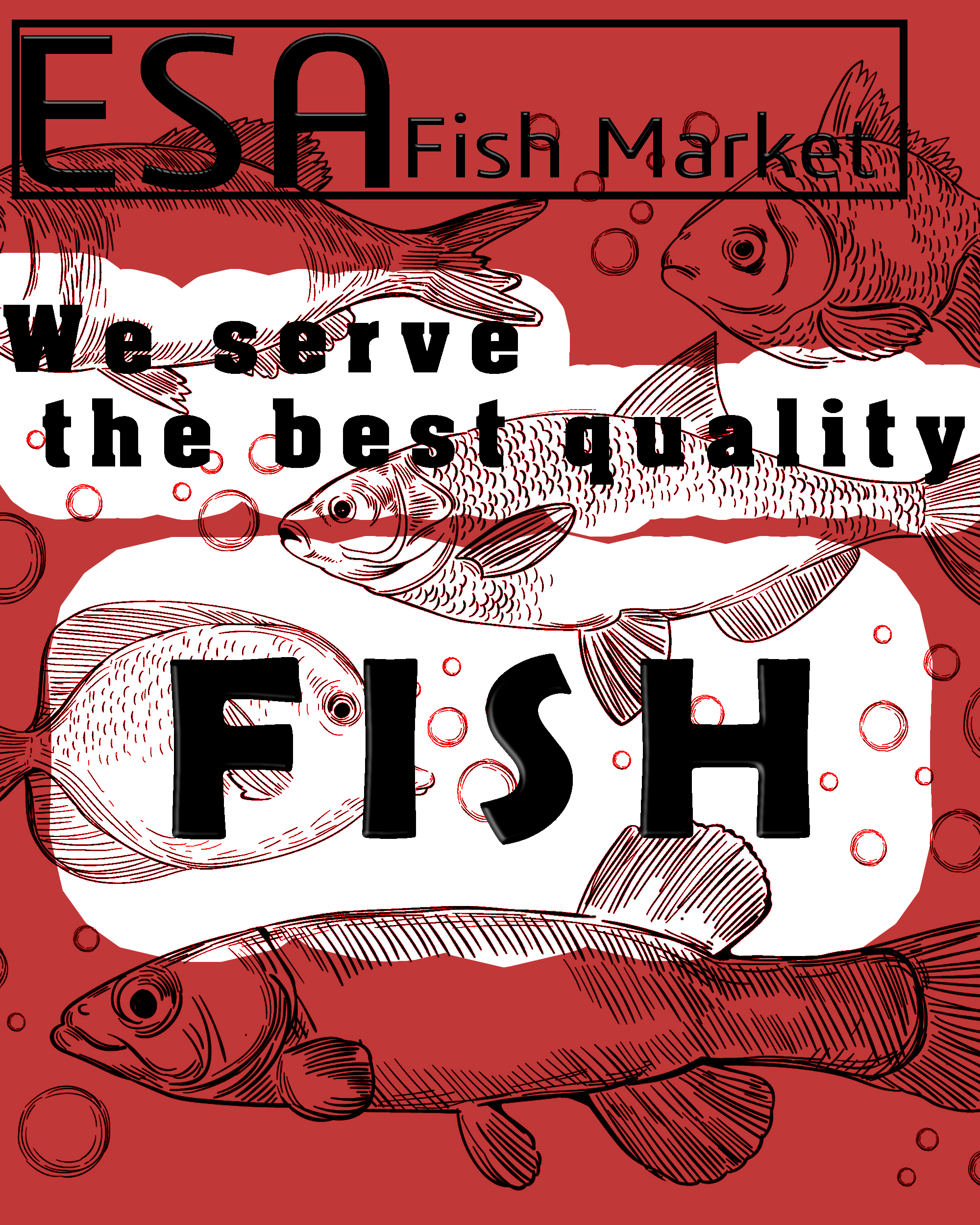
Legibility is a bit low on some of the letters due to the fish, maybe try toning down their opacity when on the white?
Also alignment is a bit unclear
1 year ago by Endo
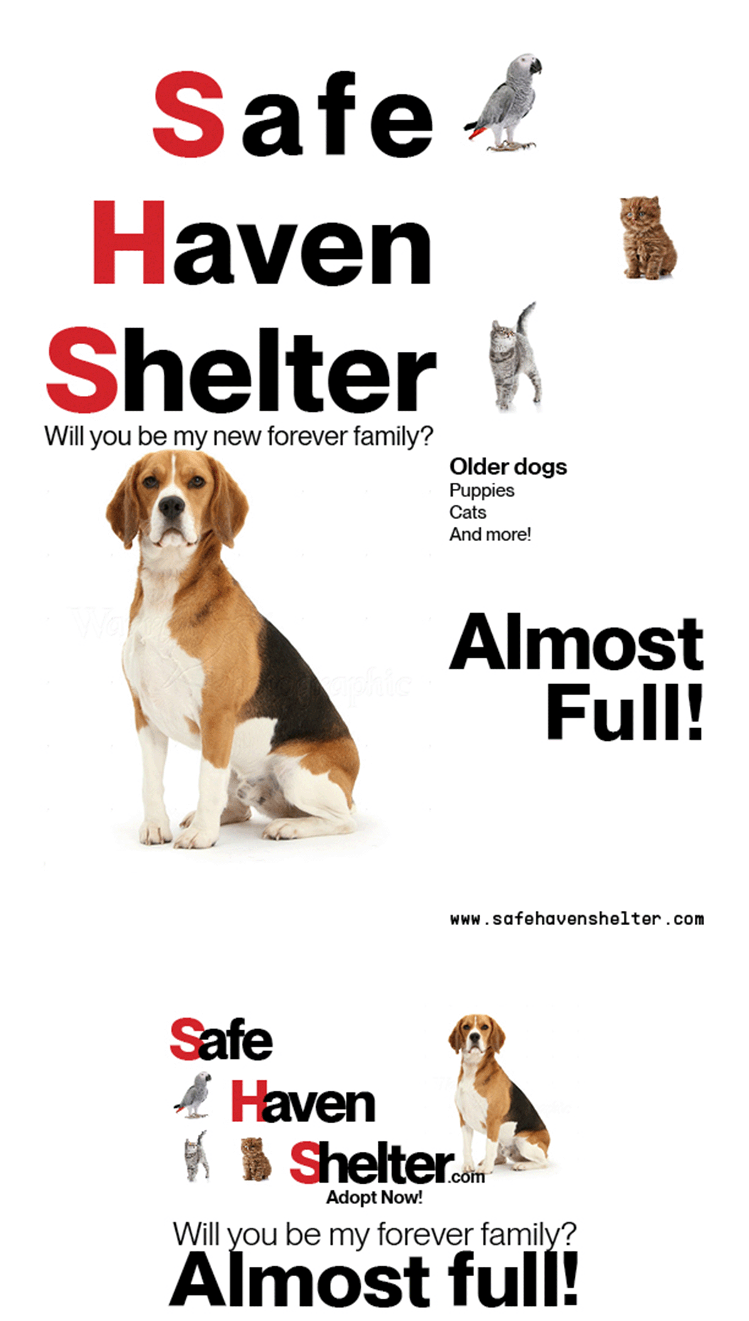
Wrong brief (Safe Haven Shelter)
1 year ago by Endo
Posts
Safe Haven Shelter (First Design)
- Report
1 year ago by Endo
My first design on this site, I went for a more "Swiss Design" approach
 Like
Like
 2
2
I like the typeface, it's bold but not overpowering. I noticed the spacing between Safe, Haven and Shelter is a little off. Also, the quote is way too close to the dog's head, and also too close to "Almost full!" in the newspaper ad. Also in the newspaper ad, the tracking is much too tight. Just my 2 cents.
10 months ago by Lindsay - Reply
This is wonderful! Simplistic and makes you wanna adopt a pet right away. :3
1 year ago by Diana Nichole Mapilisan - Reply