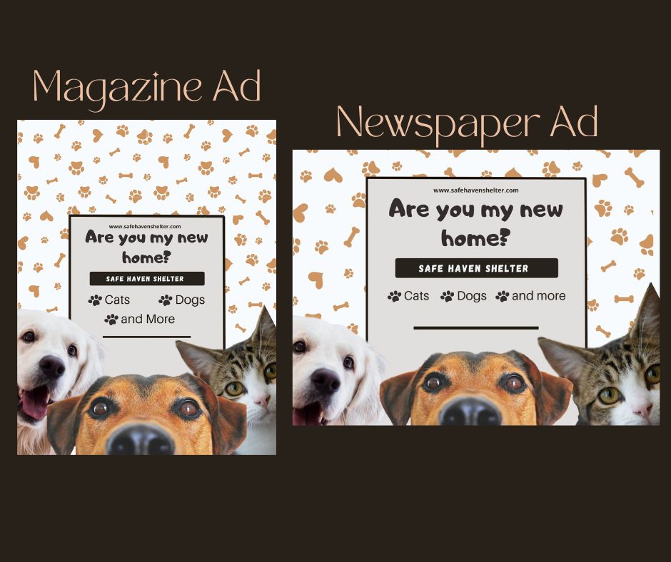
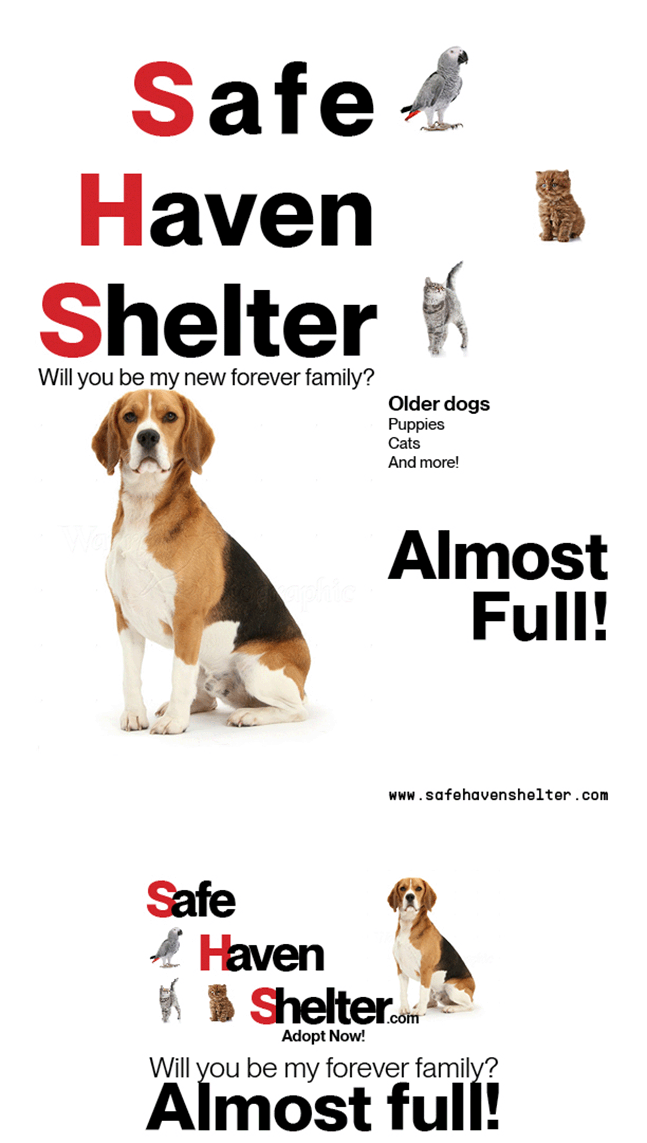
Safe Haven Shelter (First Design)
- Report
1 year ago by Endo
My first design on this site, I went for a more "Swiss Design" approach
 Like
Like
 2
2
I like the typeface, it's bold but not overpowering. I noticed the spacing between Safe, Haven and Shelter is a little off. Also, the quote is way too close to the dog's head, and also too close to "Almost full!" in the newspaper ad. Also in the newspaper ad, the tracking is much too tight. Just my 2 cents.
10 months ago by Lindsay - Reply
This is wonderful! Simplistic and makes you wanna adopt a pet right away. :3
1 year ago by Diana Nichole Mapilisan - Reply