Lindsay
Posts
3
Likes
5
Liked Posts
5
Given Feedback
6
Feedback
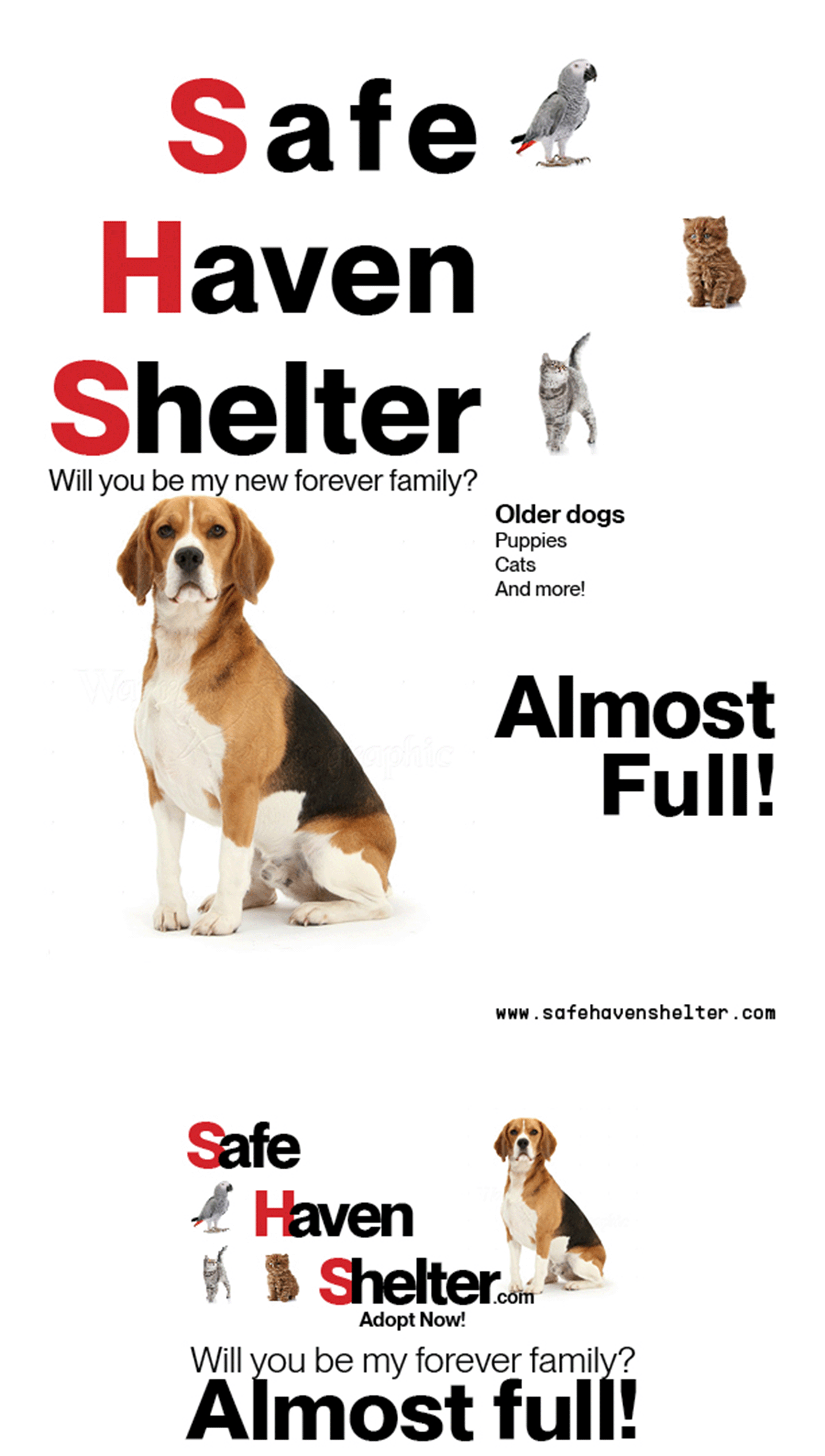
I like the typeface, it's bold but not overpowering. I noticed the spacing between Safe, Haven and Shelter is a little off. Also, the quote is way too close to the dog's head, and also too close to "Almost full!" in the newspaper ad. Also in the newspaper ad, the tracking is much too tight. Just my 2 cents.
10 months ago by Lindsay
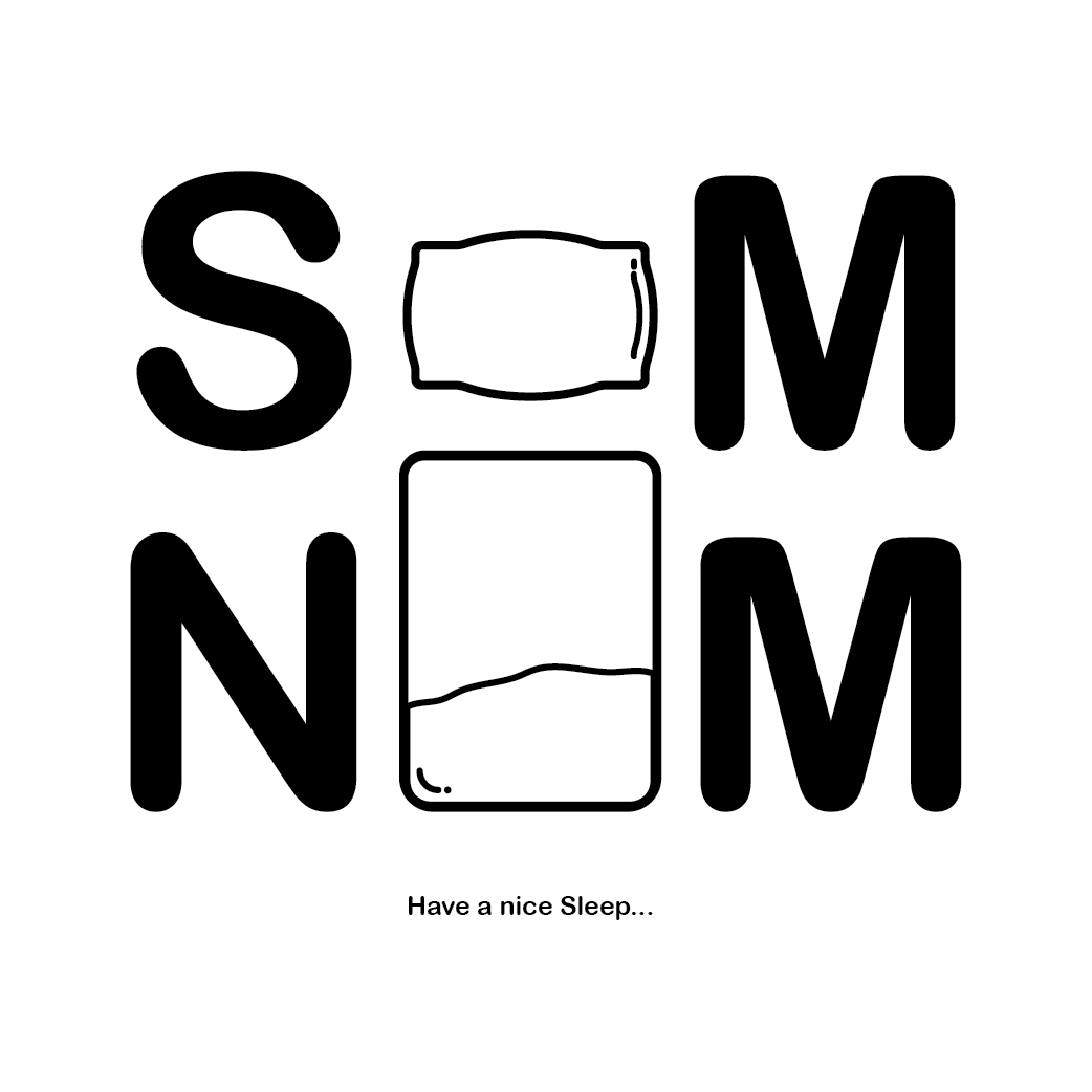
I like the creativity of this one, but I'm not sure what letter the pillow and bed are trying to make.
10 months ago by Lindsay
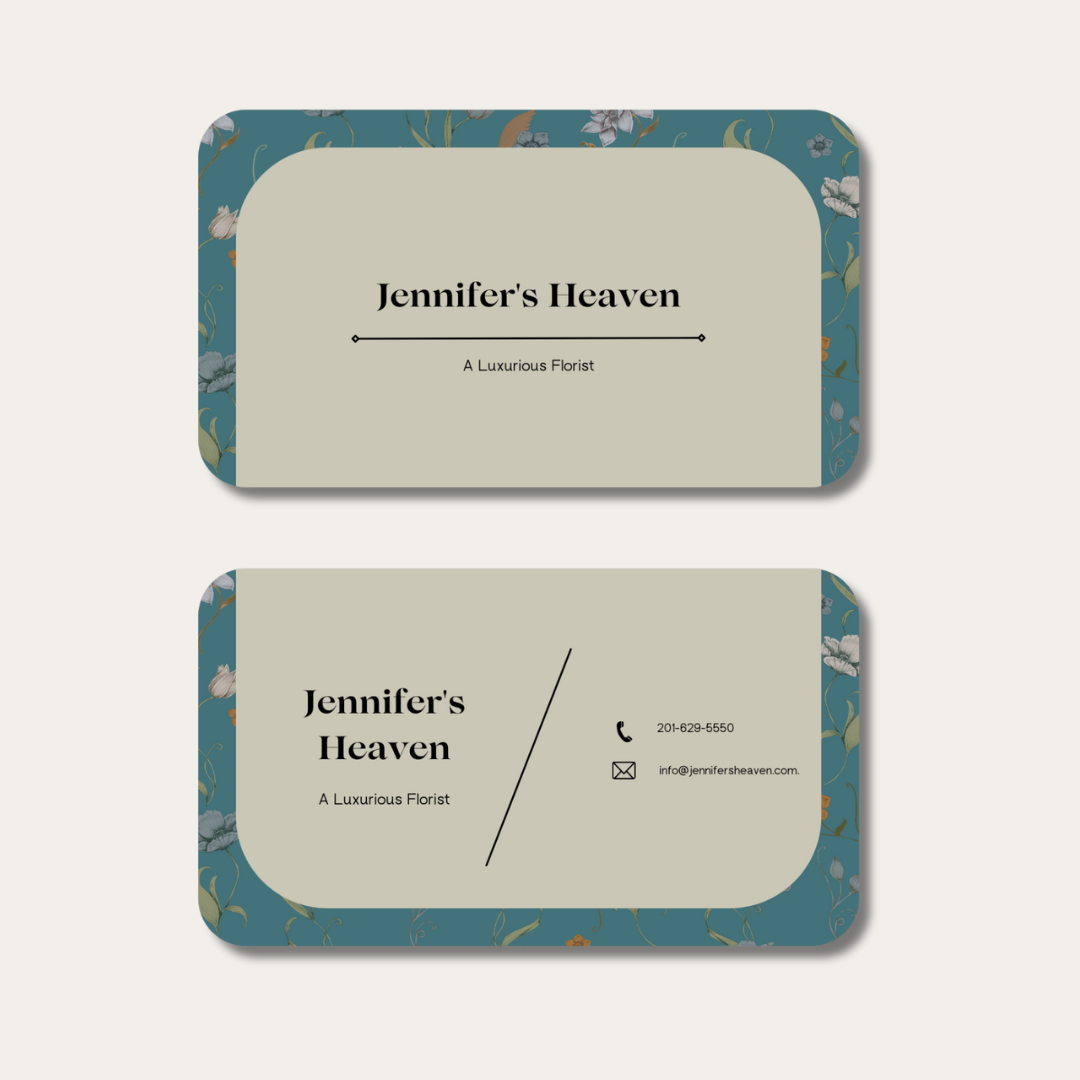
This looks great! Simple. I like the blue background, but it feels casual to me, not so much luxurious. Also, I think you could leave out the slanted like and just have the info there. For a first time, you've done well!
10 months ago by Lindsay
Thank you!
1 year ago by Lindsay
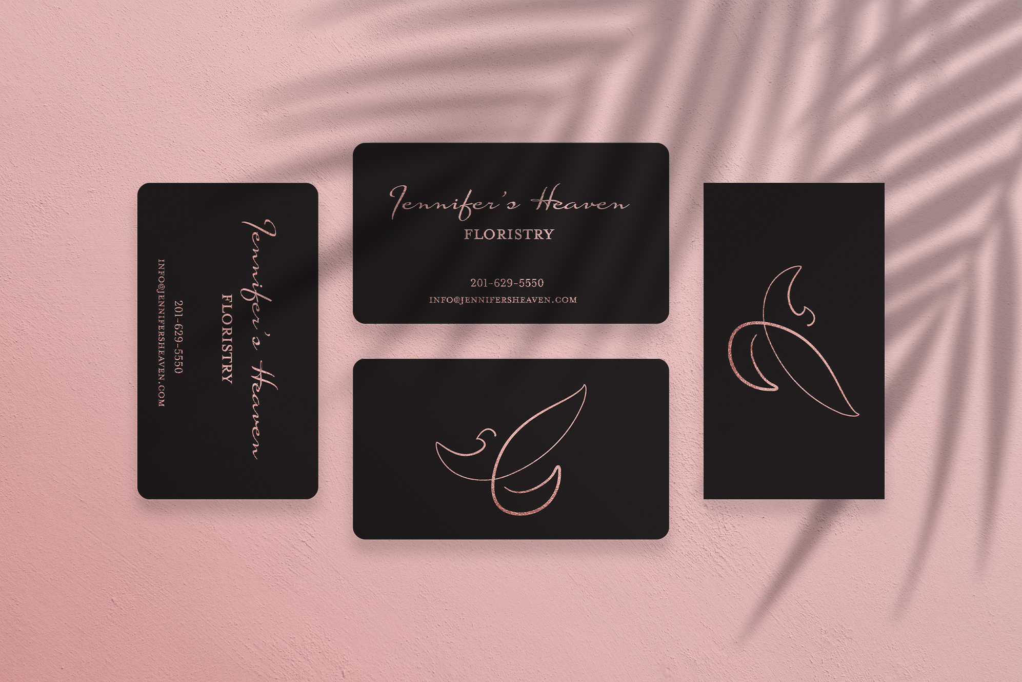
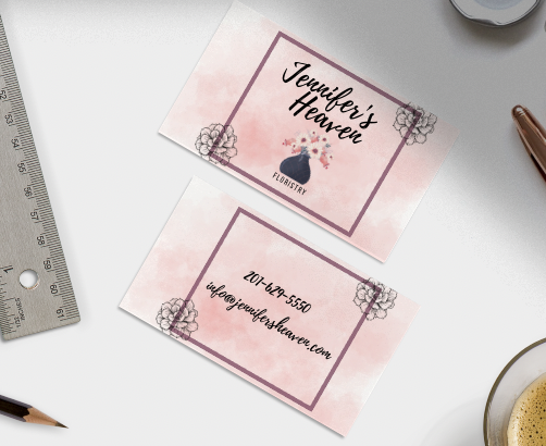
The two flowers in the corners are distracting. I might use one of those flowers instead of the vase of flowers. Also, maybe put "floristry" up by "Jennifer's Heaven" since they wanted it to be clear that they are a floristry. The colors are nice, the watercolor effect is pretty. I don't think it feels upscale to me though, this feels more like a neighborhood florist.
1 year ago by Lindsay
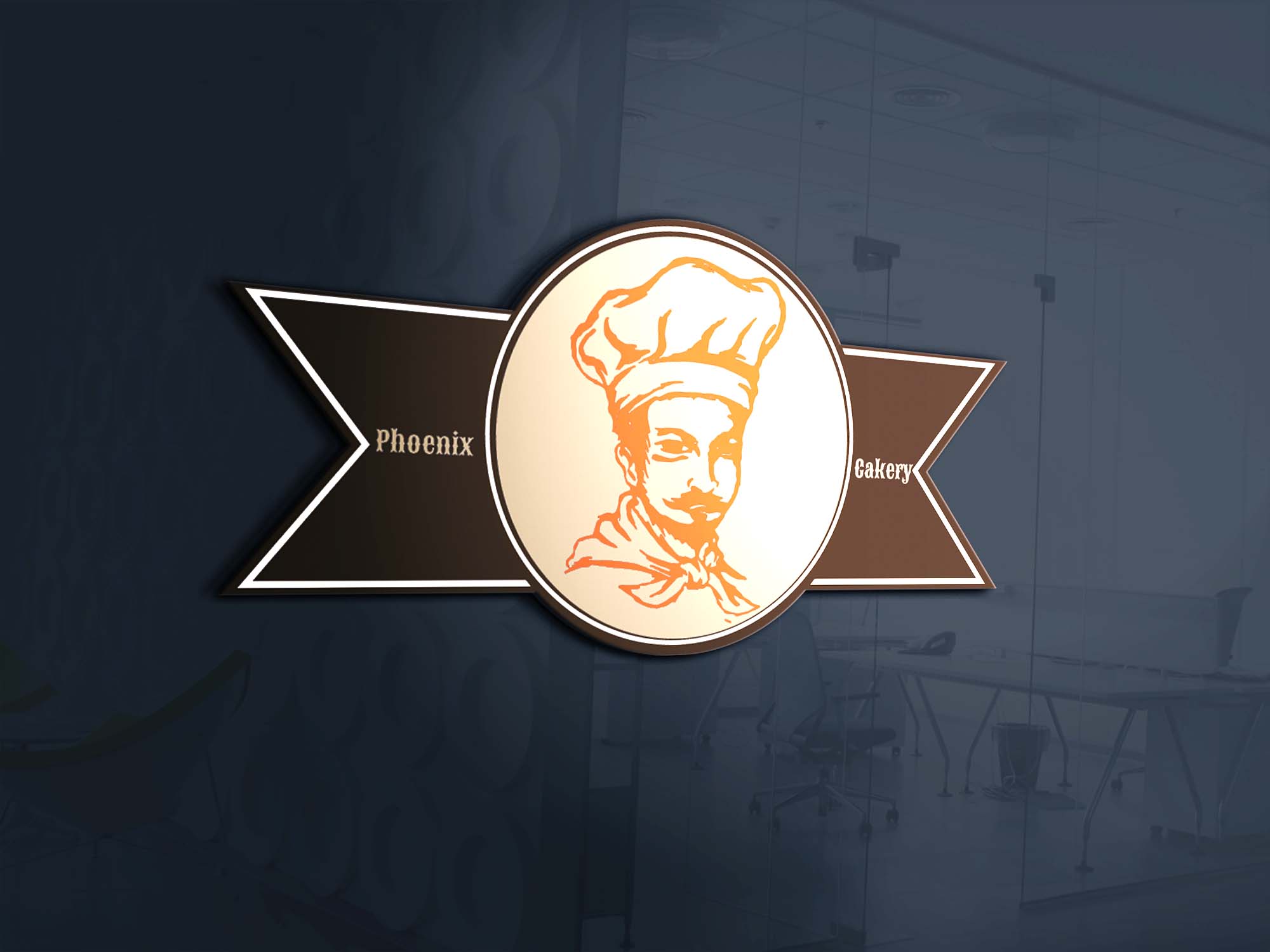
The banner is nice, but the text is too small, it's hard to read. Also, maybe a cake illustration in the middle? The colors are great!
1 year ago by Lindsay
Posts
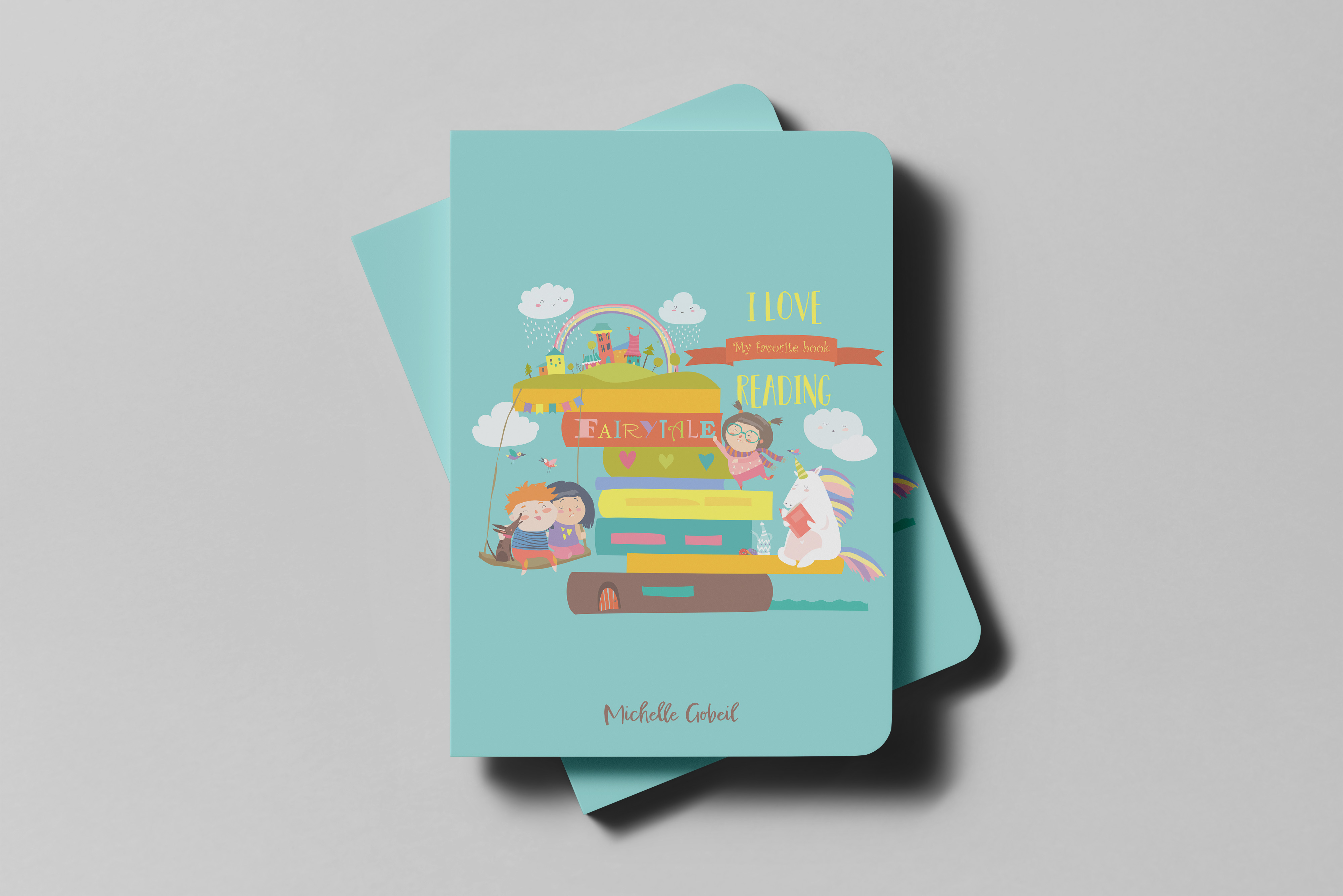
Michelle Gobiel
- Report
10 months ago by Lindsay
Michelle Gobiel signature logo on a children's book.
 3 Likes
 2
2
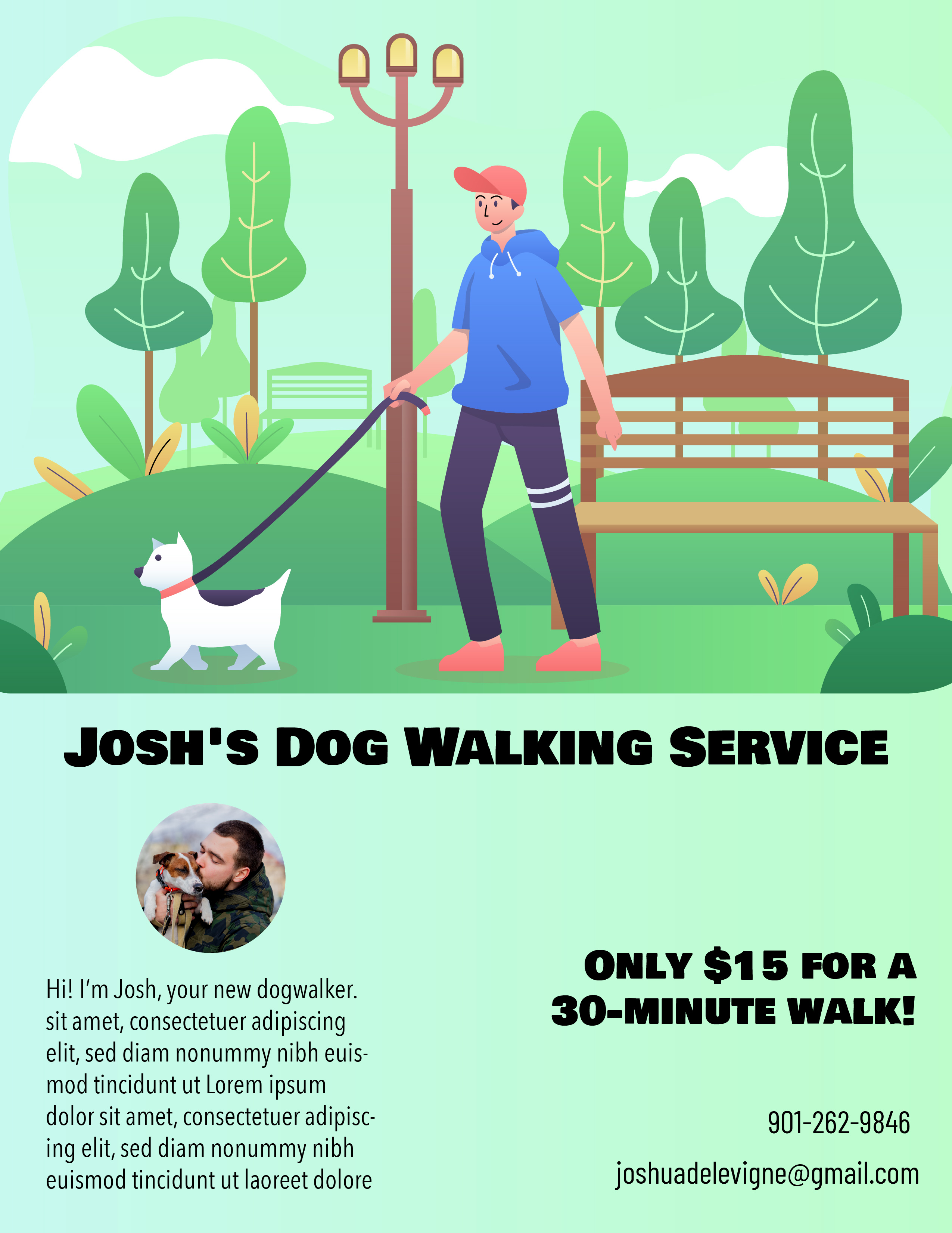
Josh's Dog Walking Service
- Report
10 months ago by Lindsay
I made this for the dog walking service above. I appreciate any feedback!
 Like
1
Like
1
loved the design bro
10 months ago by Ansh Minj - Reply
Jennifer's Heaven Floristry
- Report
1 year ago by Lindsay
The client asked for an upscale card for their floristry. Accented with rose gold, this card fits the request. Let me know what you think!
Jennifer's Heavengraphic
2 Likes
3
Wow looks so premium! Love the free flowing mark on the backside :)
1 year ago by Priyanka Salelkar - Reply