Fasya Emilia
Posts
3
Likes
6
Liked Posts
4
Given Feedback
4
Feedback
The color palette is harmonious and communicates a strong brand identity. Each color seems to be thoughtfully chosen to evoke a particular emotion or association

9 months ago by Fasya Emilia
The poster design is visually appealing and the colors used are eye-catching. However, I found the placement of the pictures a bit confusing. It took me some time to understand the flow of information due to the scattered arrangement of images. I would suggest reorganizing the pictures in a more logical sequence to improve clarity and enhance the overall message of the poster

9 months ago by Fasya Emilia
GOOD

9 months ago by Fasya Emilia
love the look and color, good job!.

9 months ago by Fasya Emilia
Posts
Market Fish Logo
- Report
9 months ago by Fasya Emilia
Hi!
I am Odelia, creator of London Fish market. For a while now, I've been looking for a good logo for my Fish market. I love mascot logos. Can you do that?
I am Odelia, creator of London Fish market. For a while now, I've been looking for a good logo for my Fish market. I love mascot logos. Can you do that?

 2 Likes
 2
2
nice
9 months ago by Epiphany Figment - Reply
good
9 months ago by Corinne - Reply
San Antonio's Logo
- Report
9 months ago by Fasya Emilia
 2 Likes
1
2 Likes
1
Design looks somewhat professional and elegant
9 months ago by Sanchayita Sharma - Reply
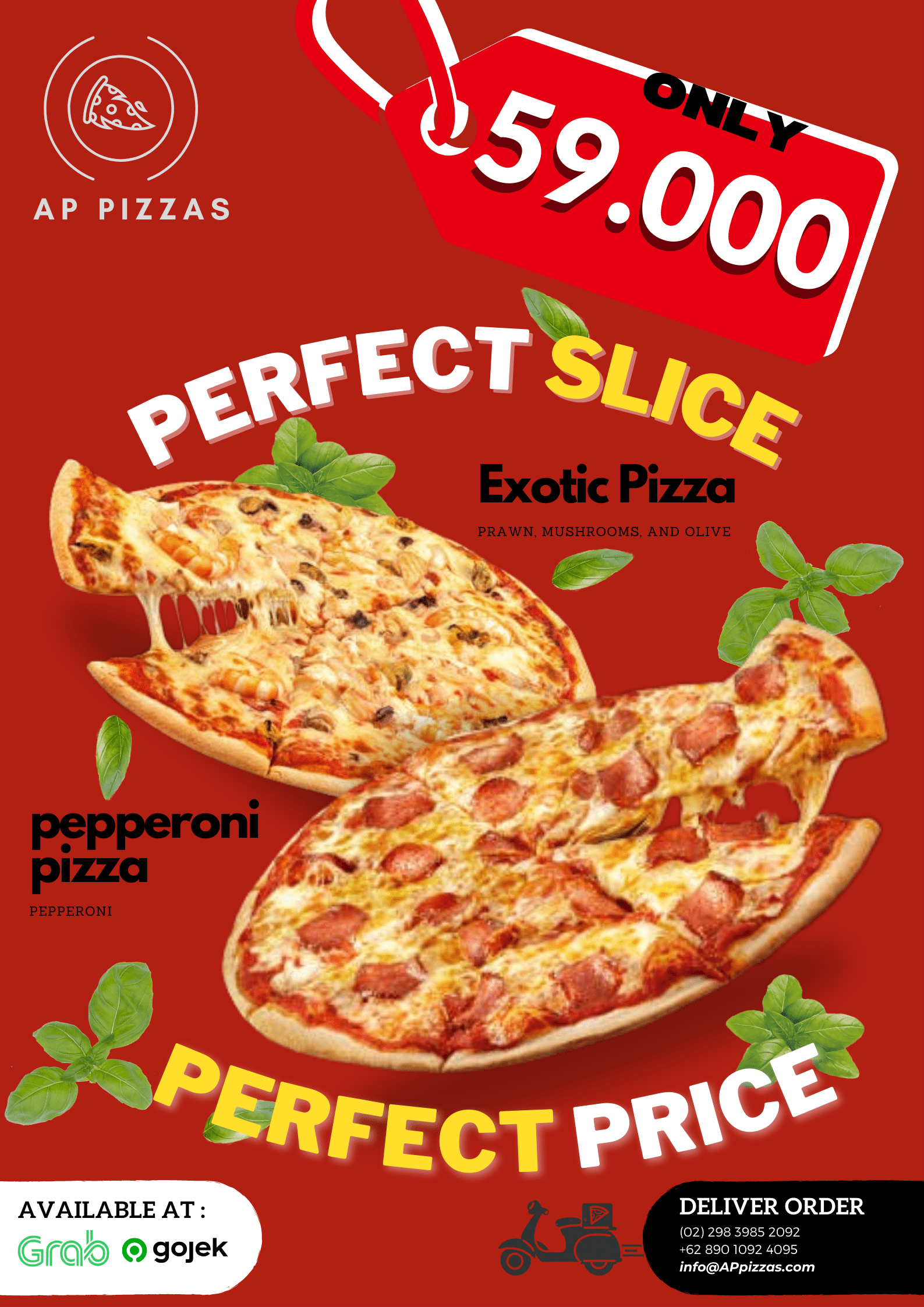
AP Pizza
- Report
9 months ago by Fasya Emilia
 2 Likes
2
2 Likes
2
The composition of the texts is a little confusing and makes it hard to focus
9 months ago by Elle - Reply
I like the playfullness of the design but i see what you mean with the text, it's a bit hard to know where to look first etc.
9 months ago by Dani - Reply