glendale marie ang
Posts
0
Likes
0
Liked Posts
1
Given Feedback
5
Feedback
Rather than a rainbow, perhaps a slightly extended wifi signal that still shows "connection". Pillows could be the same shape without a left/right side so it doesn't take away the attention. Thinner points for the other elements and leave one at bold to highlight what the edge is (maybe use thinner point for eyes and pillows so we can focus more on the wifi)
1 year ago by glendale marie ang
The name was executed beautifully. The background could do more work though. Maybe incorporate what the business is about
1 year ago by glendale marie ang
Inside logo doesn't feel centered. More emphasis on the circle edge to highlight the "rough line" giving it a more natural look
1 year ago by glendale marie ang
Great idea for the layout. However, it is still very rough. Font choices could be better. Elements are not strategically/aesthetically placed. Address is stretched up. Omit the shadow behind the pizza and smoothen the edges on the circles. Background could be made vibrant
1 year ago by glendale marie ang
Well executed. Only thing that could be done better is the font choice for STAR. Otherwise perfect
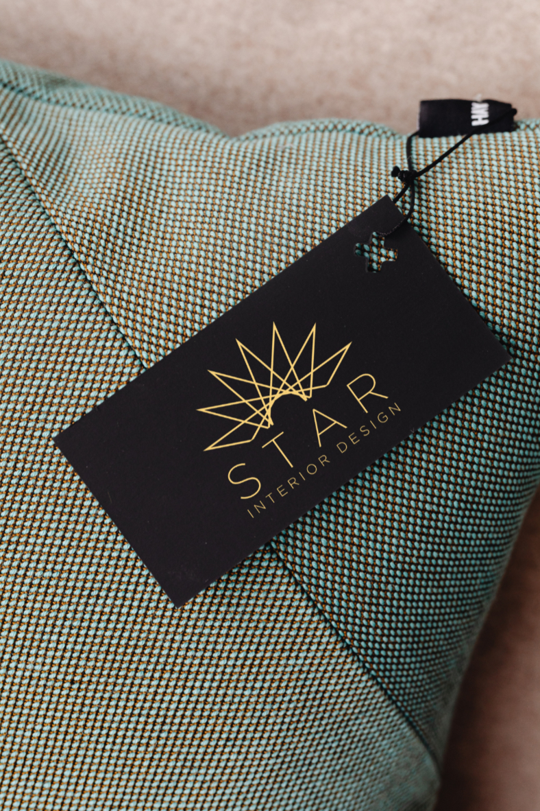
1 year ago by glendale marie ang