samin
Posts
7
Likes
6
Liked Posts
2
Given Feedback
8
Feedback
good.but work on theme

11 months ago by samin
not bad
1 year ago by samin
nice
1 year ago by samin
good
1 year ago by samin
okay

1 year ago by samin
thank you for the advise
1 year ago by samin
🤔🤔
1 year ago by samin
Good but common idea

1 year ago by samin
Posts
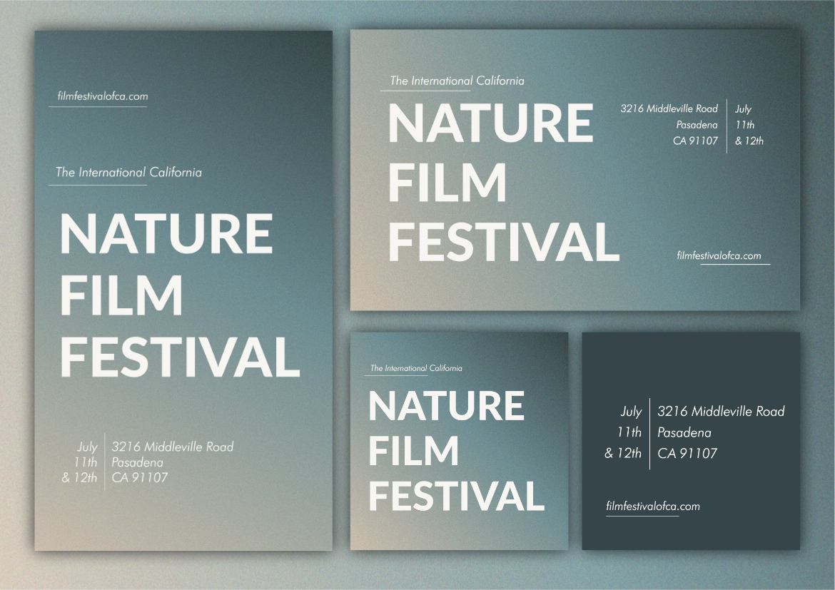
Be simple
- Report
11 months ago by samin
Hello!
I'm Leona, I recently started a new business called Leona's Cafeteria. I'm looking for someone that can make a good logo for my business. I think a combination mark will fit best with the business. Can you help me out?
I'm Leona, I recently started a new business called Leona's Cafeteria. I'm looking for someone that can make a good logo for my business. I think a combination mark will fit best with the business. Can you help me out?
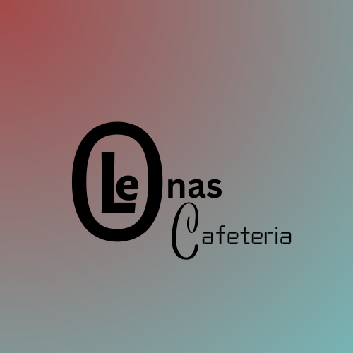
 Like
Like
 1
1
Hi Leona! I can help you with your Logo.
11 months ago by Micah Escaño - Reply
for you
- Report
1 year ago by samin
Michelle Gobeillogo
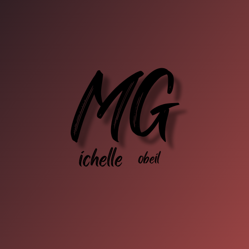 1 Like
2
1 Like
2
please change to much lighter color bg and white color text also you can ditch the shadings.
11 months ago by Anthony John Hinay - Reply
I like the font choice
1 year ago by Emily Davies - Reply
classic
- Report
1 year ago by samin
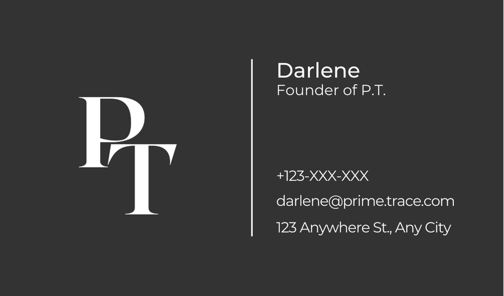
Hey!
I'm Darlene, founder of PrimeTrace. I'm looking for someone that can design something for my business. I want to have a business card for myself. Can you help me out?
I'm Darlene, founder of PrimeTrace. I'm looking for someone that can design something for my business. I want to have a business card for myself. Can you help me out?
 1 Like
1
1 Like
1
great logo, great font choice, would suggest making the name a little bolder so user can be more focus on the name, 60% tends to forget name after been handed a card, making the font bolder will optimize for retention
1 year ago by Olamilekan - Reply
logo created by canva
- Report
1 year ago by samin
Michelle Gobeillogo
 1 Like
1
1 Like
1
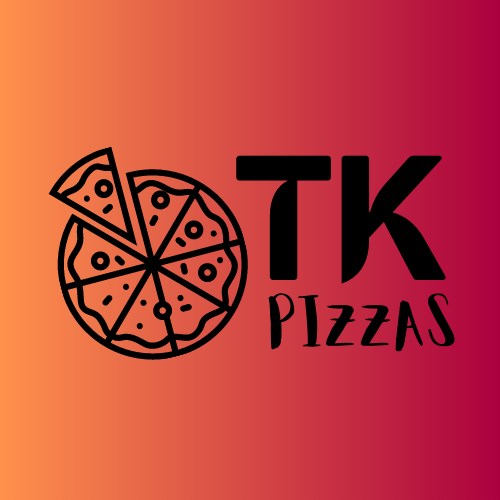
I dont think the font for pizzas matches with the rest
1 year ago by João Teixeira - Reply
just starting parctise
- Report
1 year ago by samin
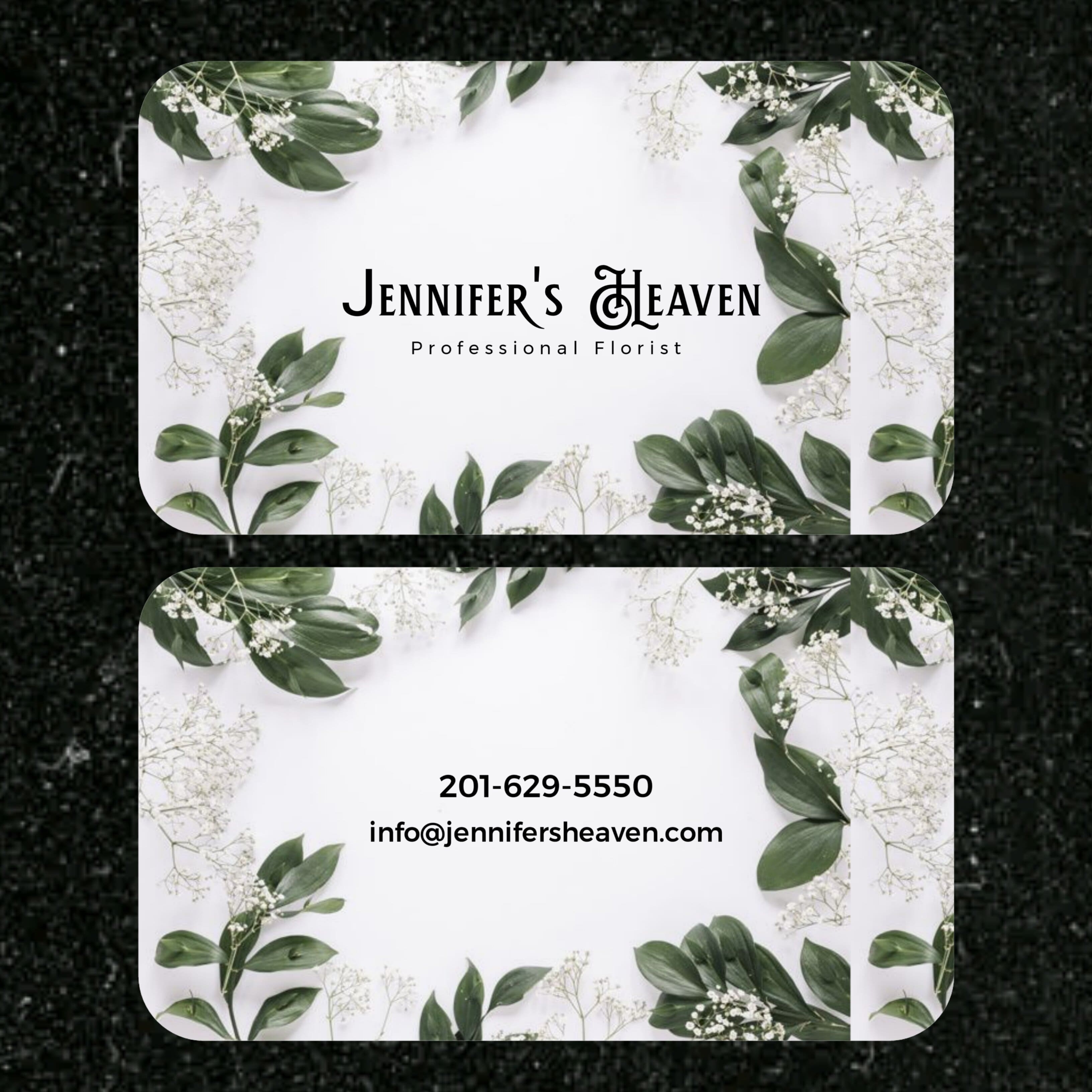
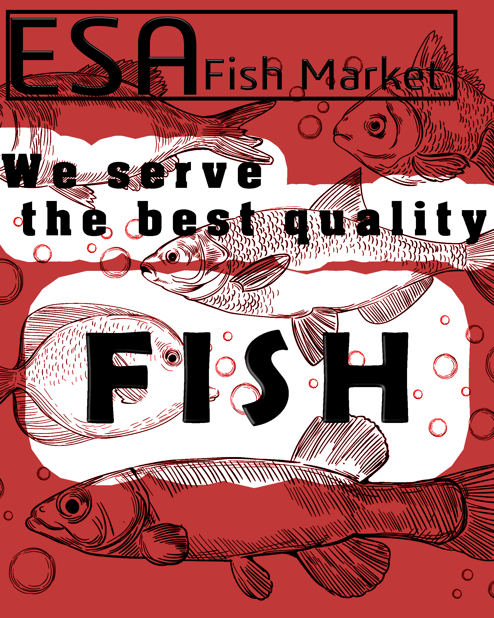
Jennifer's Heavengraphic
 3 Likes
3
3 Likes
3
Hey can I ask what is the processor to send post on this app??
11 months ago by Khan ashfa - Reply
hey! I really liked the colour scheme and use of the fish illustration but may be you could keep the top part a bit empty do that the company name pops. Keep going!
1 year ago by Ananya - Reply
Legibility is a bit low on some of the letters due to the fish, maybe try toning down their opacity when on the white?
Also alignment is a bit unclear
1 year ago by Endo - Reply