Kevin
Posts
8
Likes
28
Liked Posts
6
Given Feedback
10
Feedback
Good placement and heirarchy,

1 year ago by Kevin
Great work. Any tips for someone thinking of taking up UX/UI? Seem like you could give some. -Kevin
1 year ago by Kevin
Appreciate it, it was a first time trying this. Learned a lot so far
1 year ago by Kevin
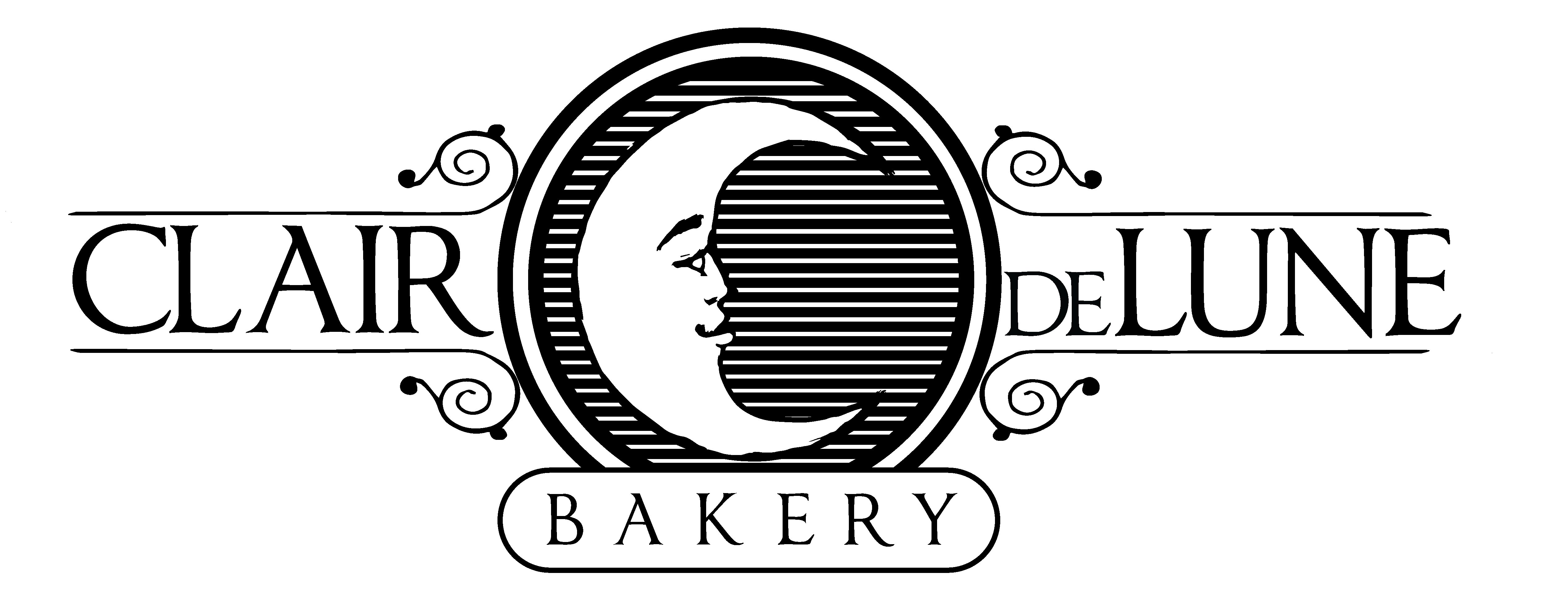
Excellent form and color choice. I would just polish up the moon a bit unless you are going for a 'hand made' aesthetic, in which case, it succeeds. Mioght be cool to either see the moon cleaner or the letters a but more 'hand crafted' as well. I wish we could upload animations onto this site, this would be a great collab
1 year ago by Kevin
Excellent concept. See if there isn't a way to make the letter 'P' and 'V' the actual weights as opposed to negative positive forms containing negative space. Look good, though, good work.
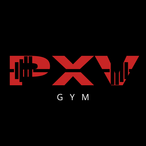
1 year ago by Kevin
in what sense so I can improve it?
1 year ago by Kevin
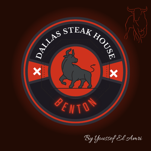
Good work. I'm wondering how it would look without the circle and with the cow/bull as the form of the logo itself.
1 year ago by Kevin
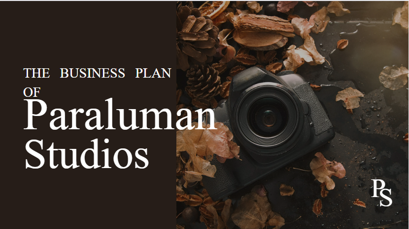
Try adjusting the spacing between the header 'business plan of' and 'paraluman Studios'. Also, 'The Business plan of' should be one line or if you want to keep 'of' separate, I'd center it so its hovering nice and balanced over the studio name. Lastly, I'd change the font to a sans serif typeface and make the brown rectangle extend father outward so that the text is contained within it.
1 year ago by Kevin
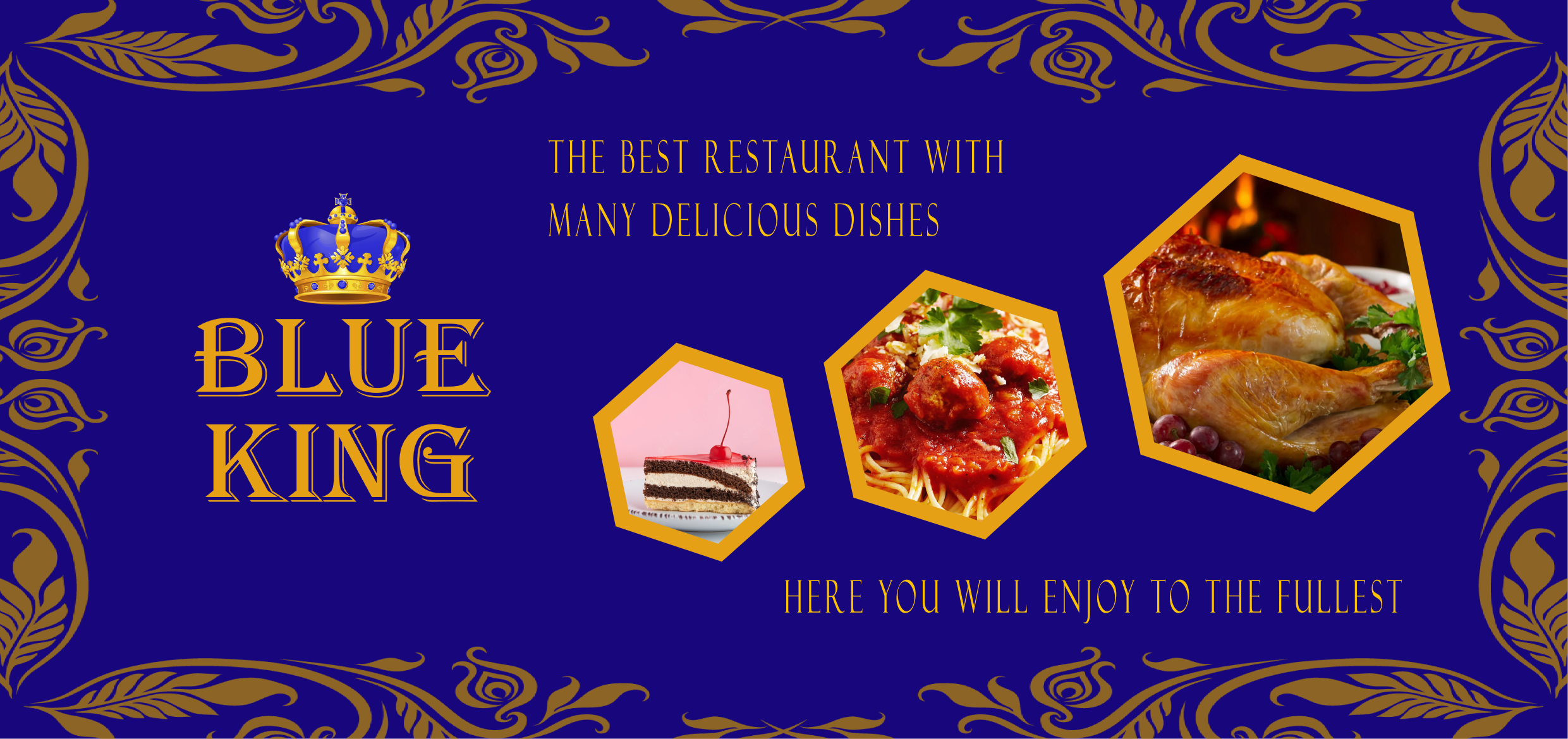
Great use of color and layout. Might be cool to see how different typefaces look, perhaps somethint sans serif and modern. Looks great, though! Talented!
1 year ago by Kevin
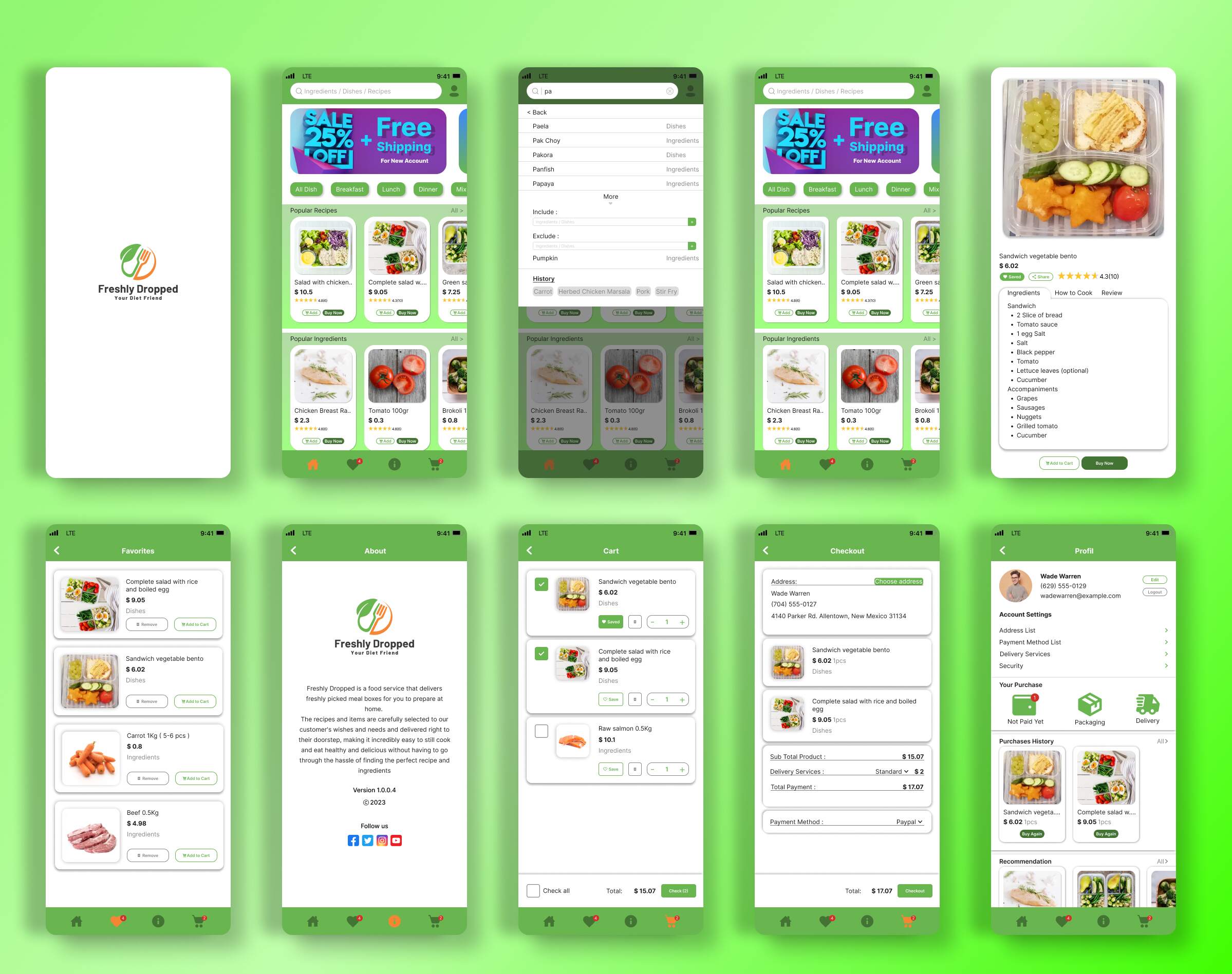
Love the hierarchy and color choices. Honestly thought this was an ad on the website. How did you isolate the photo so cleanly?

1 year ago by Kevin
Posts


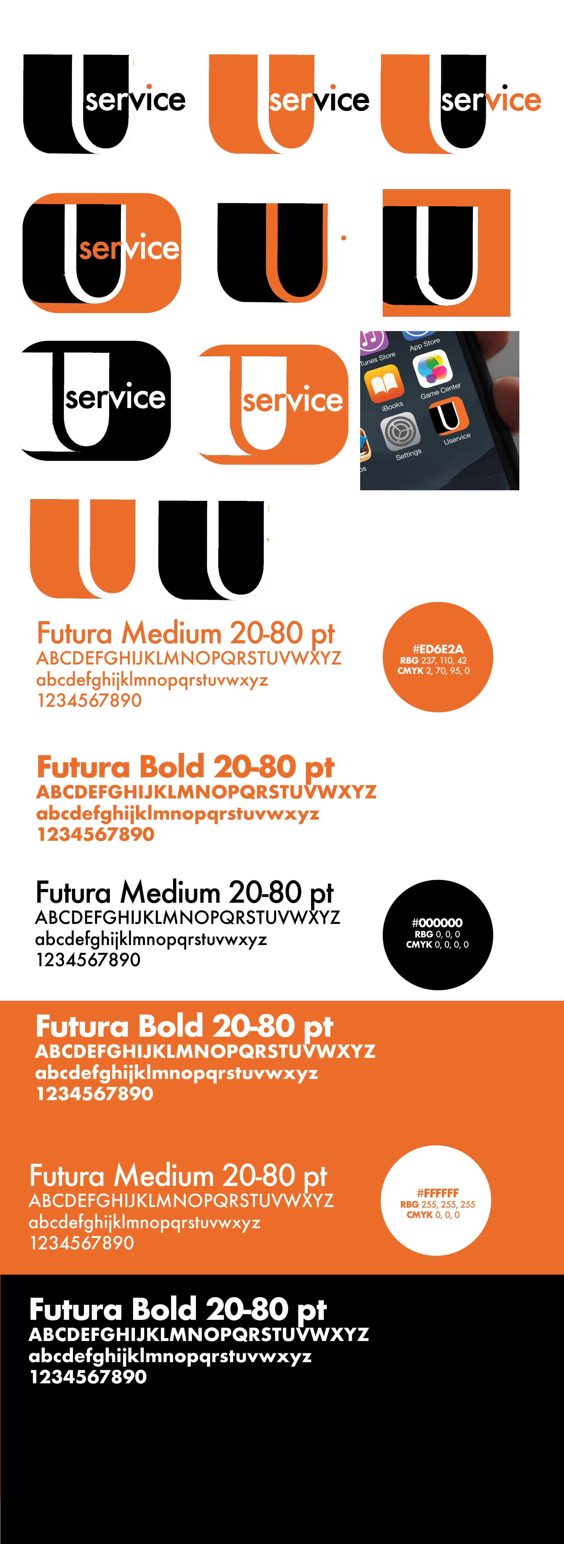
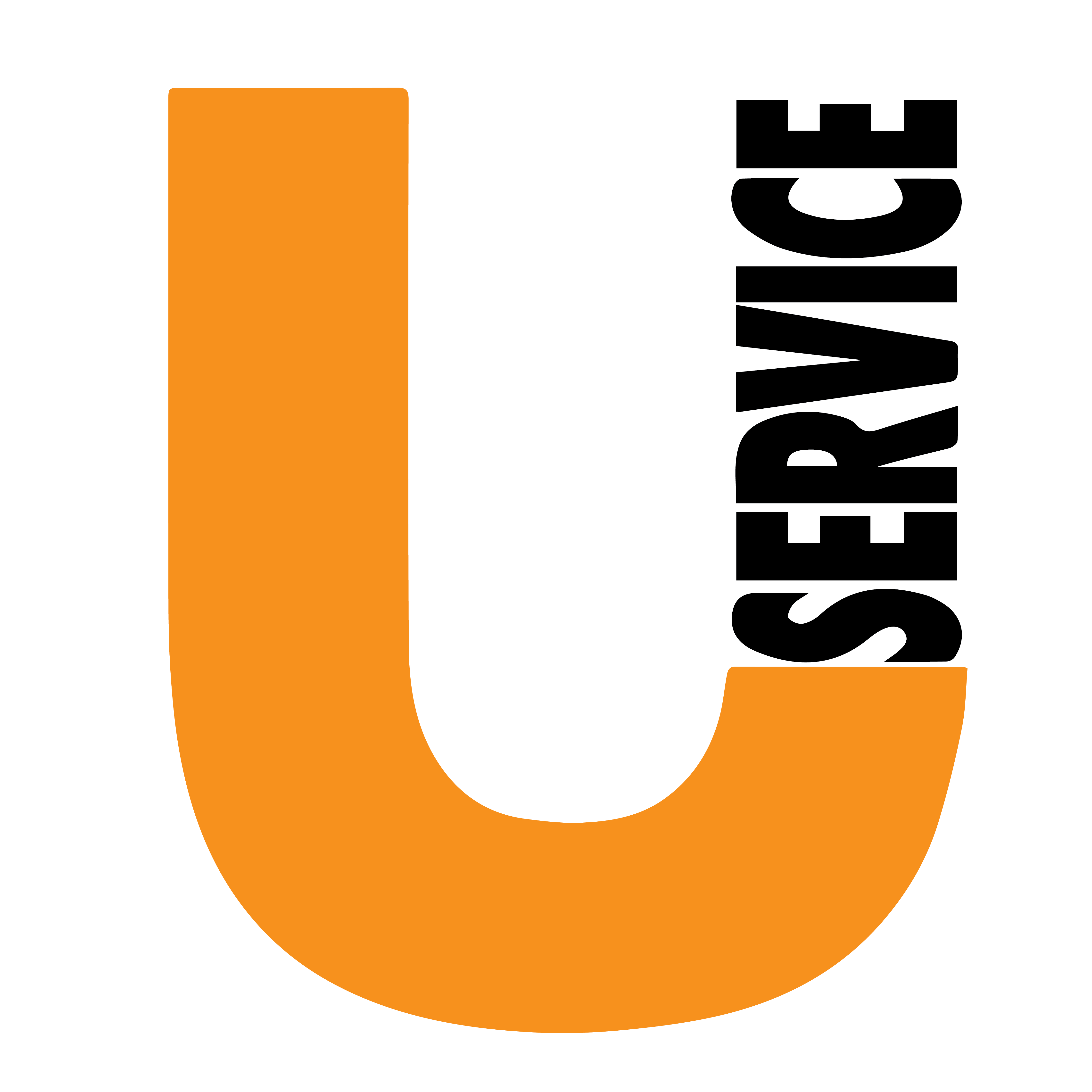
Uservice
- Report
Kevin • 1 year ago

very nice, visually represents the company name perfectly and is easy to read
1 year ago by Anaya Jobson - Reply
DTP SHIPPING SOLUTIONS
- Report
Kevin • 1 year ago


nice, simple yet proffesional :)
1 year ago by Anaya Jobson - Reply
Uservice
- Report
Kevin • 1 year ago

I think that the concept of the icon is great (I like the right one in the 2nd row the most, after that the middle one in the 3rd.) but to me it looks like you either didnt put much effort in the designing process or didnt know how to propperly do it, sorry if it sounds hard but it seems (from the given picture) pretty unprofessional, - the random dots and steps in the curve of the "U", the not even lining of the "U". I like the thought of it though! Give it more time :)
1 year ago by Ian - Reply
Appreciate it, it was a first time trying this. Learned a lot so far
1 year ago by Kevin - Reply
HALO
- Report
Kevin • 1 year ago
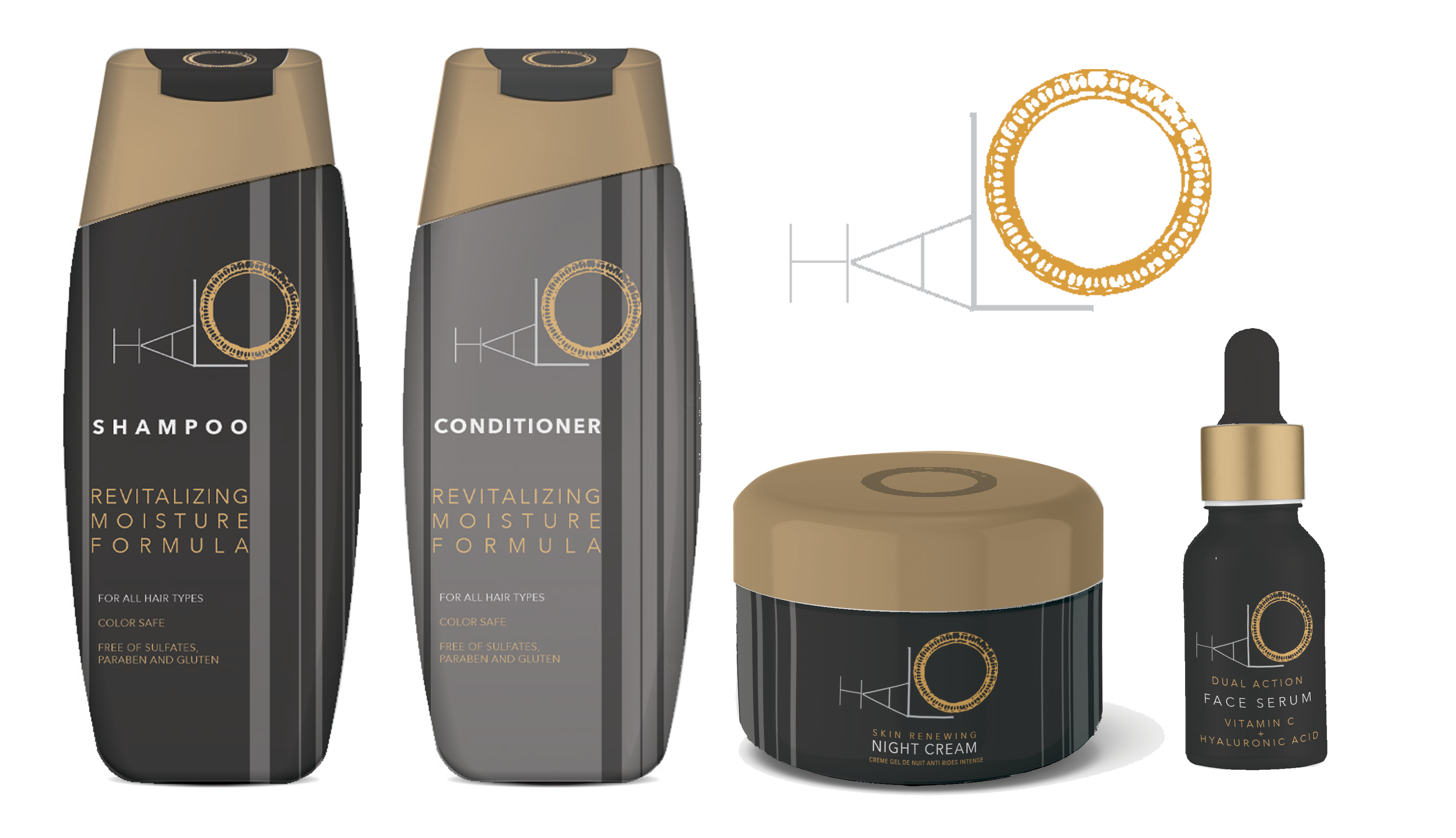

I really like the logo that you made here! the colours feel luxorius and high-end. One thing I would point out though is that the type on the shampoo and conditioner looks kinda squished and trapped - maybe give it more space and adjust the vertical lines [In the very detail the thing I realized is that the logo gets cut by the vertical lines at different spots]
Other than that this is a good design job, especially the logo!
1 year ago by Ian - Reply
Pretty Good
1 year ago by C² - Reply
give Feedback
1 year ago by ajendra khedekar - Reply