C²
Posts
4
Likes
11
Liked Posts
5
Given Feedback
6
Feedback
Great! works well with the mock up

1 year ago by C²
Pretty Good
1 year ago by C²
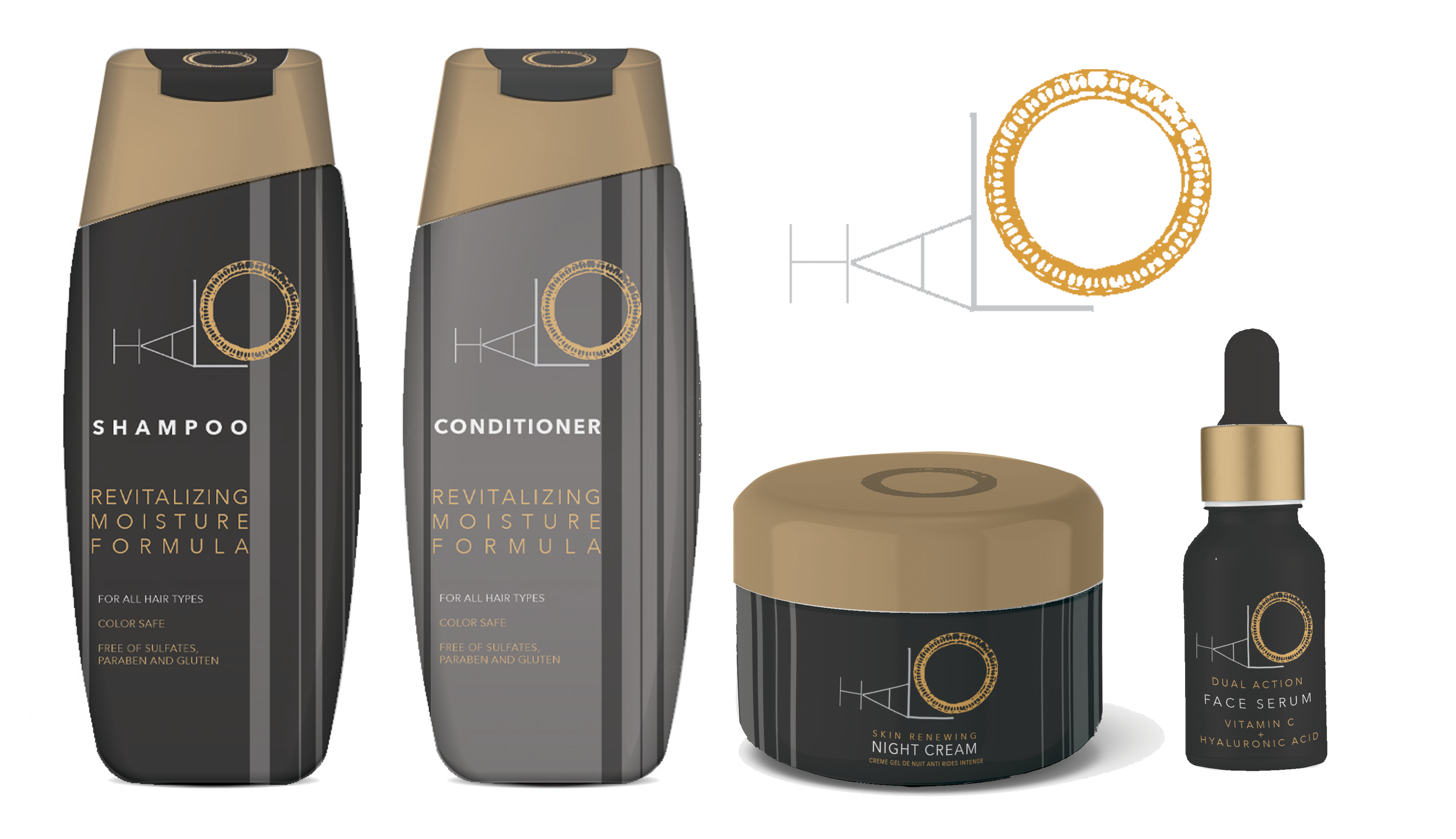
Thanks. the space between the letters was intentional so as to create that feeling of 'space'
1 year ago by C²
The idea is nice but there is a problem whe the image and your background meet. The blending is not smooth

1 year ago by C²
I think I will be better if the lines are more thick and the name don't touch the pictogram

1 year ago by C²
It is too simple
1 year ago by C²
Posts
SORU
- Report
C² • 1 year ago
Hello, i am Wade owner of soru. I'm looking for someone that can create a simple logo for my business. I like pictorial marks
Can you do that?
Can you do that?
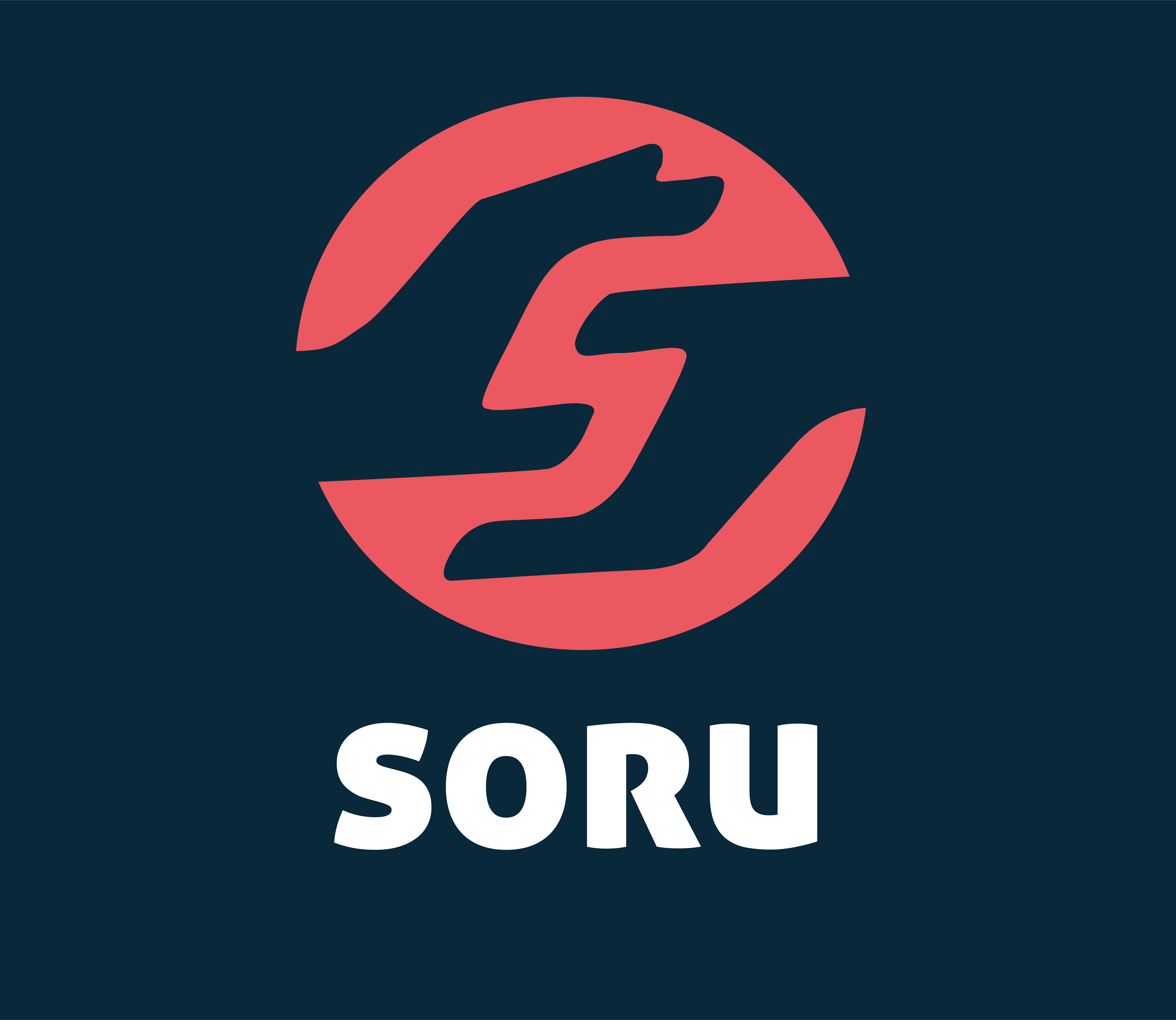


Great work
1 year ago by Maaz - Reply
Biden space
- Report
C² • 1 year ago
Hi!
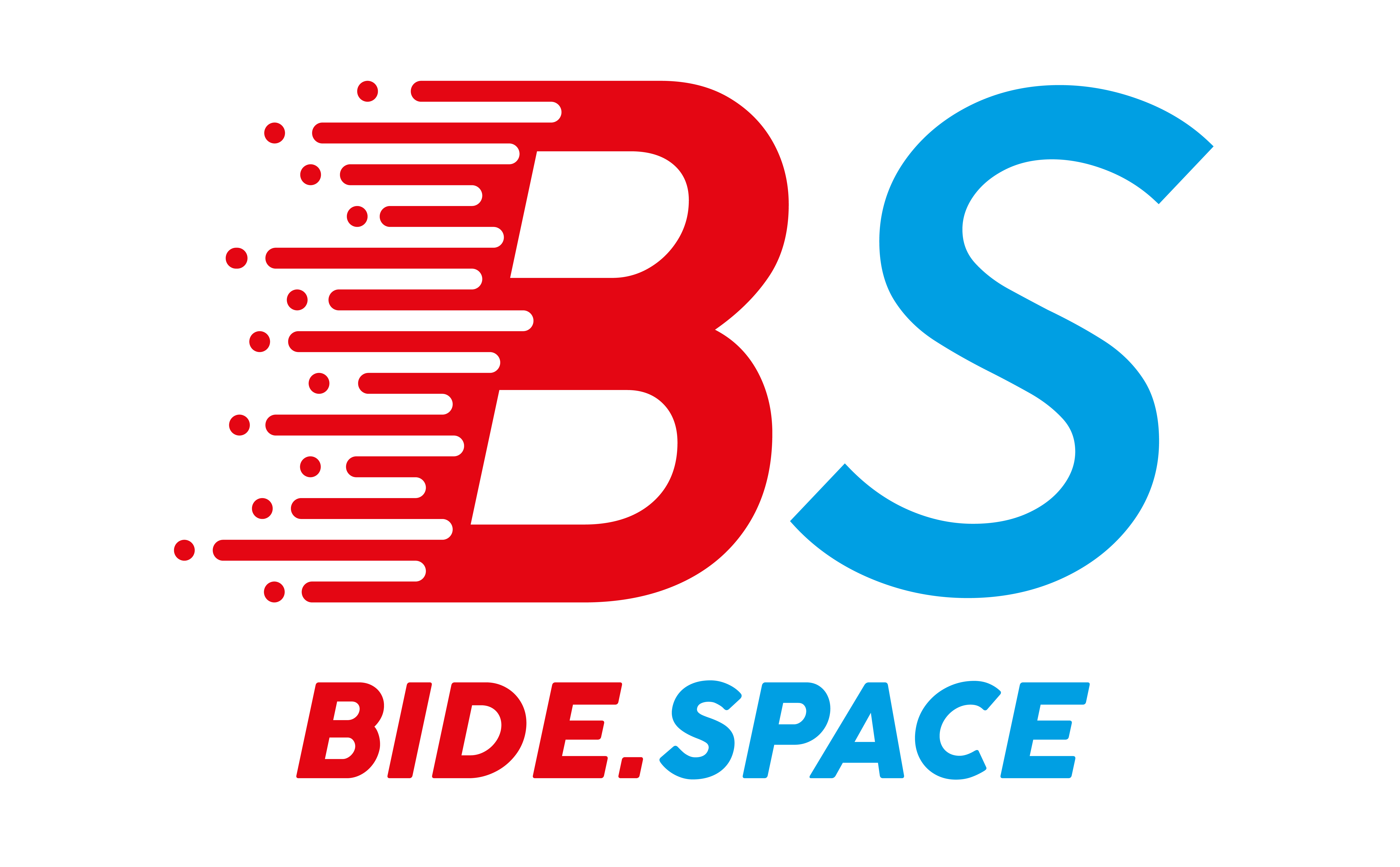
i am Marceline i just founded a new business called bide.space and we're looking for someone that can create a simple logo for our business. i think a letter mark will fit best.
can you help me out?!
i am Marceline i just founded a new business called bide.space and we're looking for someone that can create a simple logo for our business. i think a letter mark will fit best.
can you help me out?!

Nice logo, but I would have tried to place the letter “S” closer to the B at the top part. Looks like there is a big empty space there. Great logo though :)
1 year ago by Maria - Reply
Thanks. the space between the letters was intentional so as to create that feeling of 'space'
1 year ago by C² - Reply
Dallas sandwich
- Report
C² • 1 year ago
Hey,
I ma Rhett, founder of Dallas Sandwich bar. We're looking for someone that can create a simple log for our Sandwhich bar. I think a wordmark would look cool. Would you be interested?
I ma Rhett, founder of Dallas Sandwich bar. We're looking for someone that can create a simple log for our Sandwhich bar. I think a wordmark would look cool. Would you be interested?


really cool
1 year ago by Uduak Imoh Bassey Obioh - Reply
Nice
1 year ago by Umukoro victory emuhowho - Reply
song home
- Report
C² • 1 year ago
It's all about music at home
Hello,
I am Yan, creator of SongHome. We are looking for someone that can design a professional logo for our business. I think a combination mark will fit best with the business. Can you help us out?
I am Yan, creator of SongHome. We are looking for someone that can design a professional logo for our business. I think a combination mark will fit best with the business. Can you help us out?
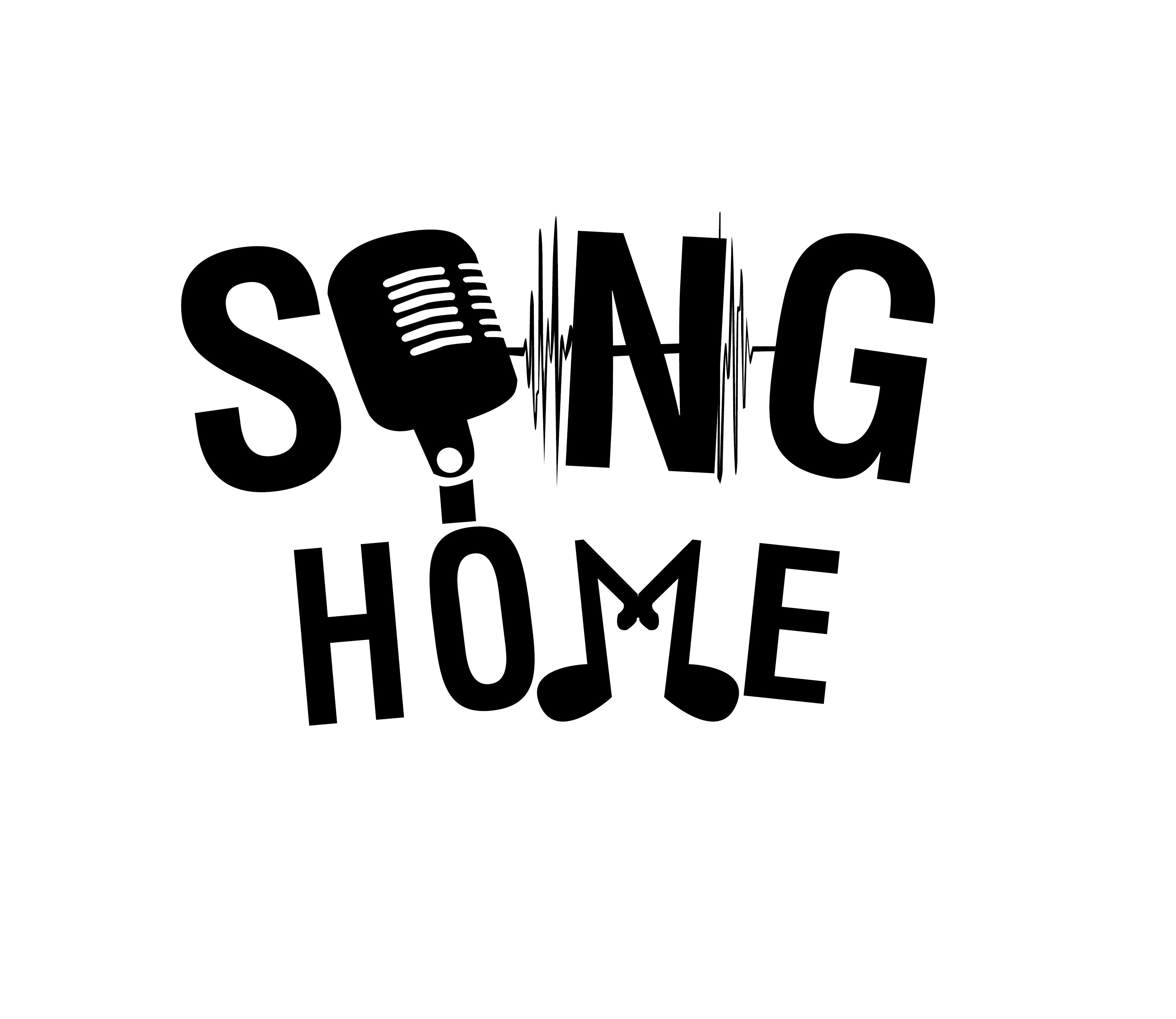

I think this combination mark is too crowded, I can see the idea but the execution needs work. This looks like easy clip art. You should either take out the microphone, or the sound waves around the N. And if you take out the Microphone, then you could take out the notes for the M too because it would looked lined up and for this design I don’t think it’d look nice like that. Lack of color too.
1 year ago by Aubrey - Reply
this is a good
1 year ago by RAFLY - Reply