Maria
Posts
1
Likes
0
Liked Posts
0
Given Feedback
2
Feedback
Elegant and simple, but looks like a logo made from a template of Canva. I would try a different distribution to see if I can make it a little bit more dynamic. But a great logo though :)
1 year ago by Maria
Nice logo, but I would have tried to place the letter “S” closer to the B at the top part. Looks like there is a big empty space there. Great logo though :)
1 year ago by Maria
Posts
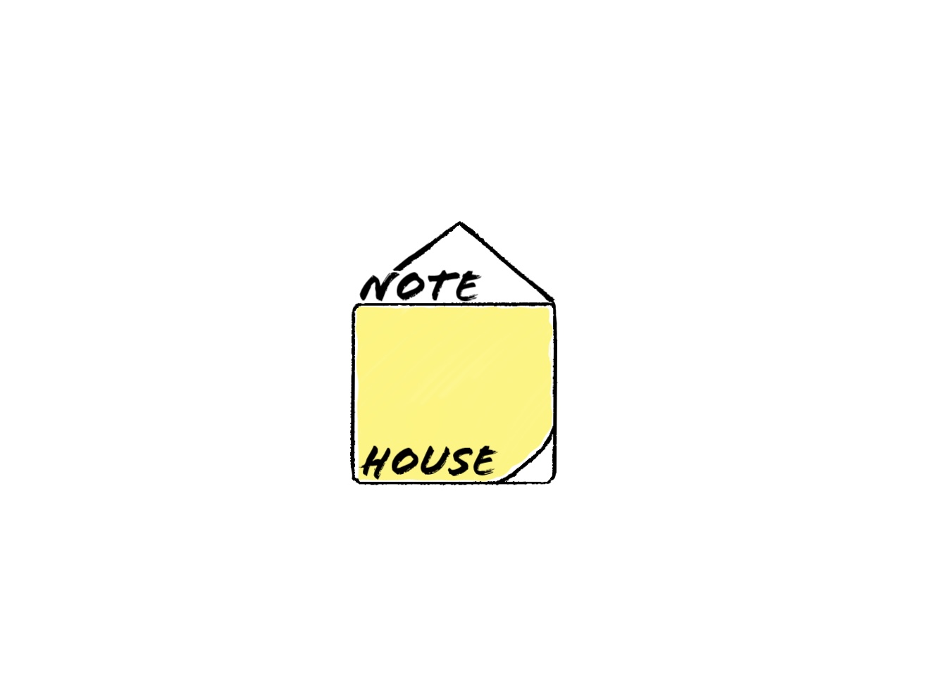
Note house
- Report
1 year ago by Maria
Not sure about the design, I’m not happy with the result. Hope you can help me.
Hi!
I am Malcolm,owner of NoteHouse. I'm looking for someone that can make a good logo for my business. I think a combination mark will fit best with the business. Can you do that?
I am Malcolm,owner of NoteHouse. I'm looking for someone that can make a good logo for my business. I think a combination mark will fit best with the business. Can you do that?
 Like
Like
 1
1
I like how the N is continuing with the roof line - try connecting the E with the line in the bottom right corner and add a few details like a window or chimney. I think it is a really good concept!
1 year ago by Anne Claire Bufkin - Reply