Uservice
- Report
Kevin • 1 year ago


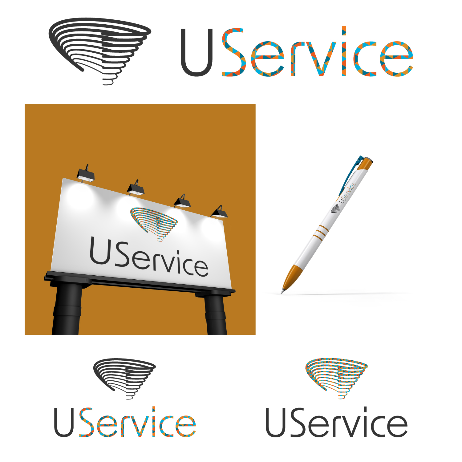
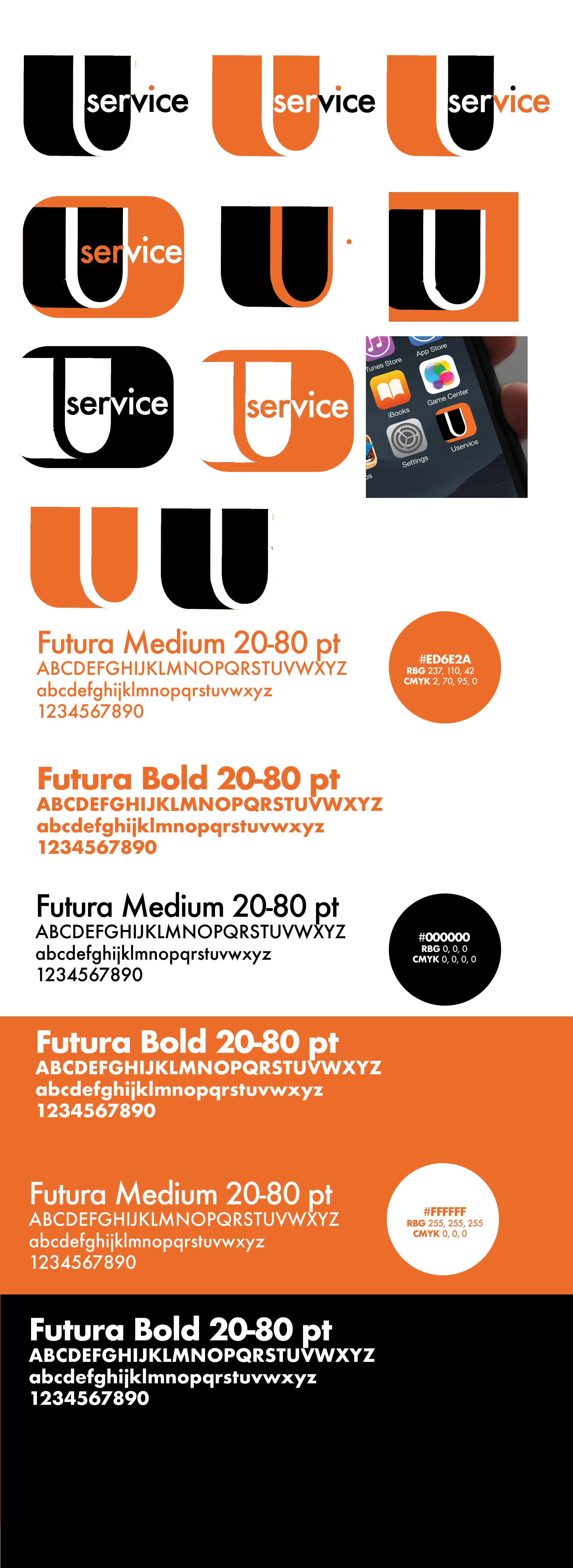
I think that the concept of the icon is great (I like the right one in the 2nd row the most, after that the middle one in the 3rd.) but to me it looks like you either didnt put much effort in the designing process or didnt know how to propperly do it, sorry if it sounds hard but it seems (from the given picture) pretty unprofessional, - the random dots and steps in the curve of the "U", the not even lining of the "U". I like the thought of it though! Give it more time :)
1 year ago by Ian - Reply
Appreciate it, it was a first time trying this. Learned a lot so far
1 year ago by Kevin - Reply