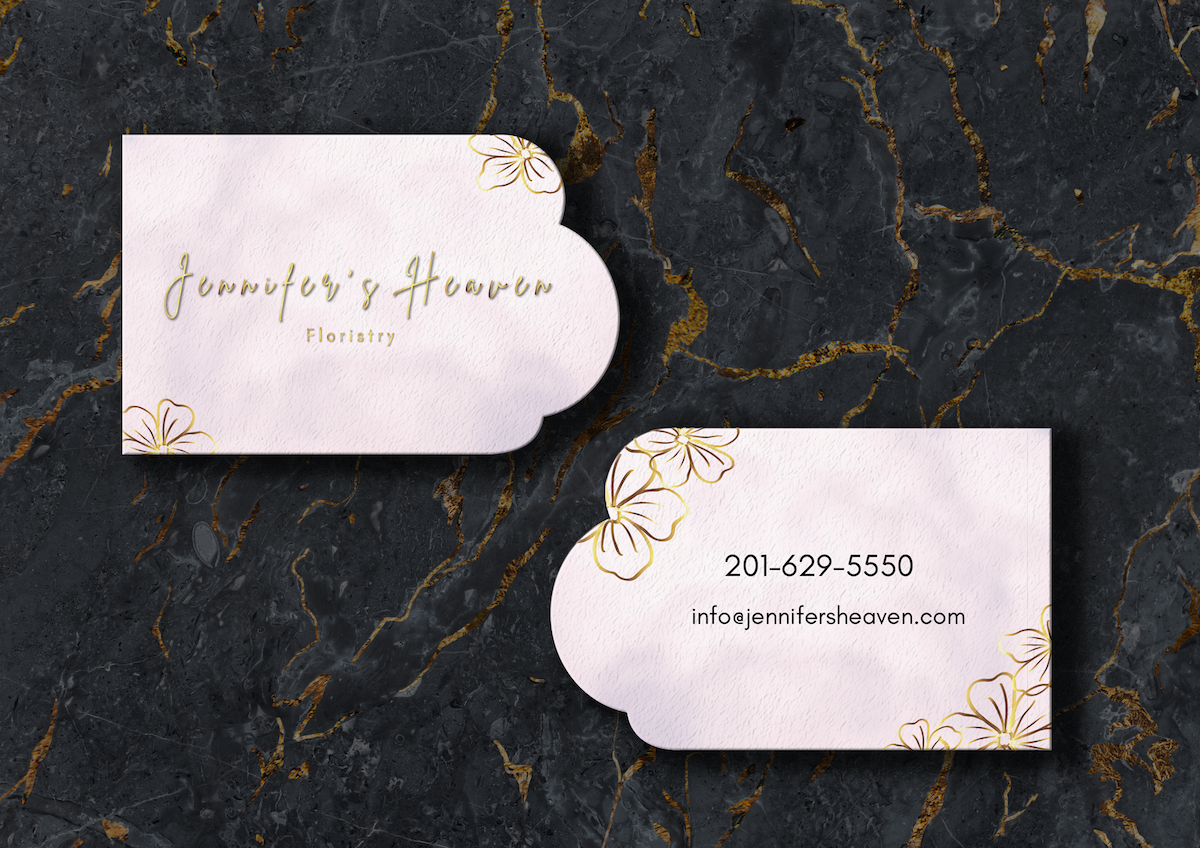
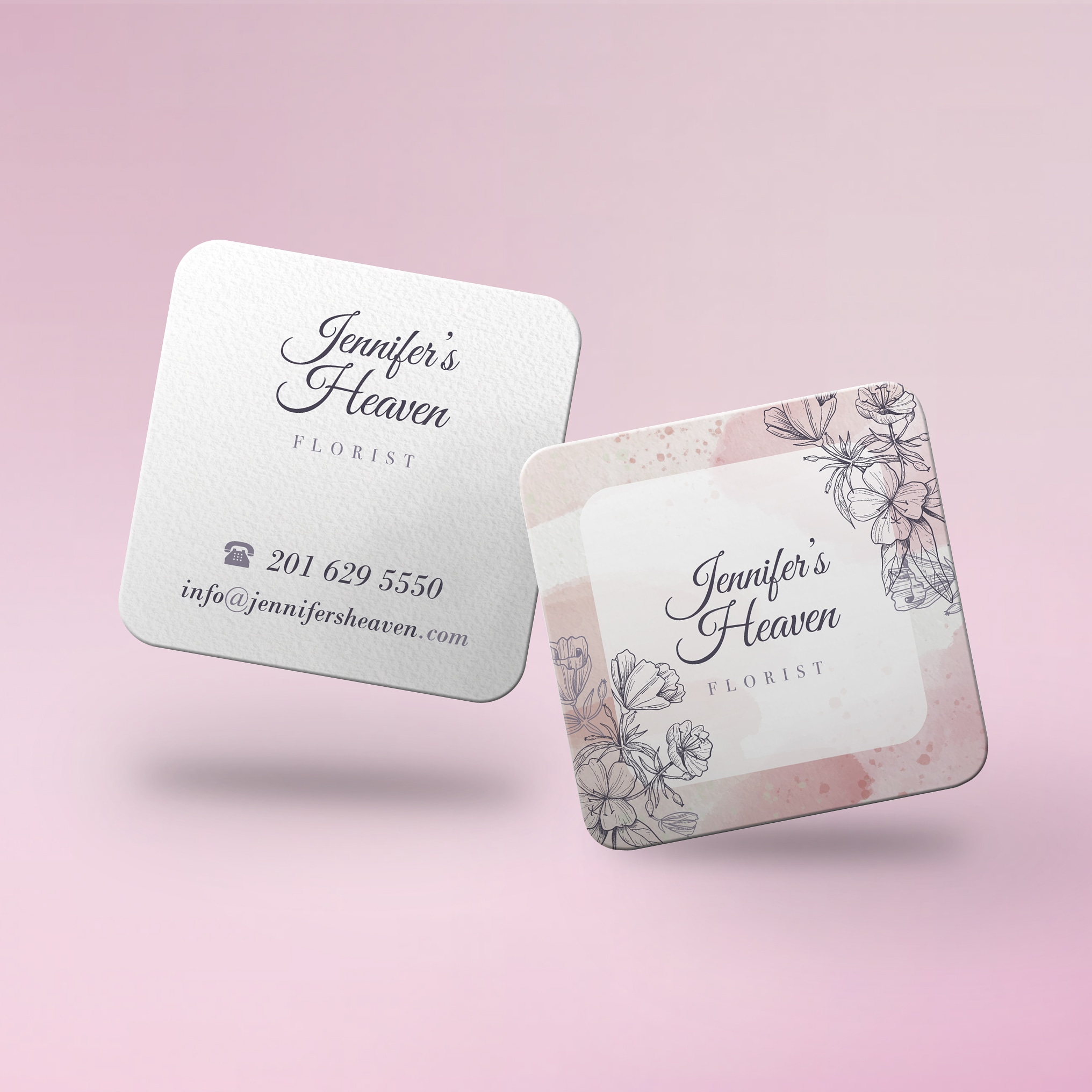
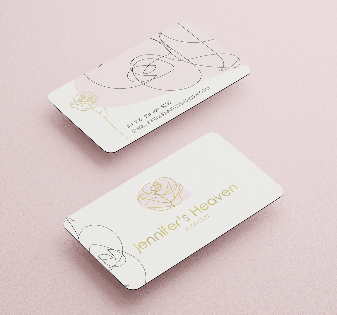
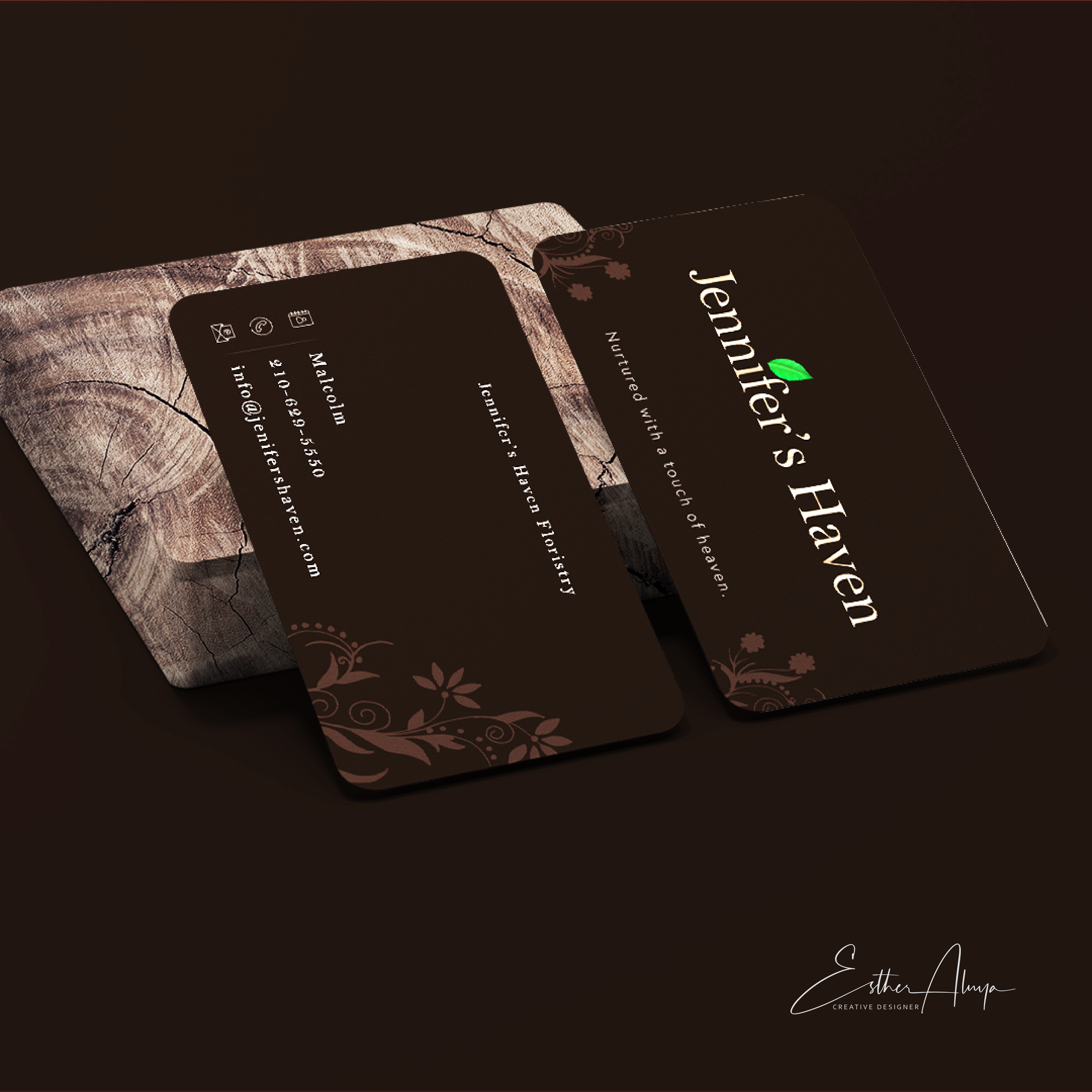
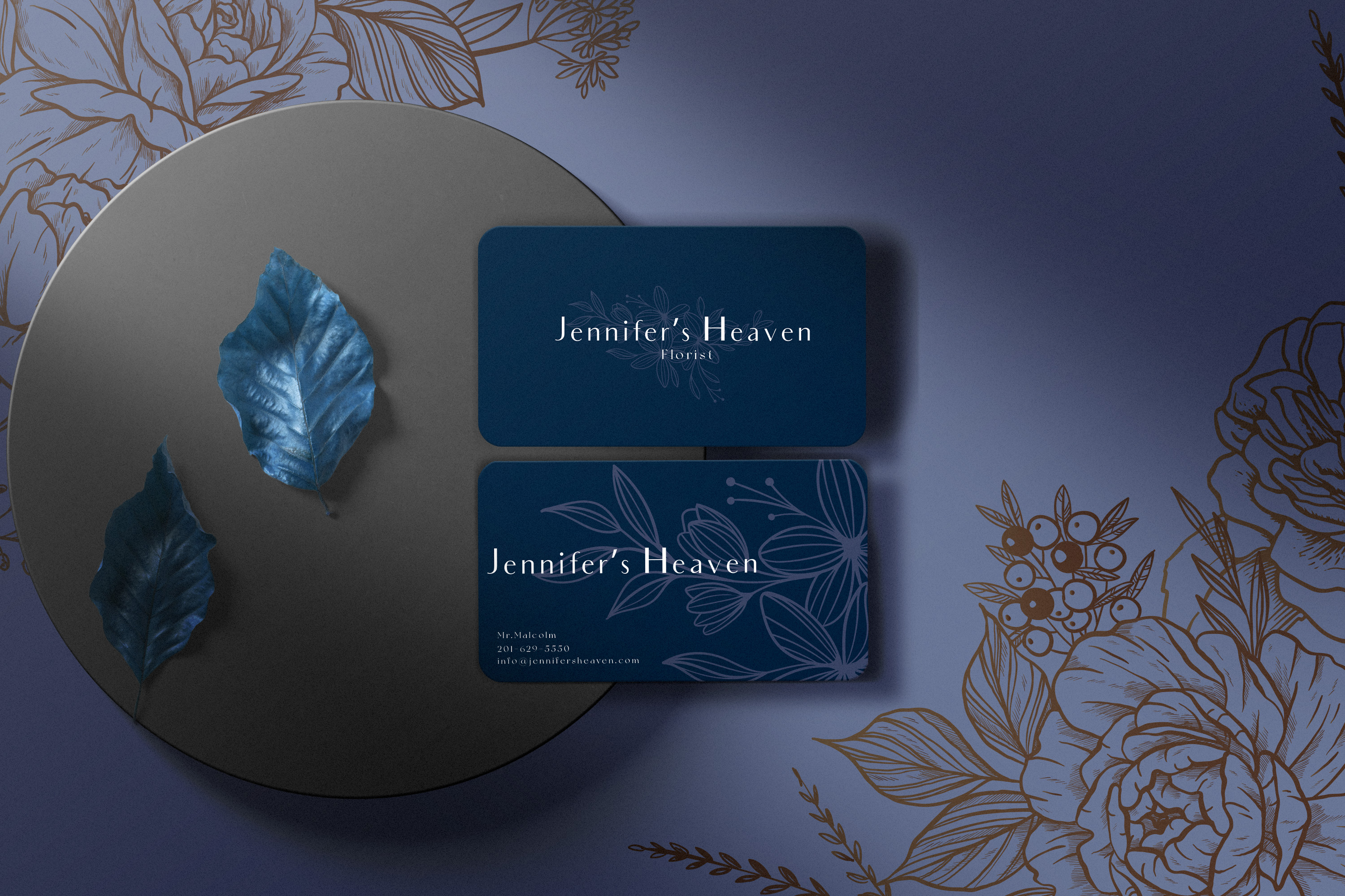
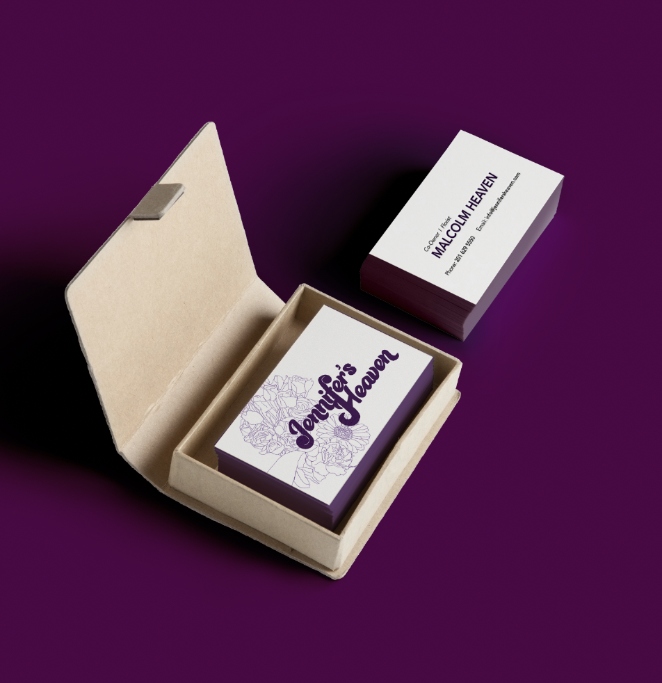
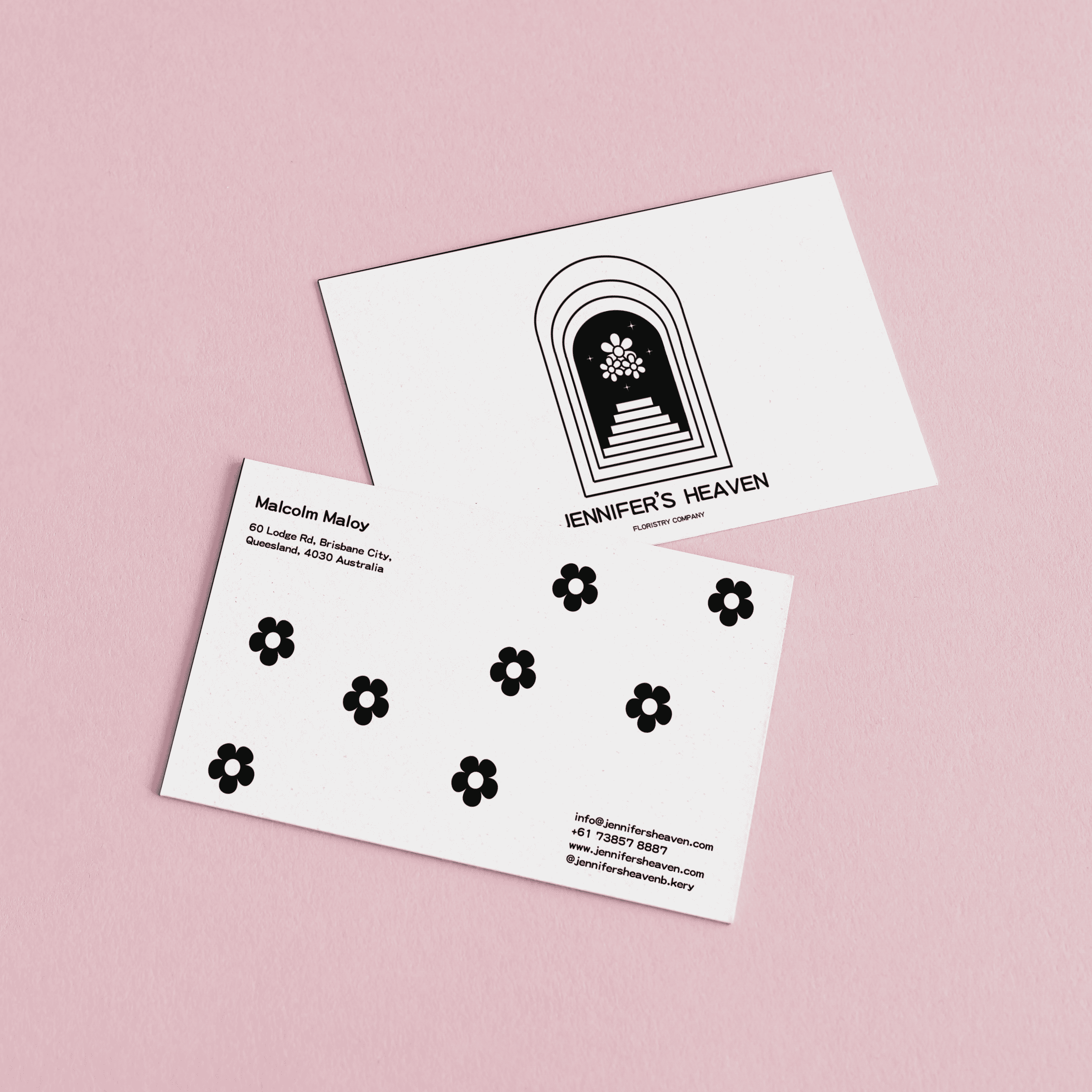
Business Card Design (Jennifer's Heaven)
- Report
1 year ago by Madelynn
I'd love to receive some feedback on this! :)
Jennifer's Heavengraphic
 8 Likes
 6
6
I like that you went for b&w only on this! The illu. seems kinda mysterious but inviting, clean and its sure to be understood. I like the amount of flowers placed on the back - overall the design looks very good! Maybe you could make one or two more flowers to get more variation going on and also (not sure) you could try using a different font for the small text. other than that great job!
1 year ago by Ian - Reply
Thanks Ian, I really appreciate your feedback! Would def look into it and make one or two flowers to see how it goes! And also changing the text as well! :)
1 year ago by Madelynn - Reply