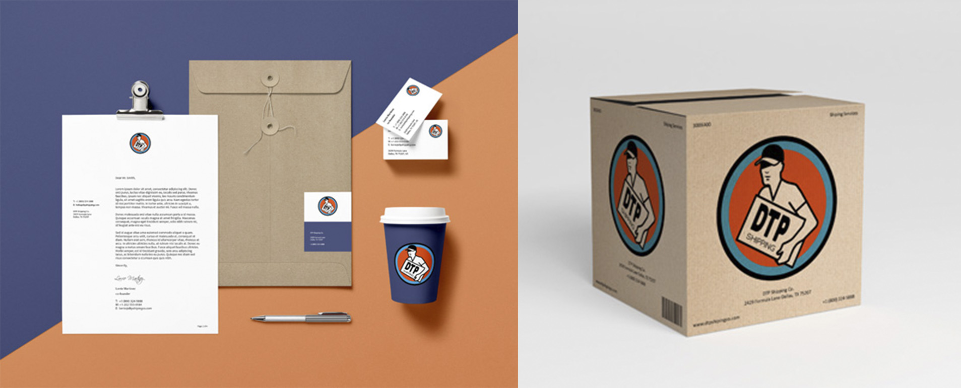
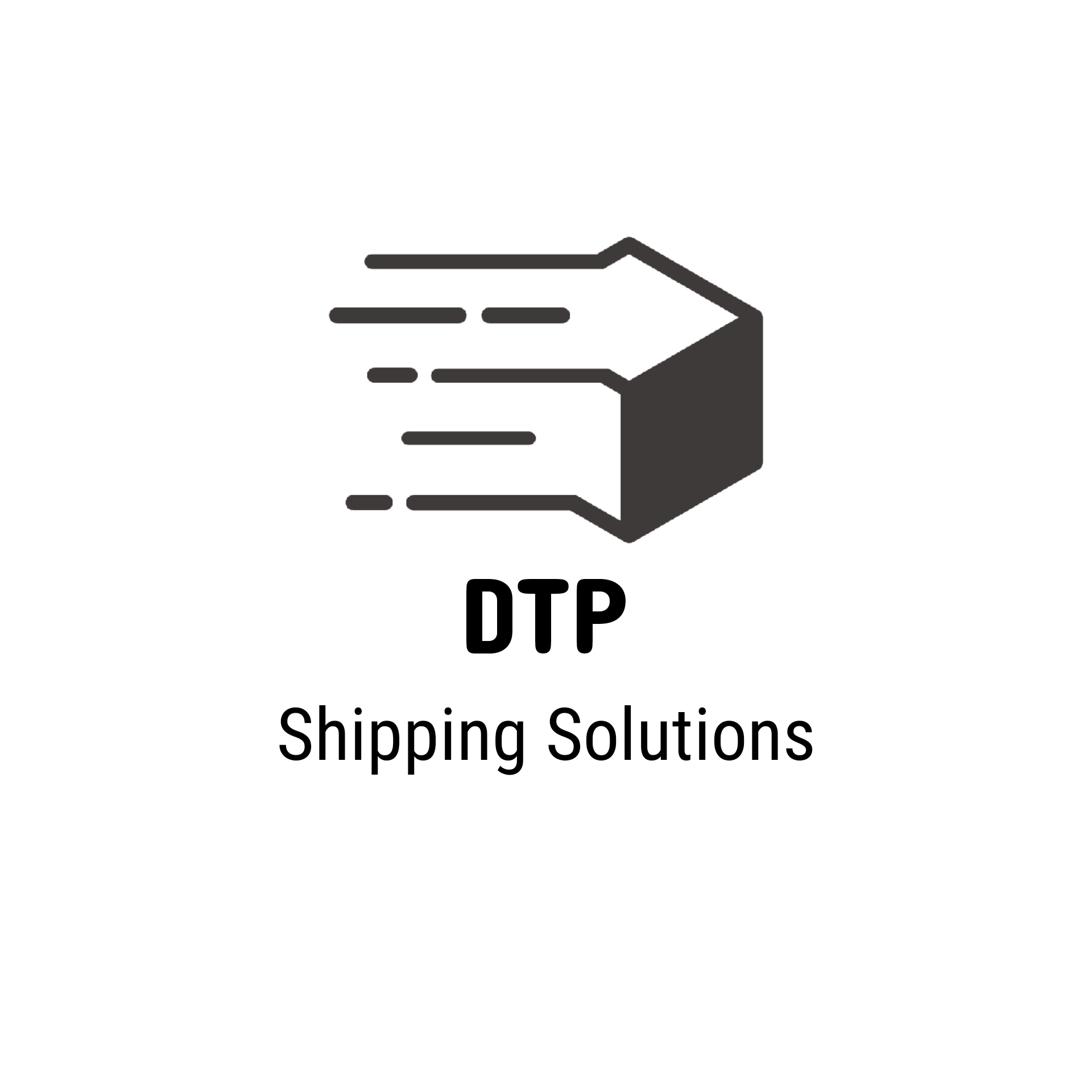
DTP Shipping solutions
- Report
Rachel • 1 year ago
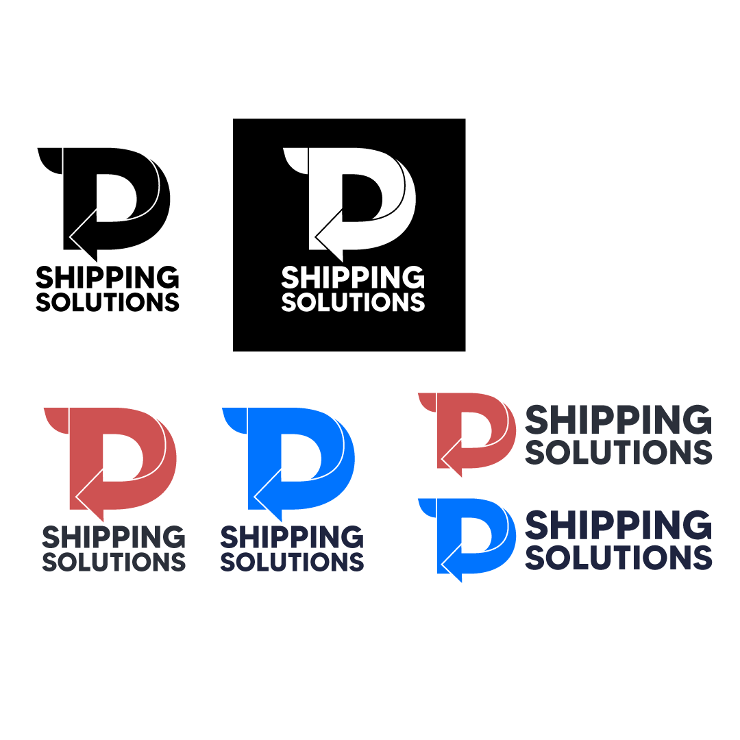
logo design DTP


The design technique is really solid here. Even your choice of font for the lettering and the "G" having an arrow. Really cool. If i really had to complain it would be that the actual icon doesn't read the full "DTP" to me. I get a solid "D" at most and maybe a "P" but that "T" gets lost. Maybe playing with the T's handle abit to make it stand out more, or maybe dont cut the "T" wing from the "D". I am not sure. Happy Designing!
1 year ago by Daryl - Reply