Daryl
Posts
1
Likes
2
Liked Posts
32
Given Feedback
16
Feedback
This is very solid! Great work!
1 year ago by Daryl
Being that this is a Business card that are typical small, i feel like the font sizing should be bumped up and made much bigger. You have some space to play with. Happy Designing!

1 year ago by Daryl
I would like to see how it would look if "Diner" was wrapped alone the bottom of the plate. Solid design. Happy Designing!
1 year ago by Daryl
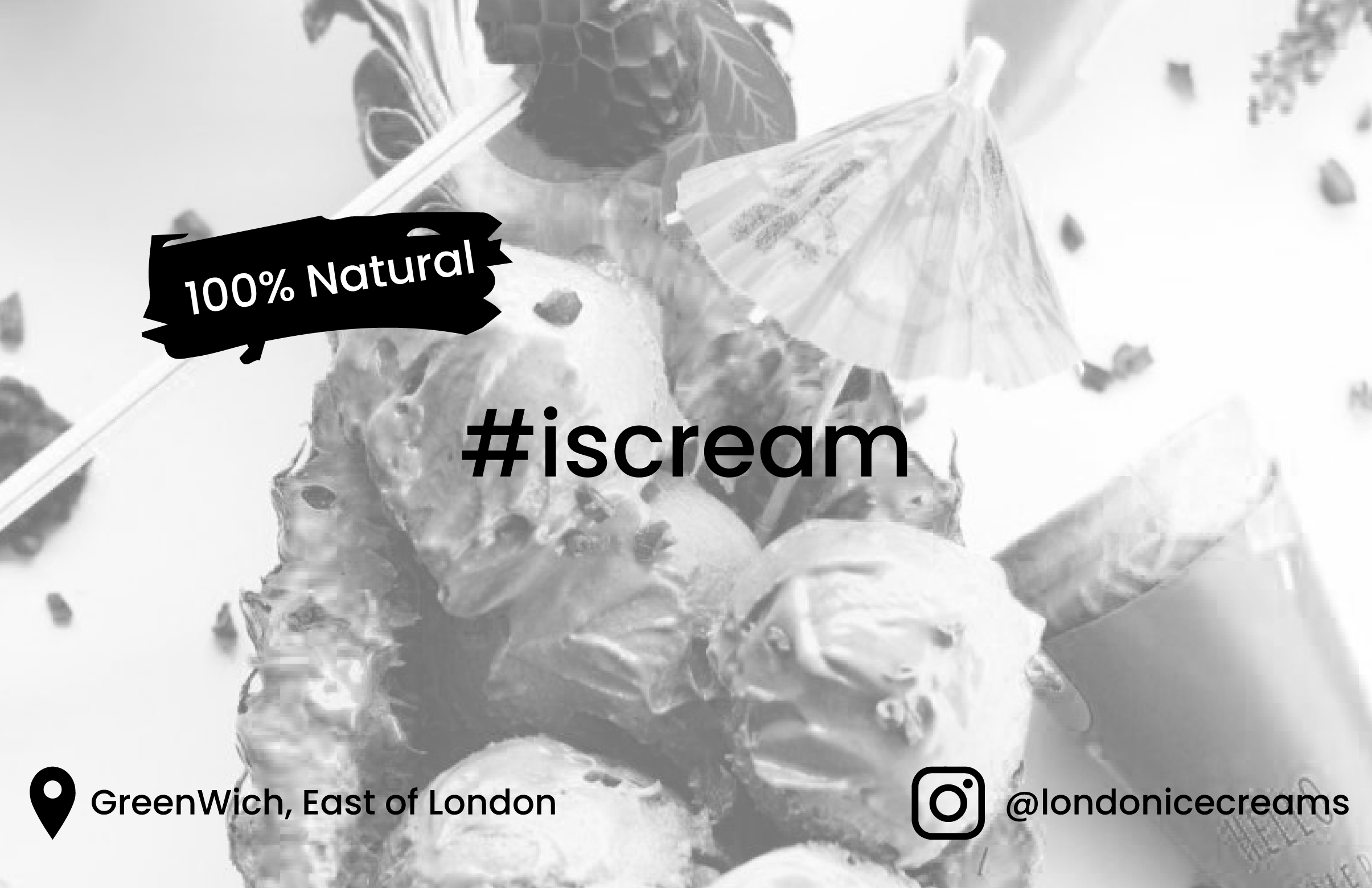
Pretty cool, Don't be afraid to take up more space with the elements that matter! The Hashtag and the "100% Natural" could be alil big to help information stand out a little more from the background. Also i like the monochromatic approach but maybe a splash of color on some of the text/elements of the foreground design would help make the info pop from the background as well. Happy Designing!
1 year ago by Daryl
Zoom out of your image and make it really small. Can you still read the font? Better yet, Can you make out what the logo is suppose to represent? prehaps making the text in the middle (Wine Time) a little thicker so its easier to read. Happy Designing!
1 year ago by Daryl
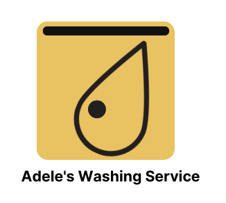
It's very abstract! Prehaps adding an abstract depiction of water or a wave would help this read better. Maybe the symbol could be some sort of depiction of a cleaning tool. I am not sure what your logo is about. It looks like a water drop, If so, thats a great place to start off. Unfortunately the prompt is very vague and doesnt give you enough direction to hone in on. But that being said, it does leave you open to a bunch of possibilties on a creative specturm. You can be abstract and creative but try to keep it in the theme of the bussiness. Happy Designing!
1 year ago by Daryl
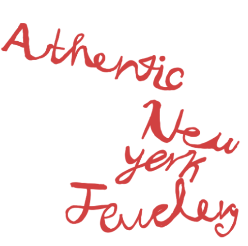
Fonts could be your friend here! Taking a crack at trying to pull an authentic calligraphy look by hand is admirable but hard work that takes a lot of practice! Luckily there are tons of fonts out there that definitely would help. Try picking a script font or a font that has the calligraphy look and edit the width and spacing of the letter, strokes and spacing to get a nice desired affect. Happy Designing!
1 year ago by Daryl
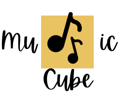
This is very simple and cool. Probably adding some negative space between the box and the "C" of the cube could help push this design alil further. Also playing around with the font size with the "MUIC" would help break up the design and make it even more interesting. Happy Designing!
1 year ago by Daryl
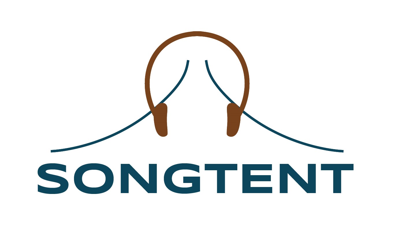
I think they meant making the word "song" brown and word "tent" blue
1 year ago by Daryl
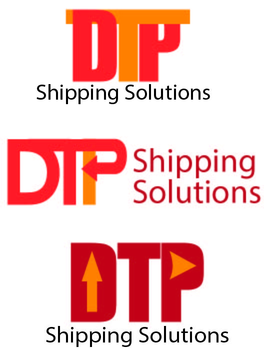
The second logo is probably the strongest one. You would need to just clean up some of the lines on top of the "DTP" logo. You can also try out a different sans font for the "Shipping Solutions" Happy Designing!!
1 year ago by Daryl
The design technique is really solid here. Even your choice of font for the lettering and the "G" having an arrow. Really cool. If i really had to complain it would be that the actual icon doesn't read the full "DTP" to me. I get a solid "D" at most and maybe a "P" but that "T" gets lost. Maybe playing with the T's handle abit to make it stand out more, or maybe dont cut the "T" wing from the "D". I am not sure. Happy Designing!
1 year ago by Daryl
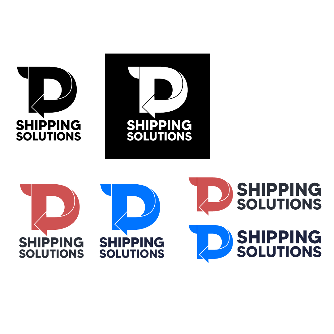
This is a good start! A lot of pictorial logo marks have strong silhouettes. Something to think about when tackling a stand alone logo icon; how would this logo icon look solid black or in black is white? Could i recognize this company from just the silhouette alone.
I am assuming its a pizza slice on a plate? or maybe a box? playing around and adding more negative space between the grey area and the pizza slice might help your design. Also playing around with the proportion of the pizza slice relative to grey rectangle might help separate the two shapes to make this read better. Maybe dropping the box in the back entirely and adding something relating to San Diego. Happy Designing!

1 year ago by Daryl
This is solid and straight to the point. Good job

1 year ago by Daryl
Cool design
1 year ago by Daryl
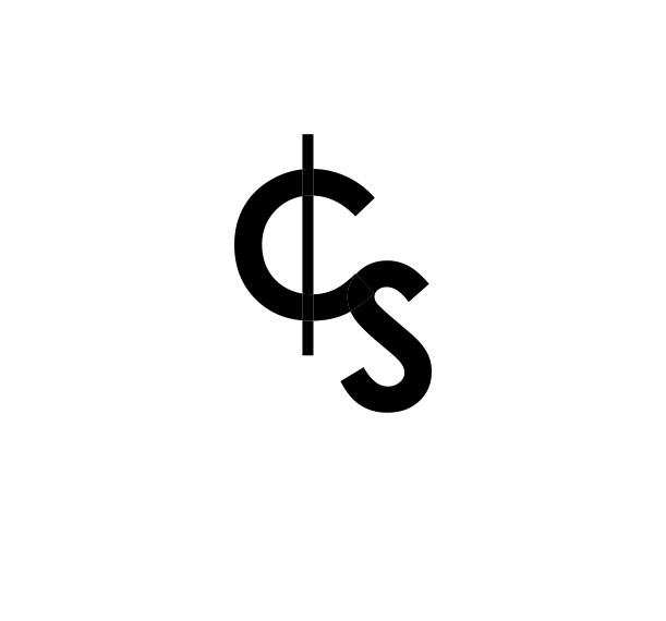
Cool design! its simple and i love the "c" in relation to the money. My only critic would be maybe adding some some sort of white space or negative space where the bottom of the "C" meets the "S". As of now the area just seems unfinished. I get that the "C" is supposed to flow into the "S" but the letters get alil lost. I think adding some sort of break but still keeping the curve and flow would really help the letter stand out as-well help make the silhouette of the logo more interesting. Maybe some sort of negative space where the line meets the C as well . Happy Designing!!
1 year ago by Daryl
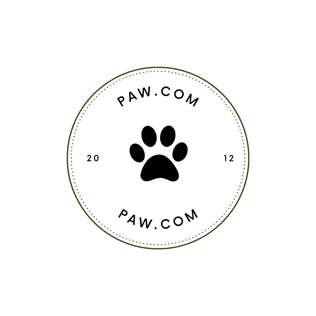
Great Start. You have a-lot of white space to play with. Perhaps sizing up the text and mainly the paw print in the center to help fill up more of the empty white space; being that the paw is in the center it can use more of the attention. Making it bigger would definitely help
1 year ago by Daryl
Posts
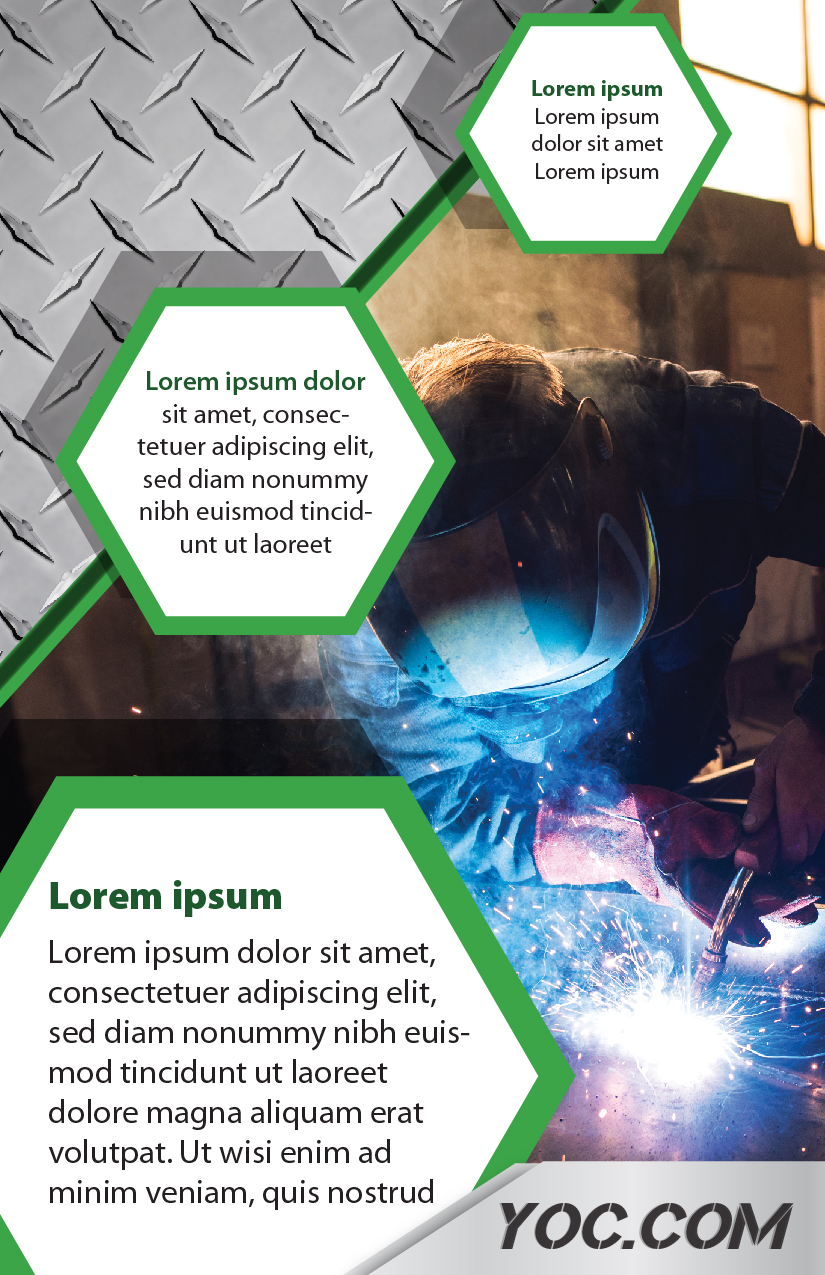
YOC.COM
- Report
Daryl • 1 year ago
Hey!
I am Eilene, founder of yoc.com. For a while now, I've been looking for a good designer for my steel production company. I would like a simple flyer for an event. We primarily use the color green (#3ba521). Can you help us out?
I am Eilene, founder of yoc.com. For a while now, I've been looking for a good designer for my steel production company. I would like a simple flyer for an event. We primarily use the color green (#3ba521). Can you help us out?


This is really nice! Perfectly fits the description
1 year ago by Victor - Reply
I like this design concept, I feel like the text could be replaced with informational dummy text
1 year ago by Choice Pro Media - Reply