All Feedback Posts
![]()
Jennifer's Heaven
Jennifer's Heaven
- Report
Lia Maveric • 2 years ago
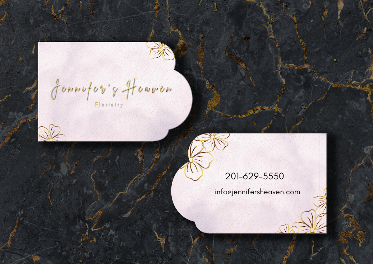
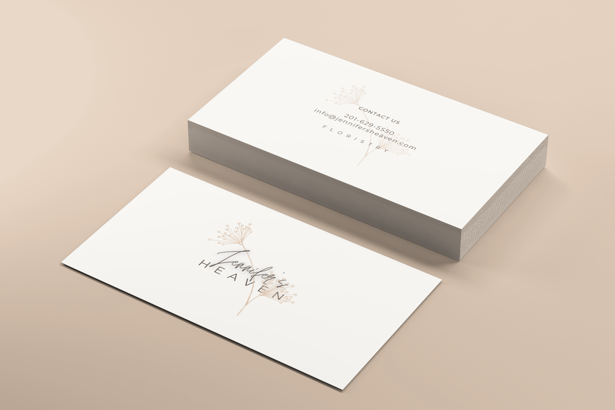
Jennifer's Heavengraphic
I should have made the corners round but I had to pay for a round corner business card mockup... Oh well 🤷♀️ I think you all get the idea.


This is so elegant! It looks great!
2 years ago by Joanna - Reply
It is good looking with sharp edges. With round edge you need already a bit other font beside Jennifer's name. And maybe just i see it but, ilustration in backgr is to thin for a floristry company. No doubt is beautiful in this composition but, is having a vibe more of a Bio-Cosmetic-Product..-ish). In general - nice touch!
2 years ago by Aurel - Reply
I think it's beautiful. Well done
2 years ago by Svetlana Shebika - Reply
Thank you so much!
2 years ago by Lia Maveric - Reply