Shoptacle
- Report
2 years ago by swati
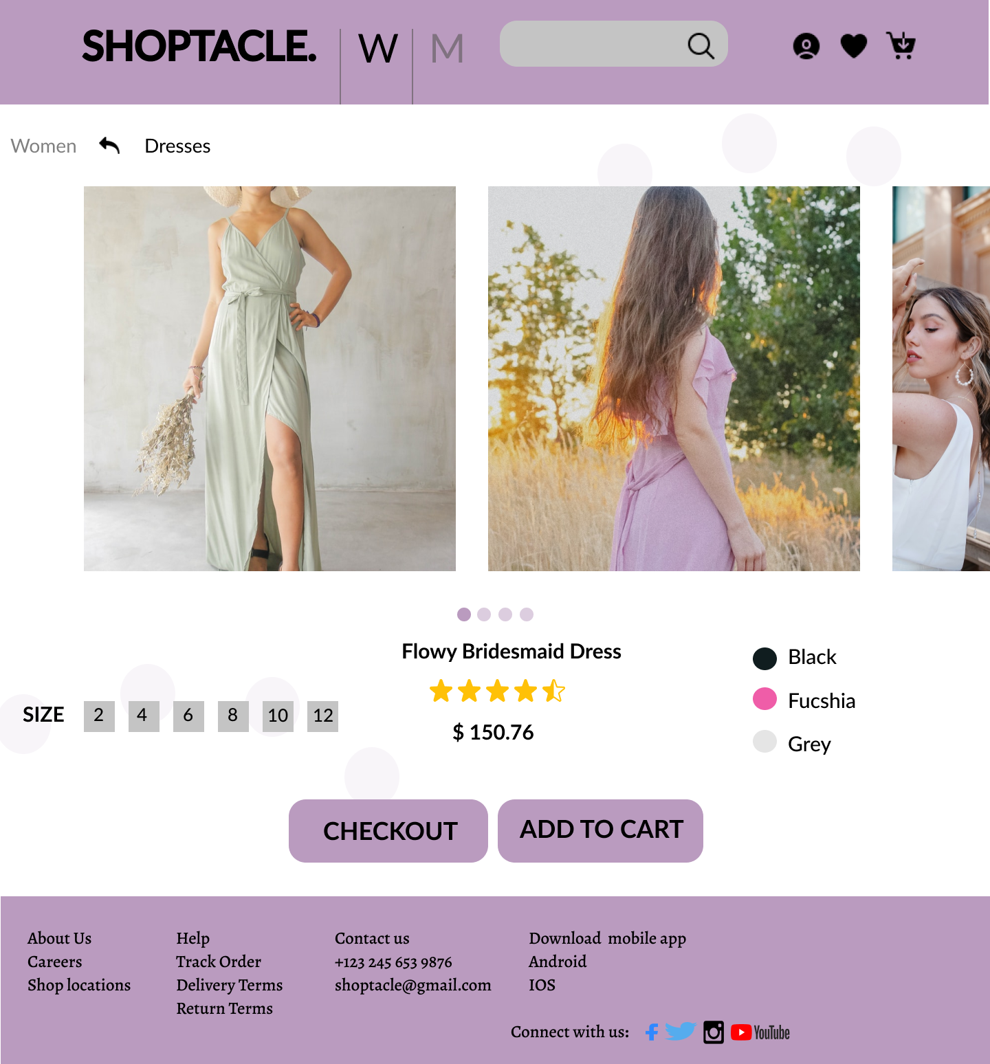
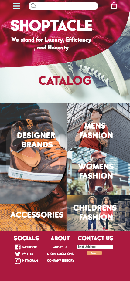
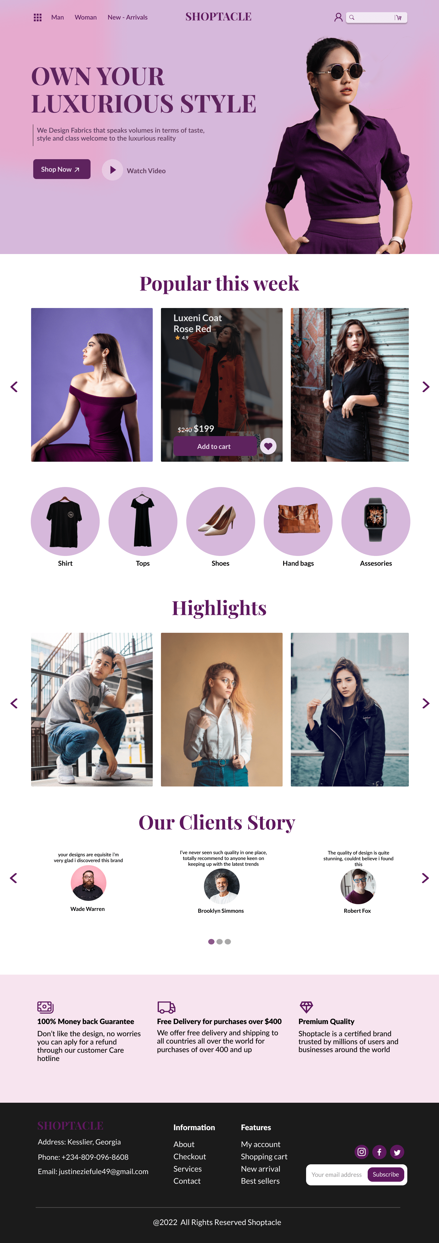
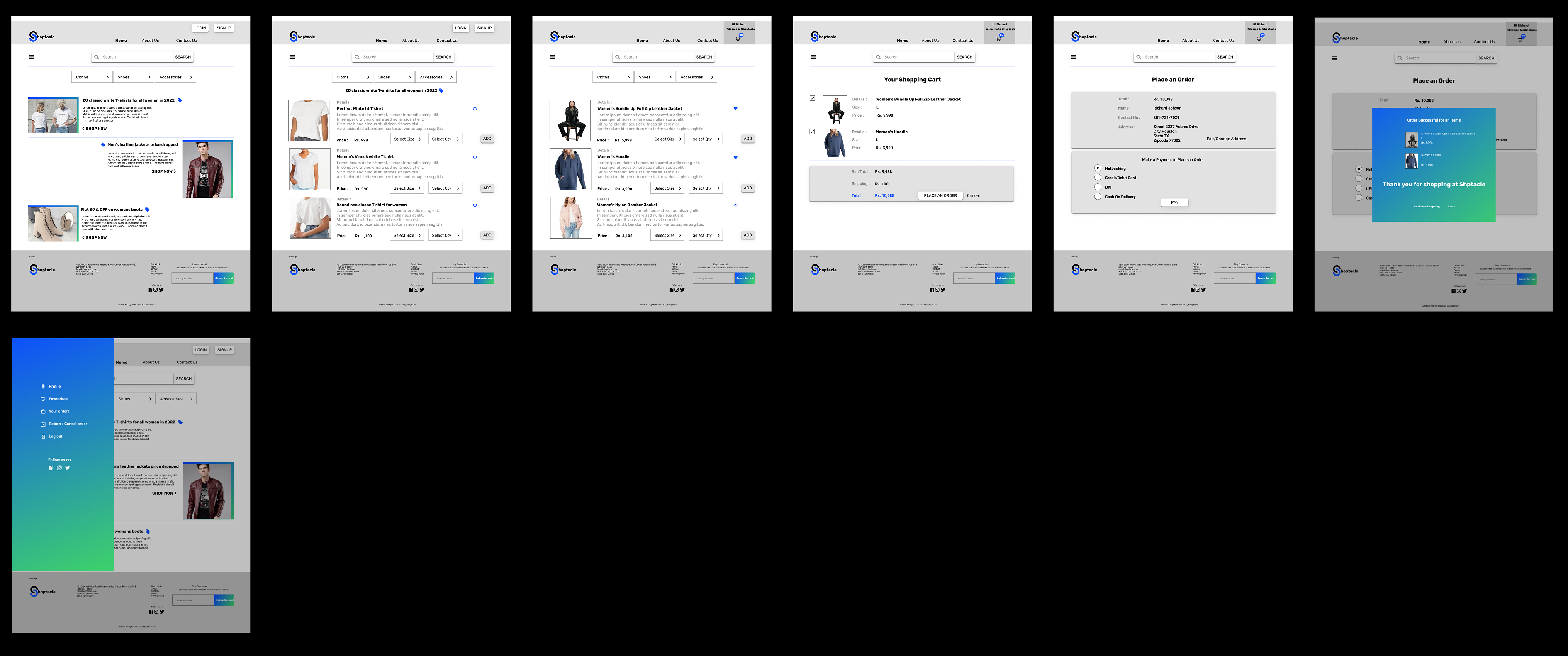
Shoptacle, is a large clothing store website. I have added a large selection of designer clothing, designer shoes, and accessories . To maximize offers and regulate customer's needs better i have added a Home page showing offers and discounts.
To make this actually work, i have designed a way to easily and
effectively search through clothes, shoes, and accessories by the list view button and place an order on our new webshop.
To make this actually work, i have designed a way to easily and
effectively search through clothes, shoes, and accessories by the list view button and place an order on our new webshop.
 1 Like
 1
1
I think your design has a lot of potential, but there are a few areas where it could be improved. For example, adding more colors could help to make the design more visually appealing and engaging. Additionally, I noticed that some of the icons were a bit hard to find and could be made more prominent or recognizable. Finally, using more vibrant colors could help to make the design pop and grab the viewer's attention. Overall, I think these changes could really enhance the effectiveness of your design. What do you think?
11 months ago by hana - Reply