hana
Posts
0
Likes
0
Liked Posts
0
Given Feedback
4
Feedback
love the simplicity of it

11 months ago by hana
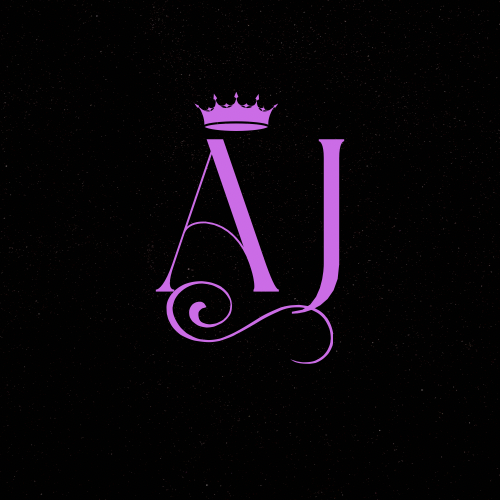
I think your logo has potential, but there are a few areas where it could be improved. Firstly, I believe that using different colors could help to make the logo more visually interesting and engaging. Additionally, I noticed that some of the icons used in the logo are not very representative of the luxury and elegance associated with jewelry. Using icons that are more related to jewelry such as diamonds, gems, or gold could help to better convey the brand's message. Overall, I think these changes could really enhance the effectiveness of your logo.
11 months ago by hana
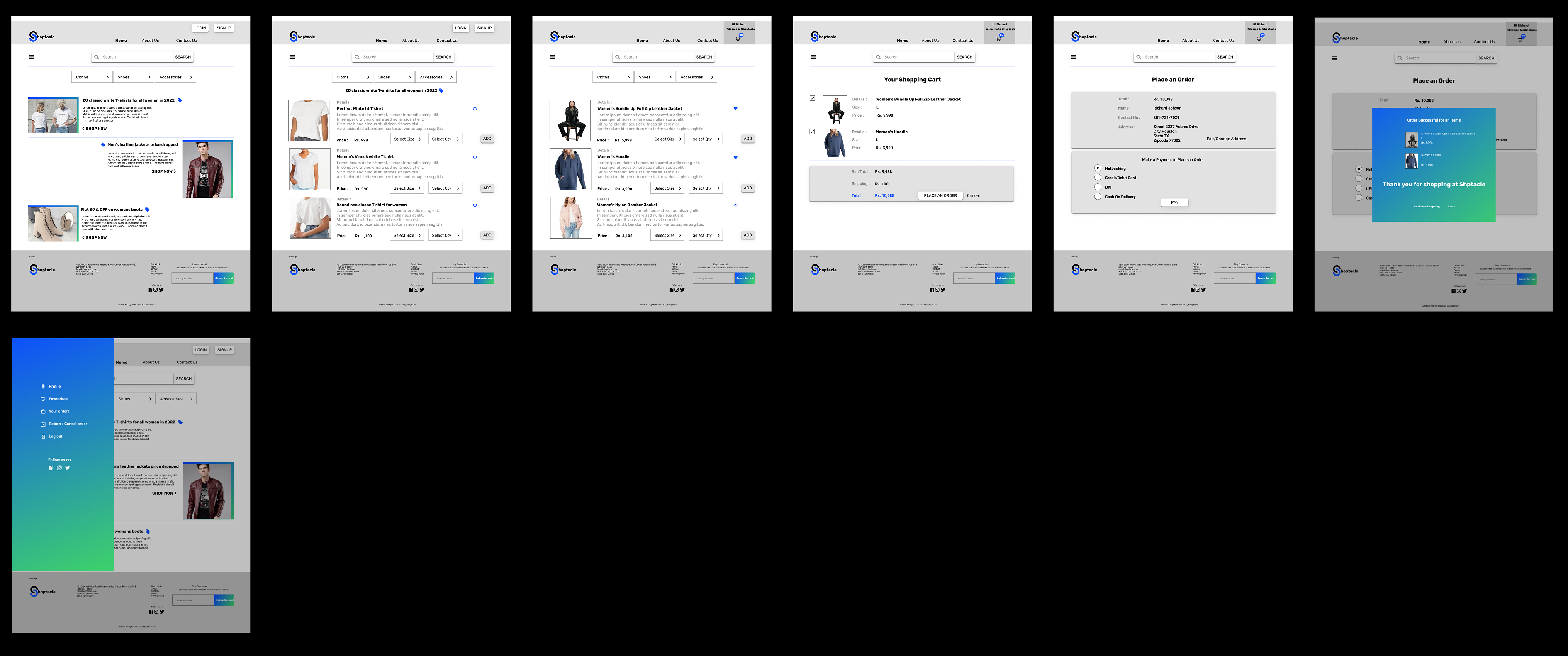
I think your design has a lot of potential, but there are a few areas where it could be improved. For example, adding more colors could help to make the design more visually appealing and engaging. Additionally, I noticed that some of the icons were a bit hard to find and could be made more prominent or recognizable. Finally, using more vibrant colors could help to make the design pop and grab the viewer's attention. Overall, I think these changes could really enhance the effectiveness of your design. What do you think?
11 months ago by hana
I can see that you have some great ideas. However, I think there is room for improvement in terms of the use of color and other design elements. Perhaps adding more colors and experimenting with different design elements could help enhance the overall look and feel of the design.

11 months ago by hana