swati
Posts
5
Likes
5
Liked Posts
31
Given Feedback
9
Feedback
I think white icons on green menu bar rectangle in the bottom page would look more attractive
2 years ago by swati
Nice and Simple :-)

2 years ago by swati
Your logo design is very beautiful. But in my suggestion, its getting hard to recognize letter e.

2 years ago by swati
Your business card design really looks great. But in my suggestion while displaying it please show it in one way so that people can read it and can see your work.
2 years ago by swati
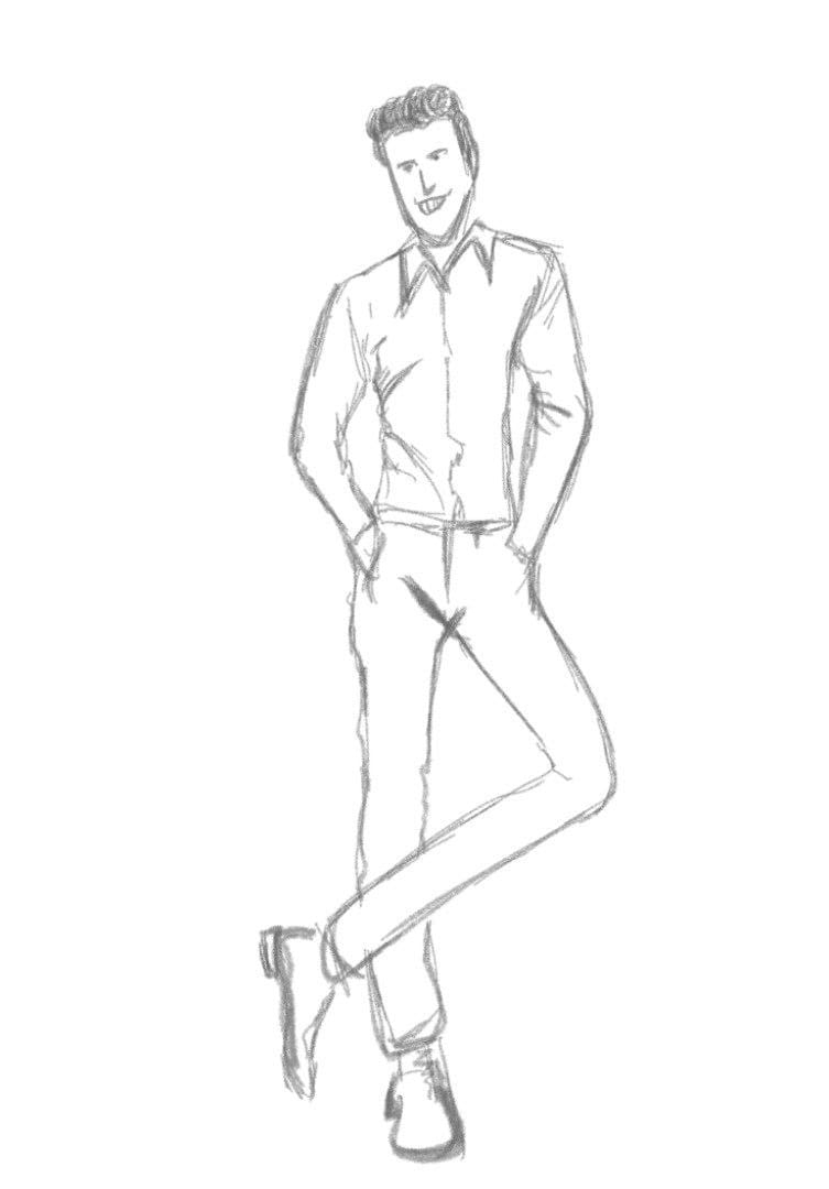
Your illustration of a standing man looks really good. In my suggestion you just need to sharpen the necklines of a man. Keep it up :-)
2 years ago by swati
thank you for your feedback.

2 years ago by swati
Nice work

2 years ago by swati
Card's look is really beautiful.
2 years ago by swati
thank you so much
2 years ago by swati
Posts
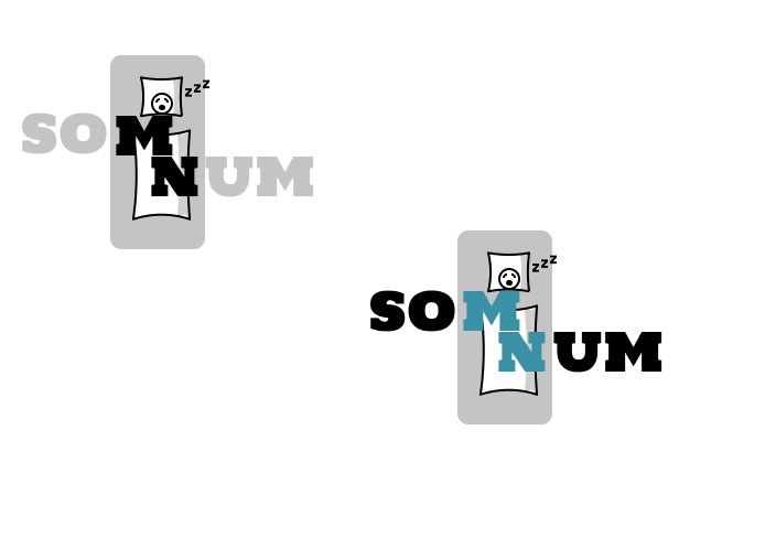
Som Num Logo Design
- Report
swati • 2 years ago
Som-Numlogo
 Like
Like


It is nice
1 year ago by Janine Benavidez - Reply
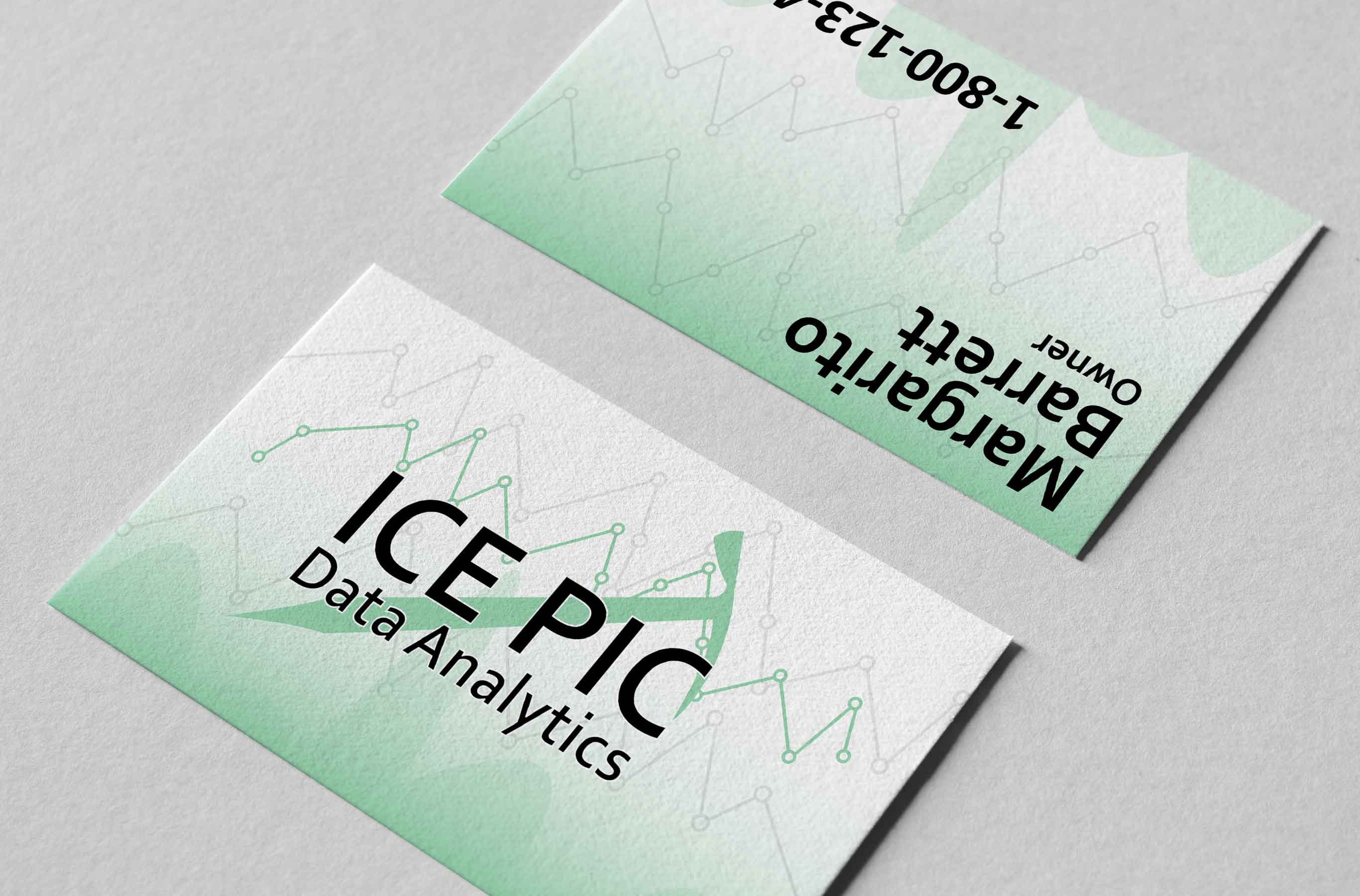
DTP Shipping Solutions
- Report
swati • 2 years ago
DTP Shipping Solutions, a shipping company based in Dallas, Texas.
I have created three versions of the logo so you can test them all out and see which one works best and which one people like most.
I have created three versions of the logo so you can test them all out and see which one works best and which one people like most.
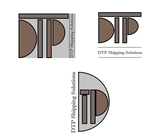

i really like this work, it's very creative
1 year ago by abdellah - Reply
Shoptacle
- Report
swati • 2 years ago
Shoptacle, is a large clothing store website. I have added a large selection of designer clothing, designer shoes, and accessories . To maximize offers and regulate customer's needs better i have added a Home page showing offers and discounts.
To make this actually work, i have designed a way to easily and
effectively search through clothes, shoes, and accessories by the list view button and place an order on our new webshop.
To make this actually work, i have designed a way to easily and
effectively search through clothes, shoes, and accessories by the list view button and place an order on our new webshop.
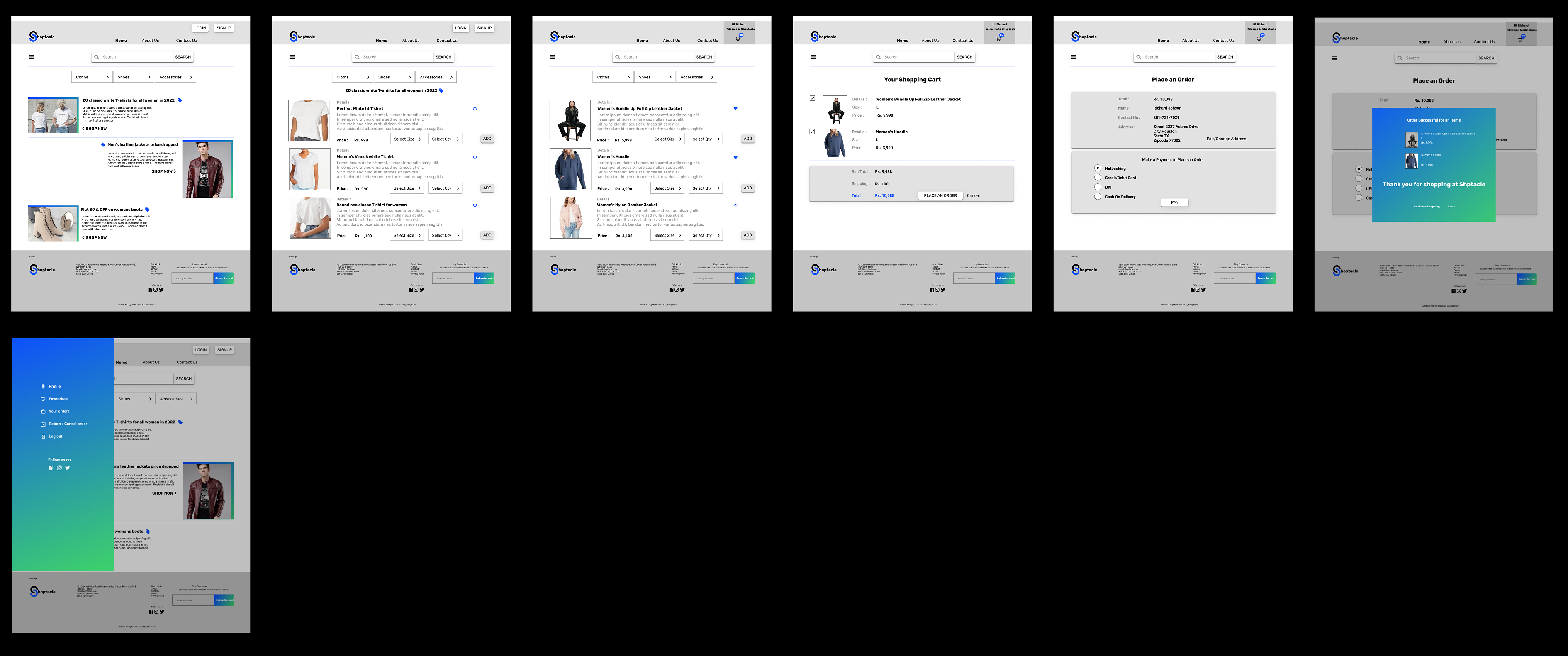

I think your design has a lot of potential, but there are a few areas where it could be improved. For example, adding more colors could help to make the design more visually appealing and engaging. Additionally, I noticed that some of the icons were a bit hard to find and could be made more prominent or recognizable. Finally, using more vibrant colors could help to make the design pop and grab the viewer's attention. Overall, I think these changes could really enhance the effectiveness of your design. What do you think?
1 year ago by hana - Reply
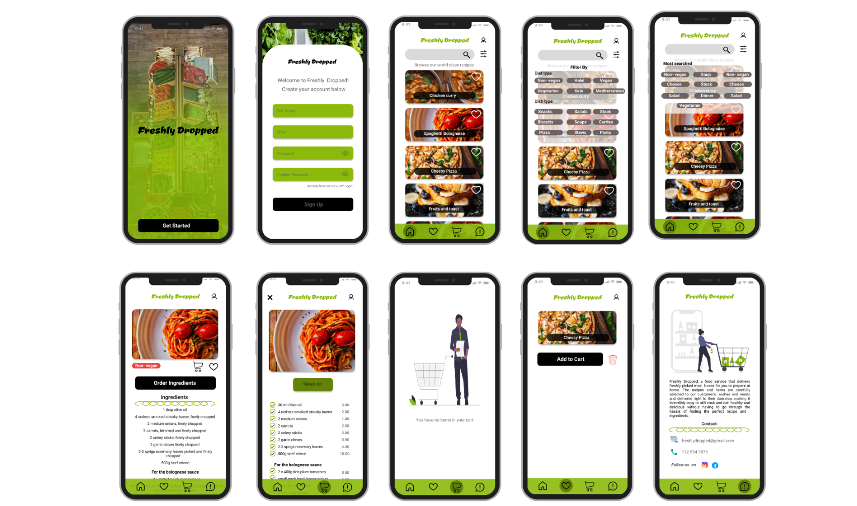
Freshly Dropped
- Report
swati • 2 years ago
On the homepage, I have added options like breakfast menu's , main course, desserts, snacks menu's so that users can just scroll through recipes that they might find interesting. There is a function to filter the recipes near search button(e.g. filter on ingredients or courses), a search bar to type in ingredients or dishes.
Different tabs within the app on the bottom of the screen (as in Instagram), where you can see the recipes that you have favorited, your shopping list, and an 'about' page of Freshly Dropped. I also added comment page in about us page to hear back from you.
Different tabs within the app on the bottom of the screen (as in Instagram), where you can see the recipes that you have favorited, your shopping list, and an 'about' page of Freshly Dropped. I also added comment page in about us page to hear back from you.

I think adding some more variety of weight, style and size of text on your longest text box would be a fun to see.
2 years ago by Jacob Hall - Reply
thank you for your feedback.
2 years ago by swati - Reply
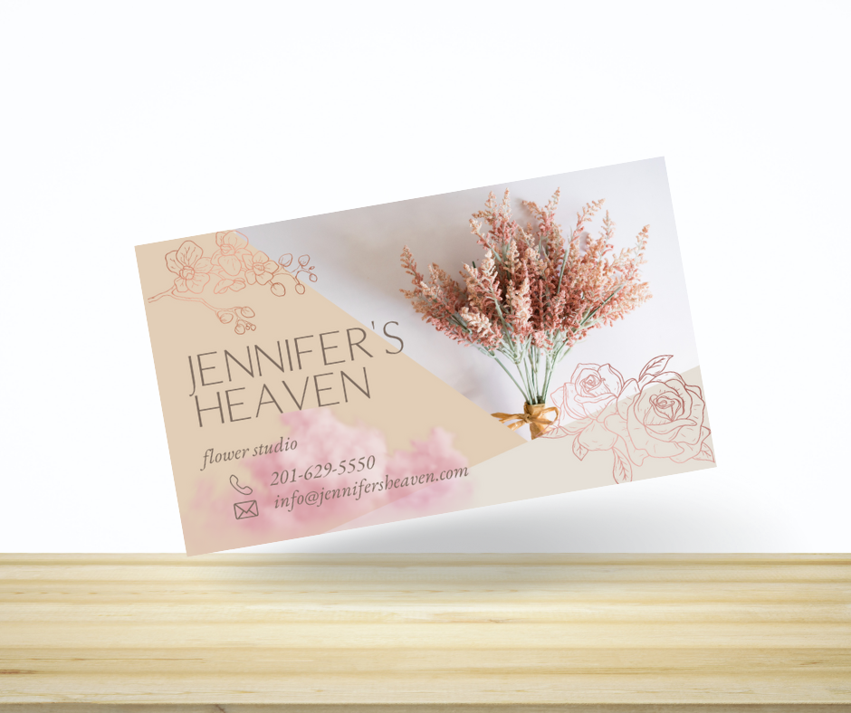
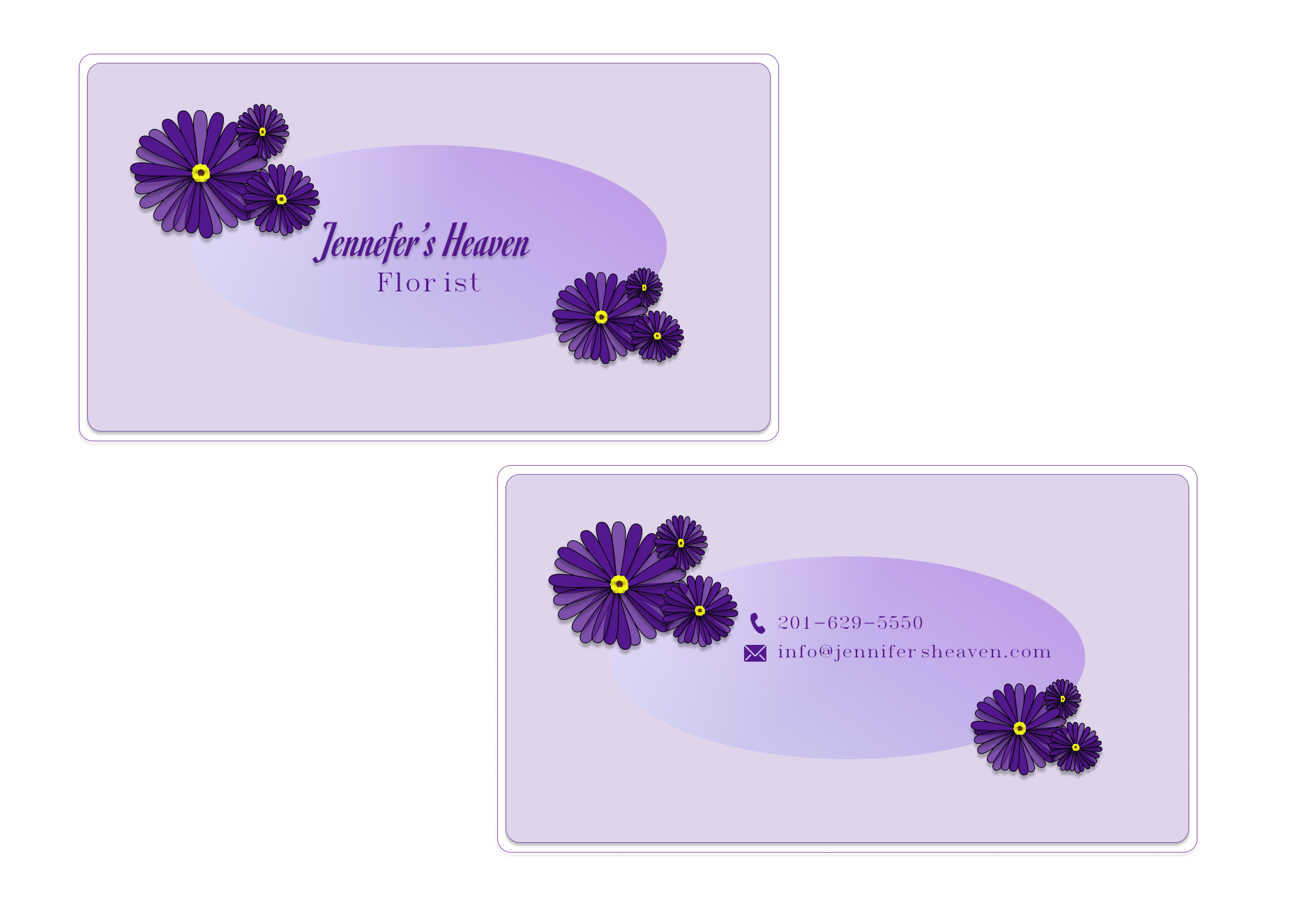
Business card
- Report
swati • 2 years ago
Business card
Jennifer's Heavengraphic

This business card looks very welcoming and will be most likely to attract more customers to this business.
2 years ago by Muhammad Mehroz - Reply
thank you so much
2 years ago by swati - Reply