Jacob Hall
Posts
5
Likes
13
Liked Posts
4
Given Feedback
21
Feedback
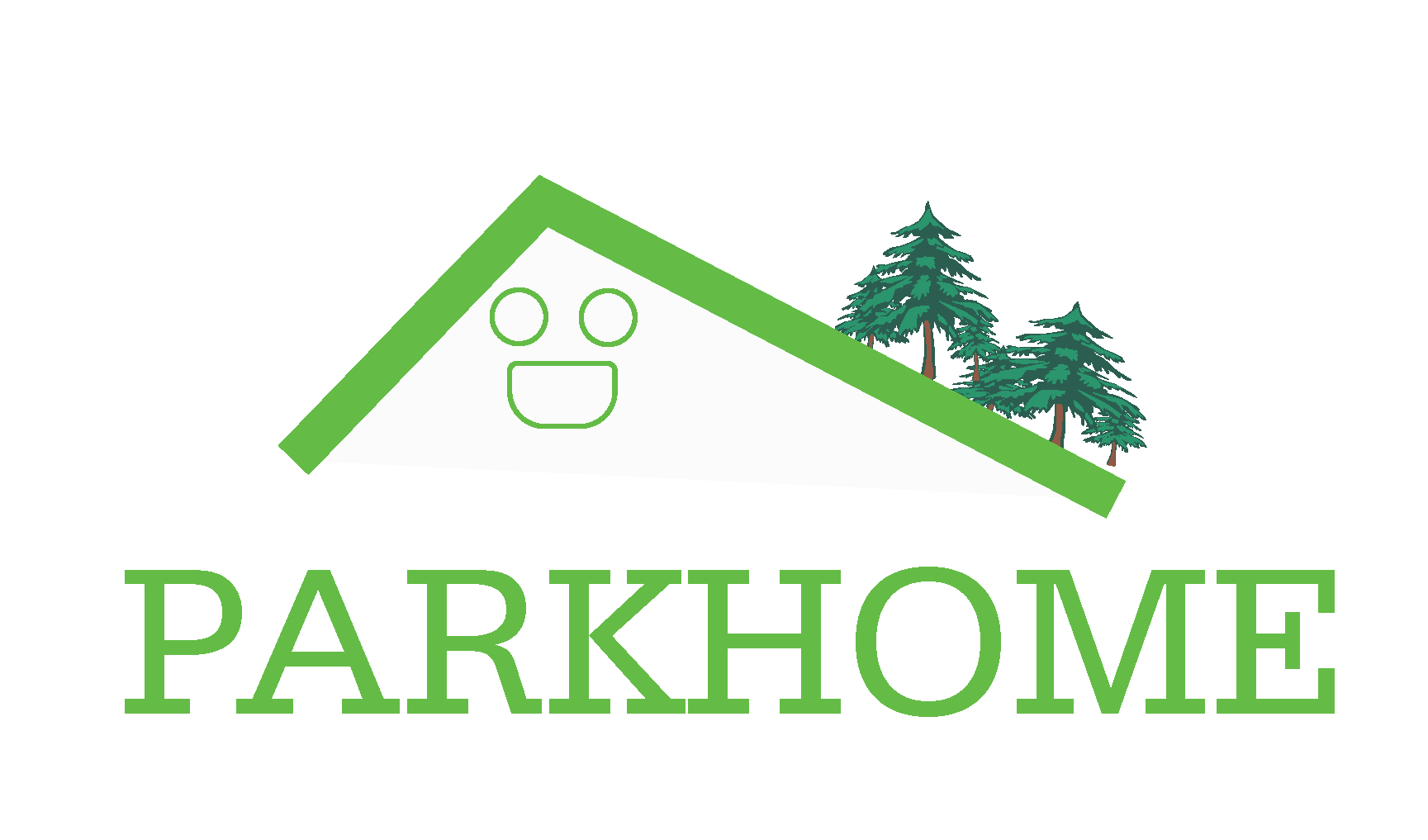
I feel like the face doesn’t really fit with the rest of the style of the logo.
1 year ago by Jacob Hall
I think you could make the font bigger. That’s what you want people to notice the most on a business card.
1 year ago by Jacob Hall
Maybe having the font not so close to the edge might make look better. And some more weight and style in the fonts.
1 year ago by Jacob Hall
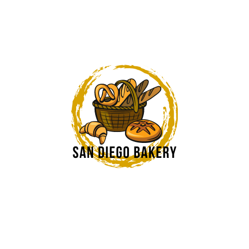
I feel like this done by a child to be honest. You have allot of negative space you can use to add some type that describes the business. Also I think if you can make some better illustrations that don’t look flat might be really helpful. You might be better off using an image instead of the illustration.
1 year ago by Jacob Hall
This looks really good. My only suggestion if any, would be to play with a font that might fit better with the Logo. I know there’s tons out there. But just an idea.
1 year ago by Jacob Hall
Looks good. I wonder if you played with different font weights, I think it’ll be fun to see more of that. Also I think your title could be a little bigger, not by much, just a little. And maybe have your text off of the right match the height of the coupon box or higher. That would be my feedback.
1 year ago by Jacob Hall
Thanks.
2 years ago by Jacob Hall
Thank you for your feedback.
2 years ago by Jacob Hall
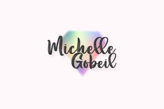
I wonder what it would look like if the font on the bottom match more with the actual style of the logo. That’s my thought on it.

2 years ago by Jacob Hall
I like this better than your recent design of this logo.
2 years ago by Jacob Hall
I think the Logo should be a little bigger and the name a little smaller. Just an Idea.

2 years ago by Jacob Hall
I feel like the diamond might be hard for some people to see it and recognize it, but at the same time I love it.
2 years ago by Jacob Hall
I think adding some more variety of weight, style and size of text on your longest text box would be a fun to see.

2 years ago by Jacob Hall
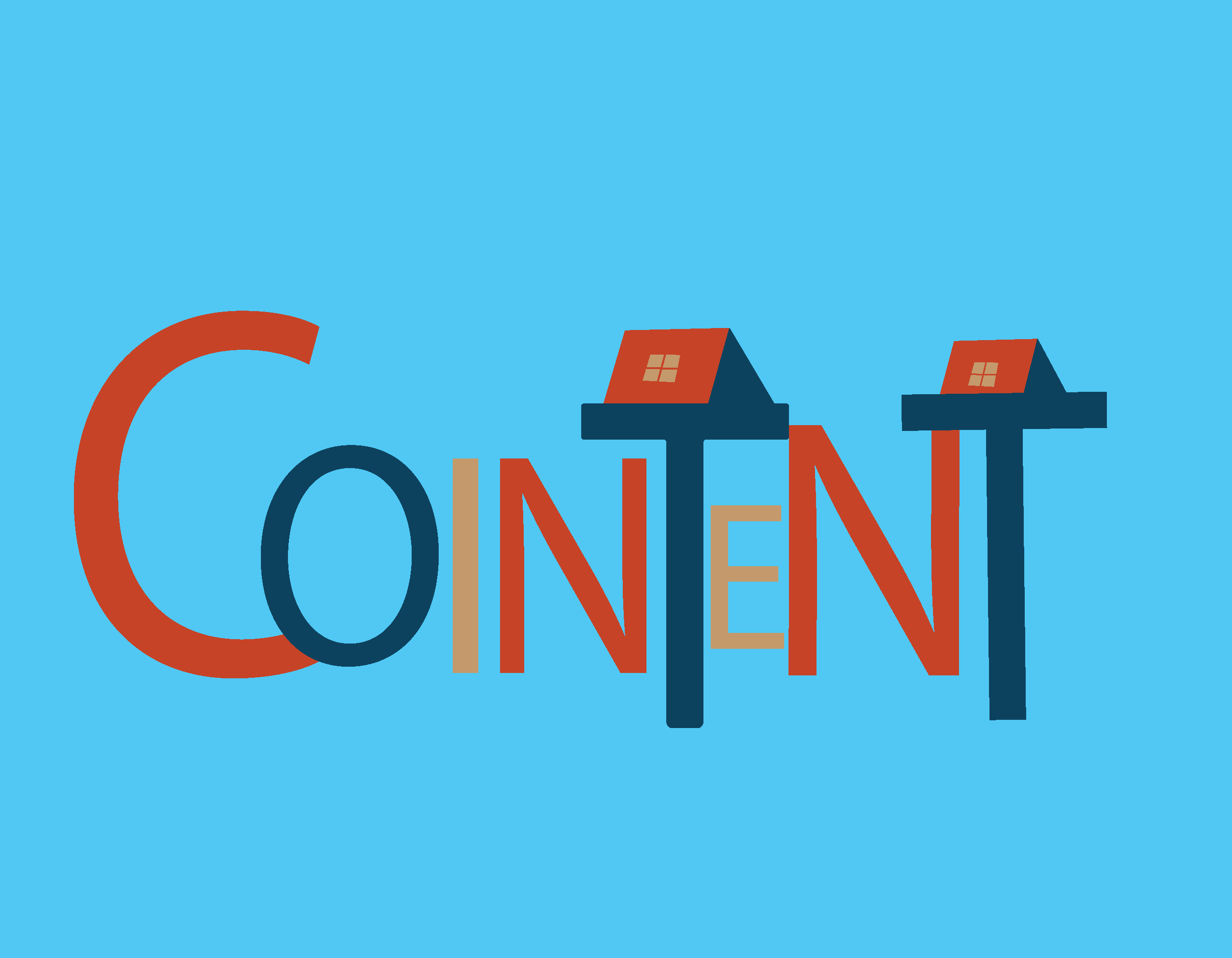
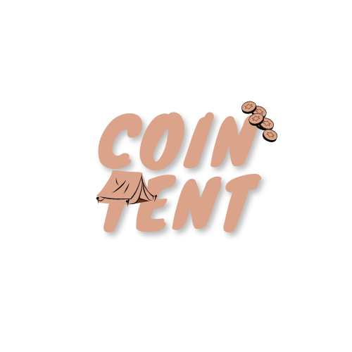
I like your design. My only suggestion is that the way the "C" and the "N" are touching other letters making a tangent. Plus maybe making the tents you have on your "T" the same size. Also maybe making the rest of the letters more even and matching could be good too.
2 years ago by Jacob Hall
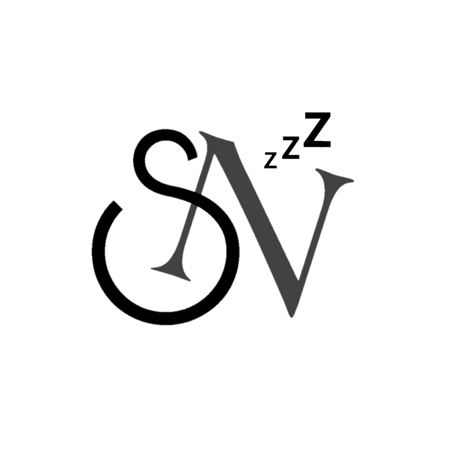
I can see that you made part of the "N" a hand on the "S" shape clock. I think if it looks more centered on a real clock that might make it nicer.
2 years ago by Jacob Hall
On suggestion. I think this logo would look good if you chose a different font. Maybe one that fits with the rest of the logo.

2 years ago by Jacob Hall
Maybe make the button bigger and the text as well. Also adding a transparency background for the text might help it pop more. otherwise it looks good.
2 years ago by Jacob Hall
I think having at least one more color would be good. Possibly another neutral color. I like you used the tent to make the "T".
2 years ago by Jacob Hall
I think if you increase the size of the day and name of the place a little bigger would be the only suggestion I can think of.
2 years ago by Jacob Hall
Looks good. If you feel like it needs it, I think the phone number could be a little bit bigger or stand out a little more.
2 years ago by Jacob Hall
Good work. I think including more colors would make your shapes pop out more.
2 years ago by Jacob Hall
Posts
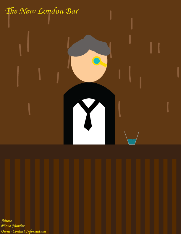
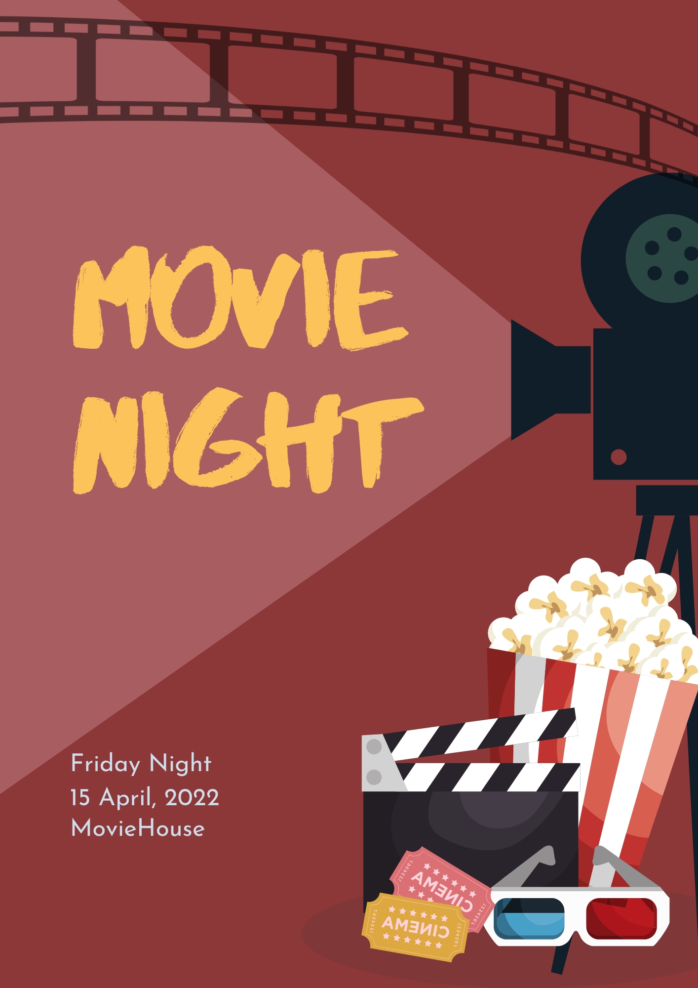
SiConnect Event Flyer
- Report
1 year ago by Jacob Hall
Event Flyer, I might’ve ended up making it into a poster. Feedback is appreciated.

 2 Likes
 1
1
Nice Work
1 year ago by Hunain - Reply
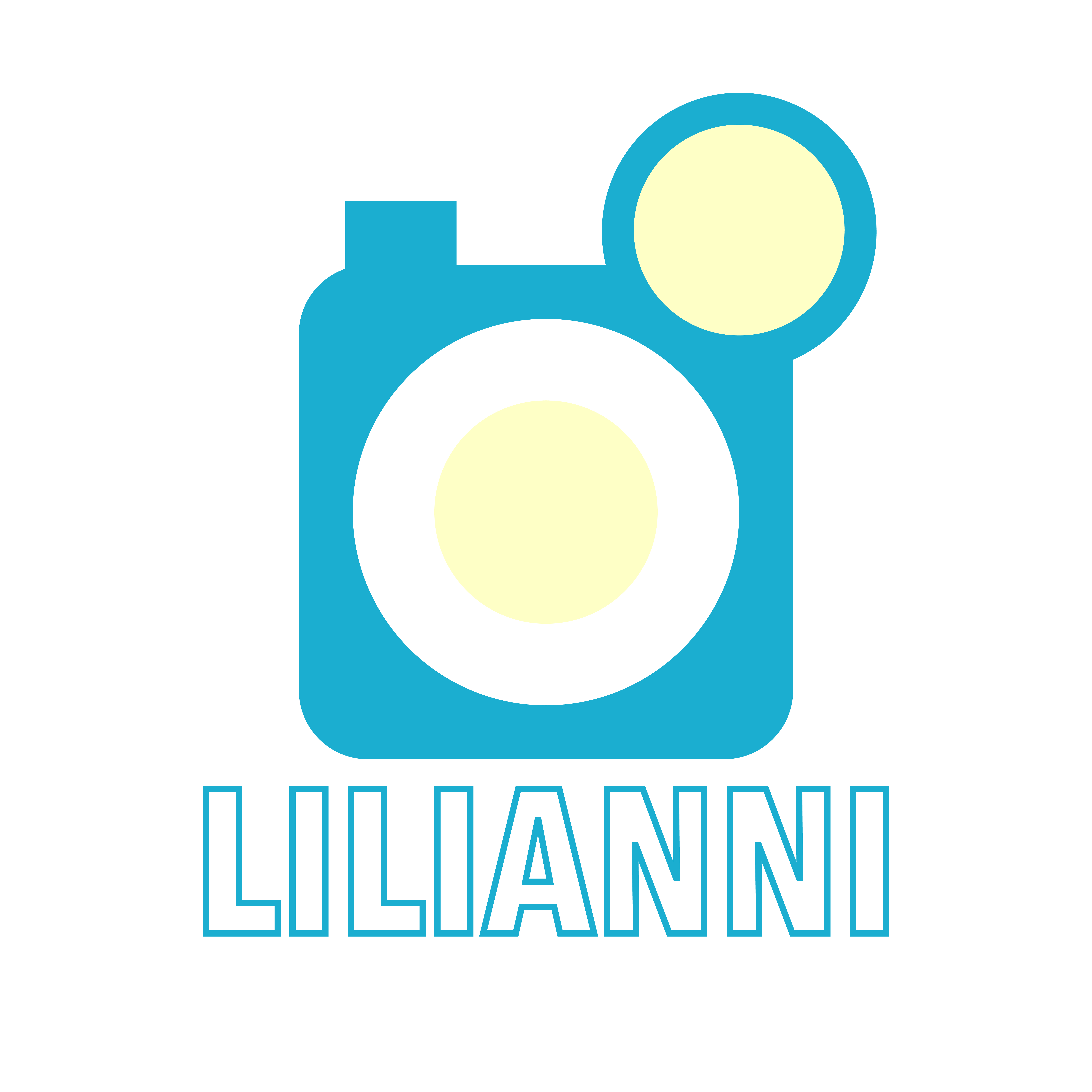
Lilianni Logo
- Report
1 year ago by Jacob Hall
This is a logo for Lilianni, a social media app. Feedback is appreciated.
 3 Likes
1
3 Likes
1
Cool logo!! I would make the text solid blue too so it fits a bit better with the solid blue icon
1 year ago by Azalia - Reply
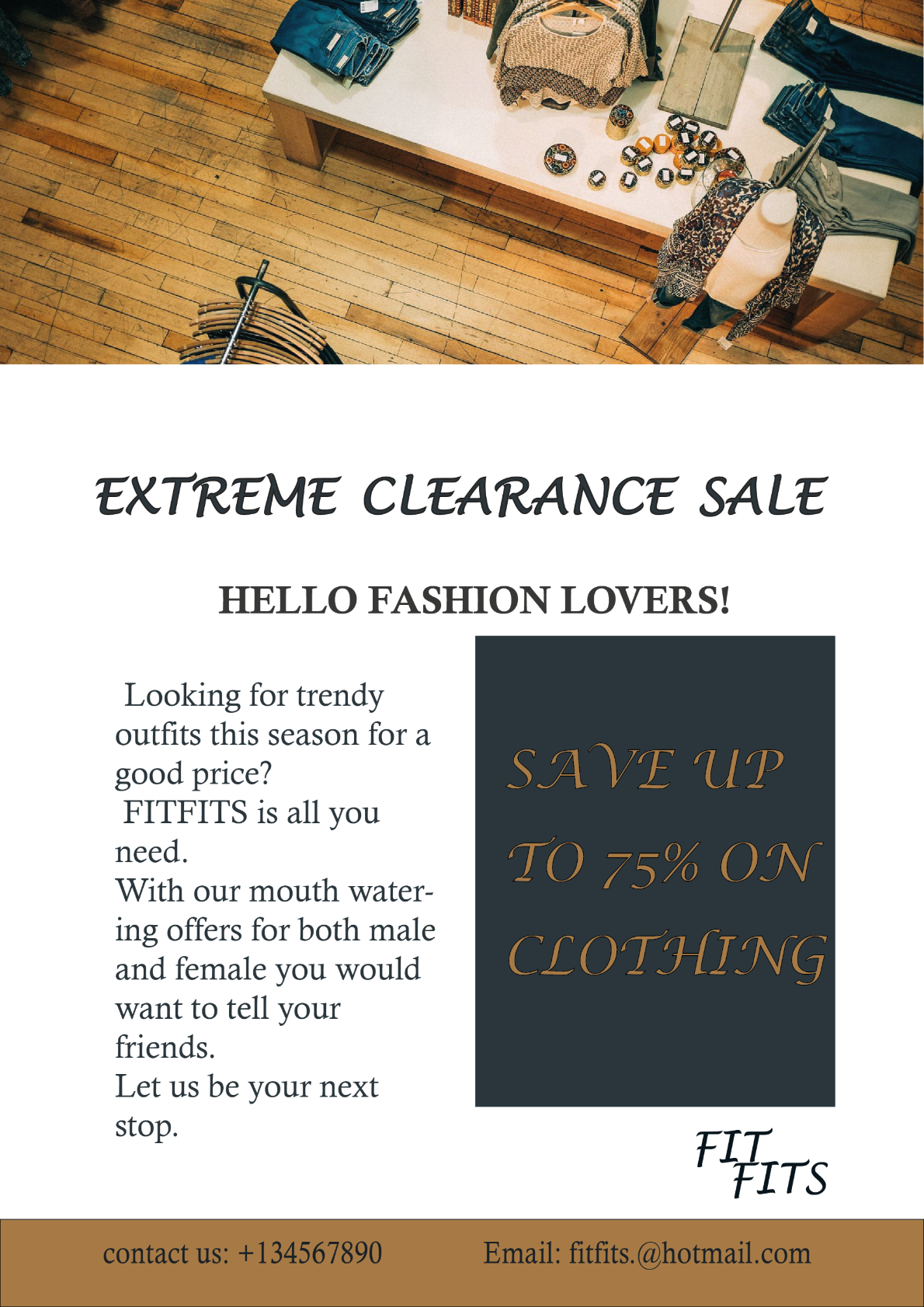
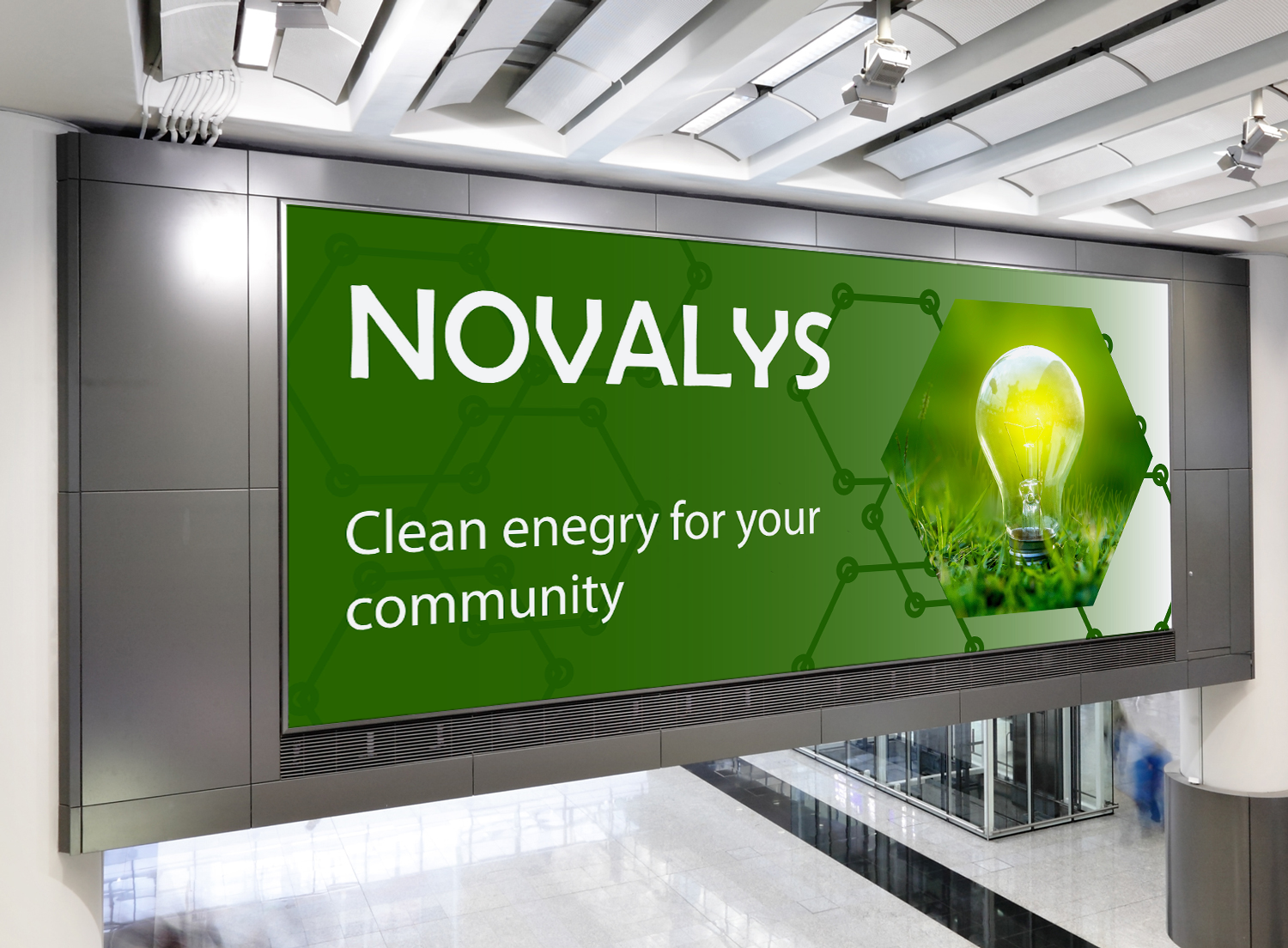
Digital Ad
- Report
1 year ago by Jacob Hall
Digital Ad for a Clean Technology Company. Feedback is appreciated.
 2 Likes
1
2 Likes
1
Take note of the wrong spelling, It should be "energy." There's not much emphasis on the focal point, make bg must not have the same color bg as the focal point. "Clean energy..." line must be made smaller, following the rule of hierarchy.
1 year ago by Dafune Azusagawa - Reply
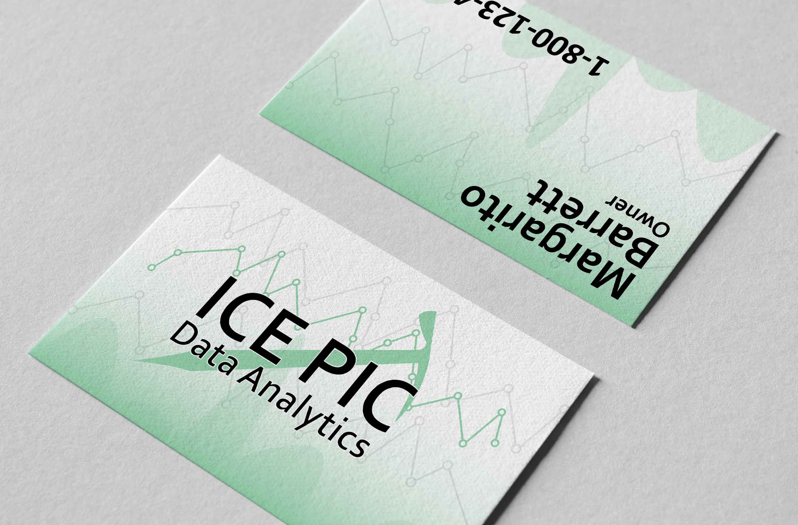
IcePick
- Report
2 years ago by Jacob Hall
Business Card for a Data Analytics Company. Feedback is appreciated.
 3 Likes
1
3 Likes
1
perfect
2 years ago by Amir - Reply
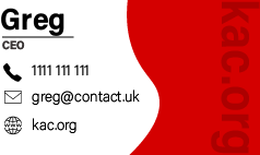
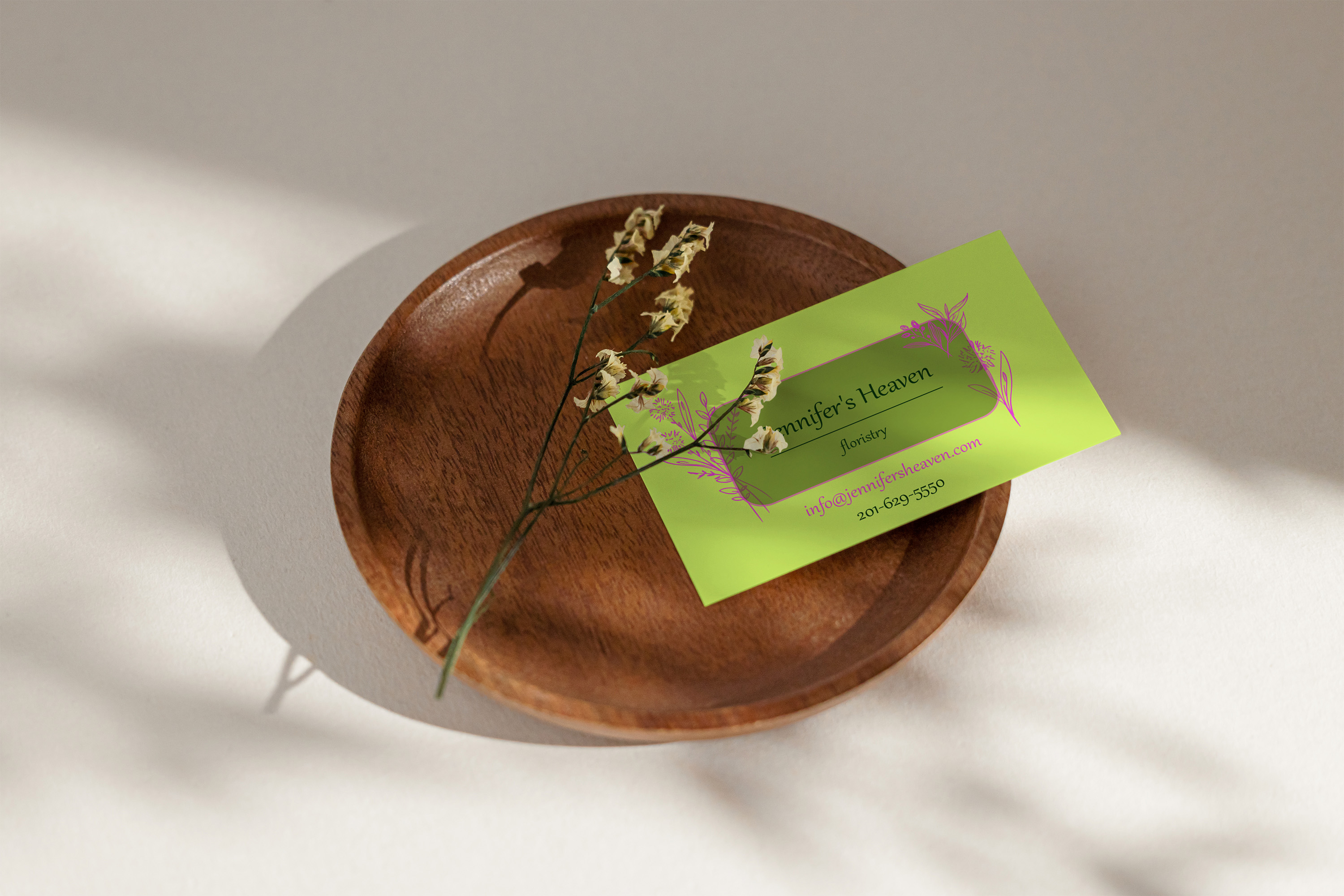
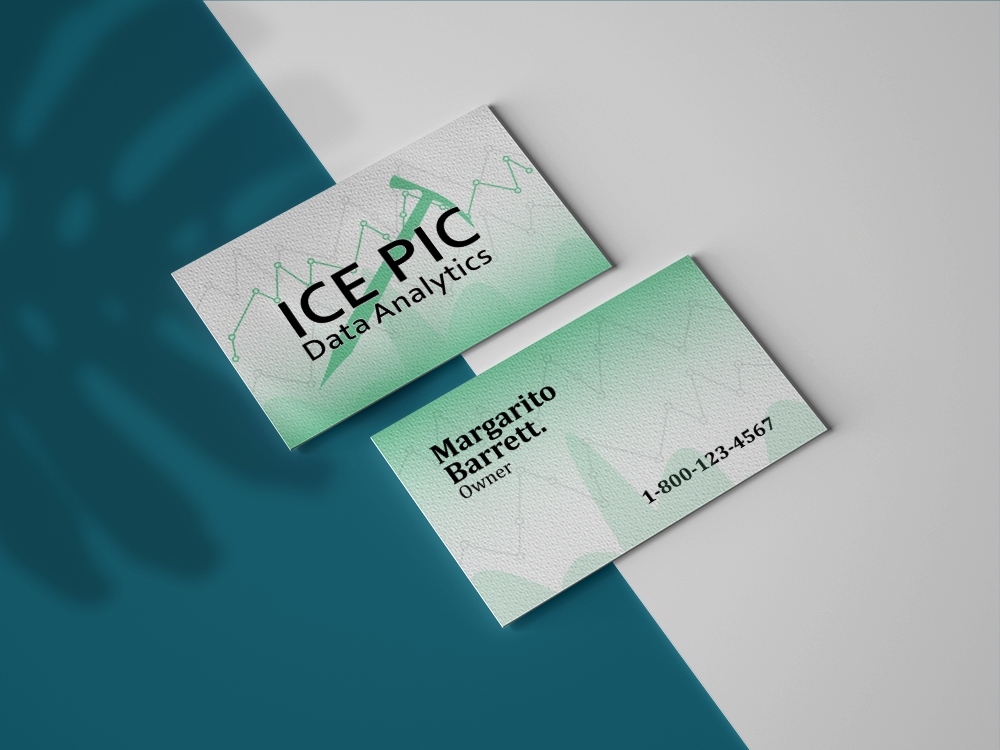
IcePick Business Card
- Report
2 years ago by Jacob Hall
Here is a Business card I designed. Feedback is appreciated.
3 Likes
4
I like it but I would've made the text a bit smaller I think
2 years ago by Amir - Reply
Thank you for your feedback.
2 years ago by Jacob Hall - Reply
Your business card design really looks great. But in my suggestion while displaying it please show it in one way so that people can read it and can see your work.
2 years ago by swati - Reply
Thanks.
2 years ago by Jacob Hall - Reply