Shoptacle
- Report
Rebecca Woodland • 2 years ago
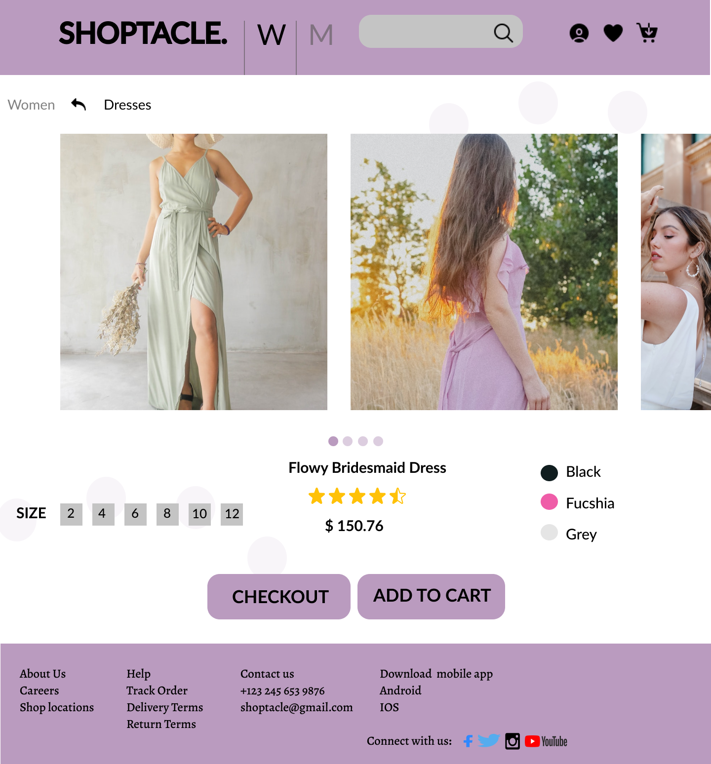
Not a HUGE fan of the name as it doesn't really scream luxury, however as a designer you may not always agree with names. I started off looking at other luxury brands websites, most department stores use a typeface as opposed to a logo so i decided to opt for a serif font with a -10 tracking applied. Dark purples speak luxury so i created a palette adapting the 60-10-30 rule. With the logo being in a serif font, it could be quite hard to read it so i thought a sans serif font could compliment it well. Referring back to the brief i wanted to make sure that the website hit its core values - luxurious, honest and efficient which i think it does.


nice one
1 year ago by dojin - Reply
Beautiful
1 year ago by pamela eyidou - Reply
Nice work
2 years ago by swati - Reply
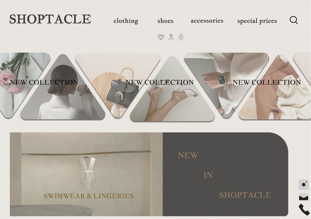
Closer to ZARA s website
2 years ago by Pratikshadate11 - Reply