Chocolate Logo Inspiration
Generate Unlimited Logo Design Ideas
While pretty much everyone likes chocolate, it can often make a great component for a business's logo or name. It can help a business to seem more 'fun' and approachable while keeping a more neutral appearance because of the brown colors. One thing to keep in mind when using chocolate as an element in your logo is to make sure it is easily recognizable. It's probably easy for most people to recognize something as chocolate if it's brown but a logo can take on many forms and sometimes it has to be printed in black and white or in smaller versions. In that case, do you still see chocolate or is it completely unclear what it is? This is an important factor to keep in mind with almost any kind of logo. but especially logos that rely on their colors a lot to be recognizable.
Logos with pieces of chocolate
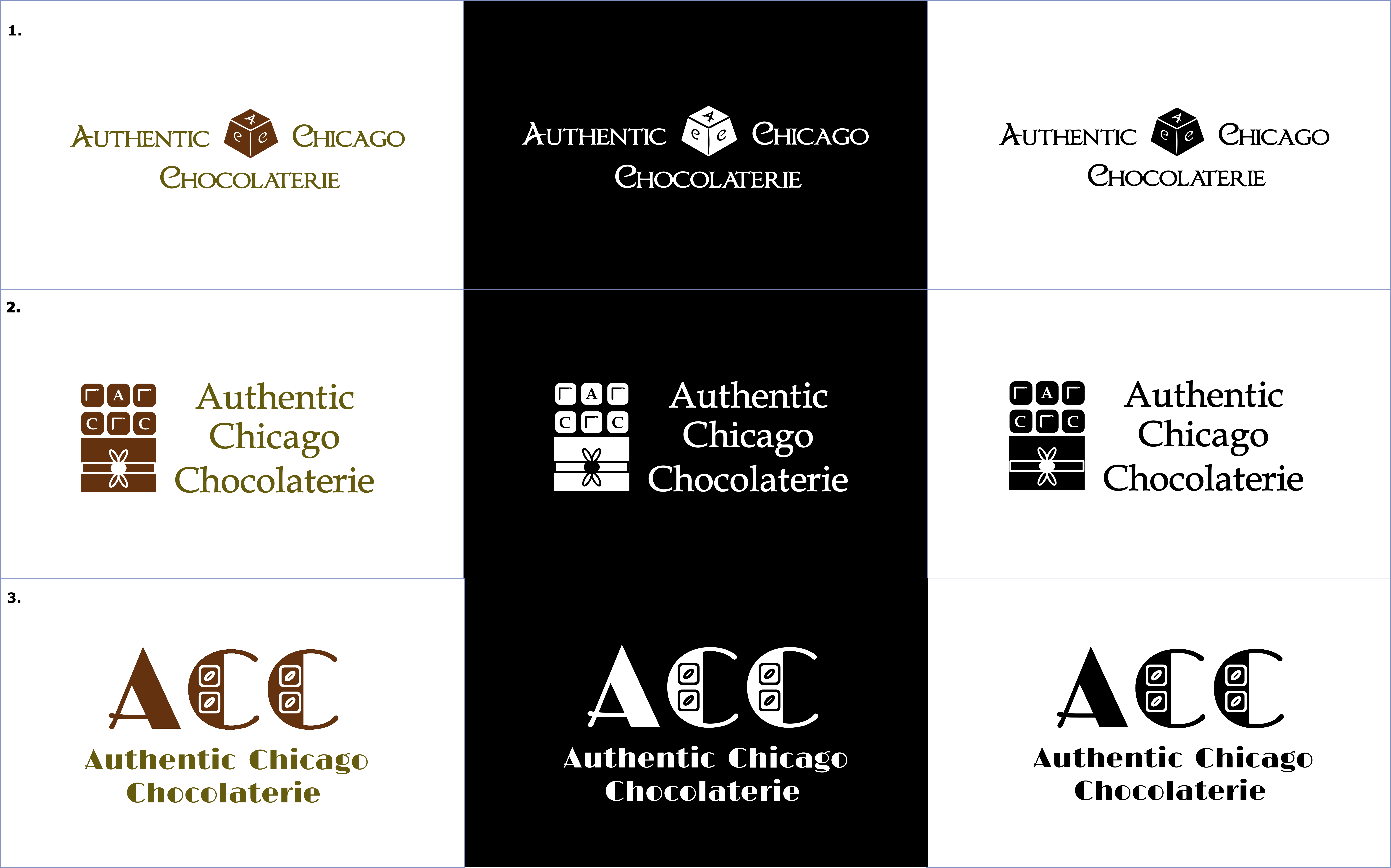
The most obvious choice when designing a logo and incorporating chocolate, is to include pieces of chocolate. These are probably the most easily recognizable element regarding chocolate and, because of its basic shape, can be incorporated in many ways. It is, however, an easy choice which can make your logo feel less unique.
Logos using cocoa beans
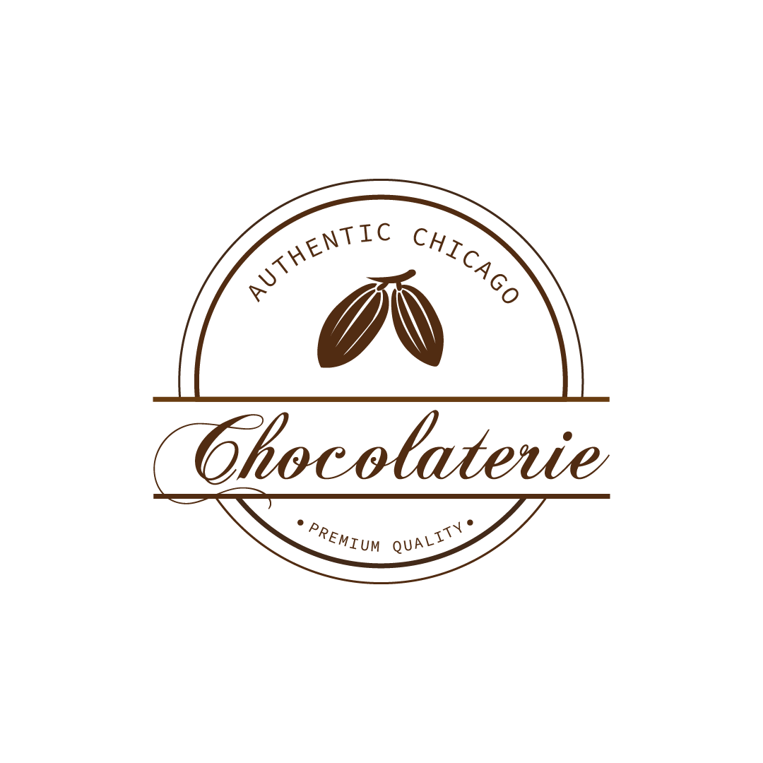
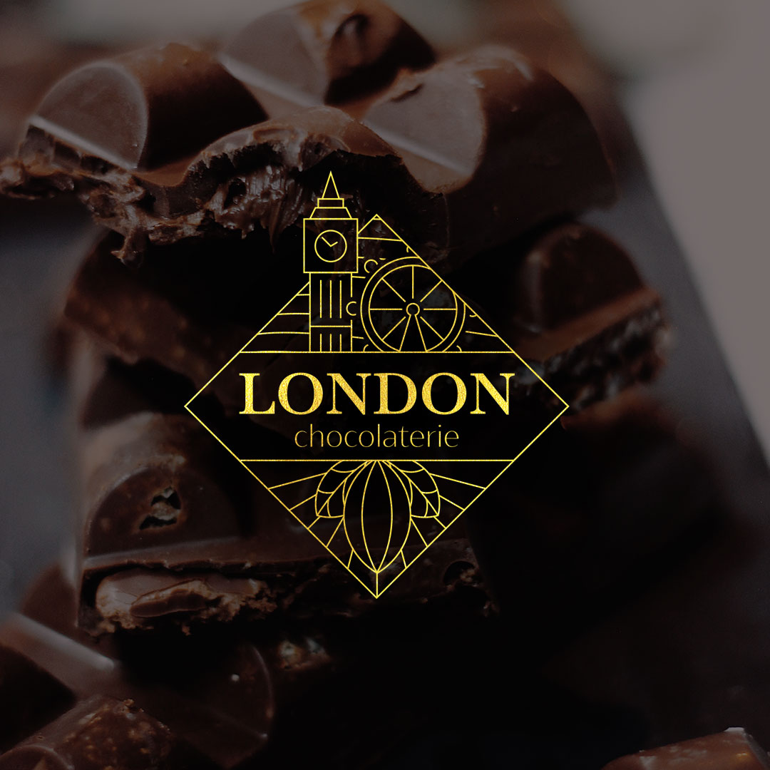
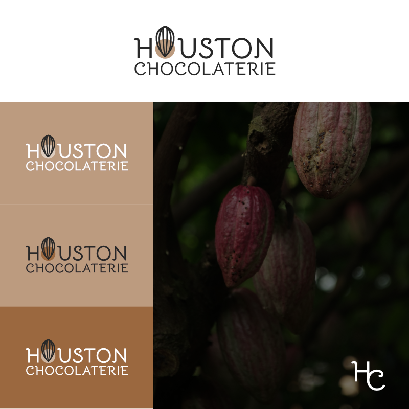
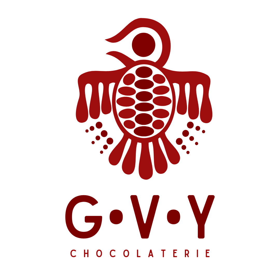
Another way of incorporating chocolate in a logo is to use one of the main ingredients. Most chocolate is made using cocoa powder, a product that is made from cocoa beans. These beans grow in a fruit-like shape that can also look good in a logo. If you decide to use cocoa beans in your logo, you do however run the risk of people not recognizing it as such. A lot of people may either not immediately see it for what it is or just simply not know what cocoa beans look like.

