Duncan Hammett
Posts
10
Likes
12
Liked Posts
20
Given Feedback
5
Feedback
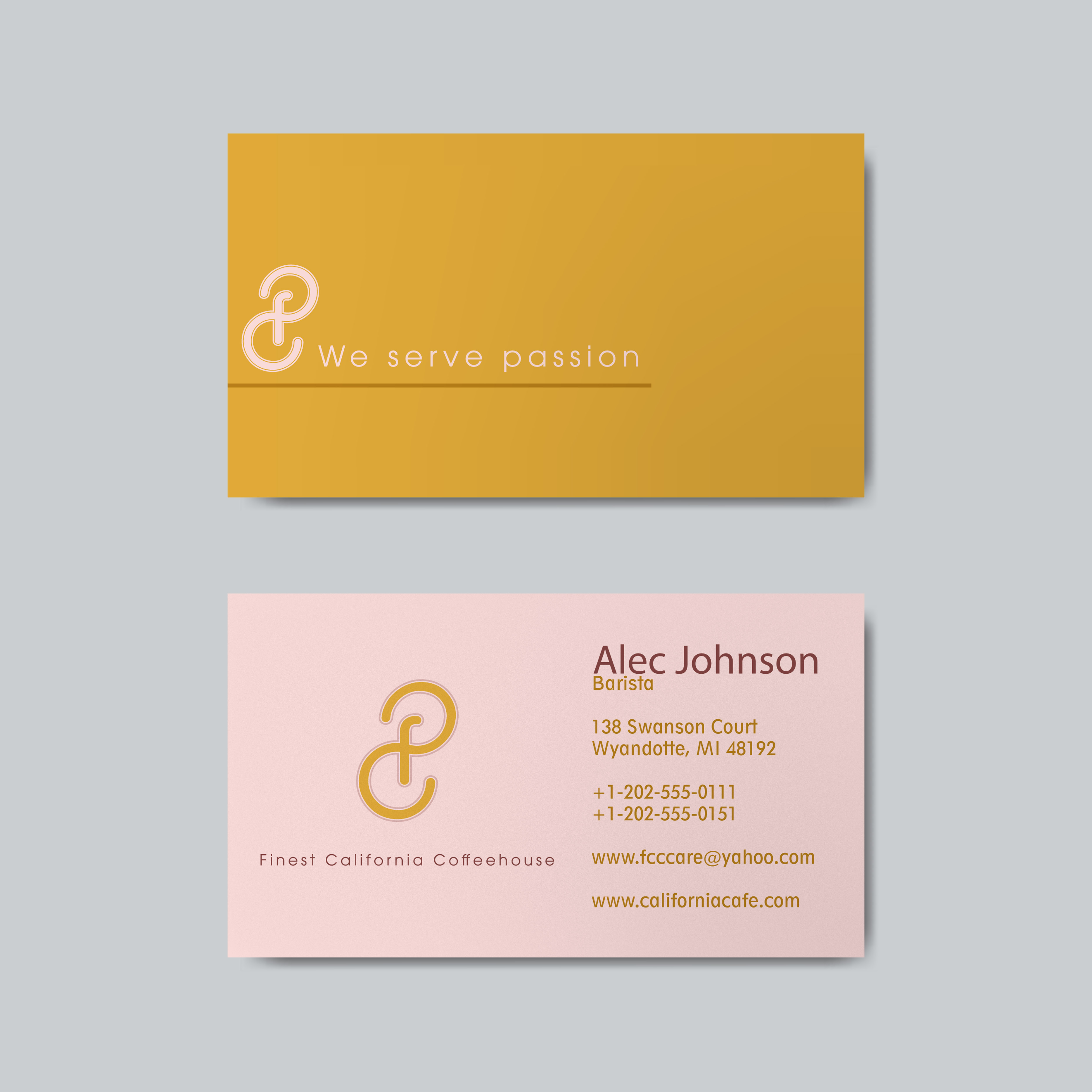
I really like the design of the iconic mark, it has a nice flow to it. However the typeface doesn't match the one used in the wordmark underneath. Also, for the business card consider using a serif typeface to compliment the sans serif type. I think you have used two sans serif typefaces. The orange works nicely - maybe they are based in Orange County, California?
4 years ago by Duncan Hammett
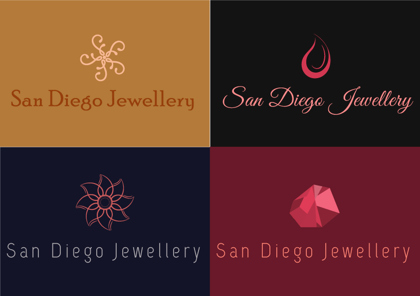
I really like these, especially the mark in the top left. Maybe combine it with the typeface in the bottom left?
4 years ago by Duncan Hammett
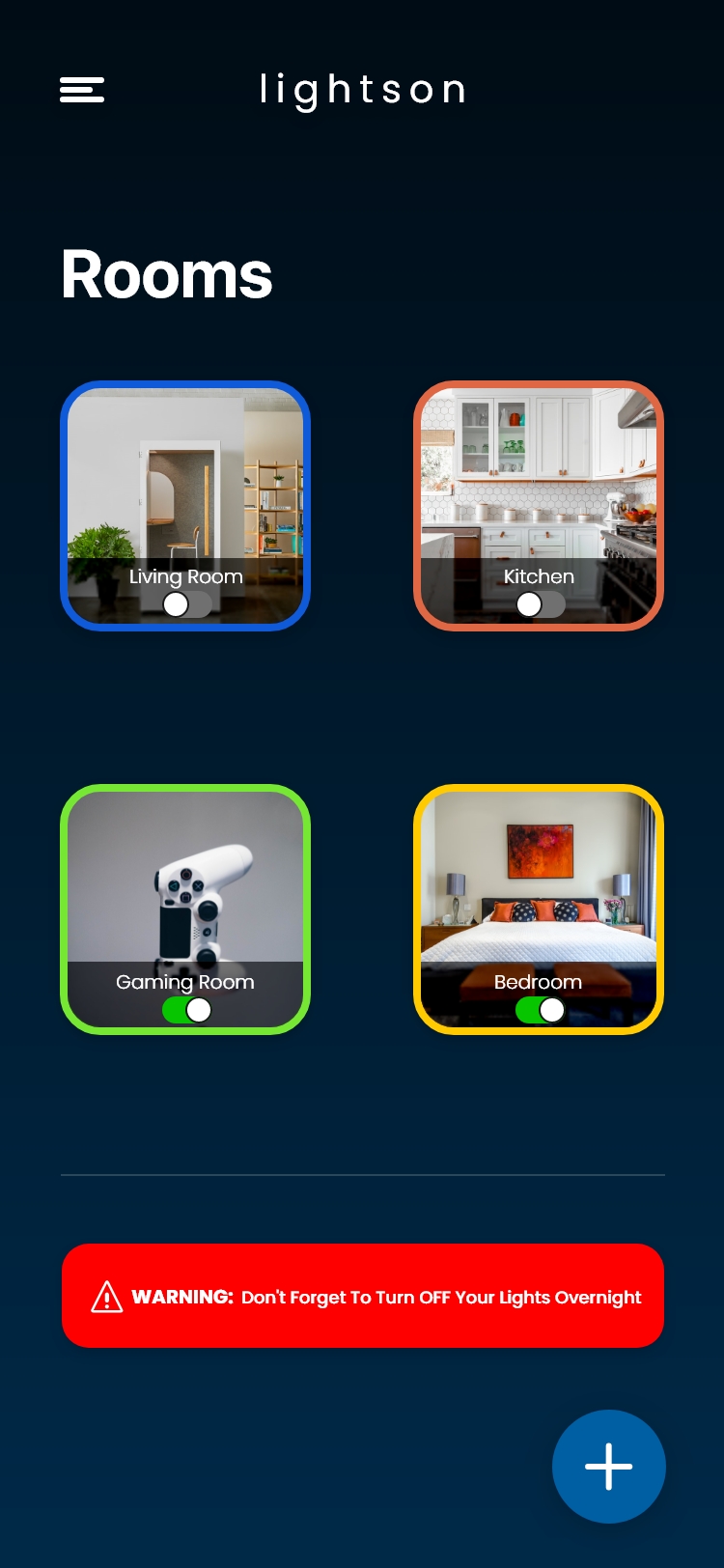
Loose the borders around the pictures, they make it look over decorated. Some of the text might need a little kearning. Does the red in the warning box match the colour palette you are using?
4 years ago by Duncan Hammett
@ Ashish Jadhav How could I improve it? Your feedback provides me with nothing tangible or useful.

4 years ago by Duncan Hammett
I like the first design, its very clean.

4 years ago by Duncan Hammett
Posts
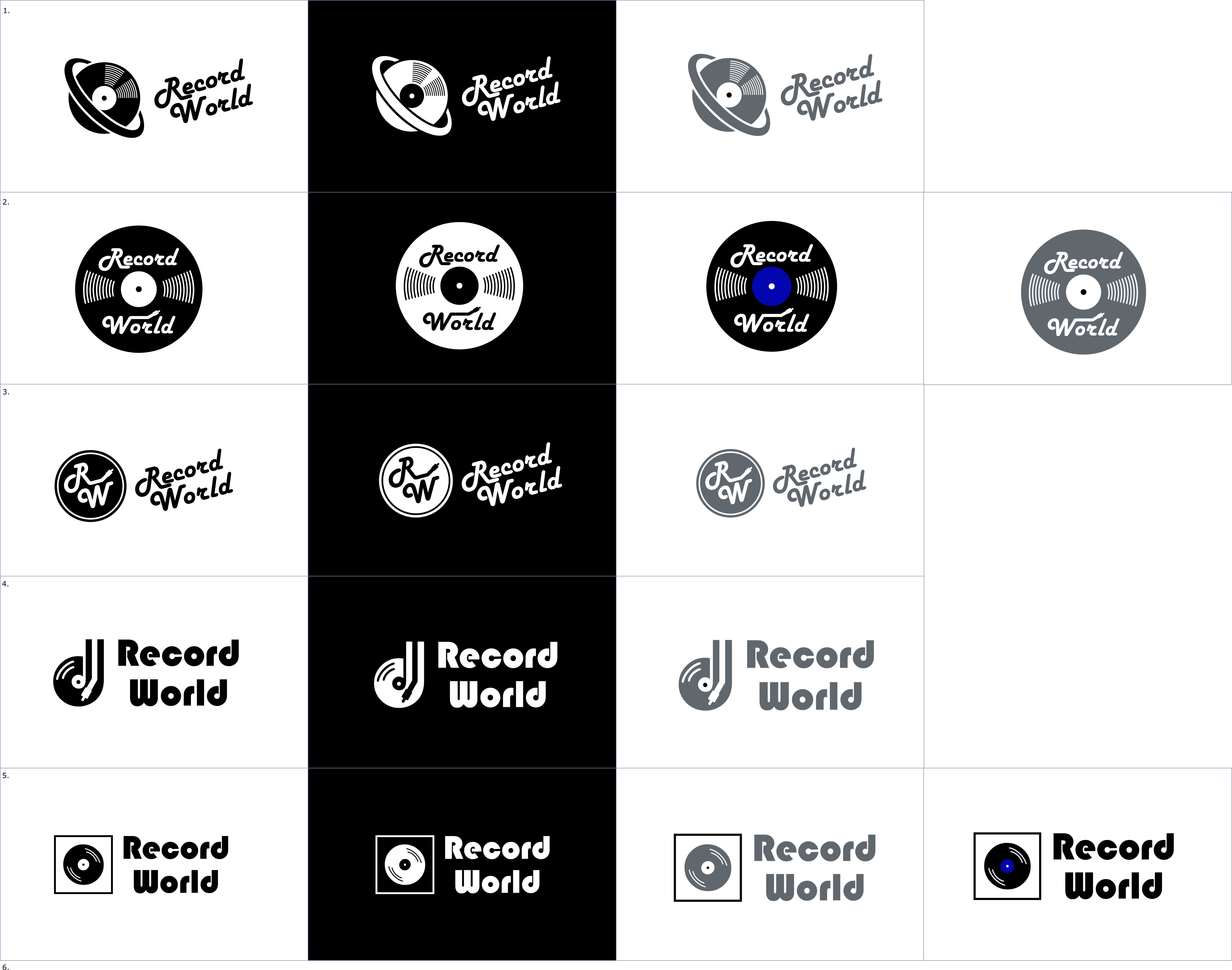
Record World
- Report
4 years ago by Duncan Hammett
This is my attempt at designing a logo for Record World, a store specializing in selling vinyl records. I think the best one is the first one, where I have combined a planet with a record/CD. I wasn't sure what to do with colour and opted for a platinum colour. I actually think the logo works best in black and white.
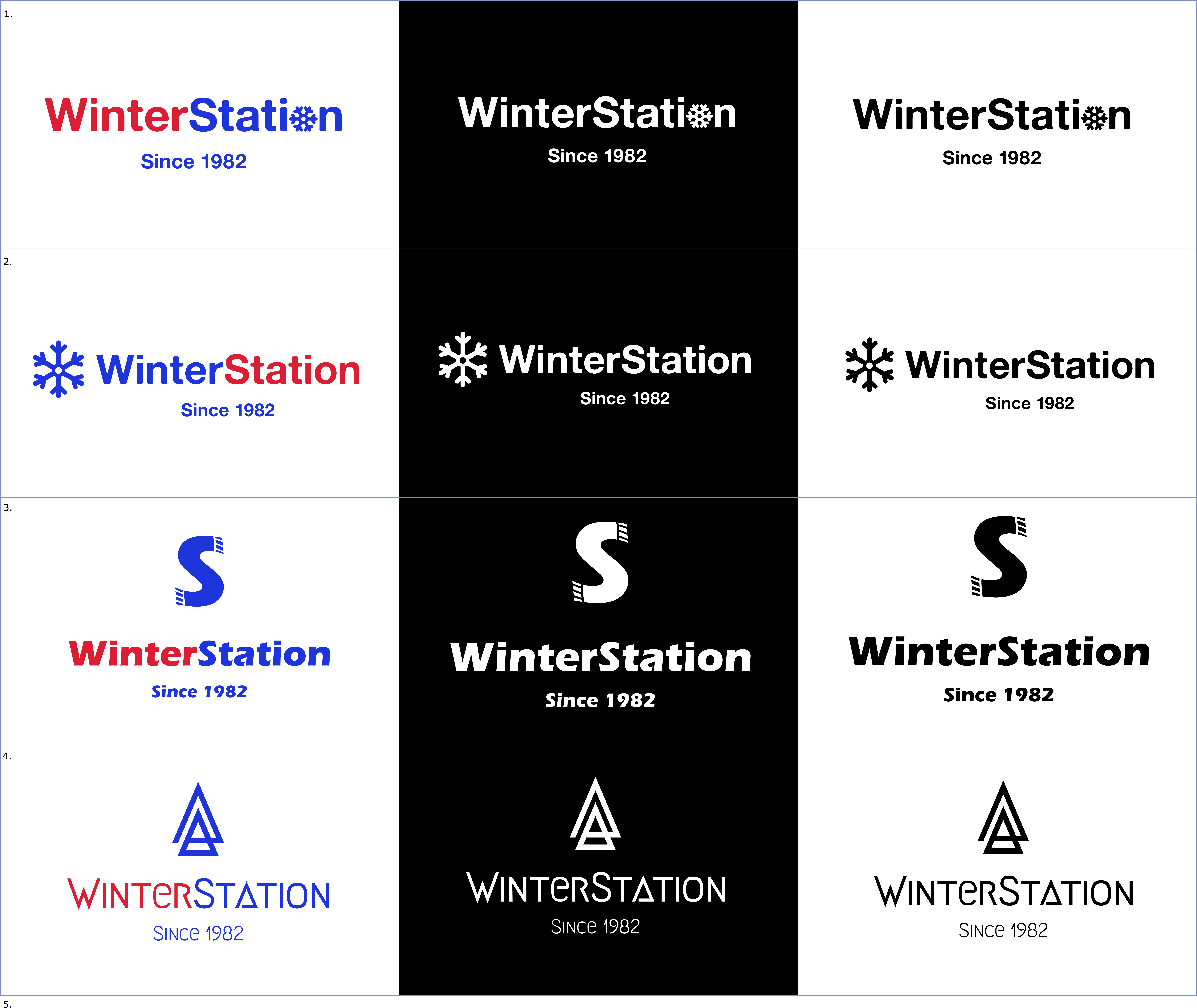
WinterStation logo reworked
- Report
4 years ago by Duncan Hammett
I have reworked a couple of my WinterStation logo ideas. I wasn't happy with the original snowflake design, so have simplified it. The colour scheme remains the same, inspired by the Icelandic flag. The red adds a touch of warmth, as winter clothes are supposed to keep you warm.
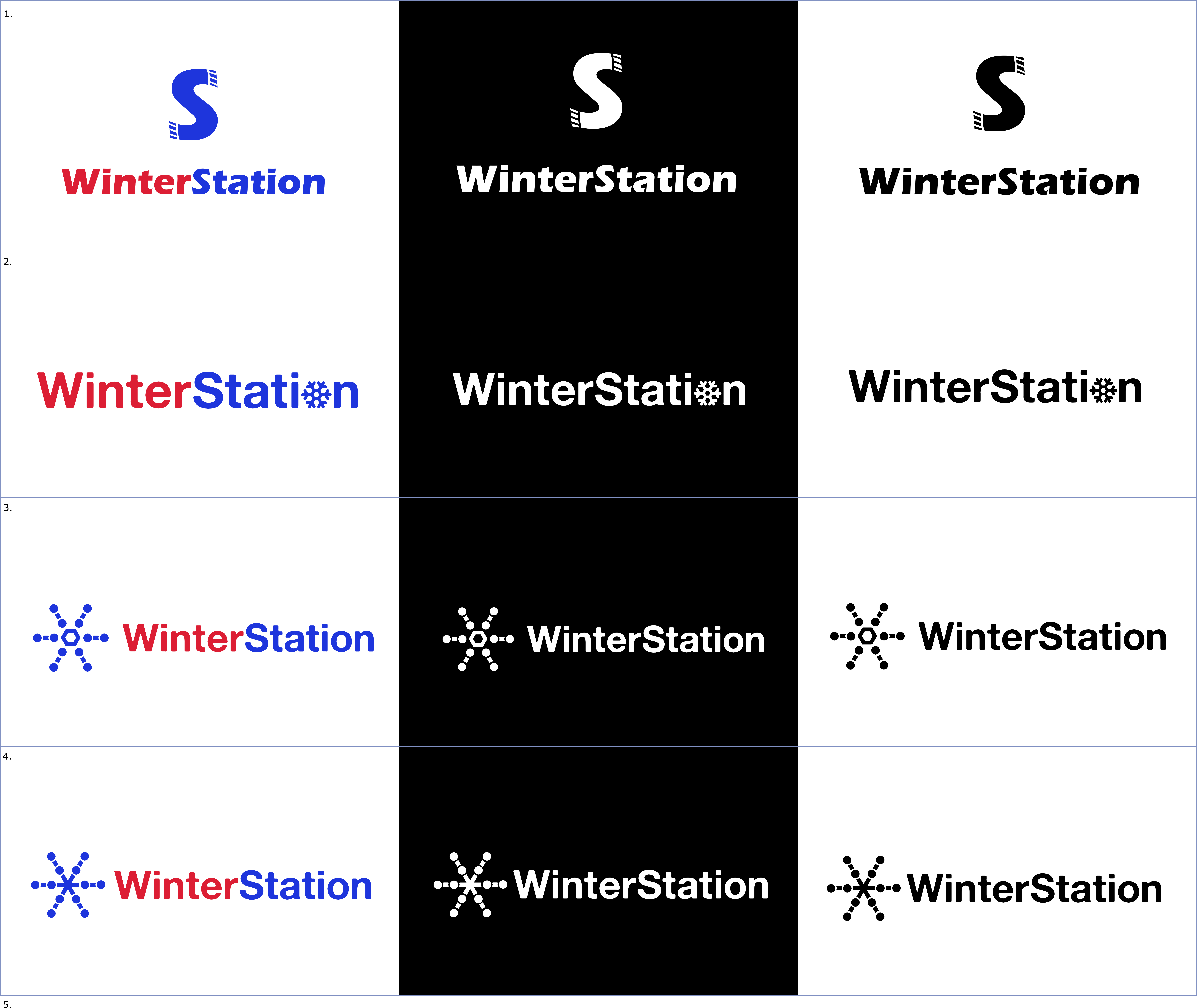
WinterStation logo
- Report
4 years ago by Duncan Hammett
Logos for WinterStation, a winter clothing store. The bottom two logos are the result of combining a snowflake with a depiction of a train line and station on map. I picked a heavy sans serif typeface as it feels strong and sturdy.
Beach Square second attempt
- Report
4 years ago by Duncan Hammett
This is my second attempt at a logo for BeachSquare. I really struggled with this one.
Jina's Teahouse
- Report
4 years ago by Duncan Hammett
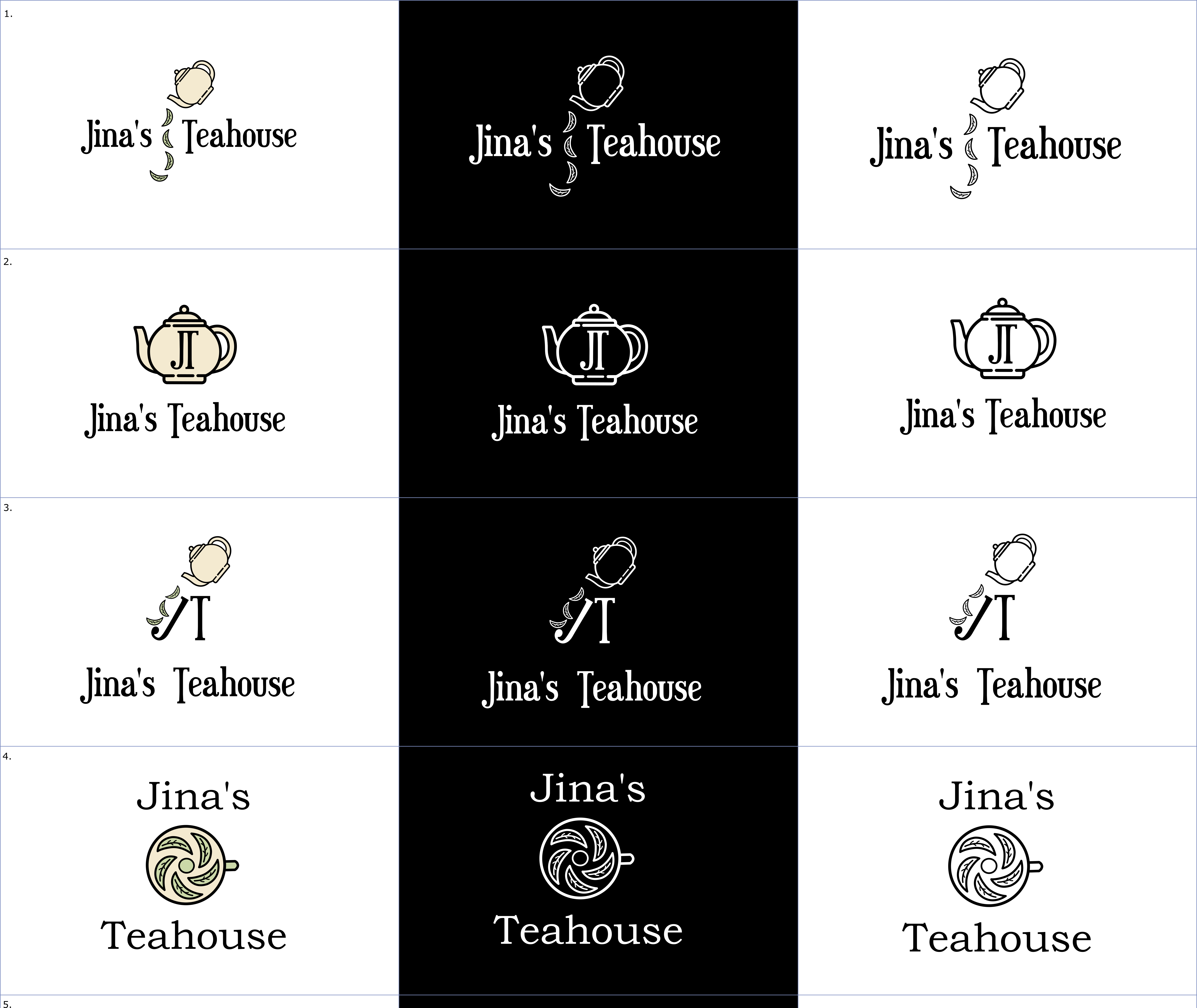
My logo designs for Jina's Teahouse. I really like the typeface I have used, it reminds me of a vintage steam fair. The teapot matches the vintage vibe, as does the cream colour. I think the first two designs are the best.
I really like N� 1 and 2. As you said, the typeface works great for the vintage style and the whole design looks very classy. For the color version, i think the colors are too similar, a little more contrast could help. Great Work! Keep it coming!
4 years ago by Elena - Reply
These are really great. Tho I think you could have used more earthy colours like green, brown, etc. Black and white is classy too though?
4 years ago by Leye Abiola - Reply
