Leachy
Posts
2
Likes
2
Liked Posts
7
Given Feedback
8
Feedback
Really cool! I love the maximalist style and the color contrast, as well as the title of the form. It might look even better with a bit more space between the inputs and information.

1 day ago by Leachy
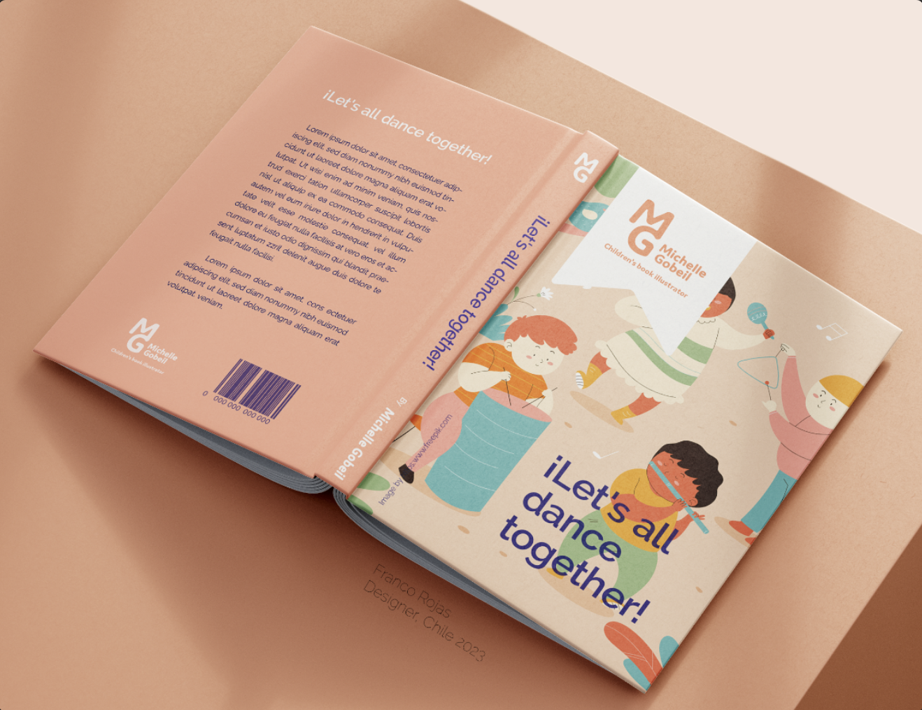
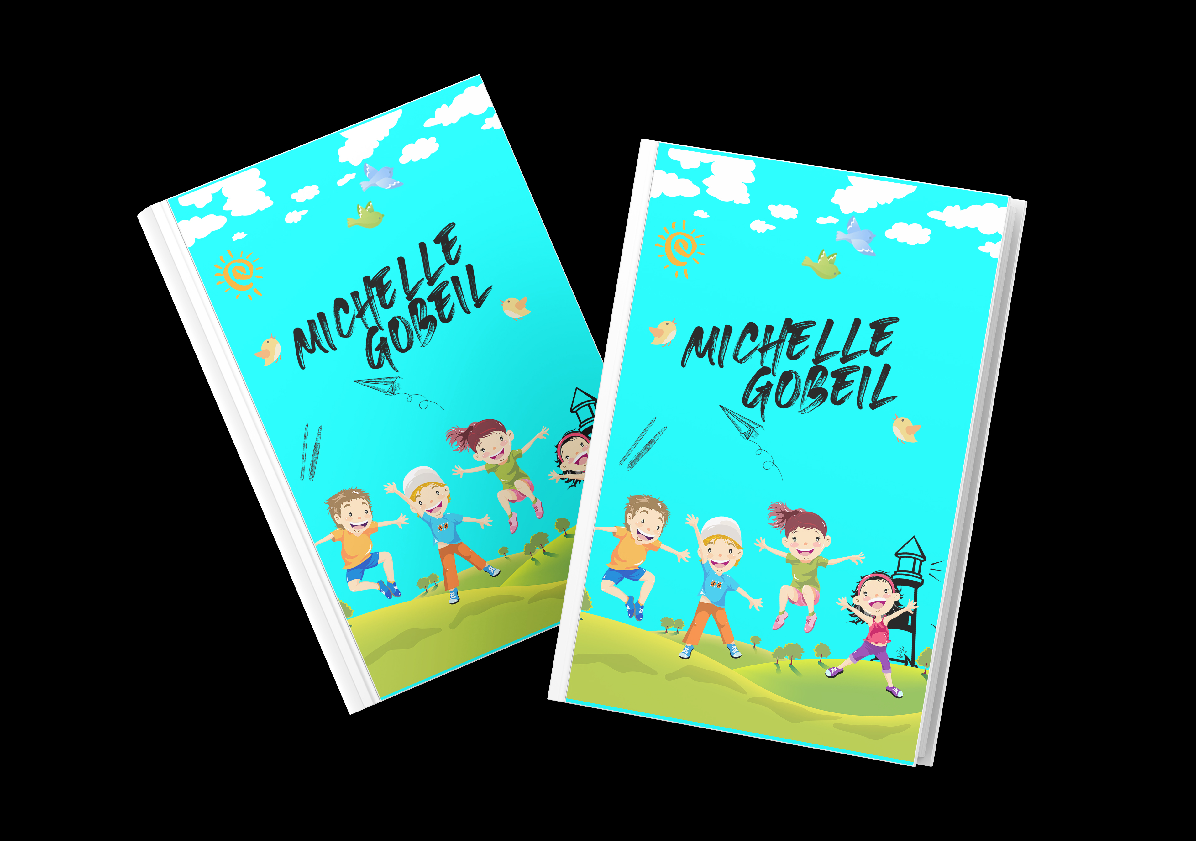
So beautiful! I love the colors; they're so refreshing and convey a feeling of youthfulness.

2 days ago by Leachy
Posts
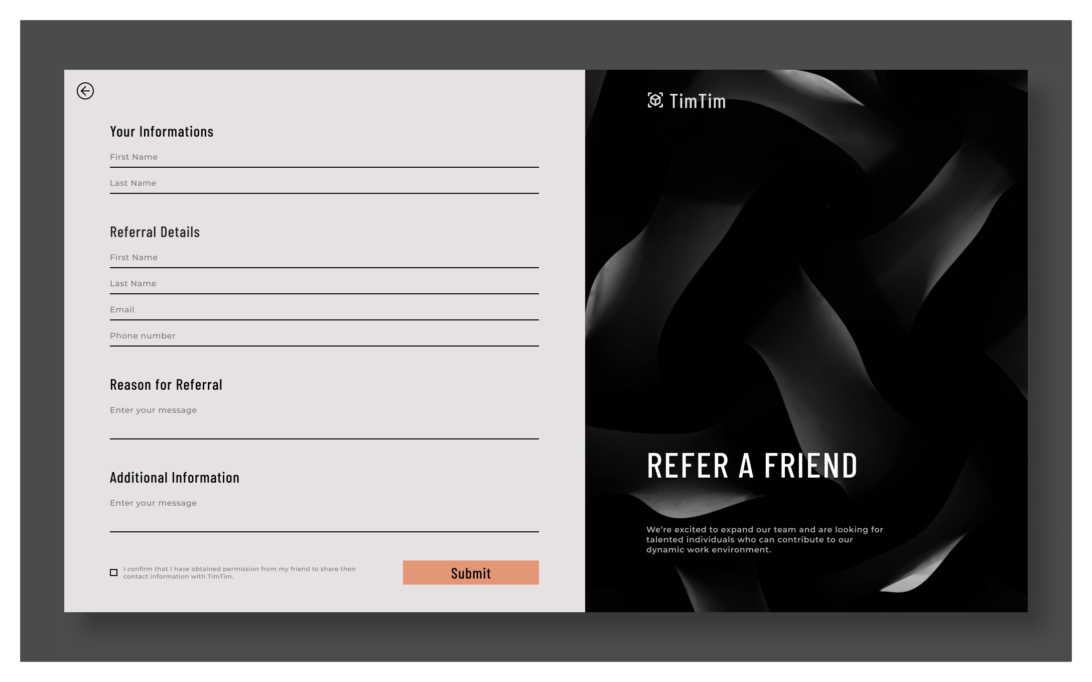
TimTim "Refer a friend" form
- Report
Leachy • 2 days ago
TimTimui
I focused on creating a clean, minimalistic form that simplifies the referral process while maintaining TimTim's professional image.
The goal was to create a modern, elegant interface that reflects TimTim’s strength and growth while making it easy for employees to submit referrals. Your feedback and suggestions are welcome to help me improve and refine the design!
The goal was to create a modern, elegant interface that reflects TimTim’s strength and growth while making it easy for employees to submit referrals. Your feedback and suggestions are welcome to help me improve and refine the design!
simple yet informative <3
9 hours ago by Andrea - Reply
Thank You for the feedback <3
6 hours ago by Leachy - Reply
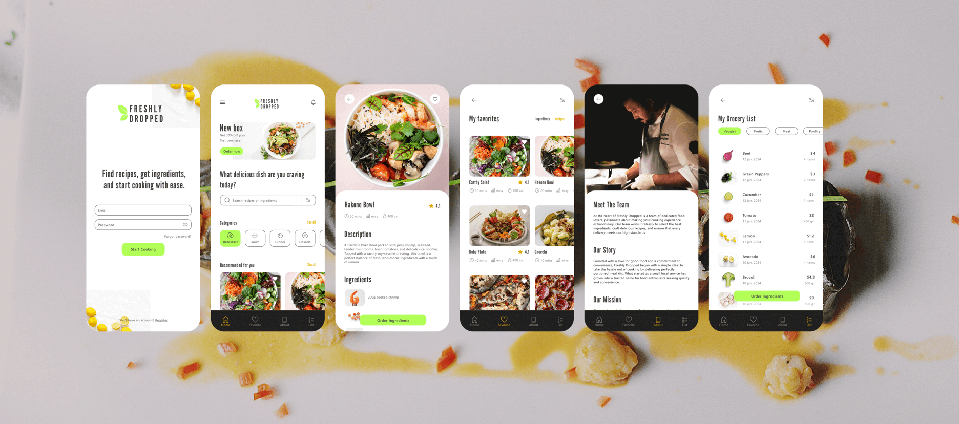
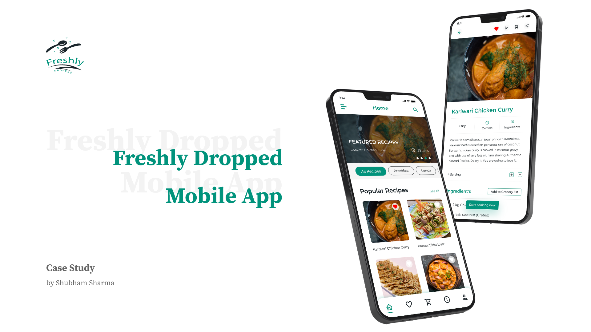
Freshly Dropped Iphone Mock Up
- Report
Leachy • 2 days ago
I designed a version of the app for iPhone, focusing on a fresh, intuitive interface for easy access.
As a programming student passionate about UI/UX design, I welcome any feedback to help me improve.
Thank you!
As a programming student passionate about UI/UX design, I welcome any feedback to help me improve.
Thank you!
i like it
7 hours ago by Winda Risna - Reply
