


Marianne Besas
Posts
2
Likes
2
Liked Posts
1
Given Feedback
1
Feedback
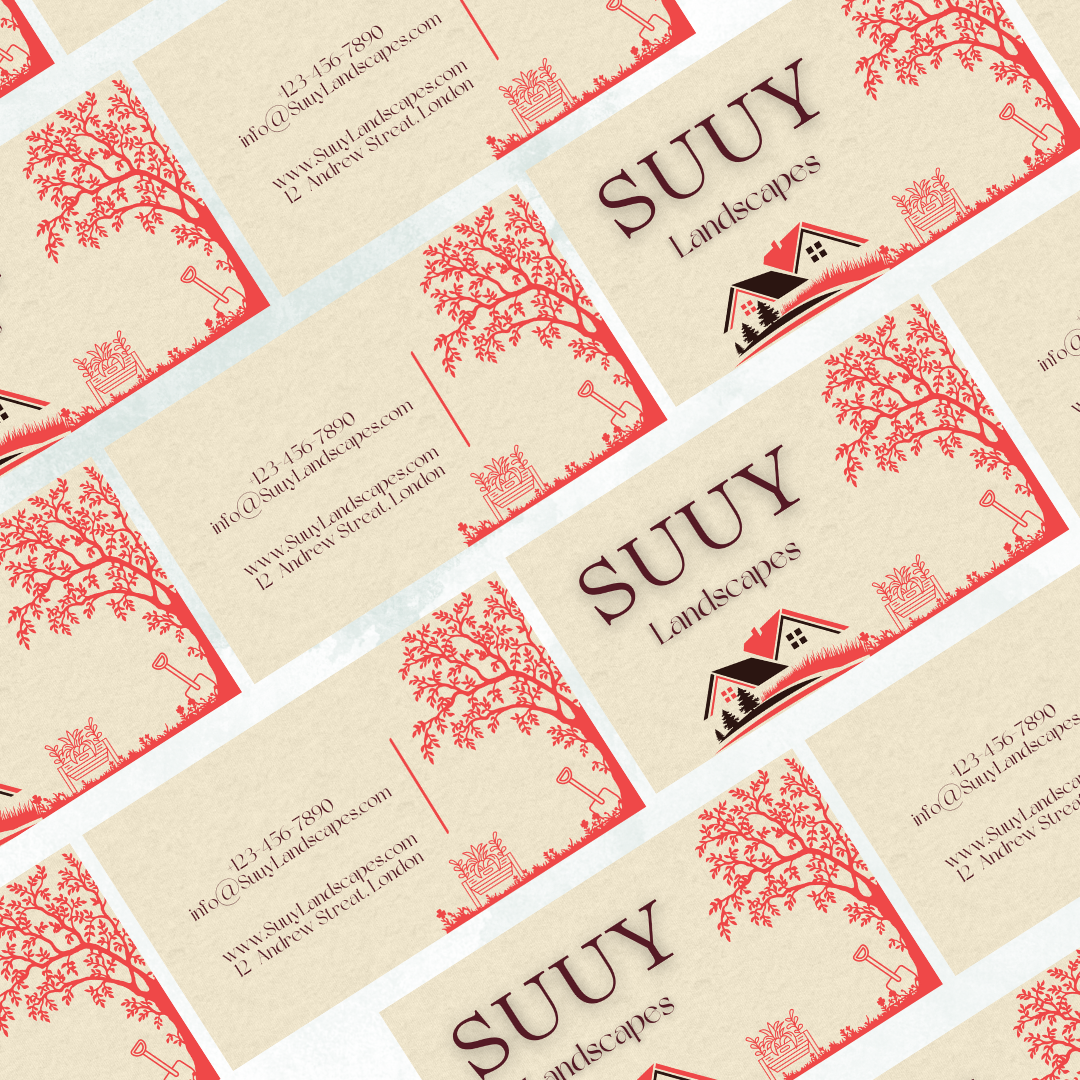
I like the sharpness of the graphic, if that makes sense! It's giving a clear, concise, exacting vibe. Upon reading the brief, I worried red would be a little difficult to work into the nature vibe but I like how it turned out!
4 days ago by Marianne Besas
Posts
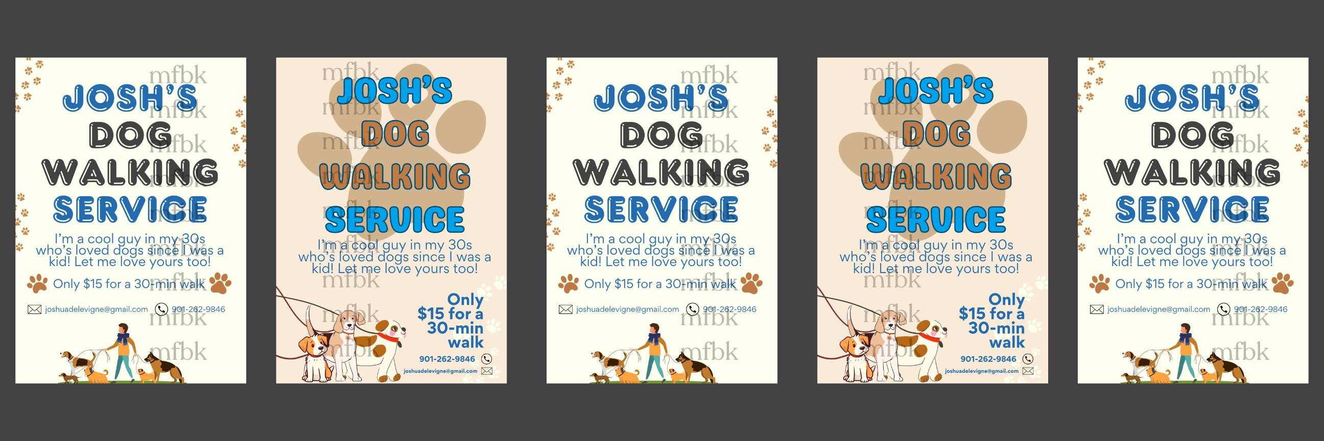


Love this! I like the one with the giant paw more. Really makes it clear what you are selling right away at first glance. I also like ho you can't see the person walking them you can only see the dogs. smart thinking.
4 days ago by sam - Reply
nice colors
4 days ago by nora - Reply
Good, and simple.
4 days ago by Princess - Reply
Looking goood but I don't know if the blue and brown work well together. Maybe other colors would work better
4 days ago by Amir - Reply


Good
4 days ago by ABATI OREOLUWA - Reply
looks good and definitely attention grabbing but I think the decorations in the corner don't really fit the more overall modern look
4 days ago by Amir - Reply
looks great!
5 days ago by sofia - Reply
I love this, it really stands out whilst conveying the message strongly!
5 days ago by Scarlett Williams - Reply