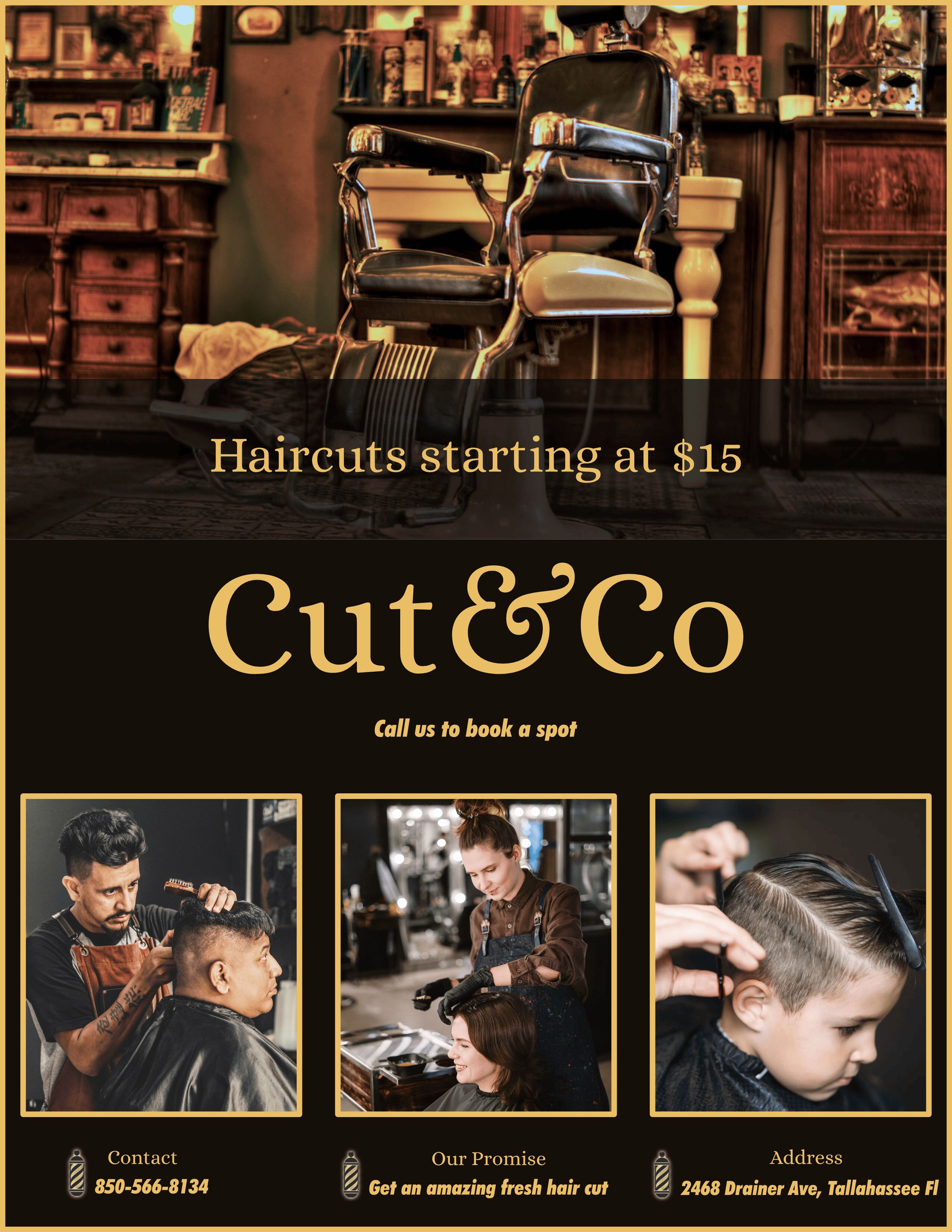
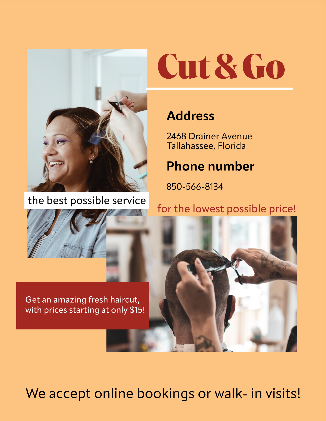
Cut & Go
- Report
5 months ago by erin
 1 Like
 1
1
beautiful! one thing I might change is the location of the address and phone number- where they are now makes them stand out like important pieces of information, and while they are, that info is usually smaller font at the bottom left or right side. You might want info like 'for the lowest price possible' to stand out more than the logistical info. Also, the proiximity of the address and phone number to everything else makes it kind of confusing- you want to group together like information, so these two pieces of info, along with any email address or social media handles, hours of the store, etc would all want to be grouped together. I wouldn't have Address and phone number in larger font- it makes it stand out too much when its just a placeholder and if any info is more important it is the actual phone number not the word phone number. i hope that helps. i would also play with different colors- look at color psychology in graphic design and see what colors might match the young, fun vibe i feel like this business has. you want to appeal to a young, professional crowd who need quick hair cuts on the go, so keep that in mind. the photos are excellent as they show clients i would think might use this service. I also like the font for Cut & Go, and all together it is a nice, functional poster.
5 months ago by kailey - Reply