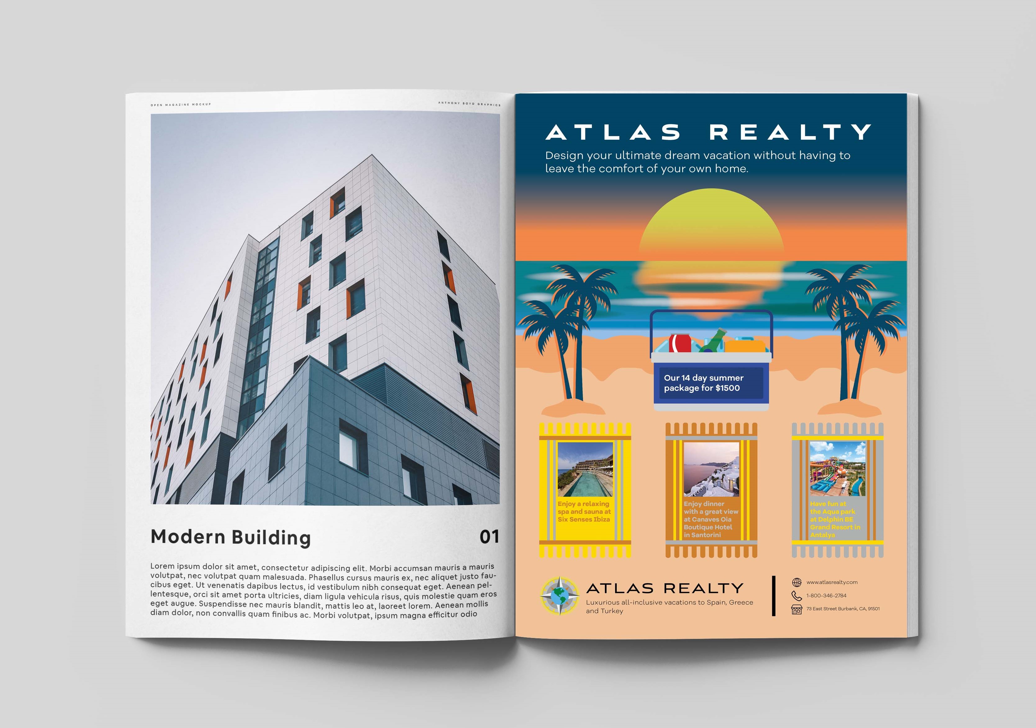
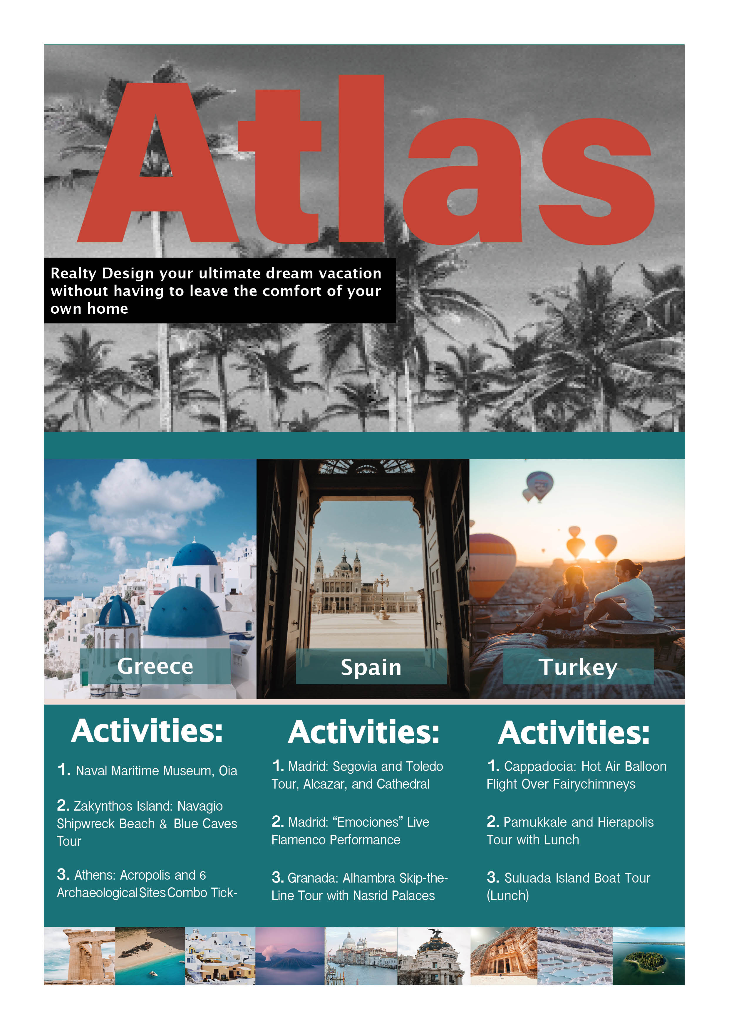
Atlas Realty
- Report
9 months ago by Sasha Stevens
I worked hard on this
 3 Likes
 2
2
Here is my feedback. The red color for "ATLAS" does not work well with the blues throughout the rest of the piece. I think that a similar blue or contrasting white/yellow would fit better. I have the same feedback about the black and white palm trees, it clashes with the vibrant, colorful pictures at the bottom of the piece. This is very nice, I could see it being a flyer.
9 months ago by Monika - Reply
I really liked your picture selection but the overall colour scheme doesn't match
Atlas for vacation should be more colourful and vibrant..
9 months ago by Riddhi Navinchandra Shukla - Reply