Monika
Posts
1
Likes
5
Liked Posts
0
Given Feedback
6
Feedback
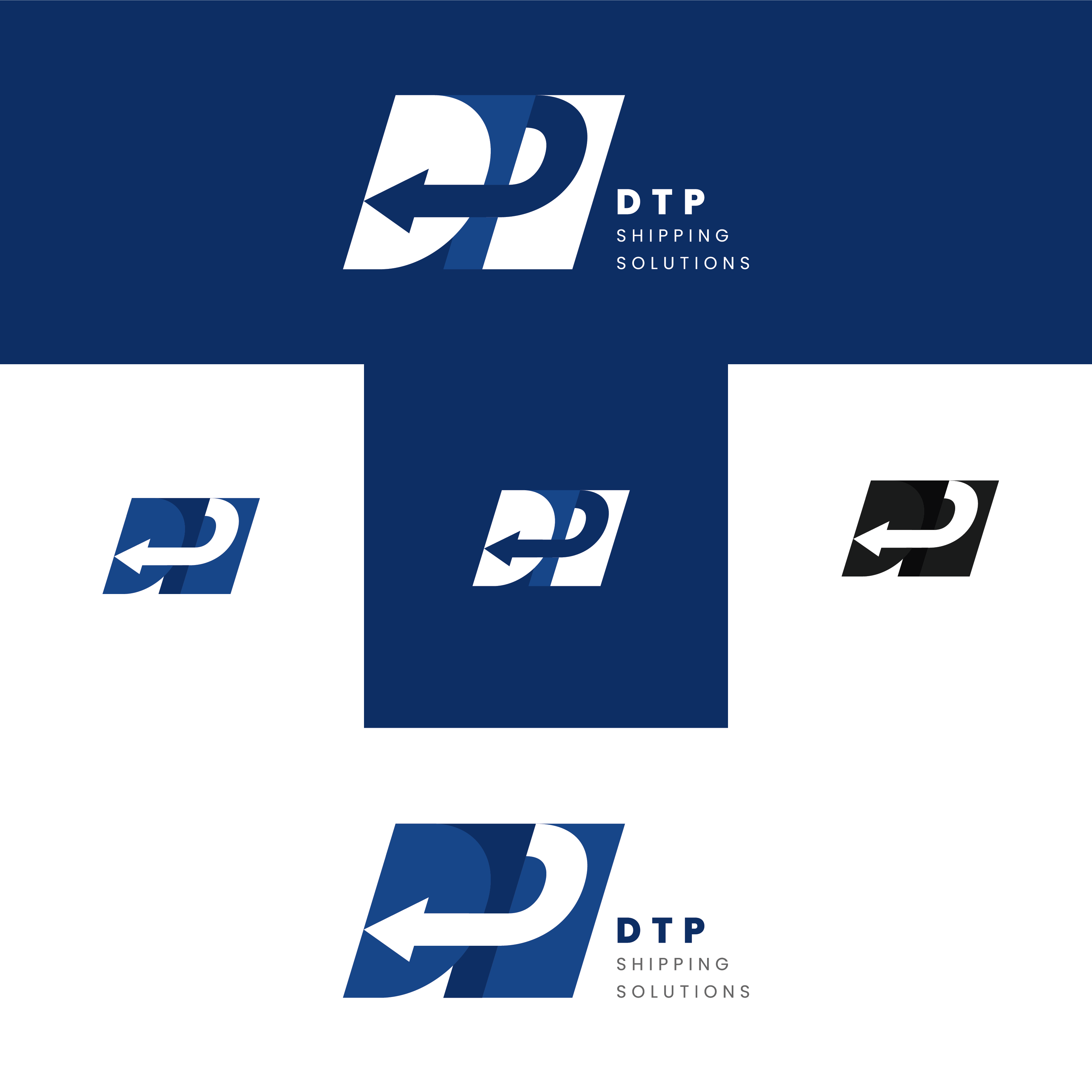
The controller is such a cool idea! It comes across very well and your use of colors is nice.

9 months ago by Monika
This is very cute! looks like a whimsical child's book or journal. I think the bright yellow works well with the darker yellow embellishments.

9 months ago by Monika
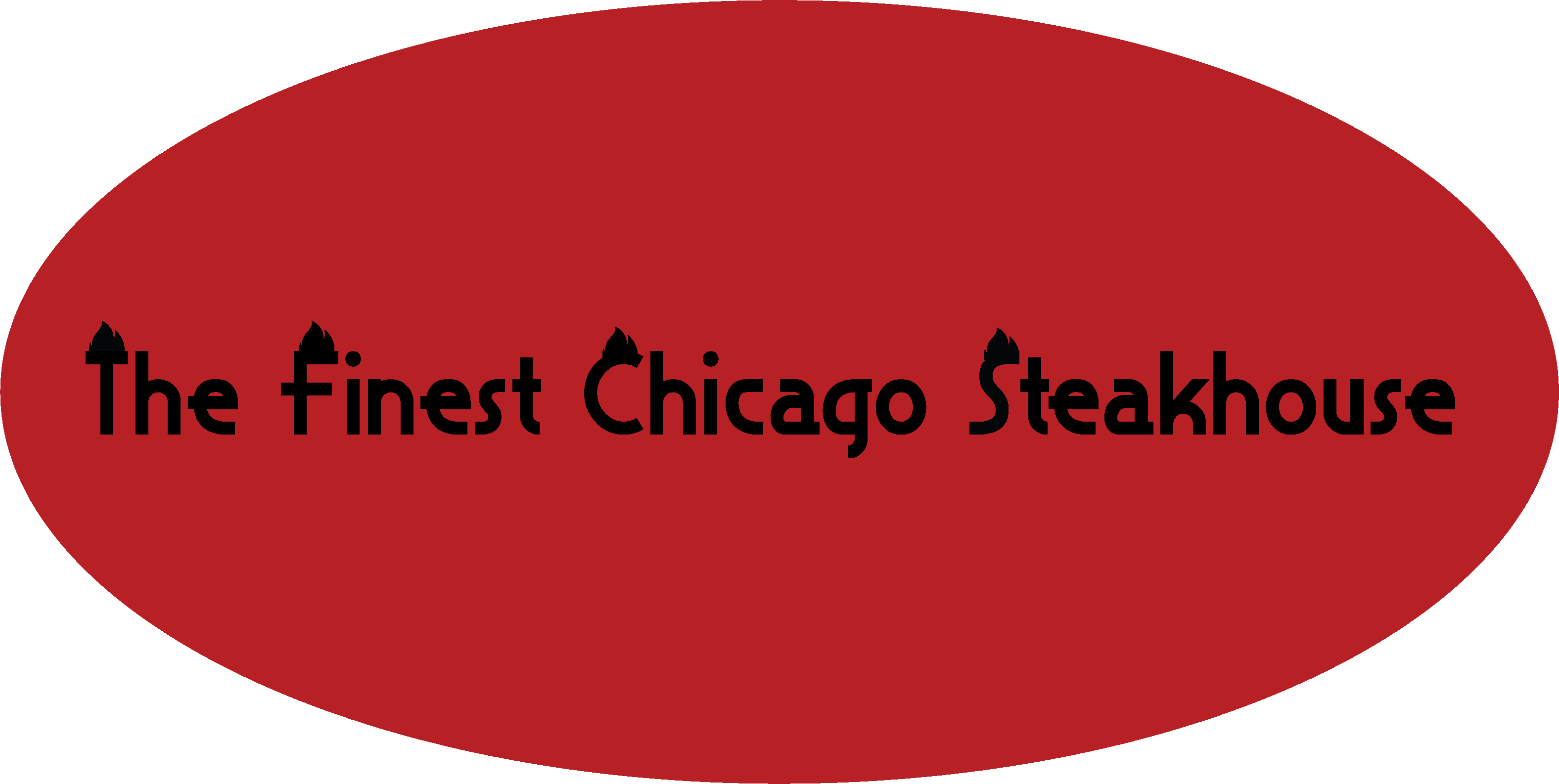
The flames on the letters is an interesting idea. If you are interested in working on this more, I would suggest ditching the circle and choosing a different font.
9 months ago by Monika
I like the logo a lot, but the T seems to get lost.
9 months ago by Monika
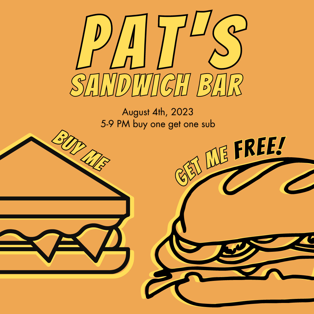
Very simple and cohesive design! The one comment I have is that I didn't realize the "buy me/get me free" were supposed to be read together to make a sentence, so maybe playing with the type to make those feel more connected could make it easier to read :)
9 months ago by Monika
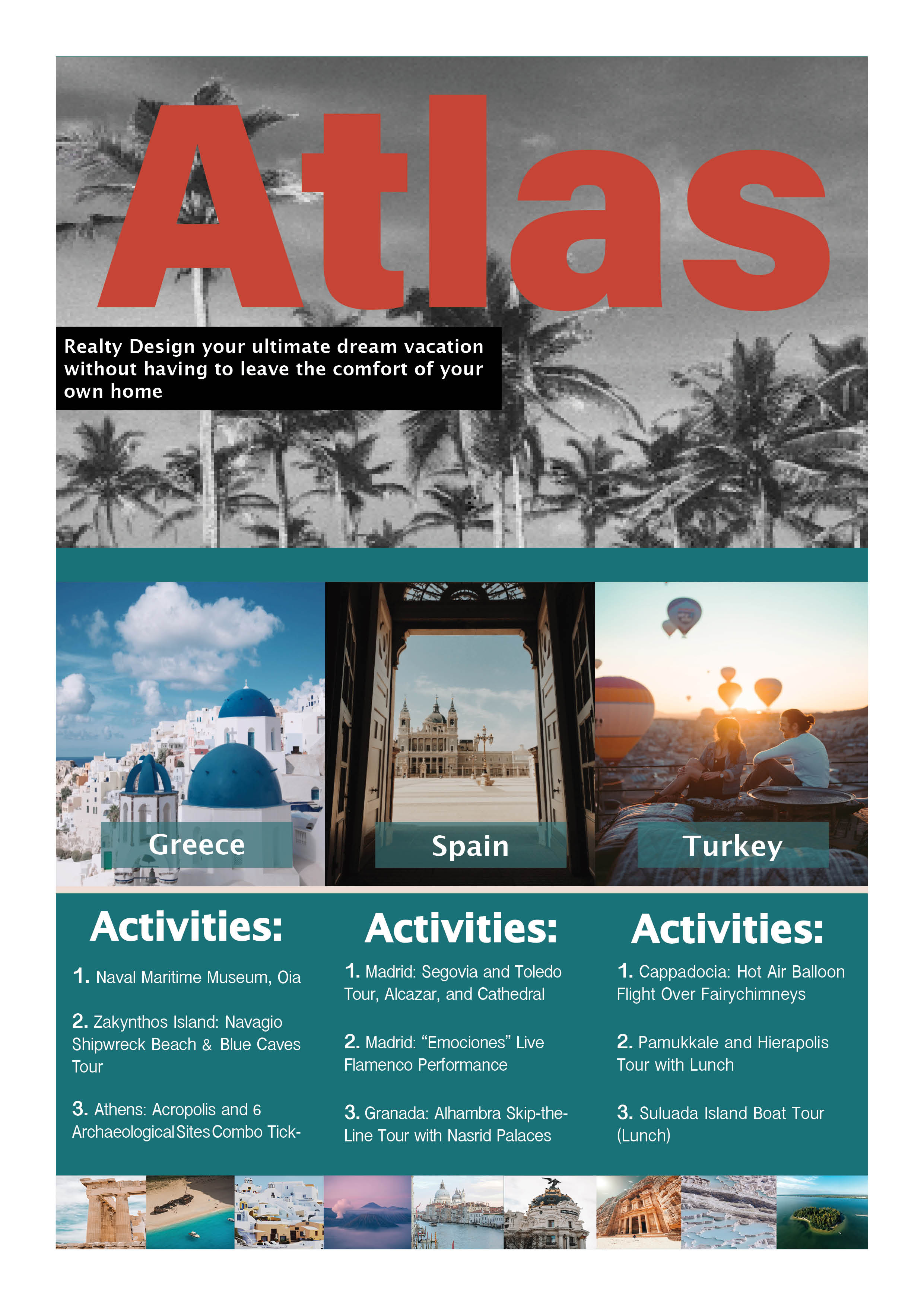
Here is my feedback. The red color for "ATLAS" does not work well with the blues throughout the rest of the piece. I think that a similar blue or contrasting white/yellow would fit better. I have the same feedback about the black and white palm trees, it clashes with the vibrant, colorful pictures at the bottom of the piece. This is very nice, I could see it being a flyer.
9 months ago by Monika
Posts
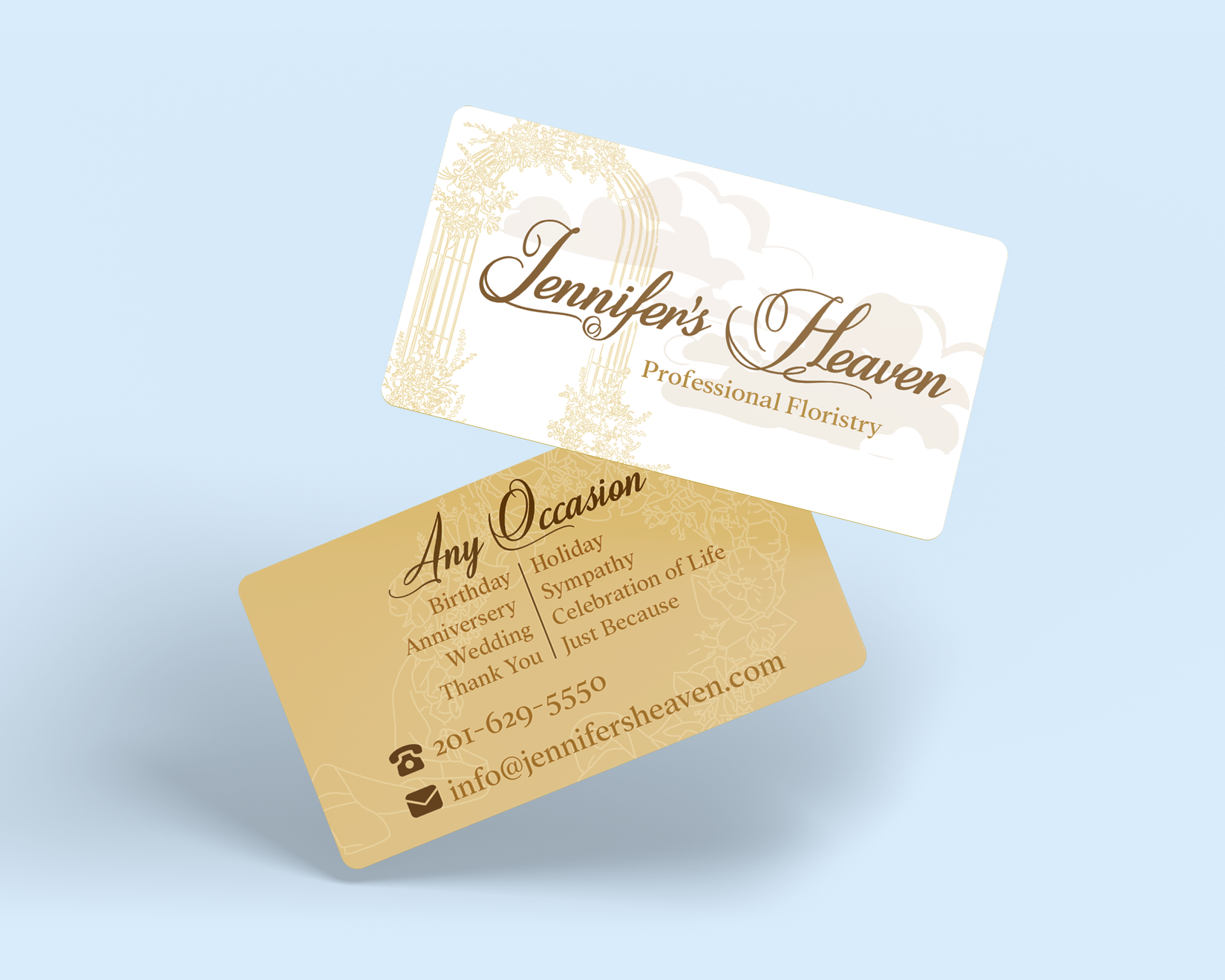
Jennifer's Heaven Business Card
- Report
9 months ago by Monika
I used golds to emphasize the "heaven". I also implemented clouds on the front for the same reason. Tried a monochromatic look for elegance and simplicity. Feedback welcome!
Jennifer's Heavengraphic
 5 Likes
 4
4
Good design
9 months ago by Jonathan - Reply
cool
9 months ago by Epiphany Figment - Reply
I love this
9 months ago by Levi Timothy - Reply
wow
9 months ago by Azi ajah - Reply