Home
Generators
Generators
Logo Design
Web Design
Graphic Design
Illustration
Painting
UX Design
UI Design
Dynamic Poses
Writing
Pro Generators
Logo Design
Web Design
Graphic Design
UX Design
UI Design
Daily Brief
Briefs
Written Briefs
Logo Design
Web Design
Graphic Design
Illustration
UX Design
UI Design
Writing
Daily Brief
Feedback
Blog
More
More
Exercises
Inspiration
Sign in
Home
Feedback
Briefs
Blog
Profile
Create an account
Name
Email
Password
By signing up, you agree to the
Terms and conditions
and the
Privacy policy
Sign In
Email
Password
Stay signed in
Forgot your password?
Reset Password
Piccio's Pizzas
Report
1 year ago by
Muhsin
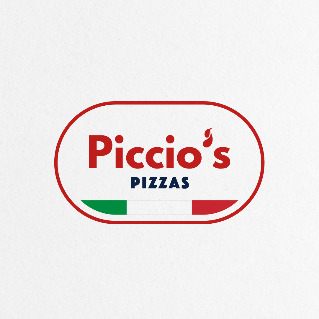
The bold and chunky font type improves legibility and the colors are representing the classic new york. The pizza shovel shape encompasses the logo as a whole to give off a grounded look overall.
Pro Brief
2
Likes
2
Sign in or create an account to comment on this post
Sign in
Create an account
Good choice of elements. The bold type is also well balanced. Don't remember where i've seen a similar design. But overall well done.
1 year ago by
Aurel
-
Reply
Thank you Aurel for the compliments! Took this as a challenge to do it up within half an hour.
1 year ago by
Muhsin
-
Reply
Similar Posts
Piccio's Logo Design
3 years ago by
Blake Bolton
12
Likes
0
Piccio's Pizza Restaurant
3 years ago by
Autumn Musso
7
Likes
0
Piccio's pizza logo design
3 years ago by
Delfina Jurado
6
Likes
0
Piccio's Pizza
4 years ago by
Mark Dickson
4
Likes
1
Piccio's Pizzas
4 years ago by
Nick
3
Likes
1
Piccio's Pizza Logo
1 year ago by
Louie
3
Likes
1
Close