Feedback
Thank you Aurel for the compliments! Took this as a challenge to do it up within half an hour.

2 years ago by Muhsin
Increase the stroke weights so that it will be legible even when the logo is shrunk into a small size.

2 years ago by Muhsin
Posts
Piccio's Pizzas
- Report
Muhsin • 2 years ago
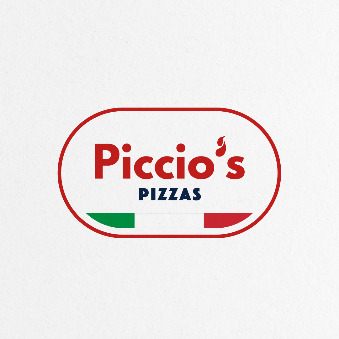
The bold and chunky font type improves legibility and the colors are representing the classic new york. The pizza shovel shape encompasses the logo as a whole to give off a grounded look overall.
Good choice of elements. The bold type is also well balanced. Don't remember where i've seen a similar design. But overall well done.
2 years ago by Aurel - Reply
Thank you Aurel for the compliments! Took this as a challenge to do it up within half an hour.
2 years ago by Muhsin - Reply