Activity Feed


Feedback Leaderboard (Past 30 days)
Remove Ads: Upgrade to Pro
Get feedback on your work
Give feedback to other users!
Give FeedbackDTP Shipping Solutions Logo
- Report
Enzo • 4 years ago
Hi!
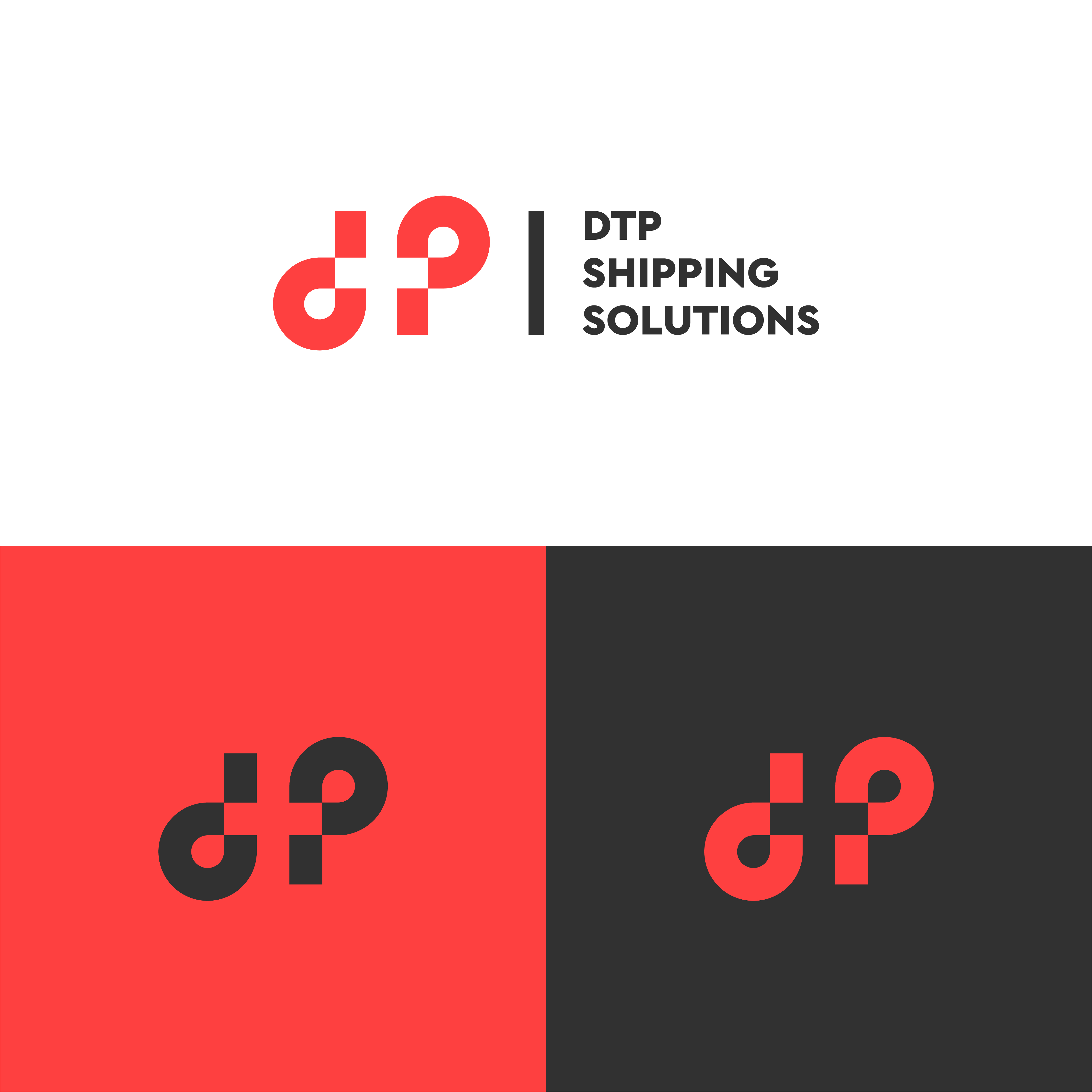
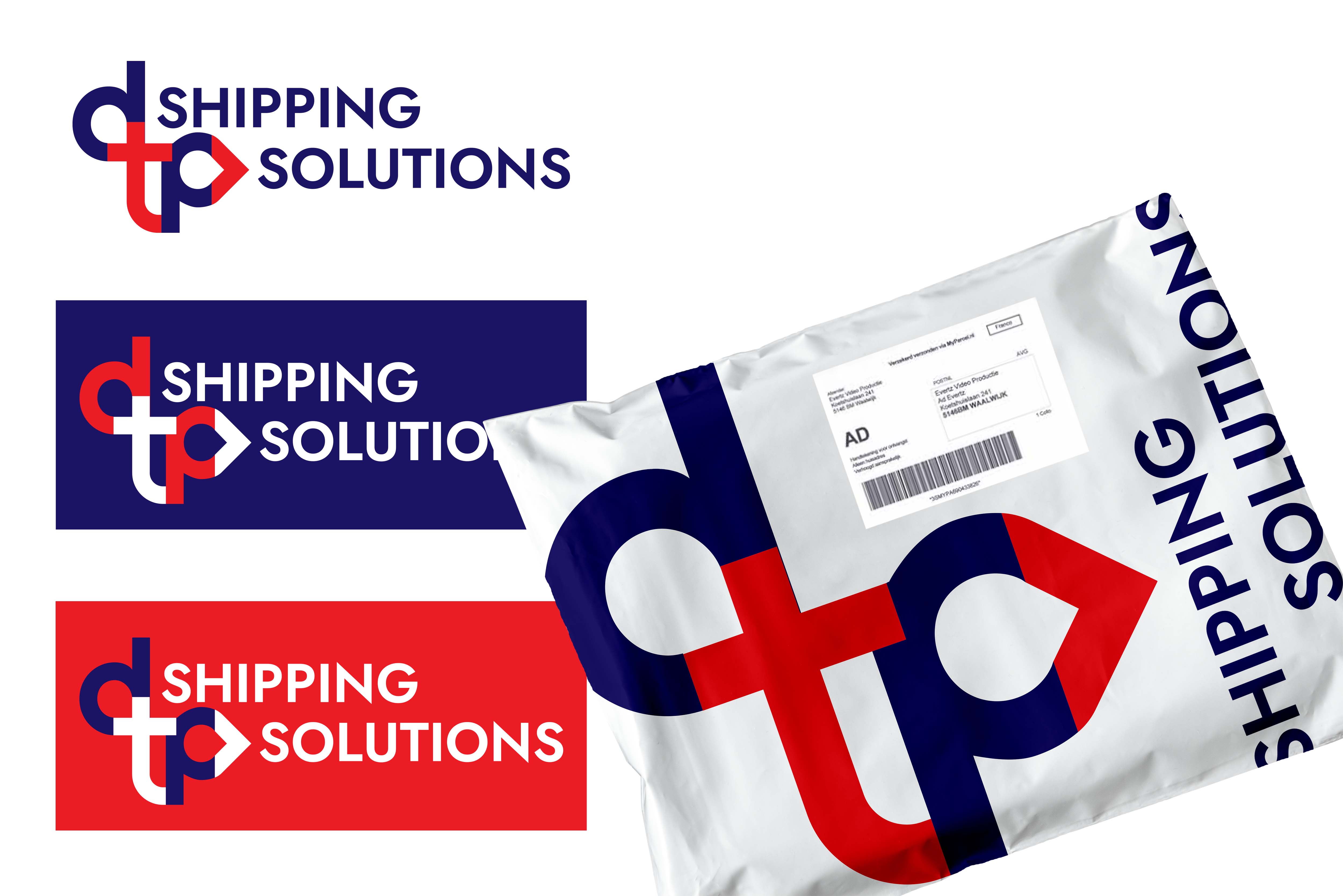
For this brief, I played around with the initials 'dtp' in lowercase and came up with a monogram logo. I made sure that it would be recognizable, visible, and adaptable in printed formats.
Let me know what you think!
For this brief, I played around with the initials 'dtp' in lowercase and came up with a monogram logo. I made sure that it would be recognizable, visible, and adaptable in printed formats.
Let me know what you think!


Wow, this looks great! very clever
2 months ago by Ashley - Reply
Very cool
2 months ago by Nathan Kromer - Reply
Nice one!
5 months ago by Bikram Basnet - Reply
All Comments
DTP Shipping
- Report
Tiffany • 4 years ago
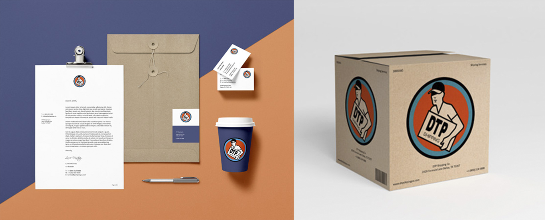
DTP Shipping Solutions fake client brief. B2B shipping services based in Dallas, TX needing a logo to put on office supplies and trucks with a professional comparable to UPS, USPS, FedEx, etc ....

DTP Shipping Solutions
- Report
James Bown • 3 years ago

The best one I see.
1 year ago by Kawishka - Reply
Clean & easy, you could understand this logo from faraway.
2 years ago by Diego van Sommeren - Reply
sddfgr etrewt wertew
3 years ago by amr - Reply
All Comments
DTP Shipping Solutions
- Report
Digital • 3 years ago

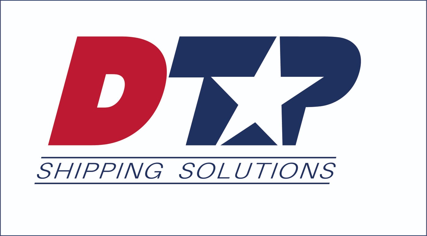
i don't like how the logo and the type have two different shades of black. they might as well be the same. other than that, i like the design.
1 year ago by Garett Noll - Reply
This is a really creative logo! but, if i were you i would try to make the "DTP" equally spaced between the "shipping solutions" and the logo (take this advice with a grain of salt because I'm not good at spotting details lol)
2 years ago by Vincen - Reply
good design
3 years ago by Mhamed Salama - Reply
All Comments
DTP Shipping Solutions
- Report
Omar Alrawi • 2 years ago
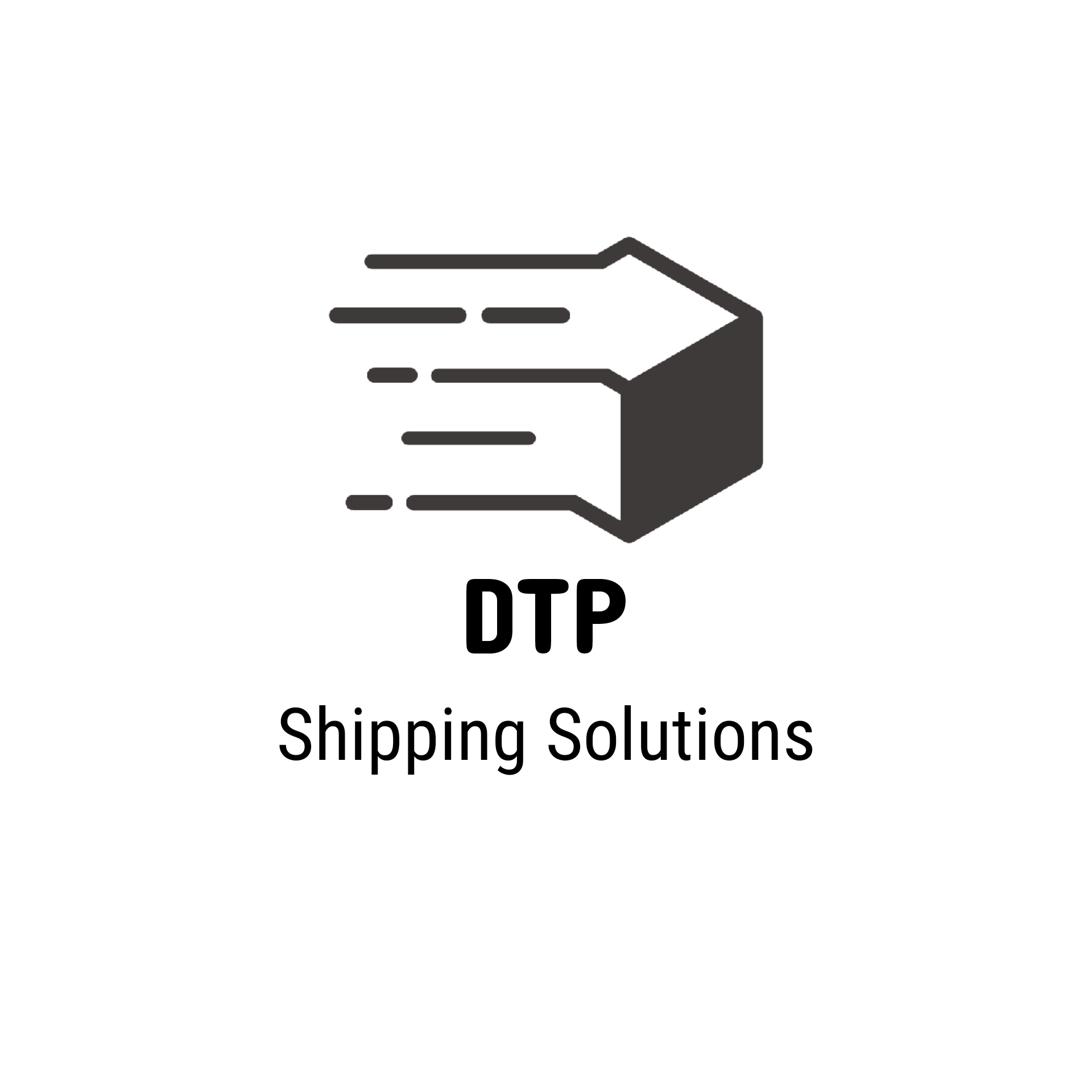
The logo is designed in a bold form giving the sense of a solid, reliable company. also, the logo is sheared forward to represent the speed of delivery.
This is my second Logo Design attempt, so what do you think?
This is my second Logo Design attempt, so what do you think?
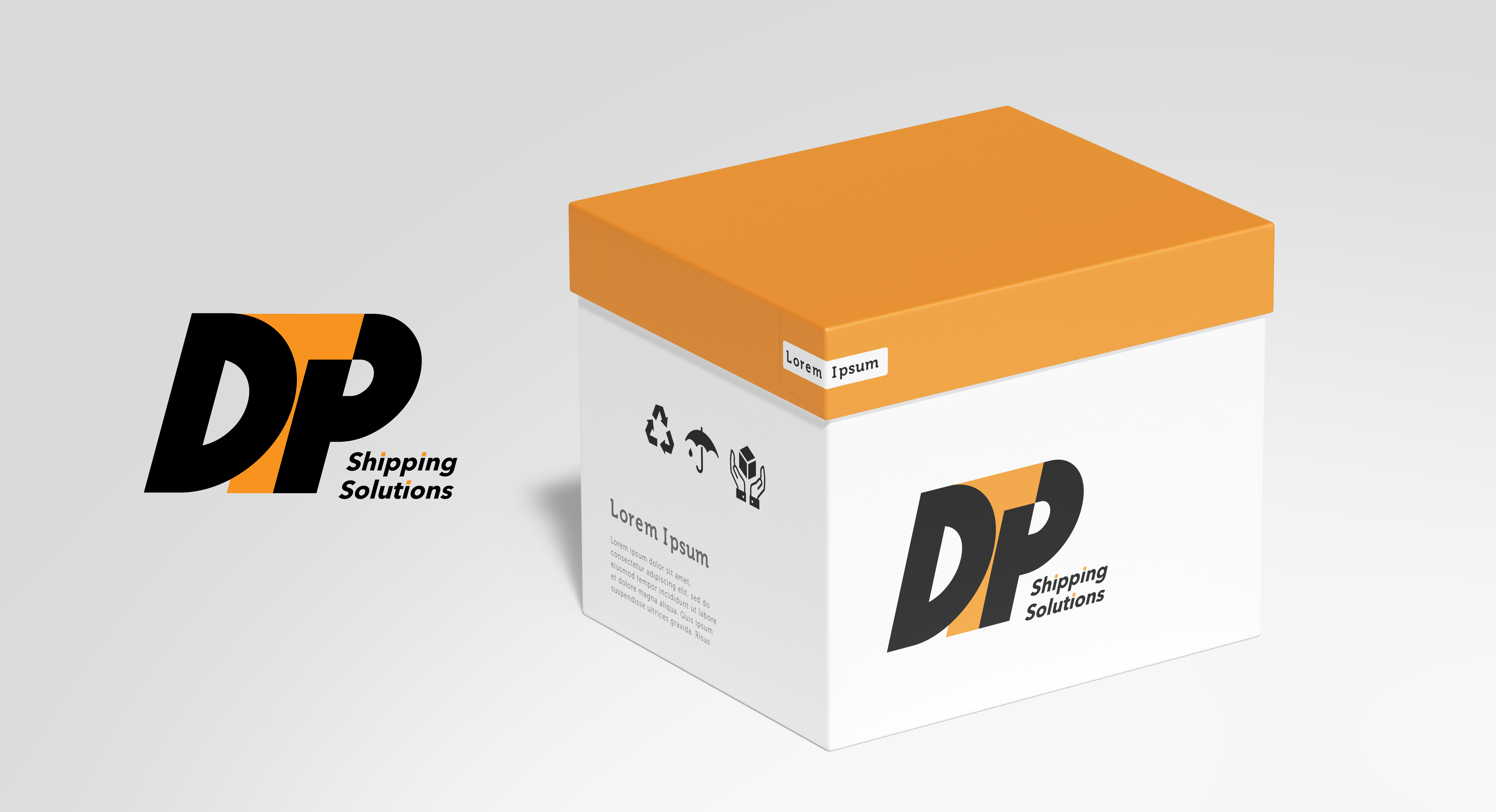

Love the logo and colors and packaging!
1 year ago by Hanan - Reply
If this truly is just your second attempt at logo design, stick with it because YOU’RE DOING IT RIGHT! This is a great logo and you’re certainly on the right track. As a suggestion, consider a common baseline for both your logo and your logotype. That’s not to say that every logo and corresponding logotype should have a common baseline… just in this case (I think) it would streamline the design. Your “D”, “T”, and “P” ought to be on the same baseline (your “D” is a touch above your “TP”). As well, (in this case) your logotype ought to be on that same baseline. Maybe even consider putting “Shipping Solutions” on the same line in a larger font size with a light weight to contrast with the logo itself. Lastly, I love how you’ve dotted your i’s with orange, nice touch! Looking forward to seeing more of your work!
2 years ago by A.T. Norman - Reply
DTP shipping solutions
- Report
Maud • 2 years ago

I think the icon is a bit chaotic but its a good concept
1 year ago by Garett Noll - Reply
good design
2 years ago by Zethz - Reply
Load more
