Cool logos that are easy to draw
Drawing popular logos is not only a fun exercise for logo design and drawing practice, but it also helps you get better at designing new logos while getting better at drawing. Below is a list of some cool logos that are easy for everyone to draw. You can change the difficulty of the exercise by either just drawing the flat logo as if you were looking at it from a screen or try to exactly draw it like it’s displayed on the pictures below.
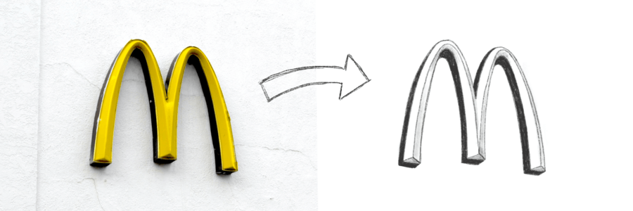
McDonald’s
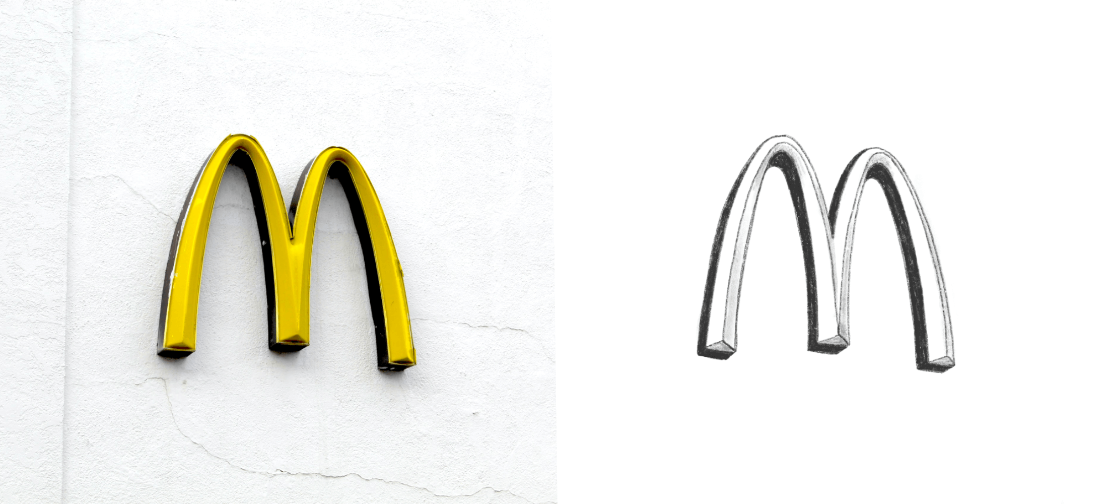
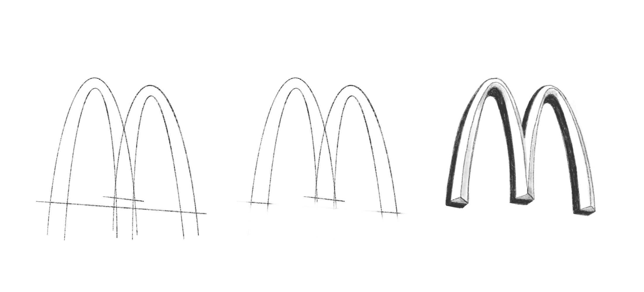
McDonald’s has one of the most recognizable and well-known logos and branding in the world. The logo has been in use since the 1960s and pretty much anyone knows what it represents. It’s quite an easy logo to draw but it can be hard to get exactly right.
Mercedes-Benz
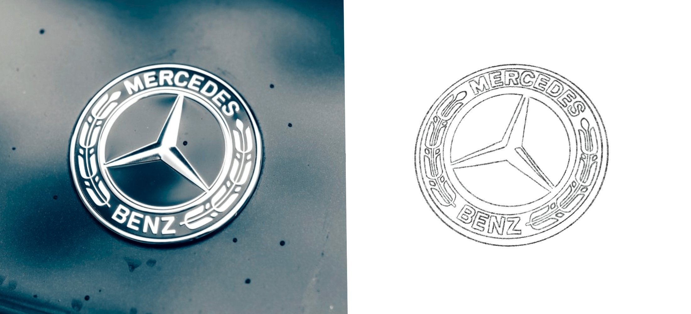
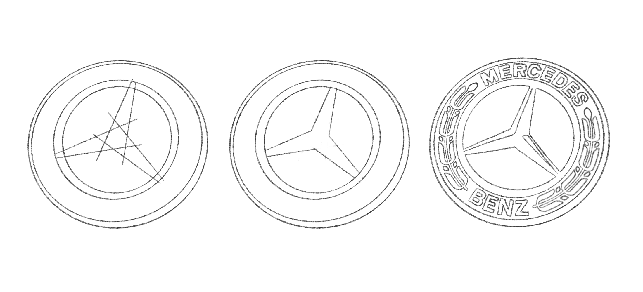
The Mercedes-Benz three-point-star is one of the easiest logos to draw as a beginner. The iconic star has been in use for over 100 years and is used on all Mercedes cars and is synonymous with luxury. The most important aspect you have to look out for when drawing this logo is the proportions of the star. If you draw the points of the star too skinny or too wide it quickly looks off and no longer like the Mercedes logo.
Volkswagen
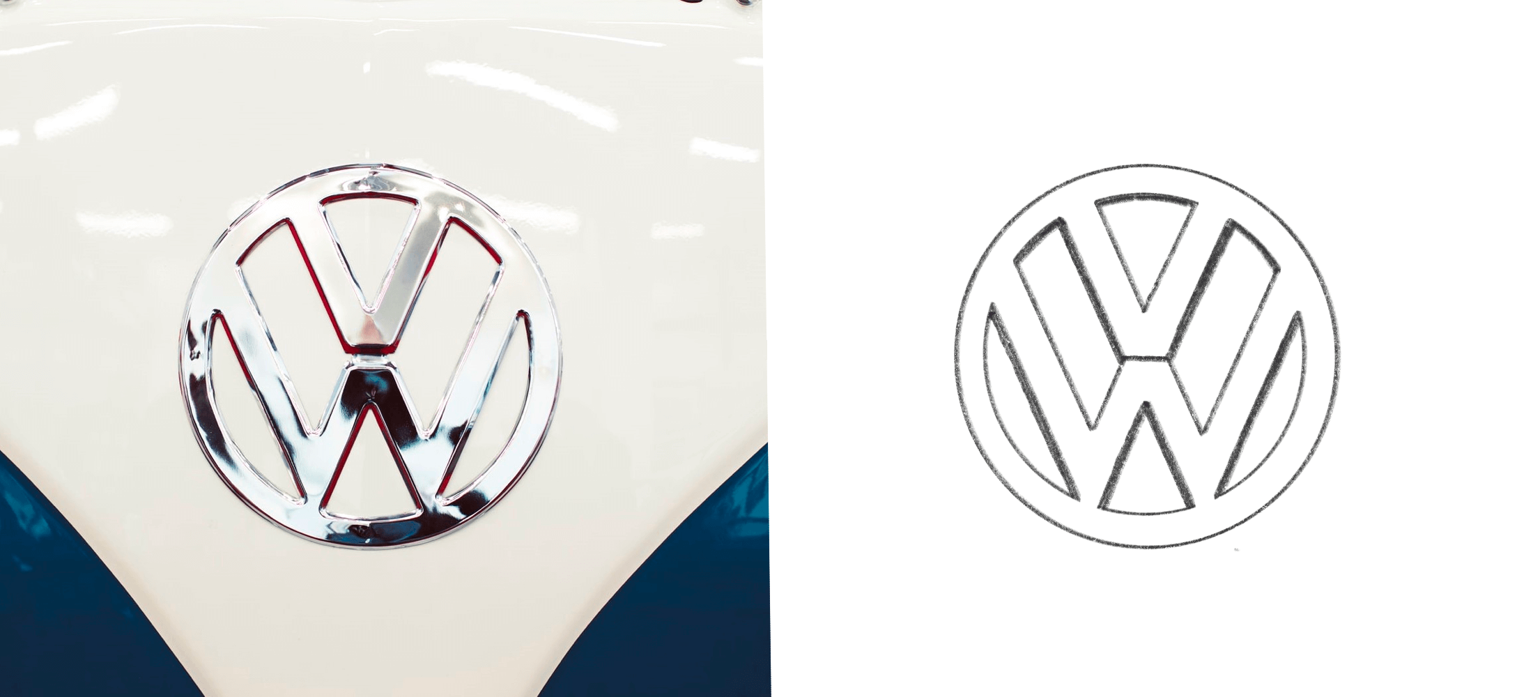
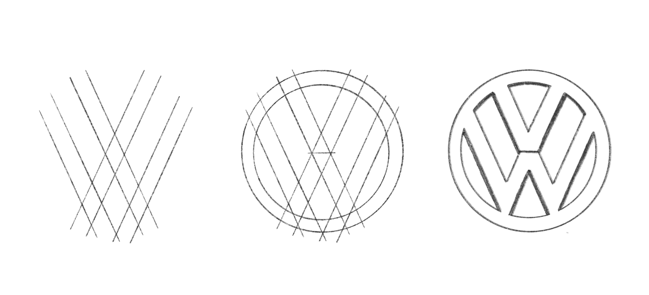
Just like Mercedes-Benz, Volkswagen’s logo hasn’t changed much in almost 100 years. It’s just as iconic and it’s a great exercise to draw this logo. It’s also a great design as it’s a recognizable symbol with the ‘VW’ initials of the brand hidden inside of it.
Apple
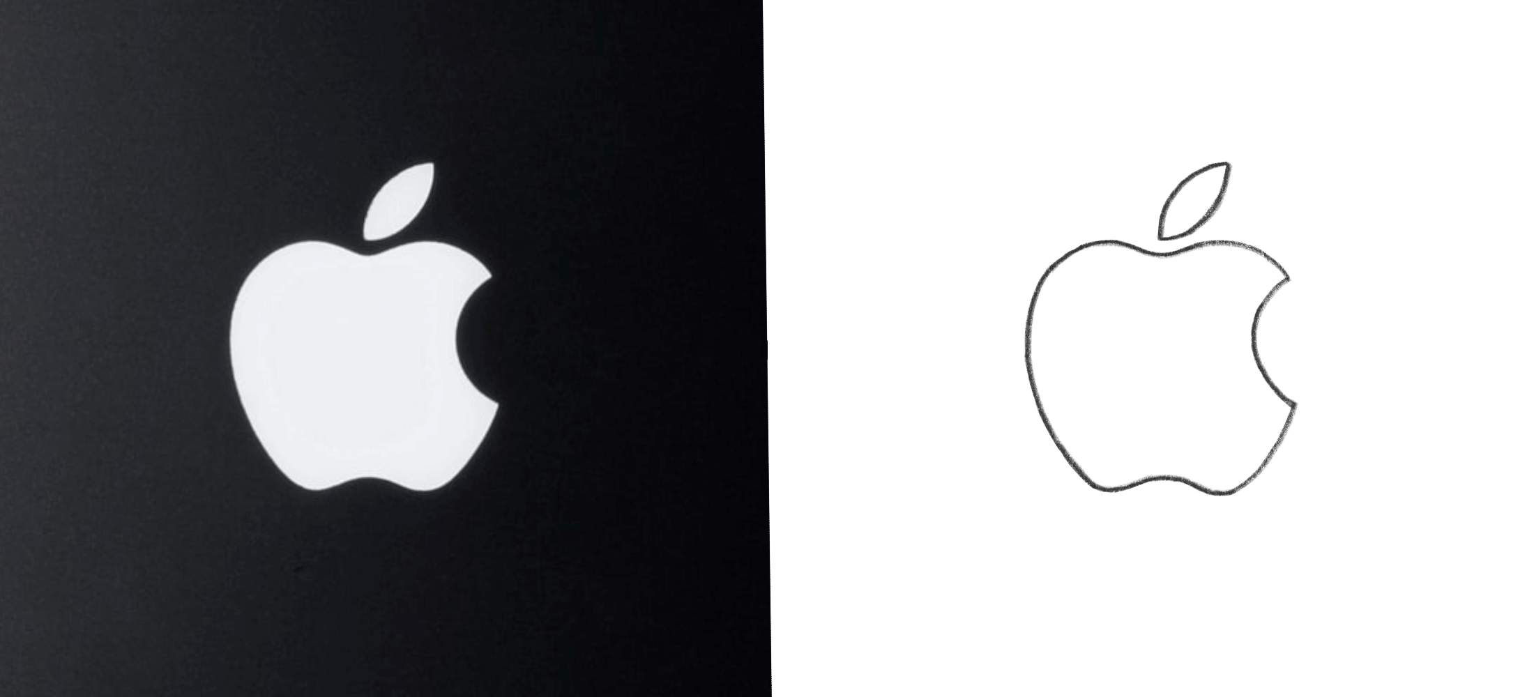
If you’re a beginner, Apple’s logo might be a little harder than the logos mentioned before but it’s still a great drawing exercise. Especially if you want to practice drawing the right proportions of a logo, this one is the ultimate test. Because the logo is so famous and recognizable, it can be hard to draw it exactly right but it should get easier after a few tries.
Vans
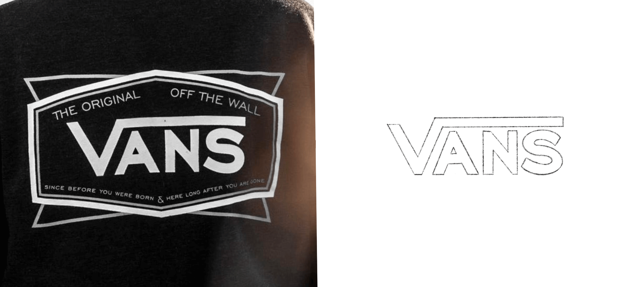
As the previous logos where mostly symbols, the Vans logo is a great logo to draw if you want to practice drawing wordmarks. This lettering isn’t too complex so it’s an easy drawing exercise to start practicing drawing logos.
Adidas
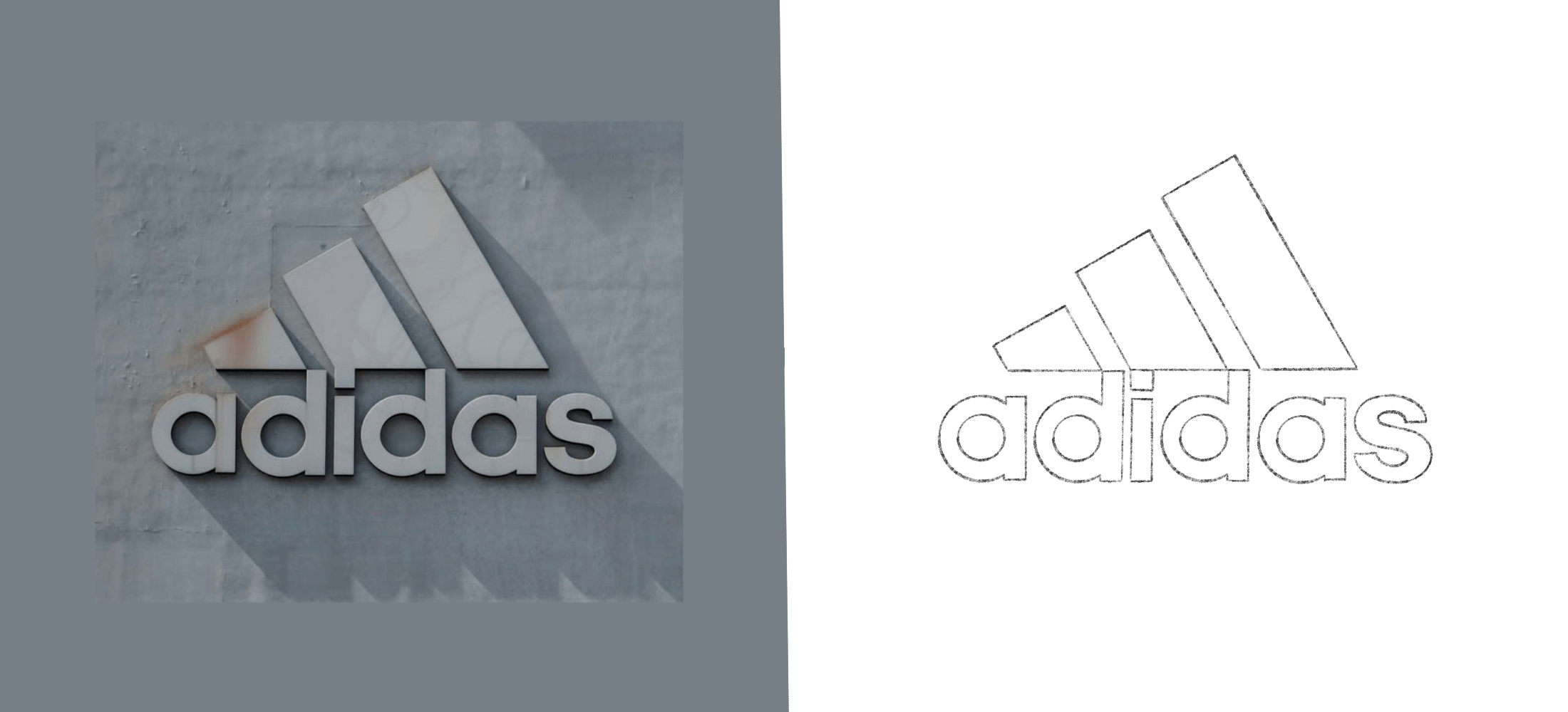
Just like the other logos, the Adidas logo is a great logo to use as a reference for drawing logos. It might seem like a very easy logo to draw because it’s simply three wide stripes. That isn’t necessarily true, however, as just like the McDonald’s logo, it can be quite challenging to get the proportions of the stripes exactly right. If you want to up the challenge a bit, you can also try to draw the wordmark beneath it or even try to draw the other ‘Adidas Originals’ leaf-like logo.
BMW
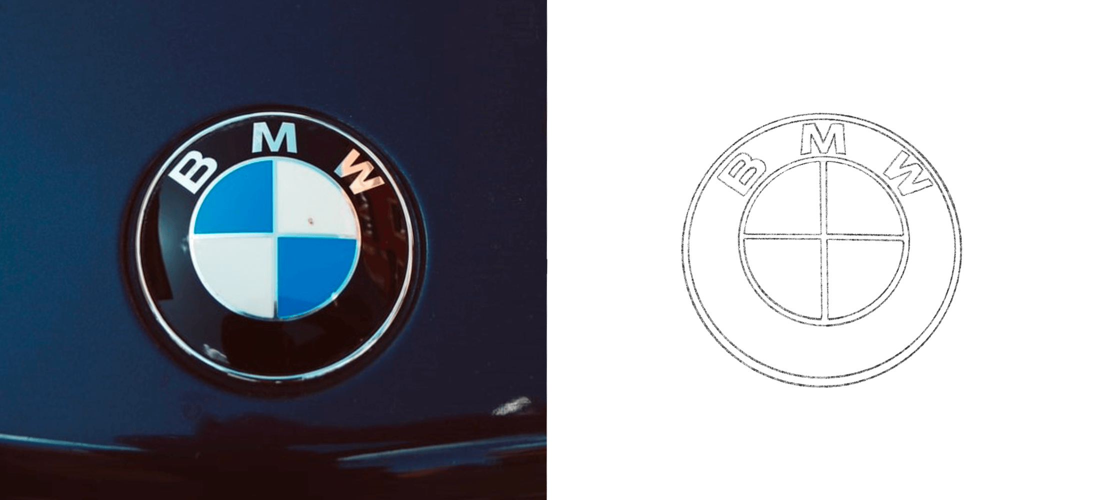
Car brand logos are often the perfect logos for practicing drawing logos. As they are often made to be recognizable from a distance and are applied with real-world materials as emblems. That’s the same for the BMW logo. It’s also been in use for over 100 years without much change and is a simple logo to draw. When it comes to car emblem logos, you can also set the difficulty of the drawing challenge for yourself. Either draw the flat logo or try and draw the full emblem in 3D as you would see it on a car.
Patagonia
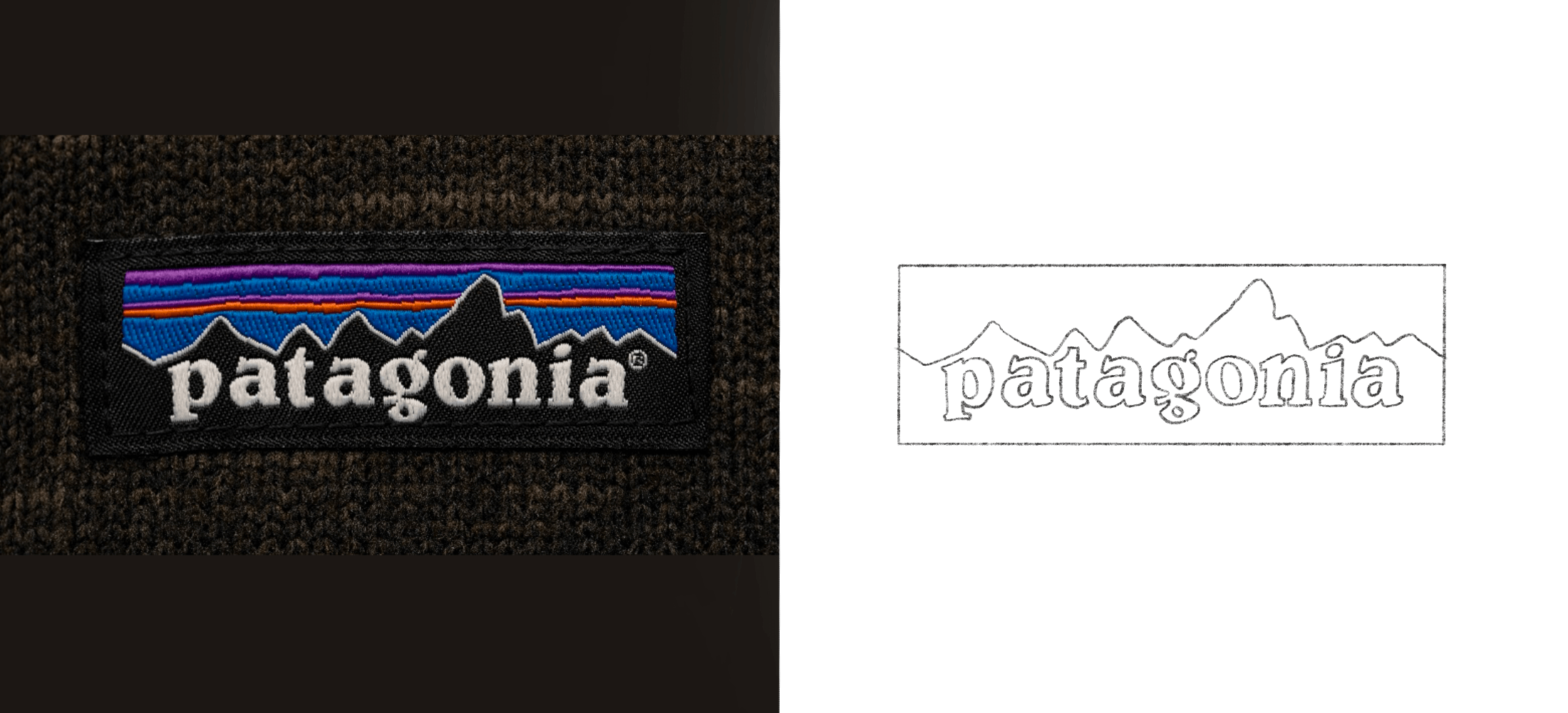
Patagonia has quite a unique logo as it combines a quite ordinary wordmark with a decorative illustration of a mountain range. The choice of colors in the sky, makes this logo really stand out, making the logo very interesting to draw. Getting the font right in your drawing may be tricky but getting the colors right can sometimes be the most difficult.
Porsche
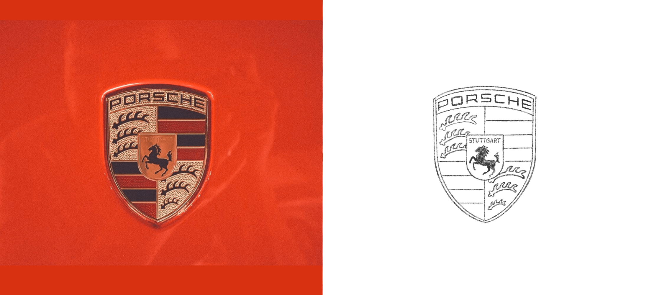
Like many performance-car brands, Porsche uses a shield as its logo. Drawing shield logos can be a great exercise, as it often involves many different elements. Porsches logo isn't that busy, however, so drawing it shouldn't be too hard.
Marshall
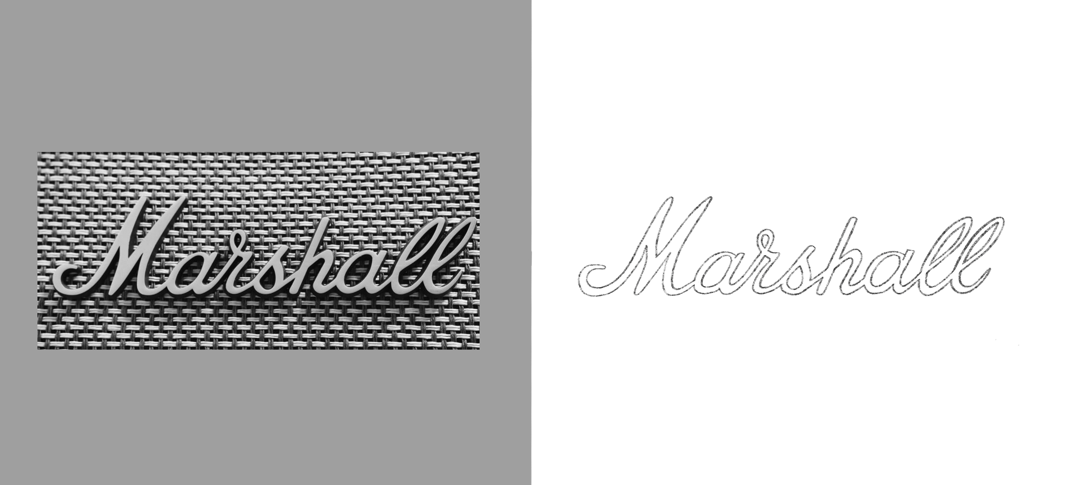
The past few logos in this list have been mostly sans-serif fonts or simple symbols while many logos still use script fonts. A great example is Marschall's logo. Marschall uses a very simple script font that is the perfect drawing exercise to practice drawing flowing letters that create an elegant but professional-looking logo.
Leica
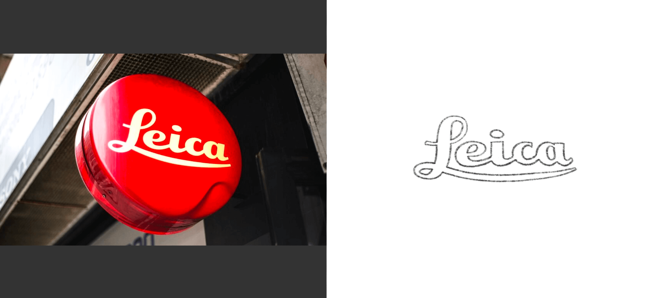
Just like Marshall, Leica is a great example of a logo using a script font. While the brand isn't as well-known as it used to be, it is still a great logo and a great drawing exercise to practice drawing more vintage-looking logos.
Burger King
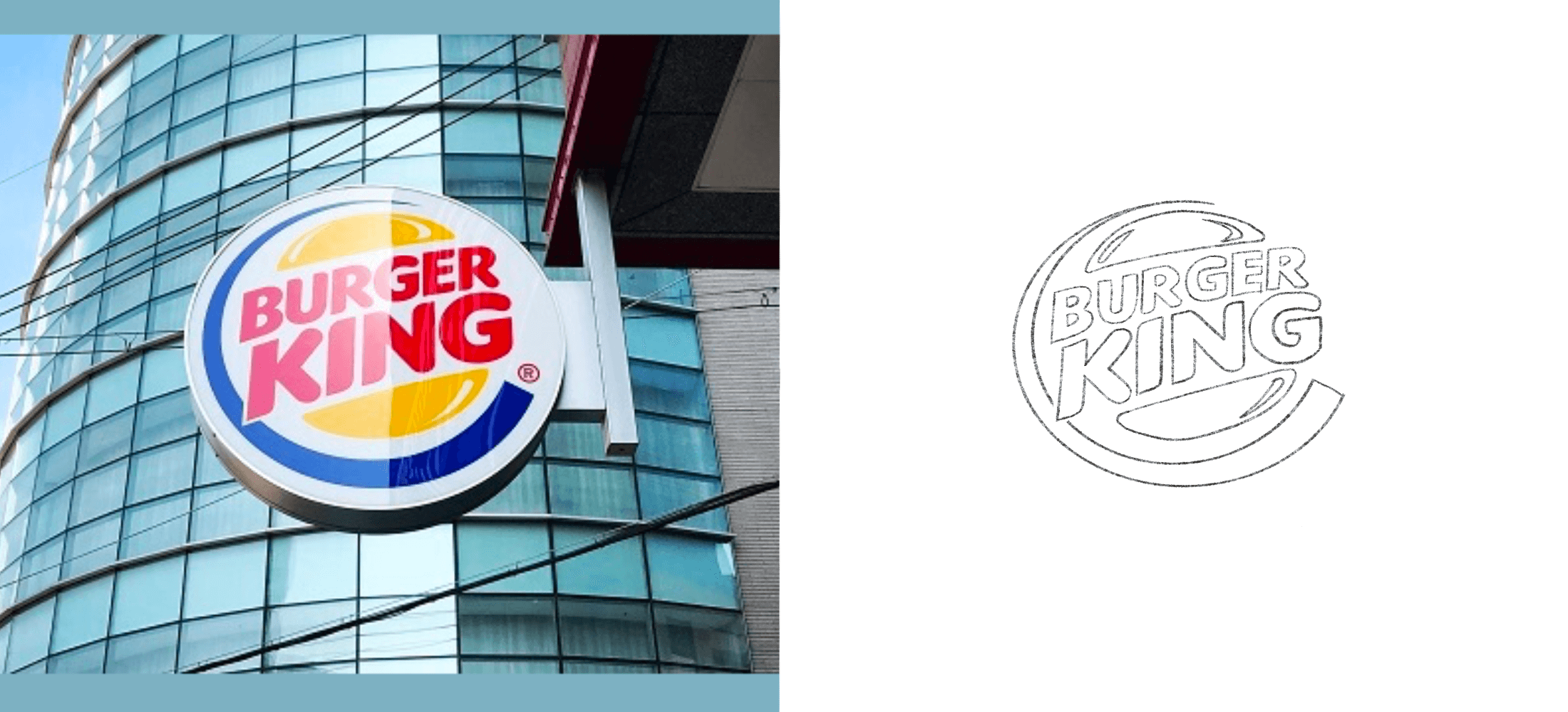
Just like Patagonia's logo, Burger King uses a wordmark in combination with illustrative elements that form its logo. With this logo not being constrained to a rectangular grid, it will be hard to get all the proportions right. Look out for this as that can lead to your drawing looking just a bit off.
Ikea
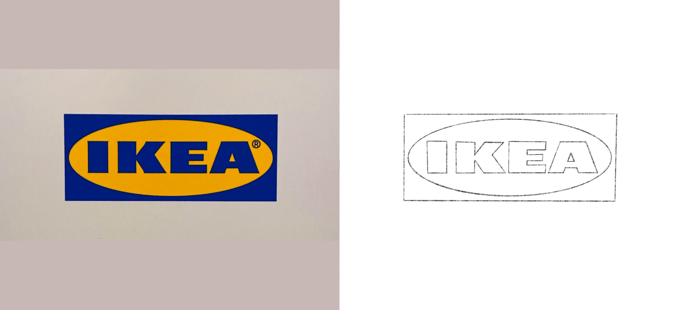
Ikea's logo is quite the opposite of the previous one as it does clearly fit into a rectangular grid. You could almost fully recreate this logo using just a ruler but don't forget the fact that the letters in the Ikea logo have small serifs, the small spikes at the edges of the letters.
Starbucks
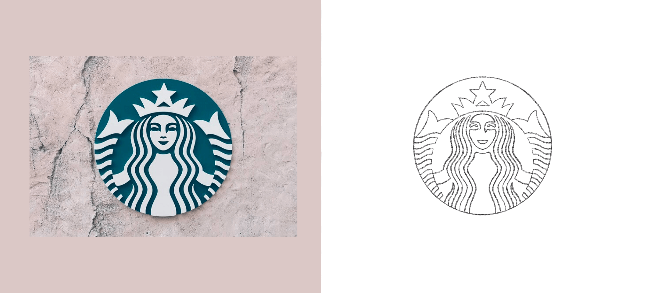
The Starbucks logo is one of the few on this list that consists of only a symbol/illustration. Apple also uses a symbol but the Starbucks logo will probably be a bit harder to draw as it is quite a bit more complicated and detailed.
Beer Brands
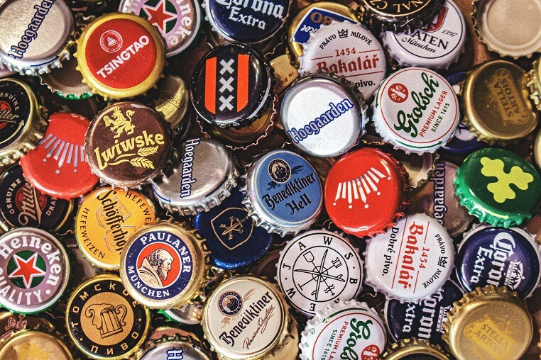
If you want more of a challenge drawing logos, drawing beer brand logos is another great exercise as they often use very detailed lettering or illustrations.
Generate more logo ideas
If you are done with this list or just want to move on to other challenges, you can use our logo prompt generator to generate even more logo design ideas. On FakeClients.com you can generate an unlimited number of logo design prompts so you can practice as much as you’d like. It’s a great practice exercise for any aspiring or beginning designer as you’ll practice logo design and you can use your imagination to think of good ideas for the logos you’ll have to design.